

You've been looking at your wall for weeks, torn between the desire to hang that beautiful artwork that you love and the urge to install those floating shelves so practical for your books and decorative objects. What if you didn’t have to choose?
Imagine being able to transform that blank wall into a true functional art gallery, where your paintings enhance your shelves and each object placed tells a story in harmony with your works. A perfect balance between artistic beauty and intelligent storage.
You've probably already tried some arrangements, but the result leaves you perplexed: either it looks cluttered or it lacks coherence. Your paintings seem lost among the clutter, or your shelves break the magic of your works.
That’s perfectly normal! The problem isn't your artistic taste, but simply the lack of a clear method for creating this delicate balance between function and aesthetics. Most people place their items randomly, without understanding the visual rules that govern wall harmony.
By the end of this article, you will master the subtle art of composing a perfectly balanced wall, where each painting naturally dialogues with your shelves to create a sophisticated and functional ensemble that will impress all your guests.
Why combining shelves and paintings revolutionizes your decor?
Modern wall art is no longer limited to a few framed pictures. Today, the most talented interior designers create three-dimensional compositions that transform a simple wall into a true exhibition space. If you continue to think "storage" on one side and "decoration" on the other, you are missing out on a unique opportunity to reveal the creative potential of your interior.
🏠 Customer testimonial: “Sarah, an interior architect, confided in me that she had transformed her small living room into the centerpiece of her Parisian apartment. By combining three floating oak shelves with a series of abstract paintings in warm tones, she created a focal wall that gives the illusion of enlarging the space while optimizing storage. Her guests now believe she lives in a much larger loft!”
💬 Conversation with a decor expert
The golden rule of wall harmony: each element must converse with others without ever shouting louder. Your artworks bring artistic emotion, your shelves structure the space and create visual rhythm. Together, they form a decorative symphony that transforms your wall into a living work of art in less than one day of arrangement.
Decoding: why your previous attempts didn't work
Do you recognize yourself in these situations? Your shelves seem to float in the void, disconnected from your artworks. Your decorative objects appear randomly placed, without a connection to the artistic atmosphere you want to create. Or even, your wall gives an impression of "overload" where the eye no longer knows where to land.
This is not a lack of taste on your part, but the result of an intuitive approach where a structured method is needed. Most people place their elements based on available space rather than thinking about overall composition. It's like trying to do a puzzle without seeing the final image.
Imagine a chef adding ingredients randomly to his dishes: even with the best products, the result would be disappointing. Wall decoration works according to the same compositional principles as gourmet cooking: each element has its place and time to reveal the best of the whole.
First hidden cause: you think "filling" instead of "dialogue"
Most people consider their wall as a space to "fill" rather than a canvas where creating a visual conversation. This quantitative approach ("I have an empty wall, I need to fill it") explains why so many compositions appear artificial and soulless.
It's like the difference between a lively village market and a crowded warehouse: in both cases there are many elements, but only the first creates a warm and vibrant atmosphere. Your artworks and shelves must interact like the merchants and customers of a market: each has their role, their personality, and all together create a unique atmosphere.
This revelation will change your approach to every new arrangement. Instead of asking yourself "where can I fit this element?", you'll ask yourself "how can this element enrich the conversation already in progress on my wall?". This simple question radically transforms your results.
🔍 Immediate test: Look at your current wall and identify which element “speaks” loudest. Now, look for the one that seems most "shy". You have just discovered your main imbalance! A harmonious wall has neither an overwhelming star nor an invisible extra.
Second cause: you neglect the "breathing" between elements
Empty space isn't wasted, it's oxygen for your compositions. This misperception leads to overcrowding walls in an attempt to optimize space, but it has the opposite effect: a feeling of visual suffocation that diminishes the impact of each element.
Think of a musical melody: it is the silences between the notes that give rhythm and emotion to the music. Your empty spaces play the same role as silences in music: they allow the eye to rest, digest each element, and fully appreciate their individual beauty before moving on.
This understanding frees you from the pressure of "maximum filling" and gives you the confidence to create more sophisticated compositions. You will discover that a well-ventilated wall exudes a natural elegance that impresses far more than an overloaded one.
Third cause: you ignore the "visual dialogue line"
There are "invisible paths" that the eye naturally follows to traverse your composition. When these paths are chaotic or interrupted, the brain perceives confusion even if each element is beautiful in itself. This is why some walls "don't work" despite quality pieces.
You can identify these lines by following your gaze on your current wall: where does it naturally go? Where does it get stuck? Where does it get lost? These clues reveal the hidden structure of your composition and show you exactly what to adjust to create a smooth and pleasant visual path.
Mastering these lines of force transforms your approach to decoration. You go from "object positioner" to "creator of visual experiences", with all the emotional impact that represents for you and your guests.
🎯 The 3 signals of a poorly balanced wall:
- Your gaze "bounces" from one element to another without fluidity: this indicates breaks in your visual dialogue line. It's like a road with too many potholes: uncomfortable and tiring.
- Some elements seem "floating" without anchorage: they are not visually connected to anything. Imagine islands lost in the ocean: beautiful individually, but lacking overall cohesion.
- The whole thing seems frozen, lifeless and undynamic: your composition lacks rhythm and movement. This is a sign of an approach that is too symmetrical or predictable, which bores the eye.
Each successful composition has a focal point where the visual energies of all other elements naturally converge. This is your "sun" around which your "planet" decor revolves. Identifying and consciously creating this convergence zone transforms a collection of objects into a true decorative constellation. You will recognize this zone because it's where your gaze spontaneously returns after exploring the rest of the composition.
The rule of harmonious proportions: your convergence zone should occupy about 30% of the total visual attention, the rest being distributed between secondary elements and breathing space. Test this proportion by slightly squinting at your wall: the element that remains most visible is your current convergence zone.
| ❌ Instinctive approach | ✅ Considered composition | 💡 Why it works | 🎯 Perceived benefit |
|---|---|---|---|
| I fill the empty spaces as I go | I first create my storyline, then I place my elements | The eye follows a logical and fluid path | Feeling of harmony and sophistication |
| I place my most beautiful objects in the spotlight | I balance stars and connecting elements | Each piece reveals the beauty of the others | Professional gallery impression |
| I maximize the use of wall space | I dose fulls and voids like a rhythm | The eye can rest and appreciate every detail | Soothing and elegant atmosphere |
| I choose elements that I individually like | I select pieces that dialogue with each other | Coherence creates a unique decor signature | Pride in an affirmed personal style |
The "3 layers" method for perfect integration
Rest assured, creating this harmony is more accessible than you might think! We will proceed like a painter who builds their painting in successive layers: first the structure, then the details, and finally the finishing touches. This methodical approach eliminates the stress of "all or nothing" and allows you to adjust at each step. In 3 clear steps, your wall will transform into a true functional work of art that will provide daily satisfaction and permanently impress your guests.
🎨 Overview of your transformation: Layer 1 - You create the structure (shelf placement and visual anchoring) which will immediately give a feeling of order. Layer 2 - You integrate your paintings creating visual dialogues that will bring artistic emotion. Layer 3 - You refine with decorative objects that will reveal the unique personality of your composition. At each step, you will see your wall gain sophistication and character.
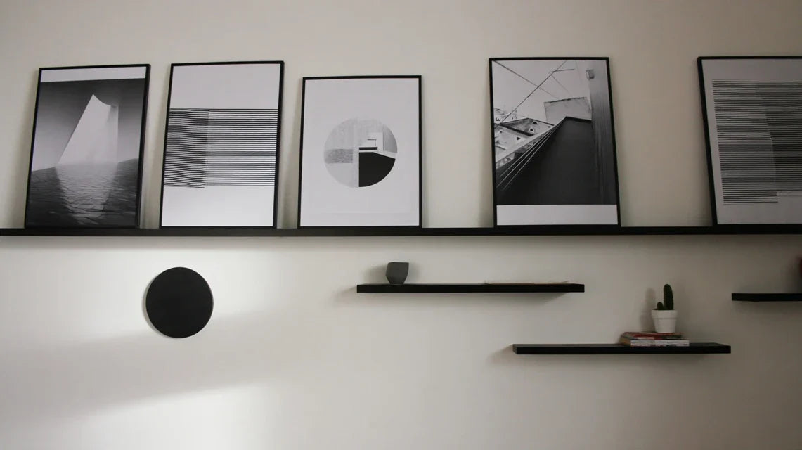
Layer 1: Create your wall architecture (the foundations)
Starting with shelves is like drawing the skeleton of your composition: it immediately gives a solid structure on which your paintings can visually rely. This logic of reverse construction avoids the "added" effect that makes so many compositions look artificial. Once this step is complete, you will already feel that satisfaction of the creator who sees their project take shape harmoniously.
🔧 What you need to get started
- Quality floating shelves: Choose models with invisible mounting to preserve the "floating" effect that creates visual magic. Opt for solid wood or steel according to your style rather than imitations which are quickly noticeable. The ideal thickness is between 3 and 5 cm: thinner looks fragile, thicker visually overwhelms your artworks. Invest in quality because these shelves will structure your decor for years.
- Digital or traditional spirit level: Perfect horizontality is non-negotiable to create visual balance. Even a subtle misalignment unconsciously disturbs the eye and gives an impression of neglect. Digital levels facilitate precision, but a good traditional level works perfectly. Check its accuracy by turning it over: the two measurements should be identical.
- Tape measure and pencil: Precise measurement avoids regrets and retouching. Use an erasable pencil to mark your temporary reference points. These basic tools are your guarantee of a professional result that will give you pride in a job well done.
Now, let's move on to the magic of composition!
🎯 Building Your Main Line of Force
Define your guideline: Mentally trace an imaginary horizontal line that will run across your composition from side to side. This line will be your "visual backbone." Place it in the lower or upper third of your wall (never in the center to avoid rigidity). This line will guide all your other placements and instantly create a sense of order and intention in your composition.
⏱️ Time: 5 minutes | ✅ Success when: You clearly visualize this line and it seems natural to you | ⚠️ Attention: Do not choose the exact center of the wall, as this creates a frozen symmetry that lacks dynamism and interest.
Position your first shelf (the anchor): Install your main shelf slightly off-center on your guideline. If your wall is 3 meters long, place it about 1.2 meters from the left or right edge. This asymmetry instantly creates dynamism. This shelf will become the anchor point around which all your other elements will be organized, like a conductor giving tempo to all the musicians.
⏱️ Time: 15 minutes | ✅ Success when: The shelf seems naturally in place, neither too centered nor lost | ⚠️ Attention: Resist the temptation of perfect centering which seems "safer" but produces a static and predictable effect.
Create your rhythm with secondary shelves: Add your other shelves by varying the distances and heights to create an irregular but harmonious visual rhythm. Think of a jazz melody rather than a military march. The goal is to guide the eye in a fluid dance rather than confine it within a rigid grid. Test several positions before permanently fixing them.
⏱️ Time: 25 minutes | ✅ Success when: Your gaze naturally circulates from one shelf to another | ⚠️ Warning: Avoid regular spacing that creates a "rack" effect rather than an artistic composition.
✨ Check your structure: Step back 2 meters and squint slightly. Your shelves should form a cohesive whole that inspires you to be "completed" by your paintings. If a shelf seems isolated or the overall impression is rigid, adjust now. This structure should make you eager to move on to the next step because you already feel the artistic potential emerging!
OUR RECOMMENDED PRODUCTS
Layer 2: Integrate your paintings (the artistic soul)
Now that your structure is in place, your paintings can fully flourish! This step transforms your wall architecture into a true personal gallery. The difference from your previous attempts will be striking: instead of "sticking" paintings on a wall, you create a sophisticated dialogue between art and function. The effect will be immediate and will give you the satisfaction of a connoisseur who masters their art.
🎨 Your tools for this artistic step
- Kraft paper or newspapers: Cut out templates to the exact dimensions of your paintings to test positions without making holes. This pro technique avoids regrets and allows you to experiment freely. Secure temporarily with repositionable tape to visualize the overall effect before committing permanently. Professional hanging system: Invest in quality hooks suitable for the weight of your works. Rail systems or adjustable hooks give you the flexibility needed to refine your compositions over time. This flexibility frees you from the pressure of "definitive placement" and encourages experimentation. Measuring tape and level (again!): Technical precision serves your artistic vision. A painting slightly crooked immediately breaks the magic of your composition, regardless of its artistic merit. This technical rigor gives you total creative freedom because it eliminates details that unconsciously "distract" the eye.
🎭 Creating your visual dialogues
Identify your "masterpiece" painting: Choose the artwork that will lead the visual symphony of your wall. It's not necessarily the largest or most expensive, but the one that carries the most emotion or character. Place it in a position to dialogue with your main shelf, neither too close (creating competition) nor too far away (losing connection). This artwork will give the artistic "A" to your entire composition.
⏱️ Time: 10 minutes | ✅ Success when: This painting seems to converse naturally with your main shelf | ⚠️ Attention: Do not confuse "main painting" with "most striking painting" - look for the one that creates the best overall harmony.
Weave visual connections: Arrange your other paintings by creating visual "echoes" with your main artwork and shelves. Look for color, shape or atmosphere matches that will create subtle visual bridges. Each painting should enrich the dialogue without ever dominating it. Vary sizes and positions to avoid monotony.
⏱️ Time: 30 minutes | ✅ Success when: Your eye travels smoothly from one element to another | ⚠️ Attention: Avoid creating "isolated groups" that fragment your composition - everything must remain visually connected.
Adjust visual breathing spaces: Fine-tune the spacing between your paintings and shelves to create the perfect rhythm. Too tight, they stifle each other; too far apart, they lose their connection. The ideal spacing allows each element to "breathe" while maintaining the visual conversation. Trust your eye: when it's right, you feel it immediately.
⏱️ Time: 20 minutes | ✅ Success when: The whole exudes a natural elegance | ⚠️ Attention: Don't look for mathematical perfection, but the intuitive harmony that touches emotion.
This final step transforms your composition into a true reflection of your personality! Your decorative objects will create the details that make all the difference between a beautiful decoration and a unique atmosphere that resembles you. This is where your wall comes to life and tells your story, with this discreet sophistication that characterizes interiors with taste. You will reach the goal and feel that profound pride of the accomplished creator.
✨ Creating your decorative signature
Select your "personal ambassadors": Choose 3 to 5 objects maximum that tell your story without visually cluttering your shelves. Prioritize emotional quality over quantity: a beautiful book, a green plant, a travel object, a design candle... Each object must deserve its place by its beauty or personal significance, and contribute to the overall color harmony.
⏱️ Time: 15 minutes | ✅ Successful when: Each object seems naturally in its place | ⚠️ Warning: Resist the temptation to "show everything" - rigorous selection creates impact.
Create the last visual links: Arrange your objects by creating subtle echoes with your paintings. A plant can pick up the green of a work, a vase can echo the geometric shapes of an abstract painting. These discreet correspondences create this "accidental" impression that distinguishes professional compositions from amateur arrangements. The eye captures these harmonies without consciously analyzing them.
⏱️ Time: 25 minutes | ✅ Successful when: The whole exudes a natural and sophisticated coherence | ⚠️ Warning: Look for subtlety rather than obviousness - the best visual echoes are those that you feel without seeing them explicitly.
The creative progression rule: You can move on to the next step when your current composition already gives you satisfaction. Never rush a step to make up for a defect in the previous one. This creative patience distinguishes successful compositions from hasty arrangements and guarantees you a result that you will be proud of for years.
Congratulations! You now master the fundamentals of sophisticated wall composition. To go from "informed amateur" to "expert", there are still a few subtleties that will make all the difference. These pro tips will transform your beautiful composition into a true decorative masterpiece that will impress even the most demanding connoisseurs.
💎 Professional decorator's secret: Create invisible "force triangles" by visually connecting three points of your composition (for example: a painting, a plant on a shelf, and a decorative object). These triangles create an unconscious visual stability that provides the feeling of perfect harmony that you cannot explain. The greatest decorators systematically use this technique for their most successful compositions.
🤔 Reader question:
"I'm afraid my guests will find my wall too cluttered or pretentious... How do I know if I'm doing too much?"
This concern is very revealing of your good taste! True sophistication is recognized precisely by this elegant restraint that avoids the "look at me" effect. A well-composed wall makes people want to approach to discover the details, without ever assaulting the eye from the first glance. If your guests spontaneously compliment you AND ask you questions about your works or objects, it's the perfect sign that you have found the right balance between visual impact and discreet refinement. Trust this simple rule: if you feel good in this space yourself, your guests will too.
🎯 Instant validation test: Invite a friend to discover your creation and observe their spontaneous reaction. A "Wow!" followed by questions about your decor choices indicates that you have succeeded. If the person remains silent or makes a polite but vague comment, it means your composition still lacks character or coherence.
The 5 mistakes to absolutely avoid (to protect your time investment)
After supporting hundreds of people in their decorating projects, I have identified the recurring errors that can ruin hours of meticulous work. These errors are so common that they seem "logical" when you commit them, but they systematically sabotage the final effect. Better to know them now to avoid them!
- 🚫 The "everything online" mistake: Perfectly aligning all your elements on a horizontal line seems reassuring and orderly, but it creates a "waiting room" effect that kills personality. This rigidity prevents the eye from "dancing" across your composition and turns your art wall into a simple decorative storage space. Vary heights by 5 to 15 cm to create rhythm while maintaining overall harmony. This is a mistake even made by novice decorators out of excessive caution. 📏 The obsession with perfect symmetry: Wanting to balance each element on the left side with its right equivalent turns your composition into a shop window. This "mirror" approach reassures the Cartesian mind but bores the eye, which needs surprise and discovery. Seek "visual weight" balance rather than geometric symmetry: a large painting can balance two small shelves loaded with objects. Nature never makes perfect symmetry, and that's what makes it beautiful! 🎨 The trap of the “single theme”: Choosing a dominant color and declining it everywhere (all in blue, all in wood, all in black and white...) creates a "catalog decor" effect that lacks life and nuance. This monochrome approach limits your possibilities for evolution and quickly gives an impression of fatigue. Prefer a palette of 3 main colors with variations of tones that create visual richness without chaos. Think "jazz harmony" rather than "simple melody". ⚖️ The critical proportion error: Placing very small objects on large shelves or vice versa creates an imbalance that unconsciously disturbs the eye. It's like wearing a thin tie with wide-leg trousers: technically correct but visually shaky. Respect the rule of thirds: your objects should occupy about one third of the length of your shelf, the rest serving as "visual breathing space". This proportion naturally creates elegance and balance. 🔄 Excessive object rotation: Constantly changing the arrangement of your decorative objects out of fear of monotony prevents your composition from "maturing" visually. Like a good wine, a beautiful composition needs time to reveal all its subtleties and create that warm familiarity that characterizes a true "home". Allow yourself at least 3 months before any major change to let your eye get used to it and fully appreciate your creation. The most beautiful interiors evolve slowly and thoughtfully.
🛡️ Your safety checklist before finalizing: Photograph your composition from different angles and let it sit for 24 hours before looking at the photos. Your "fresh" eye will immediately detect areas for improvement. Check that your gaze flows naturally without "catching" anywhere. Test the effect from your sofa, from the entrance of the room, and as you pass by: your composition should be beautiful from all angles. If an element bothers you even slightly, change it now - this small discomfort will only amplify over time.
🎁 Special offer for readers
Because you took the time to inform yourself, enjoy 10% discount on your first order:
⏰ Valid 72 hours after reading • Applicable to all our products
❓ Your most frequently asked questions about shelf and wall art integration
Allow a relaxed half-day for a professional result : 2 hours for planning and measurements, 2 hours for shelf installation, 1.5 hours for placing the wall art, and 30 minutes for finishing touches with decorative objects. This methodical approach avoids revisions and regrets that waste much more time. Customers who rush often spend twice as much time correcting! Plan a quiet weekend instead to savor each step of your creation.
Between €150 and €400 depending on your ambitions : allow 30-60€ per floating shelf of quality, 50-80€ for a complete professional hanging system, and 20-40€ for tools if you don't have them. This investment pays off over the years as quality avoids replacements and gives you that daily satisfaction that is priceless. It’s better to start with fewer shelves but of higher quality than to multiply low-end items that spoil the final effect.
Absolutely! This method has been successfully tested by people who have never held a drill before. The key is preparation and method, not technical skill. The DIY steps are limited to drilling a few precisely measured holes and screwing on shelf supports. If you know how to use a tape measure and level, you already have 80% of the necessary skills! For the remaining 20%, many stores offer professional drilling services at a reasonable price, allowing you to focus on the creative part.
Stylistic diversity is an asset when it's well orchestrated! The secret lies in creating a visual "common thread": dominant color, frame material, or common emotional theme. For example, abstract paintings and black and white photos can coexist if they share the same emotional intensity or similar tones. Your shelves then serve as "visual mediators" that unify the whole thanks to the objects you place on them. This approach creates more personal and lively interiors than "matching" compositions.


