How to transform a bland room with just two well-placed wall art pieces?
By Alexandre MARY
⏱️ Reading time: 8 minutes
You look at your living room and feel that persistent feeling of emptiness, the impression that something is sorely lacking on your white walls. However much you search, go around in circles, nothing seems able to transform this space into a warm place where you would really like to spend time.
This daily frustration of coming home to an environment that doesn't reflect us, that lacks soul and personality. You imagine receiving friends and hearing that awkward silence when they discover your interior, this lack of character that betrays a lack of attention to detail.
You have probably already tried hanging several small paintings scattered around, aligning a collection of photo frames, or even investing in a multitude of decorative objects. Yet, the expected effect is never achieved - your room remains desperately banal and flat.
This fragmented approach is exactly what doesn't work. The problem isn't your taste or budget, but this widespread belief that you need to multiply elements to create a visual impact. Exactly the opposite happens: too many elements create confusion rather than harmony.
By the end of this article, you will know exactly how to create a striking decorative impact with only two wall artworks strategically placed, instantly transforming the atmosphere of your room into a sophisticated and personal space.
Why two artworks are better than ten in your decor?
The art of impactful minimalist decoration rests on a fundamental principle often ignored: less is more, but only if each element really counts. Waiting for the "right moment" or accumulating small decorative pieces prevents you from creating a powerful focal point that will immediately transform your space. It's like cooking an exceptional dish: it’s better to have two high-quality ingredients than ten average ingredients that neutralize each other.
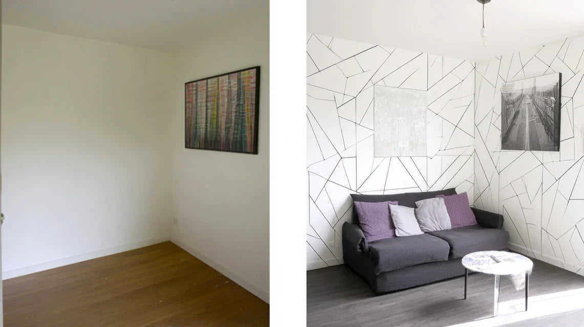
🏠 Customer testimonial: Sarah, a Parisian interior architect, says: "I spent months collecting small paintings for my 25m² living room. The result: an overloaded wall that gave me a headache. By replacing everything with two large abstract canvases positioned on either side of my sofa, the effect was spectacular. My guests only see that, and the space looks twice as big."
💬 Conversation with a decor expert
"I'm afraid that only two paintings will make it look empty... I’ve always been told that you need to fill the walls to make them feel warm."
Imagine a Michelin-starred restaurant: plates are never overloaded, but each element is designed to create harmony. It's exactly the same principle in decoration. Two well-chosen artworks create breathing room and allow the eye to rest, unlike a saturated wall that fatigues the gaze.
"But what if I make the wrong choice with only two pieces, wouldn't the mistake be more visible than if I put several small ones..."
That’s a persistent myth! In reality, several small mistakes create a visual chaos much harder to correct than one misplaced large piece. With two artworks, you retain total control of your decorative message and can easily adjust if needed.
The rule of two visual forces: Two strategically placed artworks create a dynamic visual dialogue that naturally guides the eye through the space, transforming an ordinary room into a place with character in less than 30 minutes of installation.
What’s really behind your feeling of a “bland” room
You probably feel these three frustrations daily: entering your living room and instinctively looking for where to focus your gaze, having the impression that your furniture floats in space without coherence, or hesitating to invite people over due to your decoration being "not worked enough".
The problem isn't a lack of taste or insufficient budget. It’s the direct result of an absence of visual hierarchy in your space. Your brain naturally seeks anchor points to understand an environment, and without structuring elements, it remains in a state of permanent discomfort.
Think of an orchestra without a conductor: each musician can be talented individually, but without clear direction, the melody becomes cacophony. Your current decorative elements are those musicians waiting for their conductor.
The real reason why “gallery walls” fail
Contrary to what many magazines preach, multiplying frames doesn't automatically create character. This approach only works in very specific spaces (hallways, large ceiling heights) with expert curation. In a standard living room, it dilutes the impact rather than concentrating it.
It’s like trying to light a room with ten scattered candles instead of two well-positioned lamps: you get dispersed light instead of effective lighting.
This visual dispersion creates an unconscious cognitive fatigue that makes you perceive your space as “restless” even when it’s tidy. Result: you never feel completely relaxed in it.
🔍 Quick test: Look at your main wall and count how many seconds it takes for your eye to settle on a specific element. If you exceed 3 seconds “scanning” without stopping, it’s a sign of a lack of visual hierarchy.
The illusion of perfect symmetry
Many believe that you absolutely must center and balance each element mathematically. In reality, rigid symmetry kills dynamism and makes the space static and impersonal, like a standard hotel room.
Visual balance is more like a Calder mobile: there can be creative tension between elements, as long as they create an overall harmony that breathes and lives.
When you force perfect symmetry, you create a "photographically correct" space but one that is emotionally cold, where no one wants to linger.
The trap of "accumulation" decor
This tendency to constantly add new decorative elements without ever removing the old creates an involuntary "collector's clutter" effect. Each new addition diminishes the impact of the previous ones rather than amplifying it.
You can identify this phenomenon in your home if you no longer really know why a particular object is in a certain place, or if you find yourself saying "I need to tidy up a bit" even when everything is technically in its place.
This accumulation creates visual pollution that unconsciously fatigues and diminishes your daily enjoyment of living in this space.
The 3 signs of a cluttered decor:
Your eye doesn't know where to land first: Sign of an absence of dominant focal point, like a conversation where everyone is talking at once
You regularly add without ever removing: Indicator of an accumulation strategy that dilutes impact instead of concentrating it
The space feels "correct" but lacks personality: Reveals a too cautious approach that avoids strong and memorable choices
The trigger: the power of controlled contrast
What really transforms a space is the ability to create intentional contrast - not necessarily colorful, but in terms of sizes, textures, or intensities. Two well-chosen artworks create this decorative leverage effect that multiplies impact: one attracts attention, the other maintains and guides it. You can identify this potential in your home by observing whether your gaze is naturally drawn to certain areas of your walls - these are your future strategic locations.
Rule of "visual dialogue": Two well-positioned artworks should create a silent conversation that guides the eye in a fluid movement - check by mentally tracing the path of your gaze between them.
❌ Classic scattered approach
✅ Two artworks strategy
💡 Mechanism
🎯 Immediate benefit
Multiplying small decorative elements
Concentrating impact on two strong pieces
Creation of hierarchical focal points
Instant visual clarity
Filling all available wall spaces
Leaving space around the chosen artworks
Principle of contrast by emptiness
Amplified sense of space
Seeking perfect symmetry at all costs
Creating a dynamic and lively balance
Controlled creative tension
Marked character and personality
Accumulating over time without a global plan
Choosing according to a clear decorative intention
Narrative coherence of the space
Evident sophistication
The "two forces" method to transform your space
Now that you understand why your previous approach wasn't working, here's a simple and proven method that will transform your room. Imagine yourself as a visual conductor: you’ll direct only two instruments, but in such a precise way that the effect will be striking. In three progressive steps, you'll go from an ordinary space to a place that reveals your personality and impresses your guests.
🎯 Overview of the transformation: Step 1 - Identify your power zones (strategic locations), Step 2 - Choose your two complementary artworks, Step 3 - Create the perfect visual dialogue. Each step brings you immediate satisfaction and prepares the next.
Step 1: Reveal the power zones of your room
Starting with this step is crucial as it determines everything else. It's like choosing the location of your foundations before building: once you have identified the two strategic zones in your room, choosing artworks and installing them will become natural. You’ll immediately feel the satisfaction of finally “seeing” your space with an expert eye.
What you need for this analysis
A measuring tape or a measurement app: To assess proportions and distances. No millimeter precision is needed, but understanding the ratios between your furniture and walls changes everything. Avoid estimating with the naked eye which often distorts perspectives by 20 to 30%.
Your smartphone in photo mode: To capture different angles of your room and objectively analyze the space. The camera reveals imbalances invisible to the accustomed eye. This tool gives you the necessary perspective to see your space like a professional decorator.
A notebook or notes app: To note your observations and avoid forgetting. Memorizing visual impressions is fragile, and these notes will become your reference for future choices.
Let's move on to the practical analysis of your space now
How to identify your strategic zones
Analyze natural lines of sight: Stand at the entrance of your room and note where your gaze naturally falls first. These areas correspond to the natural focal points that your architecture already creates. Don't try to fight this logic, exploit it.
⏱️ Time: 10 minutes | ✅ Success when: You identify 2-3 zones that naturally attract attention | ⚠️ Attention: Do not confuse strategic zone with practical zone - a wall can be practical for storage but visually neutral
Evaluate the relationship with your main furniture: Observe how your furniture "dialogues" with your walls. A sofa naturally creates an area of influence above and on its sides. Exploit these dialogue zones rather than ignoring them.
⏱️ Time: 5 minutes | ✅ Successful when: You understand the invisible geometry of your space | ⚠️ Warning: A free wall is not necessarily strategic if it has no relation to any element of life
Test ideal proportions: Use your hands to simulate different sizes of artworks in your candidate zones. An artwork should represent about 60-75% of the width of the furniture it surmounts to create a harmonious visual balance.
⏱️ Time: 15 minutes | ✅ Successful when: You clearly visualize the impact of each size | ⚠️ Warning: Proportions often appear smaller once the artwork is hung - slightly increase your estimates
✨ Validation of step: You should now have identified two complementary zones that create a fluid visual path in your room. If one zone seems obvious and the other hesitant, that's perfect - trust your instinct for the first and experiment for the second.
OUR RECOMMENDED PRODUCTS
Step 2: Choosing your two complementary artworks
Now that you master your space, you move to the next level: strategic artistic curation. This step is more rewarding because you begin to see the final result concretely. You no longer choose "by feeling" but according to a proven decorative logic that guarantees visual harmony.
Professional selection criteria
One dominant artwork (70% of visual impact): Larger, more colorful or more contrasting, it first attracts attention. It's your "statement piece" that sets the tone for your decorative personality. Choose it based on the emotion you want to create in the room.
One complementary artwork (30% of impact): More subtle, it guides and completes the gaze. It can share an element with the first one (color, style, theme) while having its own personality. Its role is to create a sophisticated visual echo.
An invisible narrative link: The two artworks must tell a coherent story together, even if they are different. This could be a color harmony, a common artistic style, or a thematic progression that reveals your personal universe.
Failproof selection method
Define the desired atmosphere: First choose the emotion you want to feel in this room: serenity, dynamism, sophistication, warmth... This intention guides all your subsequent choices and avoids stylistic inconsistencies
⏱️ Time: 5 minutes | ✅ Successful when: You can describe the atmosphere in a maximum of 3 words | ⚠️ Warning: Avoid overly complex intentions that create visual confusion
Apply the 70/30 rule: Your dominant artwork should represent 70% of the total visual impact. Specifically, if it measures 80cm, the complementary piece will be a maximum of 50-60cm. This clear hierarchy avoids visual competition between your two pieces.
⏱️ Time: 10 minutes | ✅ Successful when: One naturally asserts itself as dominant | ⚠️ Warning: Two works with the same impact create an unpleasant tension
🎨 Creative validation: Place your two choices side by side (even virtually). They must together create a sense of obviousness and complementarity. If you hesitate for more than 10 seconds, it means the agreement is not optimal.
Step 3: Mastering strategic installation
You have now reached the level of expertise where details make all the difference. This final step transforms good choices into a decorative masterpiece. Strategic installation reveals the full potential of your artworks and creates that "wow" effect that impresses even connoisseurs.
Equipment for professional installation
Hanging system adapted to the weight: Specialized anchors according to your wall type (drywall, concrete, brick) and the weight of your artworks. A solid attachment gives you the confidence to dare bold locations. Always allow 20% safety margin on the stated weight.
Spirit level and measuring tape: For millimeter precision that distinguishes the amateur from the professional. A misalignment of 2cm is immediately noticeable and spoils the desired effect.
Kraft paper or newspaper: To create templates of your artworks and test locations without drilling. This pro technique avoids regrets and unnecessarily damaged walls.
Installation secrets from professionals
Create the optimal visual dialogue: Your two artworks should create an invisible triangle with your main viewpoint (sofa, armchair...). This geometry naturally guides the eye and creates a sophisticated spatial reading dynamic.
⏱️ Time: 20 minutes | ✅ Successful when: The gaze flows smoothly between the three points | ⚠️ Warning: Too rigid alignment kills dynamism - dare to master creativity
Master strategic heights: The dominant artwork at 150-160cm from the floor, the complementary piece can play on varying heights to create rhythm. This controlled variation of levels adds sophistication to your composition.
⏱️ Time: 15 minutes | ✅ Successful when: Heights create a visual melody | ⚠️ Warning: Too much variation creates chaos - stay within a maximum range of 20cm
🏆 Final validation: Step back 3 meters and observe the whole. You must immediately feel a sense of completeness and harmony. The space should appear "finished" and sophisticated with just these two elements.
Expert progression rule: You can move to the next step when each installation seems obvious and natural to you - mastery is recognized by this apparent fluidity that hides a precise technique.
You now master the fundamentals of focused impact decoration. These expert subtleties will set you apart from amateur approaches and create in your guests that natural refinement impression which characterizes truly successful interiors.
💎 Professional decorator's secret: Directed lighting on your artworks (adjustable spotlights or wall sconces) multiplies their impact by three, especially in the evening. This technique transforms your rooms into true illuminated works of art which create a sophisticated gallery atmosphere in your living room.
💬 "What if my two artworks seem too few compared to what others do?"
"I'm afraid that my guests will find my walls too empty compared to the interiors we see on Instagram with lots of decor..."
This concern is very understandable - we are bombarded with images of overloaded walls presented as "warm". In reality, true sophistication is recognized by controlled restraint. Think of the most beautiful hotels or restaurants: they bet on a few exceptional pieces rather than accumulation. Your guests will immediately notice this relaxed elegance that makes the difference between "decorated" and "well decorated". Start with this clean approach - you can always enrich later, but you will probably find it unnecessary.
🎯 Social validation test: Organize an informal aperitif after your installation - you will notice that conversations naturally focus around your artworks, a sign that they create the desired impact.
The 5 mistakes that ruin the "two perfect artworks" effect
Now that you know the method, here are the classic traps to avoid absolutely. These errors are tempting because they seem logical, but they annihilate all the desired effect. Knowing them avoids you months of frustration and failed investments.
⚠️ Choosing "matching" artworks instead of complementary ones: It is tempting to take two very similar pieces to avoid risks. Result: they compete with each other instead of creating a dialogue. Prefer complementarity to similarity - same color but different styles, or same style but contrasting sizes. It is this creative tension that creates visual interest.
⚠️ Underestimating the necessary proportions: Many people choose artworks that are too small for fear of being too conspicuous. In a standard living room, an imposing work of art less than 60cm in height goes completely unnoticed. Dare to see bigger - a piece that impresses you in store will have the perfect impact at home. The rule: if it seems a little too big, it's probably the right size.
⚠️ Placing both works at the same height systematically: Perfect alignment may seem reassuring but creates a static and monotonous effect. Vary heights by 10-15cm to create a dynamic visual rhythm. This controlled asymmetry brings life to your composition.
⚠️ Neglecting the ambient lighting of the room: Your perfect artworks may appear dull if the general lighting is poorly thought out. Too direct or too weak light cancels out all your efforts. Test different lighting before final installation - the effect can vary greatly depending on the time of day.
⚠️ Wanting to perfect everything from the first try: The obsession with immediate perfection paralyzes and prevents excellent opportunities. Allow yourself experimentation - hanging can evolve, artworks can be adjusted. Initial perfectionism often prevents discovering even better solutions that emerge over time.
🛡️ Safety checks before installation: Your composition works if it attracts the eye in less than 3 seconds, if the proportions seem natural from your main living position, if the lighting highlights the real colors of your artworks, and if the whole conveys a feeling of completeness rather than expectation.
Because you took the time to inform yourself, enjoy 10% discount on your first order:
ART10
⏰ Valid 72h after reading • Applicable to all our products
🤔 Frequently asked questions about the two-piece method
💰 What budget to plan for two artworks that really transform a room?
Allow between 200€ and 600€ for a professional impact in a standard living room. It's better to have two quality pieces than ten cheap items that neutralize each other. To optimize: prioritize a high-quality dominant artwork (70% of the budget) and a more accessible complementary piece. The investment is worth it over years of daily satisfaction.
⏰ How long before I can see a complete transformation?
The visual impact is immediate upon installation, but your eye gradually gets used to the new balance over 2-3 weeks. It's at this point that you truly measure the impact on your daily well-being. Guests, for their part, notice the transformation instantly as they discover the space with a fresh perspective.
🎨 How to choose between abstract and figurative to maximize impact?
The impact depends more on contrast and proportions than on artistic style. Abstract art offers more freedom of interpretation and ages better, while figurative art creates conversations and direct emotions. The golden rule: choose according to your first instinct - it's this personal emotion that will make your works come alive in your daily life.
📏 What should I do if my room has an unusual configuration (mezzanine, sloping ceiling...)?
Unusual spaces are often the most spectacular with this method! Adapt the proportions to your architecture: under a sloping ceiling, favor the horizontal; on a mezzanine, exploit the verticality. The essential thing remains the dialogue between your two works and the balance with your furniture. Architectural constraints become creative assets.
🔄 Can I change or evolve my composition over time?
Absolutely, and it's even recommended! Start by mastering the basics with two works, then you can subtly enrich: adding directed lighting, seasonal rotation of a piece, or introducing a third element once the balance is perfectly mastered. Evolution should remain intentional, not impulsive.
🏡 Your new daily life in a space that resembles you
In a few weeks, you will cross the threshold of your living room with the deep satisfaction of coming home. Your guests will immediately notice this relaxed sophistication that characterizes truly successful interiors, without being able to explain exactly why. Your gaze will naturally settle on your two works which dialogue silently, creating this soothing and stimulating atmosphere at the same time.
This transformation goes far beyond simple decoration. You will have developed an expert eye for visual balance that will influence all your future aesthetic choices, from office layout to clothing selection. This newly acquired confidence in your tastes will reflect on your general assurance and pleasure in entertaining.
The hardest part was understanding the hidden mechanisms of decorative impact. Now that you master them, your first concrete step is simply to observe your walls with this new expert eye that you have just acquired. You will immediately see the opportunities that escaped you before, and this revelation will give you the momentum to take action this weekend.
✨ Your transformation starts now: You have all the tools to create a memorable decorative impact - trust your new know-how and dare to make choices that reveal your unique personality.
📚 Deepen your decor knowledge
Discover our other practical guides on optimal hanging, the choice of impactful colors, and the secrets of ambient lighting to become an expert in your own decoration.


