Can printed wall art and hand-painted artworks be mixed?
By Alexandre MARY
⏱️ Reading time: 8 minutes
You've just invested in this beautiful hand-painted artwork that excites you, but here's the thing: in your living room, it borders on several wall prints that you love.
And then, doubt creeps in.
Will your guests notice this difference in technique?
Does the whole ensemble seem amateurish or, worse, incoherent?
This obsessive question spoils your decorating pleasure and makes you question every artistic choice.
You may have tried to separate styles by confining prints to one room and painted works to another.
Or perhaps you've completely given up acquiring that canvas that caught your eye, for fear of mixing genres.
This hesitation is perfectly normal: we were long led to believe that we had to choose our camp in wall decoration.
In reality, this rigid rule completely ignores modern decor codes and the evolution of contemporary artistic techniques.
By the end of this article, you will master the art of harmoniously combining original prints and paintings, and you will know how to create a sophisticated wall gallery that reflects your unique personality.
Why mixing artistic techniques has become essential?
Modern wall decoration has evolved: authenticity now takes precedence over uniformity.
Waiting to have a complete budget for a homogeneous collection means depriving yourself for years of the emotion that art brings to everyday life.
It's like refusing to cook because you don't yet have the complete set of high-end kitchen utensils.
🎨 Expert testimony: Sarah, a Parisian interior designer, confides: "My most satisfied clients are those who dared to mix a lithograph by an artist with their first painted canvases. This combination creates a visual depth impossible to achieve with a single technique."
💬 Conversation with a decor expert
"I'm afraid it will look like a mishmash... People will see that some paintings cost less than others, won't they?"
In reality, it's the opposite: a wall composed only of prints can seem "decorative" without soul, while a clever mix reveals a true artistic personality. The eye doesn't gauge the price, it feels the emotion and visual balance.
"I've always been told that you have to choose a style and stick to it to be consistent..."
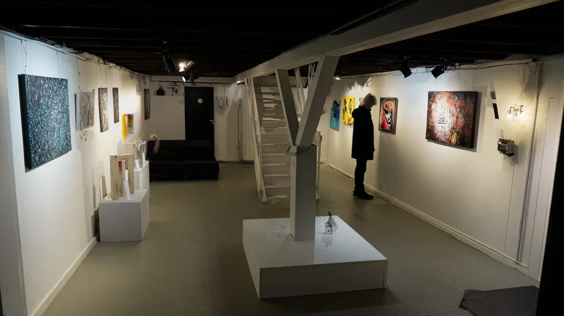
This rule dated back to the era when techniques were limited. Today, a colorist or thematic thread unites a collection better than a single technique. Look at contemporary galleries: they exhibit engravings, paintings and photographs side by side.
The modern golden rule: Harmony comes from intention, not technical uniformity.
When your artistic choices tell a coherent story, mixing becomes sophistication.
Visible result from the first hanging: a wall gallery that intrigues and fascinates.
Understanding what truly creates visual dissonance
You may have experienced it: that unpleasant feeling in front of a wall where "something is wrong" without being able to identify exactly what.
Or even discomfort with an ensemble that should work on paper, but leaves a sense of incompleteness in reality.
The true source of dissonance is never the difference in technique between your works.
It's the lack of visual dialogue between them.
Like in an orchestra, each instrument can be different as long as they play the same score.
Imagine your wall as a conversation: if each work talks about a totally different subject without logical connection, the whole becomes cacophony.
If they respond to each other through colors, shapes or atmosphere, they create a captivating visual melody.
The illusion of "visible quality" that deceives us
Contrary to a persistent idea, the difference in price or technique is not visible at first glance.
What the eye perceives immediately is the coherence of tones, the balance of masses and the decorative intention.
It's like observing an elegant dinner: you don't guess the price of each dish, but you feel the harmony of flavors and the logic of the menu.
A perfectly chosen €30 print can enhance a €300 original painting, and vice versa.
This revelation changes everything in your decor approach: you can build gradually your artistic collection without waiting for the perfect budget.
The important thing becomes the relevance of each addition, not its technical origin.
🔍 Immediate test: Look at the decor photos in your favorite magazines: try to guess which works are painted or printed. You will see that it is almost impossible without examining the texture closely!
The trap of perfect uniformity
The classic mistake is to want all your works to have exactly the same visual rendering.
In reality, this approach creates a monotony that quickly tires the eye and lacks character.
Think of a library: books of varying formats and colors create a more lively ensemble than identical volumes.
The charm comes from controlled nuances and contrasts, not repetition.
You deprive yourself of favorite pieces out of conformity, while they would precisely bring that personal touch that is missing from your decor.
The underestimated impact of lighting and hanging
Most apparent dissonances come from improper handling of the hanging rather than a compatibility problem between techniques.
A poorly lit print or a painting hung at the wrong height will disrupt harmony, regardless of its intrinsic quality.
You can easily check this: observe your existing artworks under different lighting and at various distances.
The variations in impact are surprising.
This awareness transforms your relationship with wall decor: art of mixing becomes a question of staging rather than exclusive selection.
The 3 signals of a successful harmony:
Eye naturally moves from one artwork to another: No piece "shouts" louder than the others, creating a fluid visual path
The whole tells a coherent story: Each addition enriches the overall message without contradicting it
The owner's personality shines through: You feel an intention and affirmed tastes, not a "catalog" decoration
The trigger factor: a clear decorative intention
What really makes the difference is having defined the atmosphere you want to create before choosing your artworks.
This intention acts as a natural filter: it guides you towards the right associations and avoids mistakes.
Whether you aim for a soothing, dynamic or sophisticated atmosphere, this emotional compass will allow you to immediately identify which techniques can coexist in your space.
Universal consistency rule:If two artworks give you the same emotion, they are compatible, regardless of their technique. Test them by looking at them together for 30 seconds: harmony is felt instantly.
❌ Traditional rigid approach
✅ Modern and flexible vision
💡 Why it works
🎯 Concrete benefit
"Only paintings or only prints"
"A dialogue between complementary techniques"
Diversity creates visual richness
Evolving and personalized collection
"Same price range for all"
"Same decorative intention for all"
Emotion prevails over market value
Optimized budget, maximized impact
"Waiting to have everything perfect"
"Building progressively with consistency"
The art of living doesn't pause
Immediate pleasure and evolving collection
"Hiding technical differences"
"Highlighting the complementarity of renderings"
Each technique has its own strengths
Sophisticated and original wall gallery
The 3-step method for mixing with elegance
Now that you understand the real issues, let's move on to practice.
This method avoids costly trial and error and leads you directly to a harmonious wall gallery.
As when creating a perfume, we will build your composition in layers: first the base (your guiding thread), then the heart (the visual balance), finally the top notes (personal accents).
🎯 Your success overview: Step 1: Define your decorative signature • Step 2: Orchestrate visual balance • Step 3: Fine-tune expert details. Result: a wall gallery that tells your story with sophistication.
Step 1: Create your artistic guiding thread
This first step is fundamental as it determines everything that follows.
Without this solid foundation, you risk going in all directions.
It's like choosing the dominant color of a bouquet before selecting each flower: this decision naturally guides your subsequent choices and guarantees final harmony.
The connection elements to identify
Your signature color palette: 3 to 5 shades that resemble you and harmonize with your interior. They can be declined in various nuances but must remain recognizable. Avoid more than 5 colors to maintain visual consistency. This palette will become your decorative DNA and simplify all your future artistic choices.
The desired emotional atmosphere: Soothing, energizing, sophisticated, cozy... This intention guides your choices better than a rigid decorative style. It allows you to remain consistent even when varying subjects and techniques. A clear atmosphere avoids impulsive purchases that break the overall harmony.
Your personal theme or universe: Nature, urban, travel, geometric abstraction... This thematic guiding thread unites your works beyond their technical differences and creates a true decorative signature that resembles you.
Now, let's move on to defining these elements concretely
How to define your artistic direction precisely
Analyze your existing favorites: Gather all the works you already own and that you really like. Identify common points: recurring colors, similar atmospheres, subjects that attract you. This analysis reveals your natural taste and avoids false leads.
⏱️ Time: 20 minutes | ✅ Successful when: You identify 2-3 common characteristics in your favorite works | ⚠️ Attention: Don't censor yourself for the sake of consistency - your true preferences may seem eclectic at first glance
Test your palette in the space: Select 3-4 dominant colors from your favorites and observe them in your room at different times of the day. The changing natural lighting reveals the true color affinities of your space.
⏱️ Time: 2 days of observation | ✅ Successful when: These colors seem natural in your interior | ⚠️ Attention: A color that you like in a store may clash with your domestic lighting
Define your emotional intention: Complete this sentence: "When I look at my wall art, I want to feel..." A spontaneous answer is better than current decor trends. This targeted emotion becomes your selection criterion for all future additions.
⏱️ Time: 5 minutes of reflection | ✅ Successful when: You have a clear and personal response | ⚠️ Attention: Avoid "generic" answers like "good" - be specific about the emotion you are looking for
✅ Step 1 Validation: You have a palette of 3-5 colors, a precise emotional atmosphere and a thematic universe that resembles you. These three elements form your decorative signature. If in doubt about a future purchase, this trio will be your infallible compass.
OUR RECOMMENDED PRODUCTS
Step 2: Orchestrating Technical and Visual Balance
Now that your direction is clear, we will create the visual architecture of your wall.
This is where the magic happens: transforming a disparate collection into a cohesive ensemble.
This step teaches you how to intelligently dose different techniques to create rhythm and depth without cacophony.
The Balance Rules to Master
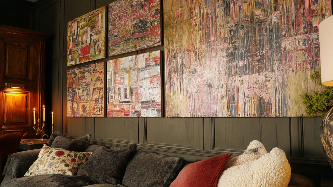
The 60-30-10 proportion rule: 60% of a dominant technique (often prints), 30% of a secondary technique (original paintings), 10% of different accents (engravings, collages...). This distribution creates a natural visual hierarchy without monotony. Adapt to your existing rooms.
Rhythmic alternation: Avoid grouping all similar works together. Create a visual dialogue by alternating techniques, like instruments in an orchestra. This distribution maintains interest and avoids "dead zones".
Strong anchor points: One or two remarkable pieces (often painted) serve as focal points and structure the whole ensemble. The other works gravitate around to create a balanced composition.
Practical Application of Balance
Map your wall: Roughly draw your wall space and position your existing works. Identify empty areas and imbalances. This overall vision reveals where to add what to balance the composition.
⏱️ Time: 15 minutes | ✅ Successful when: You clearly visualize the full and empty spaces | ⚠️ Attention: Take into account the lighting and surrounding furniture in your plan
Test the rule of triangles: Your main artworks should form imaginary triangles to naturally guide the eye. This classic composition technique works even with mixed techniques and creates a visually reassuring stability.
⏱️ Time: 10 minutes of observation | ✅ Successful when: The eye follows a smooth path between your artworks | ⚠️ Attention: Avoid overly rigid alignments that freeze the composition
Step 3: Fine-tune with expert details
This final step transforms a good composition into a decorative masterpiece.
You will learn the subtleties that distinguish an amateur gallery from a professional arrangement.
These details make all the difference and reveal your decorative expertise to even your most observant guests.
The finishing touches that make the difference
Harmonize frames: Even with different techniques, create a visual unity through the frames: same baguette color or same style (minimalist, classic...). This frame coherence naturally unites artworks of different natures.
⏱️ Time: Variable depending on acquisitions | ✅ Successful when: The frames create a cohesive ensemble | ⚠️ Attention: A frame that is too conspicuous can distort a delicate artwork
Optimize differentiated lighting: Original paintings often require softer lighting than prints to reveal their nuances. Adapt your lighting to enhance each technique according to its specificities.
⏱️ Time: 30 minutes of tests | ✅ Successful when: Each artwork reveals its optimal richness | ⚠️ Attention: Direct lighting can create distracting reflections on certain surfaces
Expert progression rule:Start small and build gradually. Master harmony with 3-4 artworks before expanding your collection. This approach avoids costly mistakes and allows you to refine your eye over time.
Congratulations! You now master the codes of mixing art like a professional.
These expert subtleties give you an edge over 90% of amateurs who are content with basic rules.
Your wall gallery now has that sophistication that intrigues and inspires.
🎨 Gallery secret: Professionals use the "visual bridge" technique: a color or graphic element that is found in at least 70% of the artworks, creating a subliminal link even between very different techniques. This trick instantly unites your collection.
💭 "What if my guests notice that some artworks are reproductions?"
"I'm afraid they'll think I'm mixing for economy rather than aesthetic choice..."
This concern is very understandable, but it's based on a false belief.
In reality, a thoughtful wall gallery impresses far more than a uniform collection without personality.
True connoisseurs admire the ability to create harmony in diversity.
By the way, the greatest collectors mix originals and limited editions without complex.
💡 Confidence tip: Prepare a simple sentence about your decorative intention: "I like to create dialogues between techniques for a more vibrant atmosphere." This assurance turns every question into an opportunity to share your expertise.
The 5 fatal mistakes that ruin harmony (and how to avoid them)
Even with the best intentions, some pitfalls await enlightened enthusiasts.
These errors are all the more frustrating because they seem logical at first glance.
I reveal them to you to avoid costly disappointments and unnecessary questioning.
⚠️ Multiplying techniques without a guiding thread: The desire to try everything (painting, photo, engraving, collage...) can create a visual cacophony. It's tempting because each technique has its charms, but without a guideline, the whole becomes cluttered. Limit yourself to 2-3 techniques maximum per space. This mistake affects 80% of enthusiastic beginners.
⚠️ Neglecting the impact of formats: Mixing techniques, yes, but pay attention to sizes! A delicate miniature next to a large expressive canvas creates a disturbing imbalance. Respect a harmonious progression of formats even when varying techniques. Imagine a conversation where someone whispers next to someone who shouts.
⚠️ Underestimating the importance of uniform hanging: Chaotic hanging heights immediately break harmony, even with perfectly compatible works. Maintain a consistent baseline (generally 150cm from the floor to the center of the work) for all your pieces. This technical rigor reveals your professionalism.
⚠️ Choosing contradictory subjects: A peaceful still life next to an expressionist portrait creates an uncomfortable emotional tension. Even when varying techniques, maintain a thematic or atmosphere coherence. Your works should complement each other, not neutralize each other.
⚠️ Ignoring the specific lighting for each technique: Oil paintings, watercolors and prints require different lighting to reveal their beauty. A single standardized lighting can tarnish some works while others shine. Subtly adapt your lighting to the specifics of each technique.
🔍 Quick checklist before every purchase: Does this new work respect your color palette? Does it fit into your emotional atmosphere? Does its format harmonize with what already exists? Does it give you the same emotion as your other pieces? If 4/4 answers are "yes", go for it!
Because you took the time to inform yourself, enjoy 10% discount on your first order :
ART10
⏰ Valid 72h after reading • Applicable to all our products
🤔 Frequently asked questions about art mixing
💰 What budget proportion should be dedicated to originals vs prints?
A 70% prints / 30% originals split provides an excellent result without breaking the bank. Start with 2-3 quality prints (30-60€ each) then add 1 original artwork that moves you (150-300€). This progressive approach allows you to refine your tastes without risking major financial regrets.
🎨 How to recognize a quality print that will blend well with your paintings?
Check the finesse of details and richness of colors: a good print reveals the subtle nuances that will dialogue with your paintings. Avoid prints that "shout" their colors or appear too smooth. A quality print should have some visual texture that doesn't clash with a painted work.
⏰ How long does it take to create a harmonious gallery wall?
Allow 3-6 months for a composition of 5-7 works that is truly successful. This duration allows you to live with your choices, observe the interactions and gradually adjust. Resist the temptation to buy everything at once: harmony is built in patience and observation.
🖼️ Should prints be framed the same way as original paintings?
Maintain a consistency of spirit rather than strict uniformity. Same family of frames (light wood, black metal...) but you can vary slightly the frame widths. An original painting can support a slightly more present frame than a delicate print. The goal: create a harmonious visual family.
🏠 Does this approach work in all interior styles?
Absolutely! Whether your interior is modern, classic or eclectic, the method of a common thread adapts. In a minimalist interior, prioritize refined works with varied techniques. In a vintage style, mix reproductions from different eras and contemporary creations. The important thing is to respect the DNA of your space while bringing this richness of mastered mixing.
Your new identity as an enlightened collector
In a few weeks, your perspective on wall art will have completely changed.
You'll never look at a gallery or exhibition the same way again: your expert eye will instantly analyze the interactions between techniques, the intelligence of associations, and the sophistication of choices.
This new skill gives you a decorative confidence that shines through in all your rooms.
Beyond your art wall, you've developed a transferable aesthetic sense: harmonizing different elements while maintaining overall coherence.
This ability applies to your entire interior and earns you remarkable decorative assurance noticed by those around you.
You become the person everyone consults for thoughtful decor choices.
The hardest part was understanding that harmony comes from intention, not uniformity.
Now that you've mastered this philosophy, your first move will be to observe your current wall with this new perspective.
You'll immediately identify what's missing or what can be optimized.
Start today: art doesn't pause!
🌟 Your new decor superpower: You know how to create sophistication in diversity, transform a disparate collection into a remarkable personal gallery. This rare expertise sets you apart and inspires those around you!
📚 To further develop your decor expertise
Discover our other practical guides on optimal hanging, choosing formats according to your spaces, and the lighting secrets of professionals.
Perfect every aspect of your wall gallery with our expert advice.


