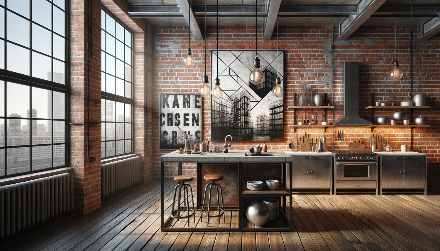
I’ve spent twelve years transforming former textile workshops into urban lofts, and I can tell you that an industrial kitchen with its exposed brick has a particular soul. These raw walls tell a story, that of a working-class past reinvented as a modern living space. But here's the challenge my clients consistently face: how to dress these character walls without betraying their authenticity? The wrong painting can ruin everything, transforming a vibrant space into a cold decor or a kitsch pastiche.
Here’s what a well-chosen painting brings to your industrial kitchen: it softens the harshness of raw materials, creates a warm focal point that humanizes the space, and establishes a fascinating dialogue between architectural heritage and modernity. The red-orange brick in your walls only wants one thing: a work that respects its character while adding that touch of emotion that transforms a kitchen into a true living space.
You’ve probably already experienced this frustration: browsing dozens of online galleries, hesitating between thousands of styles, fearing to make a choice that clashes with your authentic brick. This uncertainty is normal. The industrial universe imposes its codes, and not all paintings naturally fit in. But rest assured, there are proven paths, combinations that work every time. I'm going to share what I’ve learned from arranging more than eighty industrial kitchens, these associations that create this magical balance between strength and softness.
Contemporary abstract art: the perfect dialogue with brick
In a kitchen with exposed brick, contemporary abstract art emerges as a choice of remarkable relevance. Why? Because the brick itself already has a texture, a repetitive pattern, a strong visual presence. A figurative painting that is too busy would compete with this already expressive wall. Conversely, an abstract composition with large blocks of color creates a soothing counterpoint.
I particularly recommend works in neutral tones accented with a pop of color. Imagine an abstract painting blending anthracite gray, off-white and touches of rust or copper: it echoes the nuances of your brick while modernizing the whole. Large format canvases work wonderfully in these spaces often generous in ceiling height. A piece of at least 120x80 cm allows you to assert a presence without being crushed by the power of the brick wall.
Thick textures, impasto, layering of material also create an interesting dialogue with the roughness of the brick. This tactile correspondence between the surface of the painting and that of the wall establishes a sensory coherence that your guests will intuitively perceive, without necessarily being able to explain it.
Black and white photography: timeless urban elegance
For an industrial kitchen, black and white photography brings that touch of raw elegance that perfectly resonates with the loft spirit. I have always been fascinated by how a simple monochrome shot can transform a functional kitchen into a space full of character and emotion.
Urban subjects blend in naturally: metal architecture, suspension bridges, facades of disused factories, New York emergency stairwells. These architectural photographs create a narrative continuity with your exposed brick, as if they extend the history of the building itself. The contrast between deep black and bright white highlights the warm nuances of the brick without creating chromatic cacophony.
A trick I use consistently: framing these photographs in thin metal frames, matte black or raw steel. This choice reinforces the stylistic consistency with the industrial elements of your kitchen – taps, metal shelves, pendant lights. The whole forms a harmonious ensemble where each element supports the others.
Panoramic formats to sublimate space
In an industrial kitchen with brick, panoramic paintings horizontally (e.g., 3:1 format) work remarkably well above a countertop or console. These elongated formats accompany the horizontal lines typical of these spaces – exposed beams, extended countertops, industrial shelves. A black and white photograph of an urban skyline in this format creates a visual window that opens up the space.

Vintage typography and retro posters: the soul of industrial heritage
If your bricks come from a real industrial building, why not celebrate this heritage with vintage typographic posters? This style draws directly on the aesthetics of former factories, breweries and workshops from the early 20th century.
The typographic compositions with imposing letters, often in uppercase, with serif fonts or wooden characters, bring that nostalgic touch without falling into pastiche. Look for reproductions of old advertisements, engineering technical drawings, framed industrial patents, or even safety propaganda posters from workshops. These graphic elements have the necessary visual weight to stand up to brick.
A mounting tip: create a wall composition by accumulating several small posters rather than just one large one. This "gallery wall" approach evokes the bulletin boards of old factories and creates a dynamic focal point. Mix formats, but maintain color consistency – sepia, black and white, faded tones – to avoid visual cacophony.
When color comes into play: bold choices that work
Contrary to popular belief, an industrial kitchen is not condemned to monochrome. Brick, with its shades of red, terracotta and orange, perfectly tolerates certain well-chosen colors in your paintings.
The duck blue or petrol blue creates a striking complementary contrast with the warmth of the brick. An abstract painting with deep blues brings a welcome freshness to a space where warm tones naturally dominate. This color combination is one of the safest I know for industrial kitchens.
The forest green or olive green also works remarkably well, especially if your kitchen incorporates plants or vegetation elements. These deep greens, unlike acidic shades, have this depth that dialogues with the raw character of brick. A stylized botanical painting, an abstract composition in nuanced greens, or even a macro photograph of foliage can transform the atmosphere.
For the more daring, touches of mustard or ochre create a tonal harmony with the brick, in an expanded monochrome logic. This tone-on-tone approach, far from being monotonous, creates a warm envelope particularly appreciated in a kitchen with sometimes austere character.
The mistake to absolutely avoid
Beware of paintings with too bright or too many colors. A multicolored painting in pop art style, for example, risks creating a visual overload. Brick is already a strong element; your painting must compose with it, not fight against it. Favor works with a maximum of two or three colors, including a light or neutral dominant.

Metallic art and reliefs: the sculptural dimension
Here's a less conventional but devilishly effective approach: metallic paintings or relief compositions. In an industrial kitchen, where metal is often present (lighting fixtures, faucets, appliances), a metallic artwork creates a fascinating material continuity.
Metal wall sculptures in steel, copper or wrought iron add a three-dimensional dimension that plays beautifully with light. The brick wall, with its natural relief, perfectly welcomes these pieces that break away from the plane. Cast shadows change depending on the time of day, creating a living work that evolves with natural light.
Compositions in recycled wood operate on the same principle. Pallet planks assembled into geometric patterns, patinated or left raw, establish a dialogue between authentic materials. This more artisanal approach is particularly suitable for industrial kitchens leaning towards rustic or industrial farmhouse style.
Your industrial kitchen deserves a work of art to match
Discover our exclusive collection of Kitchen Wall Art that will sublimate your exposed brick with style and character.
Composing with the space: size, placement and lighting
The choice of wall art style is not everything; its integration into the space is just as crucial. In an industrial kitchen, volumes are often generous, with significant ceiling heights. This context requires adapted proportions.
For a brick wall 3 to 4 meters wide, aim for a wall art at least 100 cm wide, or a composition of several pieces whose total reaches this dimension. A painting that is too small would be lost against the massive presence of the brick. The work must have enough visual weight to assert its presence.
Regarding placement, the classic rule of “center of the artwork at eye level” (about 160 cm from the floor) still applies. But in a kitchen, also consider the functional context: place your work where you can appreciate it while cooking or eating, not necessarily on the largest wall. Above a dining table, a central island, or on the wall facing the sink - these strategic locations maximize your daily enjoyment.
Lighting deserves special attention. Brick absorbs a lot of light and can darken a space. Install directional lighting (track spotlights, adjustable sconces) that highlights your artwork while creating shadow play on the brick texture. This targeted light transforms your work into a true focal point, especially in the evening when natural light declines.
You are now equipped to make the choice that will transform your industrial kitchen. Imagine yourself in this space, preparing a meal, your gaze naturally falling on this artwork that resonates with the soul of your exposed brick. It's not just about decoration; it's about emotion, that feeling of being at home, in a space that reflects you. Start by identifying what naturally attracts you – abstraction, photography, typography – then mentally test this piece on your brick wall. If it finds its place there naturally, without forcing, without clashing, then you have found the right piece. Your industrial kitchen is waiting for that final touch to reveal all its potential.
Frequently Asked Questions
Can I hang a painting directly on brick or do I need a special support?
Hanging a painting on brick actually requires an adapted technique, but nothing insurmountable. Avoid simple nails that risk splitting the brick or not holding securely. The most reliable solution is to use special brick anchors or hooks screwed into the mortar joints, which are softer than the brick itself. For heavy paintings, expansion nylon plugs are the safest choice. If you're afraid of damaging your authentic wall, an alternative is to fix a metal bar or rail across the entire width of the wall, on which you will hang your painting with cables – this very industrial solution integrates perfectly into the style and allows for easy changing of artwork. Some professional adhesive systems also work on brick, but always check the load capacity and test first on a discreet area to ensure that the adhesive holds on your specific type of brick.
Are colorful paintings really compatible with a brick industrial kitchen?
Absolutely, and it's often an excellent idea to warm up and personalize the space! The common mistake is to think that industrial style dictates a strict monochrome palette. In reality, exposed brick, with its naturally warm tones, offers a perfect neutral base for welcoming carefully chosen touches of color. The secret lies in the selection and dosage of colors. Favor deep and saturated shades rather than bright and garish colors: duck blue, forest green, terracotta, mustard, or even a deep burgundy work wonderfully. These colors create a sophisticated contrast without clashing with the brick. If you opt for a colorful painting, make sure it also includes neutral elements (black, white, gray) that will link it to the rest of your kitchen. A simple rule: if your kitchen already has colored elements (chairs, appliances, visible dishes), your painting can pick up these tones to create overall coherence. The essential thing is to avoid chromatic overload – a painting with two or three strong colors maximum remains the safest bet.
What size painting to choose so as not to be mistaken in an industrial kitchen?
The size of the painting depends on several factors, but a general rule will guide you: in an industrial kitchen with often generous volumes and imposing materials, go bigger than you would instinctively. A painting that is too small will get lost against the strong presence of brick and metal elements. For a main wall, aim for a minimum of 80x60 cm for a medium-sized kitchen, and don't hesitate to go up to 120x80 cm or more for large kitchens with significant ceiling height. A trick to visualize: cut out a rectangle of kraft paper or cardboard to the dimensions you are considering and temporarily attach it to your brick wall - you will immediately see if the proportion works. If you're hesitating between two sizes, choose the larger one, especially if your brick wall is vast and sparsely furnished. Alternatively, a wall composition of several paintings of medium size (for example three paintings of 50x40 cm arranged horizontally) creates a visual impact equivalent to a large single piece while bringing more dynamism. The important thing is that the whole occupies about two-thirds to three-quarters of the width of the furniture below (table, console, worktop) to create a harmonious balance.