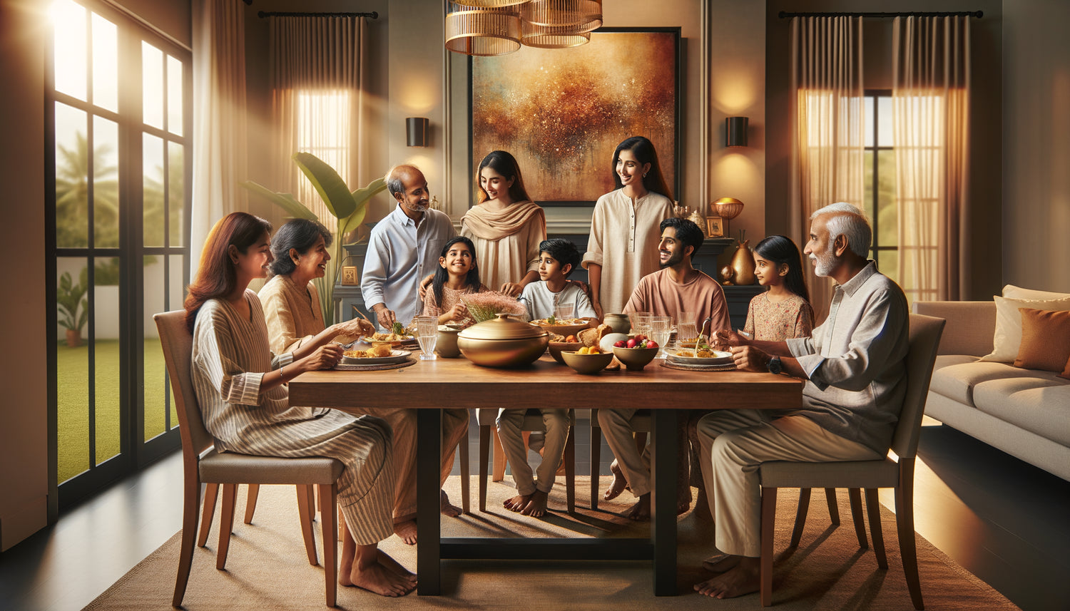
Last Sunday, a client confided in me that she had rejected three paintings for her dining room within a year. Not because they were ugly, but because at every family meal, someone had a comment. Her son found the abstract work "strange," her mother-in-law judged it "too modern," and her husband found it "depressing." The result: white walls and growing frustration. However, choosing a piece that unites rather than divides is perfectly possible.
Here's what a well-chosen artwork for your dining space brings: it becomes a positive conversation starter that enriches shared moments, it creates an atmosphere of visual harmony that puts everyone at ease, and it reflects the common values of your home rather than the tastes of one person. As an art advisor for private spaces for seventeen years, I have accompanied more than 400 families in this quest for aesthetic balance. And believe me, choosing a family artwork is as much a matter of psychology as it is of decoration.
You may have already experienced this scene: you fall under the charm of a canvas in a gallery, you proudly install it, and from the first dinner onwards, sidelong glances begin. No one dares to say it frankly, but the atmosphere is tense. It's not your fault. You've always been told to "follow your instinct" when it comes to art, but no one has explained how to reconcile your desires with those of other family members. Good news: there are proven strategies to transform your dining room into a place where art brings people together. I will show you how to identify what pleases collectively, without giving up your personality or falling into blandness.
Why do some artworks divide so much at the table?
The dining room is not a trivial space. It's the setting for your most emotionally charged moments: holiday meals, conversations after school, Sunday debates. Unlike the living room where everyone can look away at their phone, you are face to face with the artwork at the table. It becomes a silent but omnipresent fifth guest.
I have noticed that artworks that cause the most discomfort share three characteristics: they present potentially disturbing subjects (violence, explicit sadness, imagery too personal), they use colors that create anxiety (aggressive red, dominant black, brutal contrasts), or they impose a complexity that fatigues the eye during moments meant to be relaxing. One mother told me how her abstract painting with chaotic lines systematically caused headaches for her teenage daughter during meals.
Conversely, unifying artworks possess a quality I call "emotional accessibility." They offer several levels of reading: a child sees one thing, an adolescent another, a grandparent a third. No one feels excluded from the visual experience. It is precisely this plurality of positive interpretations that you should seek for your dining space.
The method of three circles to identify common tastes
Second circle: list the neutral or positive thematic universes for everyone. Nature? Urban landscapes? Geometric shapes? Culinary scenes? A family I advised discovered that despite very different tastes, they all appreciated representations of water in all its forms: sea, river, rain, waterfall. This was their guiding thread.
Third circle: identify the emotions you want to cultivate during your meals. Serenity? Discreet joy? Warm conviviality? Soothing elegance? The latter circle is crucial because it prevents you from choosing a magnificent but unsuitable artwork for the atmosphere you want to create. A sophisticated still life can be splendid but too formal for a family with young children seeking lightness.
The intersection of these three circles gives you your family's aesthetic safety zone. This is where you should focus your research. This method has allowed 90% of my clients to halve their decision-making time and almost completely eliminate post-purchase regrets.

Artwork families that (almost) always bring people together
Certain types of artworks have proven to be family unifiers. Natural landscapes with soft colors are at the top: forests in green and ochre tones, soothing seaside scenes, fields of lavender or sunflowers. Their strength? They evoke
Contemporary still lifes work remarkably well in dining rooms. Not the somewhat austere academic ones, but those that play with light, textures, stylized fruits and vegetables. They create a natural connection to the act of eating without being literal. I installed a composition of pumpkins and pears in autumnal hues in a family of five people with diametrically opposed tastes: it became their favorite artwork, the one they spontaneously talk about with guests.
Gentle geometric artworks also appeal to multi-generational families. I'm talking about compositions with simple shapes, harmonious colors, without overly aggressive angles. They bring a modernity that appeals to the younger generation while retaining readability that reassures older generations. One client told me that their concentric blue and beige circles painting had become a visual meditation point for their whole family.
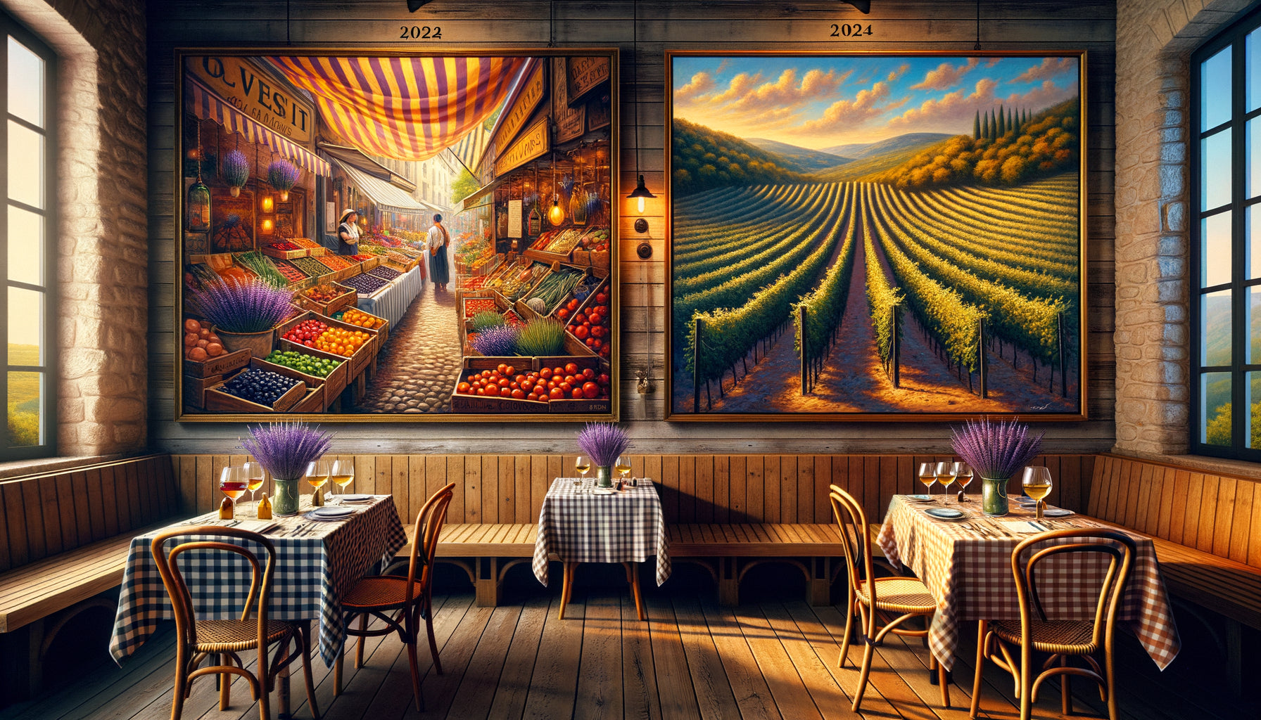
Finally, don't forget universal scenes of life: colorful markets, cafe terraces, flower gardens, rural scenes. Their implicit narrative invites conversation rather than aesthetic debate. “It reminds me of our trip to Provence” creates more connection than “I don’t understand what it represents.”
Size and placement: the mistakes that turn a lovely artwork into an intruder
A perfect artwork can become a source of tension if it visually overwhelms the space or ends up directly in the line of sight of a guest. I saw a beautiful 120x90 cm canvas create discomfort simply because it was placed just behind the teenage son's chair, turning him into an “involuntary guardian” of the artwork. Every look towards him included the painting, creating an uncomfortable subconscious association.
The golden rule of placement: the artwork should be visible to everyone without monopolizing anyone’s field of vision. The back wall, facing the entrance to the room, is generally the ideal location. Everyone can see it by simply looking up slightly, without it imposing itself. A standard height of 150-160 cm from the floor to the center of the artwork works well for most dining areas.
Regarding size, apply the two-thirds formula: the artwork should occupy about two-thirds of the width of the furniture or wall space concerned. Too small, it appears lost and creates visual frustration. Too large, it is oppressive. For an 180 cm table, aim for a work 100-120 cm wide. This proportion creates a natural balance that everyone agrees with without anyone knowing exactly why.

Involve without imposing: the strategy of shared choice
Here's a technique I use with families where disagreements seem insurmountable. Pre-select three artworks that meet your criteria for the method of three circles. Install them successively (or in photo if it is not physically possible) and live with each one for a few days. No need for a formal vote: simply observe natural reactions.
Which artwork generates spontaneous positive comments? Which one do people’s eyes naturally gravitate towards during meals? Which one goes unnoticed to the point that no one mentions it (a sign that it doesn't engage them)? This empirical method avoids abstract debates of the type “I like it / I don’t like it” to focus on real experience.
A family with three teenage children and parents with classic tastes discovered that a semi-abstract work representing stylized trees created an atmosphere of calm that everyone felt without being able to explain it. It wasn't anyone's first individual choice, but it was the first collective choice. A fundamental nuance.
Don’t hesitate to involve children in the process either, even young ones. Not by giving them a veto power, but by valuing their feelings: “What do you see in this artwork?” “Which colors make you feel good?” They feel respected, and you collect valuable information about their perceptions that you would never have guessed.
What if we stopped searching for perfect unanimity?
Let's be honest: a work that pleases 100% of everyone risks not exciting anyone. The goal is not to find the lowest common aesthetic denominator, but an artwork that respects everyone’s limits while bringing personality. There's a difference between “I wouldn't have chosen it but I like it here” and “I hate it.”
I often encourage my clients to aim for positive consensus rather than unconditional love. A work that elicits
Once the artwork is installed, give it time. In the first few weeks, some members will need to get used to this new visual presence. This is normal and healthy. Don't constantly ask « so, do you like it? » – this pressure turns the work into a permanent object of judgment rather than a natural element of the decor.
On the other hand, share the story of the artwork if it has one: the artist, the technique, what touched you when choosing. These anecdotes create an emotional connection that goes beyond pure aesthetics. One family told me how their painting depicting an orchard became « the work of the great debate », because they had spent two hours choosing between three options, creating a positive shared memory.
And above all, assume it's not definitive. A piece in the dining room can be changed every five years, keeping pace with family changes. Children grow up, tastes become more refined, family dynamics transform. Seeing art at home as evolving rather than fixed releases considerable pressure and allows you to fully enjoy each choice.
The artwork that unites becomes part of your story
A few months ago, a customer sent me the photo of a birthday dinner. In the center, her smiling family. In the background, the artwork we had chosen together two years earlier: a Tuscan hills landscape with warm colors. She wrote to me: « I don’t even notice it's there anymore, and that's exactly what's perfect. It's part of us now. »
That's exactly what an artwork in your dining room should be: not a permanent object of admiration that demands attention, but a benevolent presence that enriches without imposing itself. A kind of honorary family member who silently witnesses your meals, conversations, and shared life.
Choosing an artwork that pleases the whole family is not renouncing your aesthetic personality. On the contrary, it's an act of collective creation that reflects your ability to build a common space respectful of everyone. It affirms that beauty and harmony can coexist. And ultimately, isn’t that the most beautiful message that a work of art can carry in a home?
So before your next purchase, take the time for this collective reflection. Draw your three circles. Test under real conditions. Listen as much to silences as to words. And when you find that artwork that makes your daughter’s eyes sparkle, gets your partner's approving nod and makes your mother smile, you will know that you have found more than just a decoration: you have found a visual anchor for the thousands of meals to come.
Frequently Asked Questions
Should abstract art be avoided in a family dining room?
Not necessarily! Abstract art can perfectly suit your needs if you choose works with soft shapes and harmonious colors. Problems arise with very conceptual or visually aggressive abstractions. Prioritize abstract compositions that evoke something recognizable: stylized landscapes, organic forms, plays of light. An abstract work in blue and green tones reminiscent of water will generally be more pleasing than an explosion of colors without a natural reference. The trick is to choose an abstraction that leaves room for personal interpretation rather than one that completely confuses. I have seen very traditional families happily adopt semi-abstract works because they offered this freedom of reading. Always test the spontaneous reaction: if someone immediately asks "what is it?" with a hint of annoyance, the work may be too hermetic for your family context.
How to manage very different tastes between generations?
The key lies in finding thematic bridges rather than stylistic ones. Instead of looking for a style that suits everyone (a mission often impossible), identify universal themes: nature, seasons, travel, light. A scene from a Provence market can be treated in a classic or contemporary way, but the subject will appeal to both generations. I have found that works with a narrative dimension work remarkably well: they give older people something to tell and younger people something to interpret differently. Another effective strategy: choose a work by an emerging artist who revisits classic themes with modern language. This creates a dialogue between tradition and innovation. And above all, truly involve all generations in the process: grandparents often have more openness than one might think if their opinion is valued, and young people appreciate being consulted seriously.
How much should one invest in a work for the dining room?
The question of budget is very personal, but I would say that the artwork for your dining room deserves a thoughtful investment as you will see it daily for years. It's not about the amount, but the approach. A quality art print well framed at 200 euros which pleases everyone is infinitely better than an original work at 2000 euros which creates tensions. My advice: establish a comfortable budget that does not generate financial stress - the artwork should bring serenity, not anxiety. For a dining room centerpiece, most of my clients invest between 300 and 1500 euros depending on their means, including professional framing which makes a considerable difference. Always prioritize the quality of the print or work and suitable framing rather than a large size with mediocre finish. A 60x80 cm artwork superbly presented will have more impact than a poorly printed 120x90 cm. And remember: a work that pleases your whole family is priceless in terms of daily well-being.