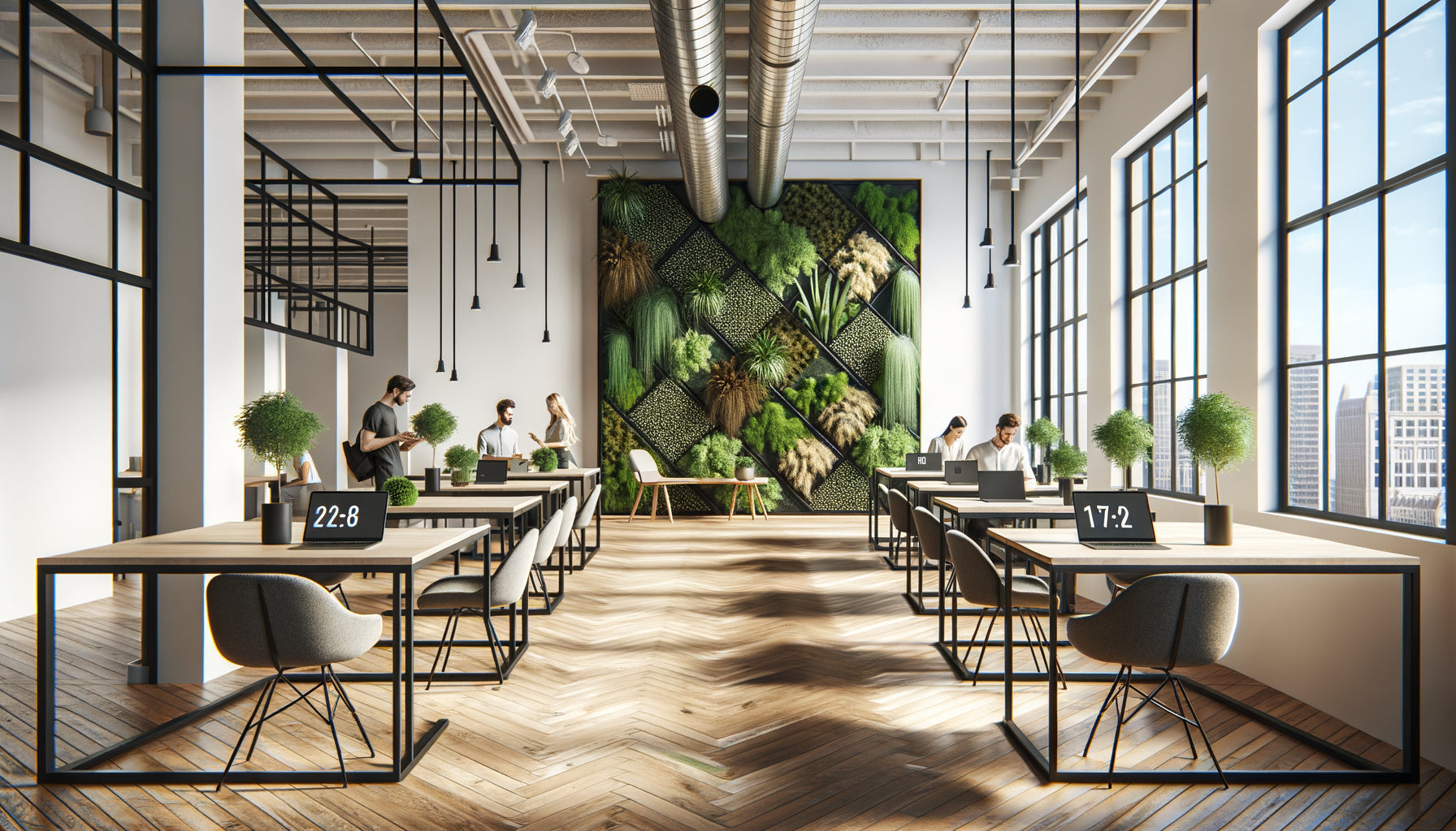
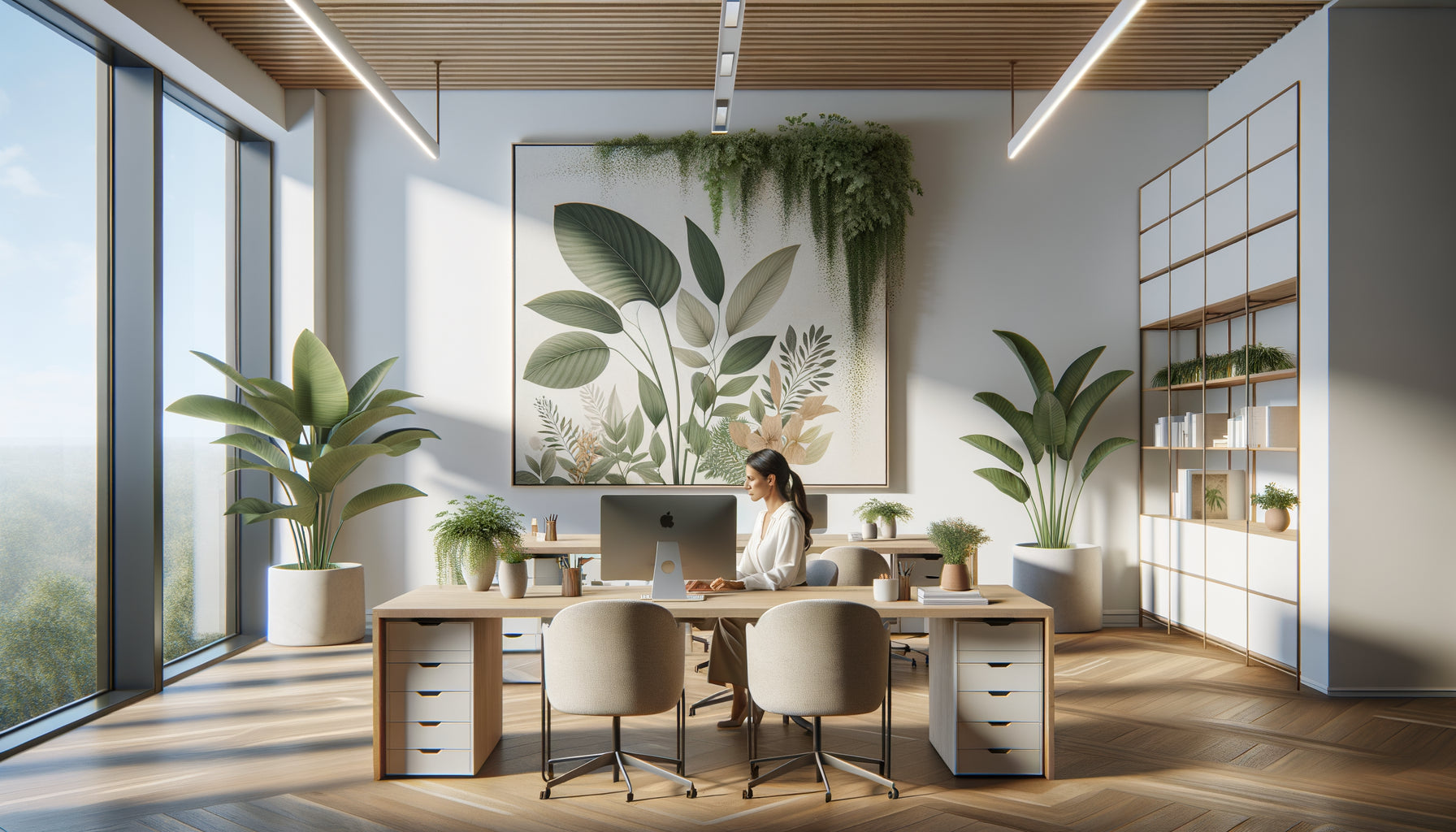
I remember this Parisian loft of 180 m², bathed in light, with its immaculate white walls that were 4 meters high. A magnificent space, but which seemed strangely empty despite the designer furniture. The owner confided in me: 'I feel like I'm living in an elegant hangar.' Three weeks later, after applying the principles of visual composition to wall art, this same space breathed harmony. Volumes found their balance, each zone revealed its personality.
Here’s what the principles of visual composition applied to wall art in large spaces bring: they structure oversized volumes, create emotional anchor points, and transform cold acoustics into a enveloping atmosphere.
Faced with a large space, many give up. They hang a painting that is too small which floats sadly on a cathedral wall, or align several works without coherence, creating visual noise rather than harmony. This hesitation is understandable: the composition rules we know for classic rooms seem obsolete when walls rise to 3.50 meters and perspectives extend over 15 meters.
Rest assured: proven principles exist to tame these generous volumes. They are based on universal visual laws, adapted to a monumental scale. Once understood, these principles radically transform your perception of space.
I'm going to reveal how to orchestrate your wall art so that your large spaces finally reveal their architectural potential.
The rule of monumental proportions: when size really matters
In large spaces, the first principle of visual composition is to respect the architectural scale. A 60x80 cm painting that would be perfect in a classic living room becomes insignificant against a wall 5 meters long and 3.50 meters high.
The golden rule I consistently apply: the artwork or wall composition should occupy between 60% and 75% of the width of the wall. For a 4-meter wall, aim for a visual presence of 2.40 to 3 meters. This proportion creates a harmonious relationship between empty space and fullness, between breathing and presence.
You have three options to achieve this scale:
The unique monumental work: A large format that asserts its presence. This solution works beautifully for main walls, creating a powerful focal point. Favor abstract compositions with dynamic lines or large-format photographs that support enlargement.
The gallery wall composition: Several paintings orchestrated like a visual constellation. The whole forms a virtual rectangle or square that respects the 60-75% rule. This approach brings dynamism and allows you to tell a visual story in several chapters.
The triptych or polyptych: A work fragmented into multiple panels, creating a horizontal rhythm that follows the width of the wall. The spaces between the panels (ideally 10 to 15 cm) add breathing while maintaining visual unity.
Visual anchoring at soul height
The second crucial principle of visual composition concerns height placement. In a large space, the classic mistake is to mathematically center the artwork on the wall. The result: the work flies towards the ceiling, losing all connection with the lived space.
The museum rule remains your best ally: the visual center of the painting (or composition) is positioned 1.60 meters from the floor. This height corresponds to the eye level of an average-sized person, creating a natural and immediate connection with the work.
For very high walls, this rule intentionally creates a vast empty space above the artwork. Don't fill it! This void is not a problem but a solution: it preserves human scale in a disproportionate volume. Your work remains emotionally accessible, anchored in your daily life rather than suspended like an inaccessible ornament.
I add a nuance for spaces with mezzanine or double height: create a vertical dialogue by installing a second composition at the level of the upper floor, visible from the mezzanine. Thus, each level finds its own visual anchor.
The secret of the horizon line
In your multiple wall compositions, draw an imaginary horizon line at 1.60 meters. All your paintings must align with this line, either by their center, or by their base or top. This consistency creates an invisible but perceptible structure that brings serenity and professionalism to the whole.

Architectural breathing: orchestrating the full and empty spaces
The third principle of visual composition in large spaces concerns the spatial distribution of artworks. A large space is not a single giant wall, but a set of functional and emotional zones.
Rather than saturating all available walls uniformly, adopt a rhythmic and breathing approach. Identify 3 to 4 main areas in your space: the reception wall that welcomes the gaze upon entering, the contemplation wall visible from the sofa, possibly a circulation wall that accompanies movement, and a breathing wall deliberately left bare.
This alternation creates a visual hierarchy: moments of focus where the gaze rests, and moments of rest where the eye regenerates. Without this breathing, even the most beautiful compositions become exhausting, transforming your space into a shopping mall rather than a living space.
The spacing between decorated areas is as important as the artworks themselves. In a 150 m² loft, allow for a minimum of 3 to 4 meters between two major compositions. This distance allows each set to radiate without visual interference.
When colors orchestrate space
The fourth principle of visual composition exploits the psychology of color on a large scale. In a large space, the colors of your wall art do not just decorate: they structure, delineate and characterize areas.
Create a guiding palette of 3 to 5 dominant colors that will converse across the entire space. This chromatic consistency visually unifies the volume while allowing for variations in intensity according to the zones.
For the reception and energy area (entrance, open kitchen), favor artworks with dynamic and contrasting colors: warm ochres, deep blues, emerald greens. These tones stimulate and welcome.
For relaxation areas (living room, reading corner), opt for soothing harmonies: shades of gray, nuanced beiges, pale blues. These hues slow down the gaze and invite contemplation.
The professionals' trick: use a chromatic thread – a signature color that appears discreetly in each wall composition, creating a subliminal connection between the different areas of your large space.
The emotional temperature of the space
Warm colors (reds, oranges, yellows) visually advance and perceptually reduce distances. Use them on the short walls of a large rectangular space to rebalance proportions. Cool colors (blues, greens, purples) recede and enlarge: reserve them for the long walls to accentuate perspective without weighing down.

The principle of visual triangulation
Here is a principle of visual composition that few know but which radically transforms the coherence of a large space: triangulation. Rather than strictly horizontally aligning your wall art, create triangular relationships between three visual points.
Specifically: if you install a major composition on the living room wall, place a complementary work on a perpendicular wall, then a third on the opposite wall. These three points form an invisible triangle that guides naturally the gaze in a fluid circulation through the space.
This triangulation also works with chromatic elements: a touch of coral red in a painting in the living room finds its echo in an abstraction in the entrance, then is subtly repeated in a photograph in the dining room. The eye travels, connects, unifies.
Triangulation avoids the 'gallery corridor' effect where all the works line up neatly on one wall, leaving the others bare and unbalanced. It instead creates a three-dimensional circulation of the gaze, fully exploiting the volume of the large space.
Depth through stylistic contrasts
The last principle of visual composition that I apply in large spaces concerns controlled stylistic diversity. A large volume can support – and even demand – a richness of styles that a small room could not tolerate.
Consciously mix different visual genres: monumental large-format photography in the main area, graphic abstractions in the workspace, organic illustrations in the reading corner. This variation creates narrative depth, transforming your space into a visual journey rather than a monolithic decor.
The key to success is to maintain a unifying constant. It could be a common color palette, a conceptual theme (nature, urban, energy), or a formal element (vertical lines, circular compositions). This constant prevents cacophony while allowing richness.
In my projects, I like to create visual density contrasts: one area with a lush gallery wall composition dialoguing with an area purged with only one minimalist work. This contrast amplifies the impact of each approach.
Ready to transform your large volumes into harmonious spaces?
Discover our exclusive collection of wall art for coworking that respects the principles of visual composition to elegantly structure your generous spaces.
Your large space revealed
The principles of visual composition applied to wall paintings in large spaces are not academic constraints, but revelation tools. They reveal the hidden potential of your volumes, transforming intimidating ceiling height into an intimate cathedral, vastness into spatial richness.
Start with a single wall, the one that welcomes you every day. Apply the rule of monumental proportions, anchor your composition at 5'3" (160 cm), let the space breathe above. Observe how this simple gesture already transforms your perception of volume.
Then, gradually, orchestrate the other zones according to the principles of triangulation and breathing. Your large space will cease to be a challenge to become your most beautiful decorative achievement: structured without rigidity, harmonious without monotony, monumental while remaining deeply human.
FAQ: Mastering visual composition in large spaces
What is the minimum size of a painting for a 4-meter high wall?
For a 4-meter high wall, your wall composition should be at least 1.20 meters wide, ideally between 1.50 and 2 meters. Contrary to intuition, the height of the wall is less important than its visible width in determining the size of the painting. Apply the 60-75% rule of the wall's width rather than its height. A 150x100 cm painting will create a sufficient impact without appearing lost. If you opt for a gallery wall, the entire composition should respect these same proportions. Don't be afraid to go big: in generous volumes, timid formats literally disappear. If your budget limits the purchase of monumental works, create a composition of several medium-sized paintings that together reach the necessary dimensions. The eye perceives the whole as a visual unit.
How to avoid my large space looking like a cold gallery?
The secret lies in personal selection and the emotional anchoring of your wall paintings. A gallery presents works uniformly and neutrally; your living space should tell your story. Prioritize works that resonate with your emotions rather than blindly following trends. Create thematic groupings that reflect your passions: travel, nature, meditative abstraction. Also vary the hanging heights by a few centimeters to break up museum rigidity, while maintaining the horizon line at 1.60 meters as a base. Integrate three-dimensional elements: wall sculptures, framed objects, mirrors that dialogue with the paintings. Finally, leave walls completely bare – a gallery has no blank walls, your home does. This breathing affirms that it is a living space, not an exhibition.
Should I use identical frames for a harmonious composition in a large space?
No, the uniformity of frames is not an obligation to create a harmonious visual composition, but it considerably simplifies the exercise, especially for beginners. In a large space, you have two winning approaches. The first: rigorously identical frames (same color, same style, same thickness) which create a strong unity, particularly effective for gallery walls with many pieces. This uniformity of the container enhances the diversity of the contents. The second approach, more sophisticated: varied frames but sharing a common characteristic – same wood tone, same metallic finish, or even same style (all modern, all vintage). This subtle coherence allows for more personality. Absolutely avoid random mixing: baroque gilded frame next to minimalist black frame next to shabby white frame. In a large space, this cacophony is visually amplified. The golden rule: the less experience you have in composition, the more uniformity of frames will help you succeed.