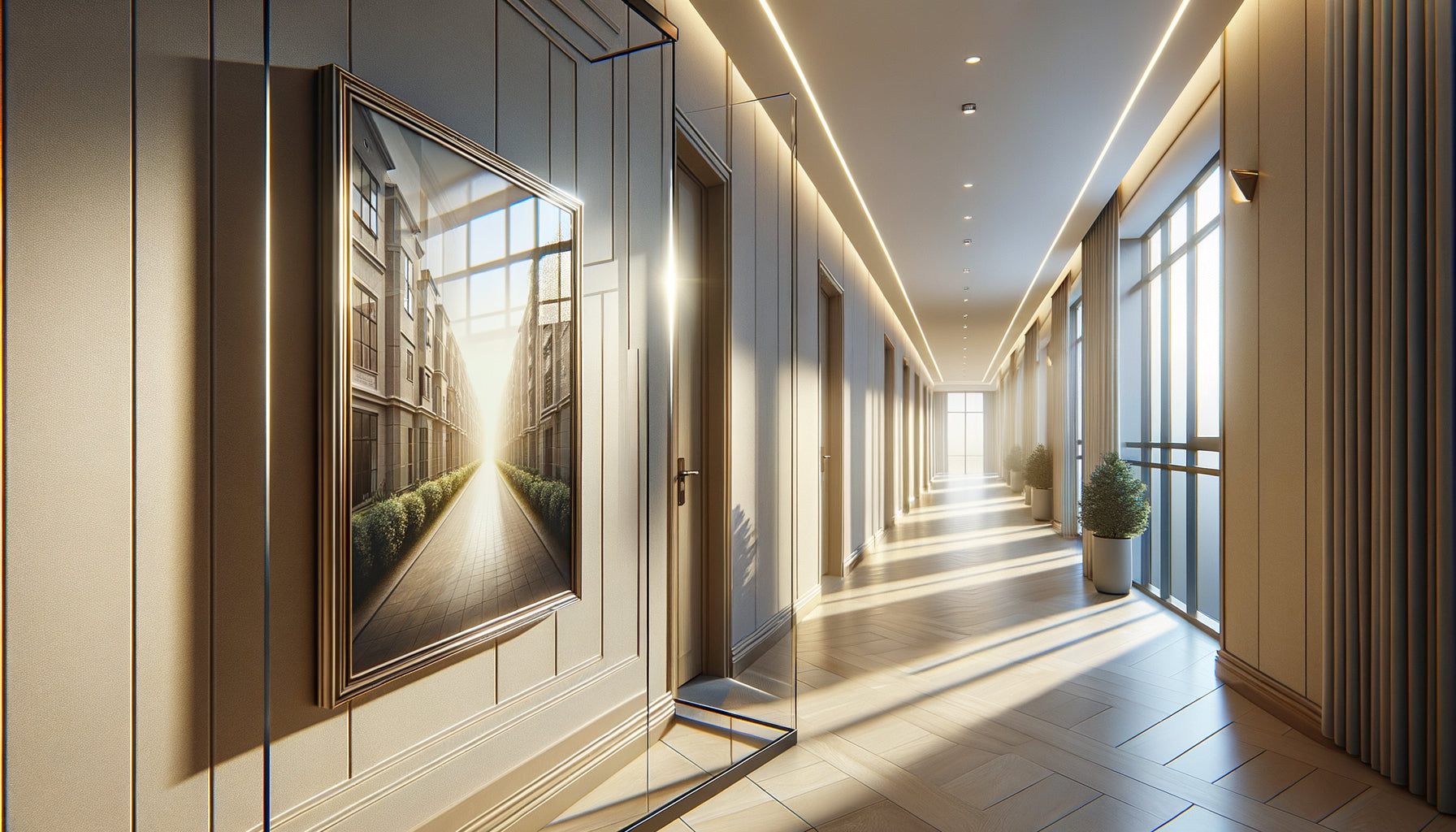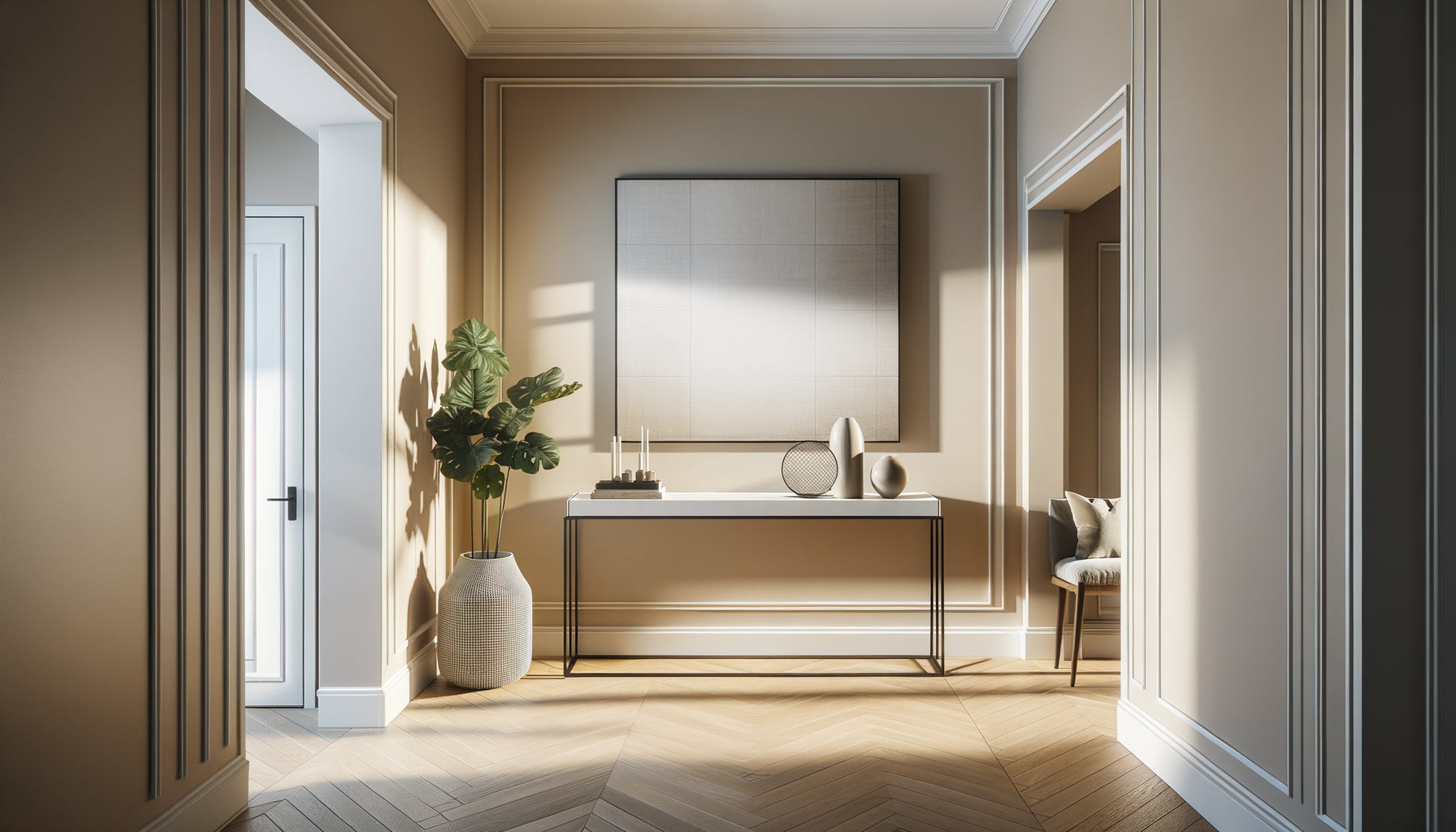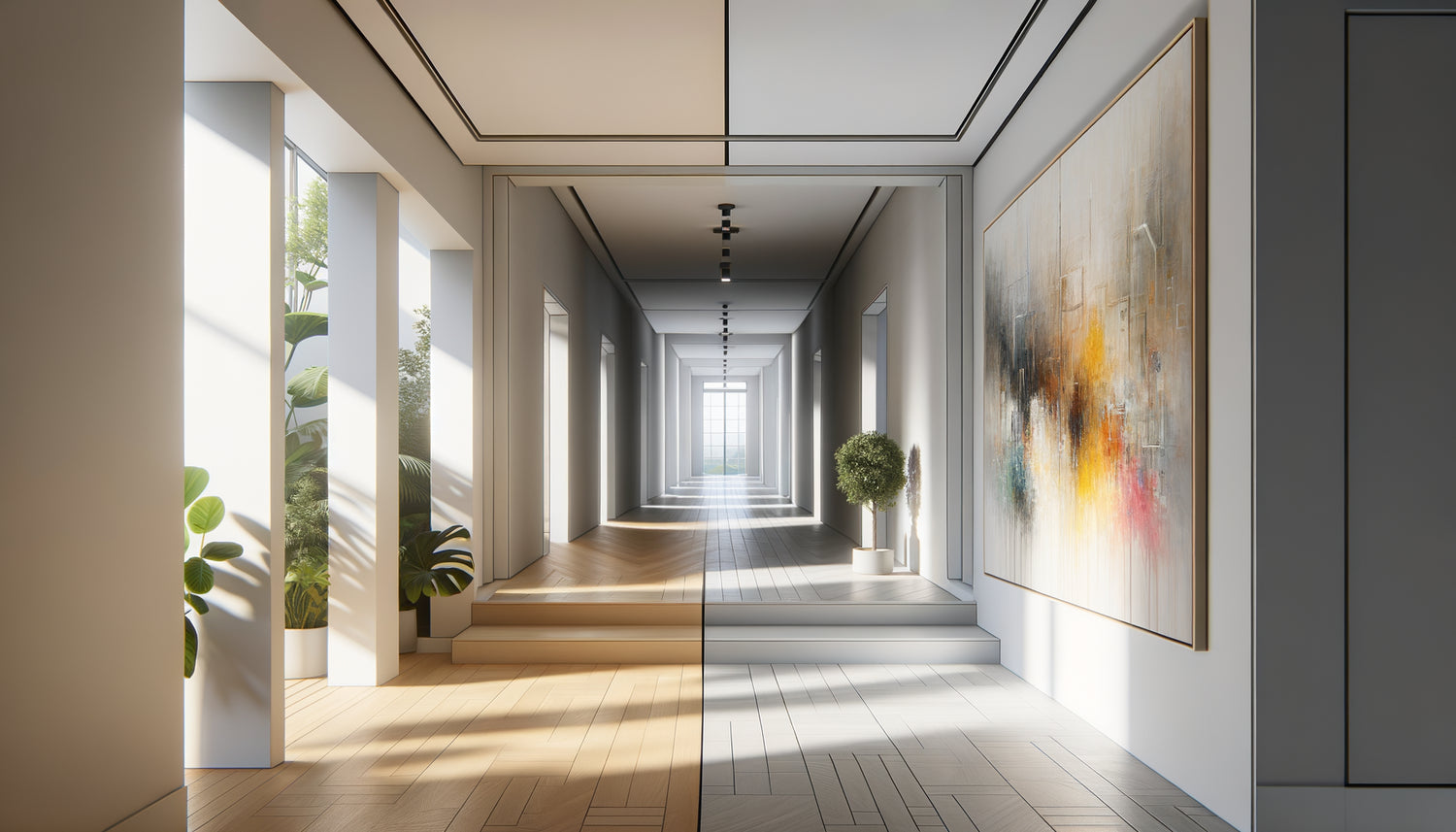
That off-white hallway that runs through your apartment. Those beige walls connecting rooms without ever attracting the eye. That reassuring but terribly bland neutrality. You've found the perfect painting, the one that will finally give character to this forgotten passage. But a question haunts you: should you opt for an elegant limited palette or dare to embrace the vibrancy of a multicolored composition?
Here’s what a well-chosen painting brings to your neutral hallway: it structures the space without weighing it down, creates a focal point that naturally guides circulation, and reveals the hidden personality of these neglected square meters.
The classic trap? Choosing on impulse, then realizing that this explosion of colors turns your hallway into a visual chaos, or conversely, that this minimalist canvas literally disappears into the surrounding neutrality. I have accompanied dozens of collectors facing this specific dilemma.
The good news: there are no bad choices, only objective criteria to understand. The luminosity of your hallway, its width, the function you assign it – quick passage or contemplative gallery – naturally dictate the answer. In the 900 words that follow, I will give you the keys to transform this hesitation into certainty.
The limited palette: the art of elegant suggestion
A painting with a limited palette – generally two to four dominant shades – works like a whisper in a neutral hallway. It integrates without imposing itself, creating a chromatic harmony that extends the existing neutrality while injecting subtle sophistication.
In a narrow hallway (less than 90 cm wide), this approach becomes almost strategic. Monochrome compositions in black and white, shades of blue-gray or variations of raw Sienna create depth without visual fragmentation. The eye does not bump into aggressive contrasts; it naturally glides along the passage.
I recently advised a collector for his Haussmannian hallway with ivory walls. We opted for a series of three abstract paintings in ocher tones, blush beige and off-white. Result: the space seems 20% larger, natural light diffuses better, and guests instinctively slow down to observe these nuances they hadn't noticed at first glance.
When to prioritize chromatic restraint
The limited palette excels in several specific configurations. If your hallway connects rooms with different color atmospheres – duck blue living room, powdered pink bedroom, sage green office – a neutral painting serves as a soothing visual transition. It avoids the chromatic telescoping that fatigues the eye.
Likewise, in spaces already rich in textures (wood paneling, moldings, antique tile), adding a multicolored work would create a sensory overload. The reduced palette then allows the painting to exist without competing with the existing architecture.
Technically, look for compositions with subtle tonal variations: a monochrome that plays on shades and highlights, a gradation where nuances respond to each other. This depth in restraint prevents the 'hospital wall' effect dreaded by owners of neutral hallways.
The multicolored explosion: when the hallway becomes a destination
Conversely, a multicolored painting radically transforms the function of your hallway. It is no longer just a passage but a destination in itself, a space that deserves to be stopped at, returned to, and shown to visitors.
This approach works beautifully in wide hallways (over 120 cm) and bright spaces. The colorful artwork captures natural light and redistributes it into chromatic reflections that animate neutral walls. A painting with dominant yellows, reds and blues can literally make a white corridor seem lifeless vibrate.
I have seen spectacular transformations: a charcoal gray hallway transformed by an abstraction in vibrant oranges and emerald greens, creating an unexpected depth. Or this cream passage awakened by a floral composition in fuchsia roses, deep violets and touches of gold that now attracts all eyes during dinners.
Conditions for multicolored success
However, be careful: a multicolored painting requires certain conditions to shine without being overwhelming. First rule: your hallway must be neutral enough – white, beige, light gray, taupe – to serve as a backdrop. On an already colored wall, the effect becomes cacophonous.
Second imperative: the quality of light. A dark hallway will literally swallow bright colors, turning your investment into an indistinct shadow area. If natural light is lacking, install directional lighting (at least 3000K LED spotlights) that will reveal the nuances without distorting the tones.
Third consideration: balance with the rest of your decor. If your main rooms already display a strong chromatic personality, make sure the colors in the painting harmoniously dialogue rather than create a brutal break. Look for complementary tones or subtle echoes.

The dimensions that change everything
Beyond the chromatic choice, the dimension of the painting radically influences perception. In a neutral hallway, proportions become your best ally or your worst enemy.
For a standard passage (2.50 m high, 1 m wide), prioritize vertical or square formats from 60x80 cm to 80x100 cm. This verticality naturally accompanies the flow of movement. A painting that is too small (30x40 cm) will get lost; a format that is too horizontal (120x40 cm) will visually clutter the space.
The rule of thumb I apply: the painting should occupy approximately 60% of the width of the wall where it is hung. This creates a confident presence without saturation. In a very narrow hallway, opt for several small formats (40x50 cm) arranged in a vertical series rather than one imposing piece.
Regarding hanging height: position the center of the painting 1.60 m from the floor, the standard eye-level height. In a hallway where you walk standing up, this position ensures optimal visibility without needing to look up or down.
Lighting: Revealing or Destructive
A neglected technical detail ruins 80% of painting installations in hallways: inappropriate lighting. Your choice between a limited palette and a multicolored composition must absolutely integrate this dimension.
Paintings with a limited palette better support indirect lights and less bright hallways. Their subtle nuances emerge even in low-light conditions. Soft lighting (2700K bulbs) will enhance their intimate and elegant side.
Conversely, multicolored artworks require direct light to reveal all their richness. Prefer directional spotlights (3000-4000K) angled at 30° towards the painting. Absolutely avoid cold neon lights that distort reds and yellows, turning your investment into a dull crust.
Conservator's tip: install a dimmer switch. You will adjust the lighting according to the time of day and the desired atmosphere, allowing your painting to live differently between the bright morning and the cozy evening.
Your hallway deserves better than indifference
Discover our exclusive collection of hallway paintings that transform forgotten passages into captivating personal galleries.

Your hallway now tells your story
Imagine: tomorrow morning, you walk through this transformed hallway. If you chose the limited palette, you feel that felt elegance, that refinement which doesn't shout but asserts itself with evidence. Your guests slow down, intrigued by these nuances they discover with each passage.
If you opted for the multicolor, it’s an injection of daily energy. These colors that converse with changing light become the vibrant pulse of your apartment. Your hallway is no longer a neglected in-between but the beating heart that irrigates each room.
The truth? Your neutral hallway simply awaits you giving it permission to fully exist. Limited palette or chromatic explosion, the only bad choice would be not to choose at all. Observe your space tonight with a new look. The answer is already there, inscribed in the light that caresses your walls, in the width of your partitions, in the life you want to breathe into these forgotten square meters.
Now, you know. All that remains is to act.