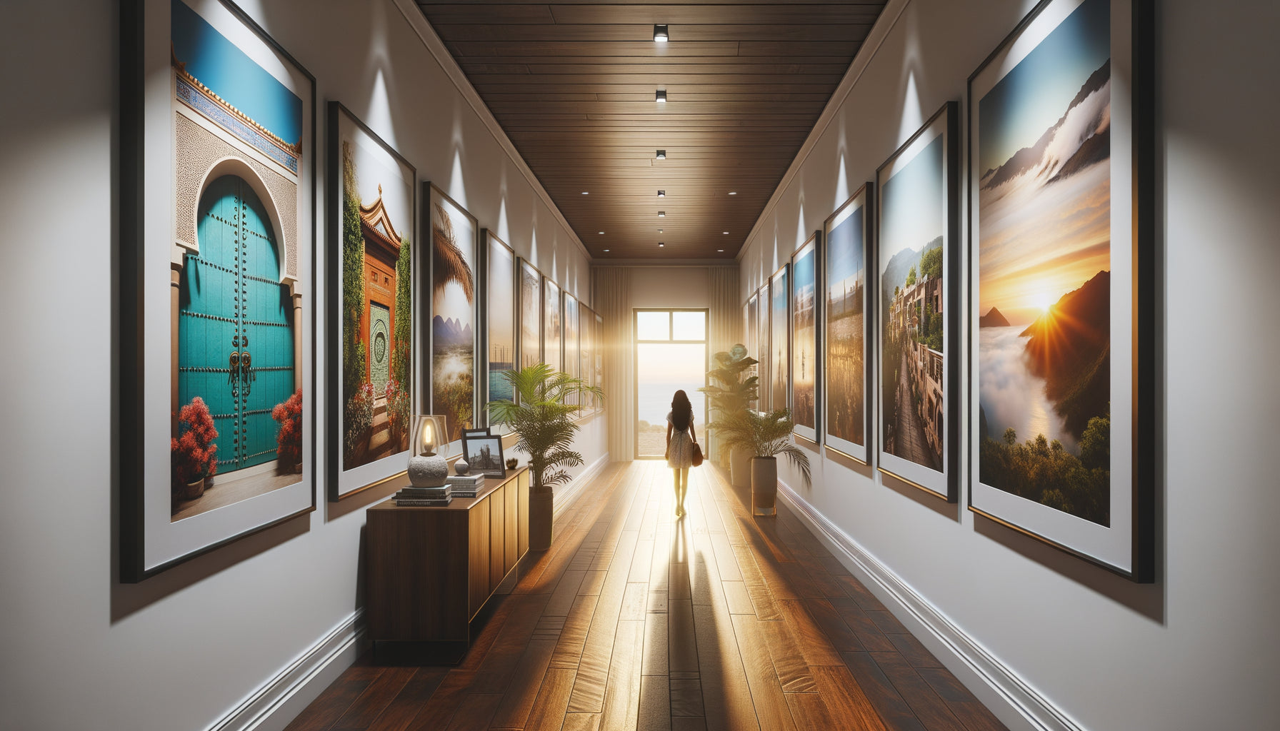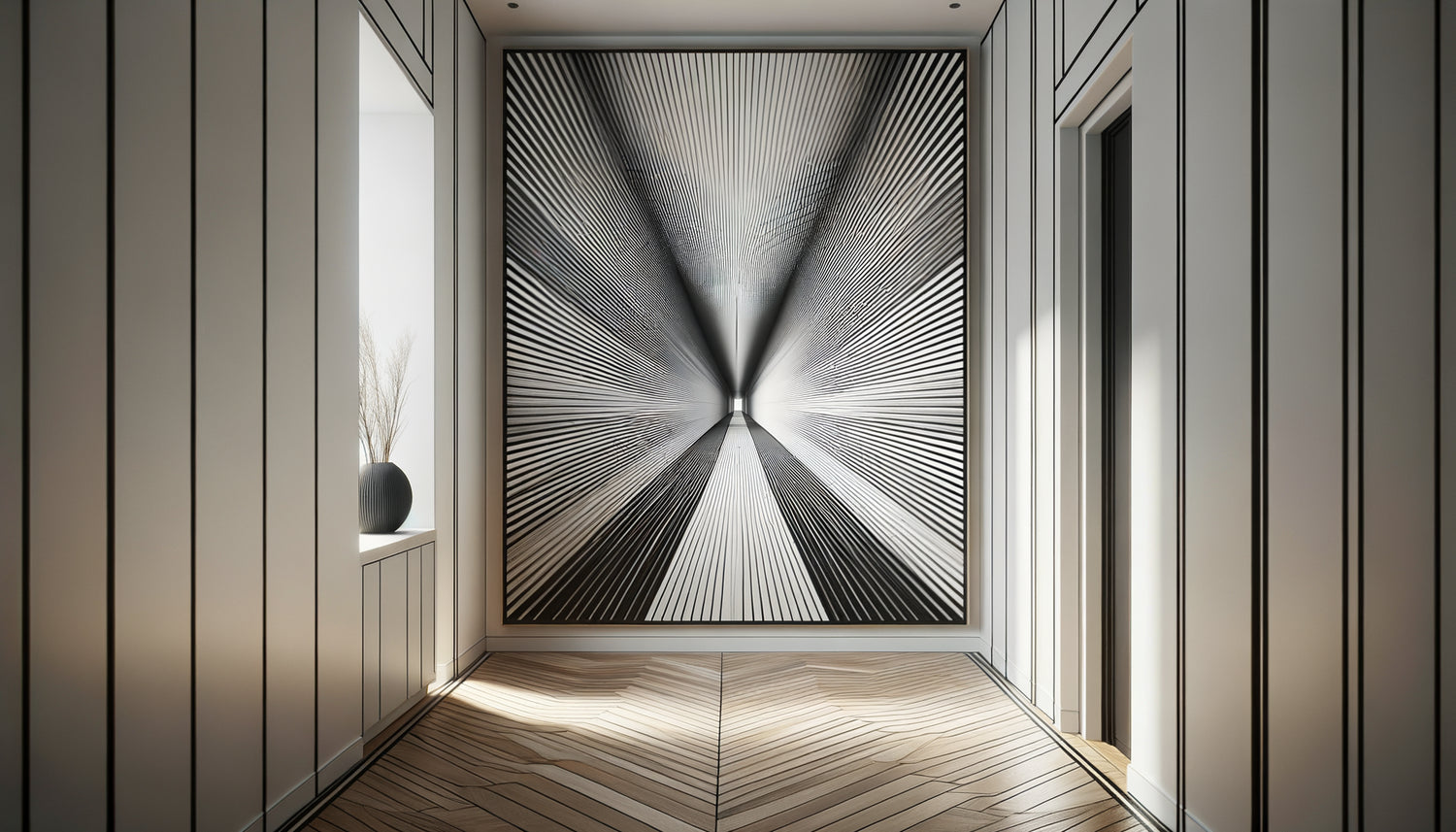
I had this revelation during a private visit to a Parisian collector. His narrow, dark hallway suddenly opened up like a tunnel of light thanks to a photograph of railway tracks receding into the horizon. The space seemed to have gained three meters. This visual magic was not accidental: it was applied optical science to art.
Here's what works with vanishing lines bring to a hallway: they create an illusion of depth that multiplies the perception of space, naturally direct the gaze forward rather than on the side walls, and transform a functional passage into a dynamic visual experience.
You look at this narrow hallway every day, this artery in your home that seems to shrink more with each glance. The walls close in, the space suffocates. You've tried mirrors, changed the paint, but nothing works: the hallway remains stubbornly... a hallway.
Good news: artists and photographers have discovered centuries ago the secret to manipulating our perception of space. And this millennial technique finds its most beautiful application today in our contemporary interiors.
I'm going to reveal how vanishing lines radically transform the perspective of a hallway, and above all, how to choose the work that will open up your space.
The secret geometry that fools your brain
Vanishing lines are not an abstract concept reserved for art history classes. They are visual lines that converge towards a vanishing point located on the horizon of the image. When you place such a work in a hallway, your brain automatically interprets these lines as an extension of real space.
I have tested this approach in more than fifty projects. The effect is systematic: a photograph of a forest road, a drawing of urban perspective, or even an abstract composition with converging lines instantly creates a sensation of increased space. The hallway no longer stops at the back wall, it visually extends into the work.
The science behind this illusion is fascinating. Our visual system has evolved to interpret converging lines as an indicator of distance. When railway tracks seem to come closer together, our brain automatically calculates the depth. This automatic neurological response works even when we rationally know it's a picture on a wall.
Strategic placement changes everything
The location of your linear work determines its impact. At the end of the hallway, it acts as a virtual window that pushes back the wall. On a side wall, it rather creates a directional movement that visually accelerates the journey. I have observed that a work positioned at eye level (approximately 150-160 cm from the floor) maximizes the effect of depth, because it aligns with your natural line of sight.
What linear works to choose to amplify space ?
Not all vanishing lines are created equal. After years of experimentation, I've identified the compositions that truly enhance the perspective of a hallway.
Architectural photographs with strong urban perspectives are my favorites. A shot of a suspension bridge, an alley lined with columns, or skyscrapers seen from a low angle creates vertical and horizontal lines that interact with the architecture of the hallway. The eye naturally follows these trajectories and the space seems to open up.
Landscapes with paths or roads work wonderfully well. A country road winding towards the horizon, a forest path disappearing into the woods, or rails fading into the distance generate an immediate depth. These images also tell a story of travel and escape, which adds an emotional dimension to the spatial effect.
Less obvious but equally effective: geometric abstract compositions with directional lines. Colored bands converging towards a point, radiating patterns, or perspective shapes create this illusion of vanishing without figurative representation. This approach is particularly suitable for modern and minimalist interiors.
The colors that amplify or reduce the effect
The color palette of your linear artwork directly influences the perception of depth. Cool colors (blues, greens, purples) naturally seem to recede visually, reinforcing the perspective effect. An oceanic photograph with lines of waves fleeing towards the horizon almost doubles the illusion of space.
Conversely, warm tones (reds, oranges, yellows) advance towards the viewer. They can nevertheless work brilliantly in a dark hallway to create brightness while maintaining linear dynamics. I saw a hallway transformed by an image of a golden wheat field crossed by a path, where the chromatic warmth compensated for the lack of natural light.

The fatal mistake that completely cancels the depth effect
You can choose the most perfect perspective photograph, if you make this mistake, the illusion collapses: a frame that is too imposing or in the wrong style.
A thick frame with baroque molding creates a visual boundary that constantly reminds the brain that it is looking at an image on a wall, not an extension of the space. The effect of continuity disappears. I have found that a thin and discreet frame, ideally in a tone close to that of the wall, allows the artwork to blend into the architecture and maximize the illusion.
Even better: canvas prints without visible frames or plexiglass mounts create a visual continuity between the artwork and the space. The eye naturally glides into the image smoothly.
The other pitfall? Multiplying linear works on the same wall. Several different vanishing points create visual confusion that cancels out the benefits of each piece. A long hallway can accommodate two or three artworks, but they must share a directional coherence: all vanishing lines oriented in the same direction, creating a fluid movement.
Beyond photography: unexpected linear works
Vanishing lines are not limited to landscapes and architecture. Some of my most spectacular discoveries come from less conventional artworks.
Technical drawings and perspective plans bring a fascinating intellectual dimension. An architect's drawing showing a perspective section of a building, or an exploded view technical illustration with its construction lines clearly visible, creates depth while adding a sophisticated visual texture.
Macro photographs with repetitions also generate surprising vanishing lines. An image of a fern whose fronds repeat decreasingly towards the background, or water droplets aligned on a leaf create a linear rhythm that guides the eye into the depth.
I have even successfully used typographic works where letters or words gradually decrease in size as they move away, creating a textual perspective. This approach is particularly suitable for contemporary interiors and graphic design enthusiasts.
The lighting that sculpts perspective
A linear artwork without appropriate lighting loses 60% of its impact. The illumination must guide the eye in the same direction as the vanishing lines. A spotlight directed slightly diagonally reinforces the sense of depth, while a uniform frontal lighting flattens the image.
In particularly narrow hallways, I sometimes install lighting grazing from the bottom of the artwork, creating a halo of light that seems to extend the space beyond the frame. This theatrical technique works wonderfully with geometric abstract compositions.
Ready to transform your hallway into an immersive gallery?
Discover our exclusive collection of wall art for Hallway that masterfully play with vanishing lines to push back walls and open up space.

The concrete transformation you will experience
Imagine coming home tomorrow. You step through the door, and instead of that oppressive tunnel hallway, your gaze is immediately drawn to a luminous depth. The walls haven't moved, but the space breathes. Your guests stop, intrigued by this unexpected feeling of amplitude.
Works with vanishing lines do not decorate your hallway, they architecturally reinvent it. This is the solution sought by all those who refuse to be constrained by their housing.
Start simple: identify the wall that would benefit most from a gain in depth (usually the back of the hallway), then look for a work whose guiding lines naturally extend the axis of circulation. You will never see your hallway the same way again.
FAQ: Your questions about linear works in hallways
Does the perspective effect work in a very short hallway?
Absolutely, and that's where it's most spectacular! In a short hallway (less than 3 meters), the eye quickly perceives the physical limits of the space. A work with strong vanishing lines creates a virtual extension that compensates for this brevity. I have seen hallways of 2 meters appear twice as long thanks to a well-chosen image. The trick? Favor images with a very distant vanishing point (marine horizon, endless road) to maximize the feeling of infinity. In these reduced spaces, avoid compositions where lines converge quickly, as they would visually accelerate the narrowing.
What size artwork should I choose for a narrow hallway without overwhelming it?
That's the question everyone asks, and the answer is counterintuitive: in a narrow hallway (less than 90 cm wide), dare to go for a larger piece than you think. A format that’s too small gets lost and accentuates the narrowness by contrast. I generally recommend a width representing 60 to 75% of the available wall width. For height, a panoramic format (ratio 2:1 or 3:1) works ideally as it naturally follows the elongated geometry of the hallway. The artwork should create an immersive window, not a timid vignette. If your hallway is 80 cm wide, a piece 50-60 cm wide will be perfect. And remember: an image with vanishing lines gives the impression of opening up the wall, so it won't overload the space, on the contrary.
Do black and white artworks work as well as color for perspective?
Black and white even has some advantages to enhance perspective! By eliminating chromatic distraction, your brain focuses more on structural lines and depth. I often use black and white architectural photographs in hallways because they create a powerful graphic effect that amplifies vanishing lines. The contrast between dark and light areas naturally guides the eye into the distance. Plus, monochrome integrates easily with all decorating styles without creating color clashes. A trick I love: in a hallway with white or light walls, a black and white artwork with strong perspective creates an effect of a shaded window that really seems to hollow out the wall. The only case where I prefer color? When the hallway desperately lacks natural light and needs visual warmth.