

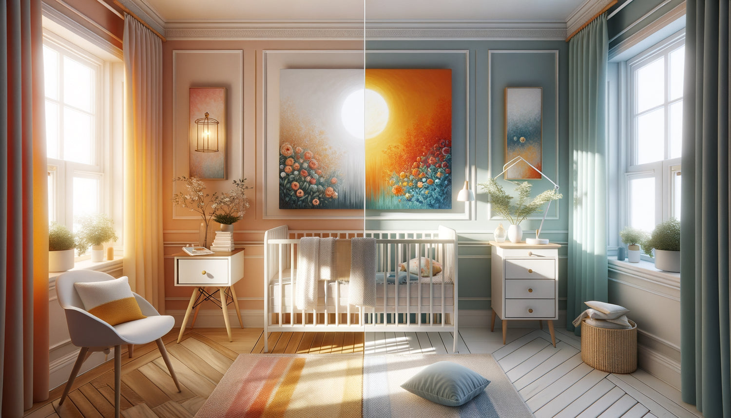
I still remember the moment when Clara, a young and exhausted mother, contacted me in the middle of the night. Her 18-month-old son hadn't been sleeping since they had lovingly redecorated his room. Repainted walls, new furniture, and that magnificent painting with red-orange tones that she had chosen to energize the space. Except that instead of calming her little boy, the atmosphere seemed to excite him even more. This anecdote perfectly illustrates the often underestimated impact of color palettes in the world of toddlers.
Here's what a well-chosen color palette brings to your child’s room: it naturally regulates their energy level, promotes restorative sleep and creates an emotional cocoon tailored to their sensory needs. You might be wondering how simple nuances can have such power? You are right to be curious. Babies and young children perceive colors with an intensity that we, adults, have forgotten. Their immature nervous system reacts directly to visual stimuli. Good news: understanding the influence of warm and cool palettes will allow you to transform your toddler’s room into a perfectly calibrated sanctuary.
The science of color in the world of toddlers
Contrary to popular belief, newborns do not see in black and white. From the first months, their vision gradually improves, and colors become major sensory information. Warm hues—red, orange, yellow, terracotta—immediately capture attention. They stimulate, awaken, invite movement. These are colors that speak of energy, human warmth, vitality.
Conversely, cool palettes — blue, green, lavender, pearl gray — act as visual lullabies. They naturally slow heart rate, lower tension and invite calm. In Scandinavian nurseries I have visited, there is consistently a predominance of blue-green in rest areas, while activity corners incorporate touches of coral or mustard.
A painting in a child’s room is never just a decorative element. It's a focal point that the eye instinctively seeks, especially during those moments when the child observes their surroundings from their bed. Its chromatic impact directly influences the overall atmosphere of the space.
Warm palettes: when and why to choose them
Warm colors have this extraordinary ability to make a space feel alive, almost pulsating. In a room with limited natural light or facing north, a painting with ochre, terracotta or peach tones can literally warm up the atmosphere. It's like inviting a permanent ray of sunshine into the room.
For dynamic and creative children
I’ve noticed that naturally energetic toddlers, those who relentlessly explore, thrive in spaces that reflect their vitality. A painting with a warm palette in their play area or above their drawing space becomes a mirror of their temperament. Honey, apricot, or brick tones stimulate their imagination and encourage creative expression.
However, be mindful: in a room primarily intended for sleep, these shades can interfere with falling asleep. If you opt for a painting with warm colors, prioritize a strategic location — facing the play corner rather than directly within view from the bed.
The cocooning effect of ochres and earth tones
Important nuance: not all warm colors are stimulating. Earthy hues — camel, soft bronze, rose beige — possess the rare quality of being both warm and soothing. In rooms with neutral tones, a painting in these shades creates a protective, almost maternal atmosphere without disrupting rest.

Cool palettes: the art of creating a haven of peace
When Mathieu and Sophie moved into their Parisian apartment, their daughter’s room overlooked a busy street. It was impossible to modify the external environment, but we worked on the interior atmosphere. A large painting in blue-green tones depicting an abstract seascape became the visual anchor of the room. Result? Their daughter, previously restless at bedtime, now fell asleep within minutes.
The soothing power of blue
Blue remains the most popular color in toddlers’ bedrooms, and for good reason. Environmental psychology studies demonstrate its direct effect on melatonin production, the sleep hormone. A painting in sky blue, grey-blue or navy blue tones instantly creates an atmosphere conducive to rest.
But not all blues are equal. Electric or highly saturated blues can paradoxically stimulate. Prefer soft and powdery shades — lavender blue, opaline blue, glacier blue — which envelop the space like a soft blanket.
Green, that balancing color
Green has this fascinating peculiarity of being on the border between warm and cold. A artwork with a cool palette dominated by sage green, almond green or mint green offers the best of both worlds: it soothes while maintaining a connection with nature and life. It is the color of growth, harmony, renewal.
In sensitive or anxious children's bedrooms, green demonstrates remarkable regulating virtues. It does not artificially slow down like blue, but naturally rebalances the energy of the space.
Adapting the chromatic choice to your child's temperament
Each child has their own energetic signature. I have learned to observe these differences after accompanying hundreds of families. Some babies are initially contemplative, observant, almost meditative. Others seem constantly in motion, exploring every corner as soon as they are able.
For a calm and reserved toddler, a touch of warm color can gently stimulate their curiosity without overwhelming them. A painting with tones of peach or soft mustard provides that little spark of encouragement to explore. Conversely, for a naturally intense child, a painting with cool colors acts as a natural regulator, creating a soothing counterpoint to their overflowing energy.
The classic mistake? Wanting to absolutely calm a dynamic child with an abundance of blue, or stimulate a quiet child with bright reds. The key lies in subtlety and balance. Your parental intuition, combined with attentive observation of your child's reactions, remains your best guide.

Lighting: that often forgotten multiplier factor
A technical detail that changes absolutely everything: the way natural and artificial light interacts with your artwork radically modifies its chromatic impact. A painting with cool tones in a south-facing bedroom, flooded with warm light in the afternoon, will take on softer and more balanced nuances.
Conversely, a painting with a warm palette in a room lit by cool white LED bulbs can lose its warmth and appear aggressive. Think about testing the effect of your choice at different times of the day, particularly during key moments: waking up, napping, bedtime.
A trick I consistently apply is to install a dimmable ambient light near the painting. This allows you to modulate its impact depending on the time of day and the child's needs. In the evening, soft lighting even softens the most vibrant palettes.
Ready to transform your little one's room into a true sensory cocoon?
Discover our exclusive collection of wall art for kids that harmonizes aesthetics and well-being, with palettes carefully designed to accompany each temperament.
Creating Your Own Chromatic Balance
Rather than radically opposing warm and cool colors, the most successful arrangements I have observed integrate both. The ideal nursery is neither a minimalist icy spa nor a sensory overload. It's a space that breathes, adapts, and evolves.
Specifically? A main painting with cool tones for the sleep area, complemented by warm touches in textiles, toys, or a second smaller painting near the play area. Or vice versa: a painting with warm colors as a focal point, tempered by walls in soothing cool shades.
This approach also allows you to support your child's growth. The painting remains, but its role and perception evolve. What stimulated the newborn can soothe the two-year-old toddler. What calmed the baby can inspire the young child's first artistic creations.
Visualize the Transformation
Imagine that evening moment when you put your little one to bed. Their gaze naturally falls on the painting that you have chosen with intention. The colors interact with the fading light. If you opted for a cool palette, the space seems to calm as daylight fades, as if the room itself accompanied the bedtime ritual. Blues deepen, greens soften, creating this protective bubble that every child needs to fall asleep.
Or perhaps you have chosen a warm palette to counteract insufficient natural light? In this case, even in the evening, the room retains this inner light, this reassuring warmth that tells your child: you are safe, you are home, you can rest.
The choice between warm and cool palettes isn't a matter of fashion or absolute rules. It's an intimate decision that takes into account your child, your space, and your family's sensibilities. Observe, feel, adjust. And most importantly, trust yourself: you know your toddler better than anyone.
Frequently Asked Questions
Can you really mix warm and cool colors in a toddler's room?
Absolutely, and it's even recommended! The idea isn't to create a monochromatic space, but rather to establish a dominant theme that corresponds to the main need of the space. A wall art with a cool palette can perfectly coexist with warm touches in textiles or accessories. This combination creates visual richness that stimulates the child's cognitive development while maintaining a soothing balance. The trick is to respect a proportion: 70% of the dominant color, 30% of complementary colors. So, if you choose a blue-toned wall art to soothe, some ochre or coral elements will add life without disrupting the overall harmony. Observe how your child reacts in the first few weeks: their sleep times, their mood upon waking, and their level of agitation will indicate whether the balance is found.
From what age does a baby really perceive the impact of colors in a wall art?
Color vision begins to develop from the first weeks of life, but it's around 3-4 months that your baby can actually distinguish shades and focus their attention on a wall art. Before this age, they mainly perceive strong contrasts and shapes. That said, even if your newborn doesn't yet distinguish all the chromatic subtleties, the overall atmosphere created by the color palette influences the lighting of the room, and therefore indirectly their well-being. Colors affect us all, even unconsciously. Around 6 months, the impact becomes truly significant: baby actively observes their environment, and colors become emotional landmarks. That's why it's never too early to think about the chromatic harmony of their room, even if the effect will intensify with the months.
My child has trouble falling asleep: should I immediately change the wall art in their room?
Trouble sleeping rarely has a single cause, and the artwork is just one element among others. Before changing everything, observe the entire environment: room temperature, sound level, bedtime routine, screen time before sleep. That said, if you have recently installed an artwork with warm and vibrant colors directly in the field of vision from bed, it can indeed contribute to overstimulation. The solution is not necessarily to remove it, but perhaps to move it or accompany it with soothing elements. You can also temporarily test covering it with a light veil at night and observe whether sleep improves. If so, you will have your answer. Ideally, cool and soft tones in the sleeping area are best, reserving more dynamic visual stimulation for the play or awakening zone.


