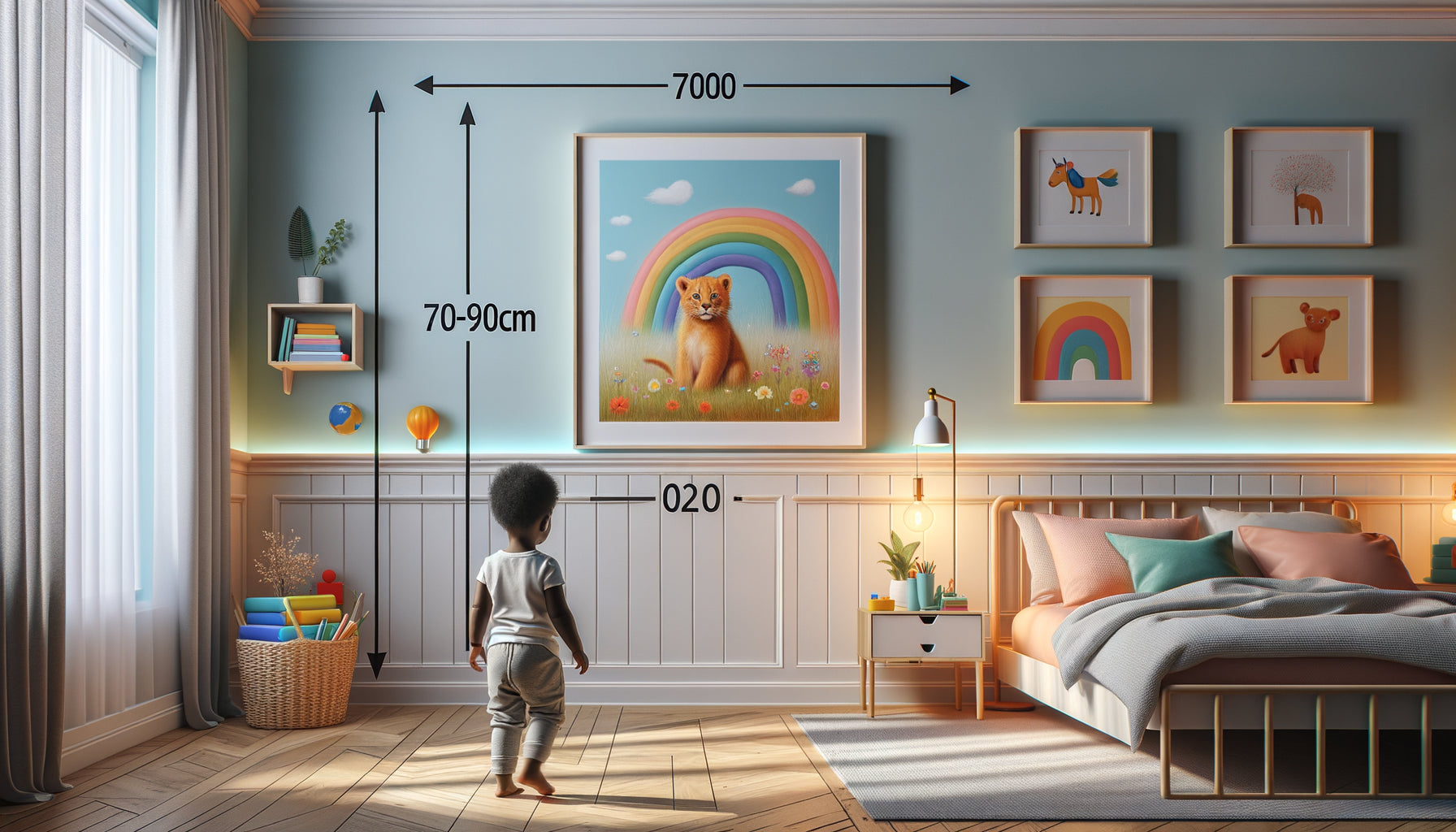
I still have a vivid memory: my three-month-old daughter, lying on her play mat, completely absorbed by a simple painting with large blocks of red, yellow and blue hanging on the wall of her room. Not the sophisticated mobiles, not the flashing toys. Just those three bold colors that seemed to fascinate her for long minutes. That day, I understood that decorating a baby's room wasn't just about parental aesthetics.
Here's what paintings with primary colors bring to your baby's visual development: optimal stimulation of their still immature perceptual abilities, progressive training of their binocular vision, and cognitive awakening that lays the first stones of their understanding of the visual world.
You may have decorated the nursery with soft pastel tones, soothing beiges, convinced that these delicate shades would better suit her fragile universe. You may have avoided bright colors, thinking they would be too aggressive for her sensitive eyes. This well-intentioned intuition, however, goes against what their visual system actually needs to develop.
Rest assured: it's never too late to incorporate these essential color stimulations. And no, that doesn't mean turning the room into a garish playroom. It just takes understanding how a newborn’s vision works and offering them exactly what their eyes instinctively seek.
In this article, I will explain why these three simple colors – red, yellow, blue – constitute your child's first visual alphabet, and how to integrate them harmoniously into their daily environment.
The blurry world of the first months: understanding newborn vision
At birth, your baby sees the world as through a thick fog. Their visual acuity does not exceed 1/20th, or about ten times less sharp than adult vision. Imagine looking at the world through a slightly frosted glass: the outlines are imprecise, the details blend together, only large and contrasting shapes emerge.
During these first weeks, retinal cones – these cells responsible for color perception – are still immature and not very functional. The newborn essentially perceives a universe in black, white and shades of gray. This is why sharp contrasts so effectively capture their attention: they correspond exactly to what their visual system is capable of processing.
But from the second month onwards, a remarkable transformation takes place. The cones begin to mature, and the baby gradually accesses the world of color. However, not all shades are equal for their eyes still learning. Primary colors – red, yellow and blue – are the first they can clearly distinguish, long before the subtle nuances or pastel tones that seem gentler to us.
Why red, yellow and blue? The science behind this preference
Babies' preference for primary colors is no accident of decoration. It rests on the physiology itself of their developing visual system. Primary colors correspond to the three types of cones present in the human retina: cones sensitive to red (long wavelengths), to yellow-green (medium wavelengths) and to blue (short wavelengths).
These pure hues produce a maximum stimulation of each type of cone individually, which facilitates their maturation. Unlike secondary or tertiary colors that stimulate several types of cones simultaneously with varying intensities – requiring thus a more complex visual processing – primary colors offer a clear and direct signal that the baby's immature brain can process effectively.
Red, in particular, has a longer wavelength that penetrates better the still underdeveloped retina. Studies in infant neuroscience have shown that babies from two to four months fixate significantly longer on red objects than on objects of other colors. Bright yellow, with its high luminosity, also remarkably captures attention, while clear blue offers a thermal contrast that helps the child differentiate visual elements.
The impact on neuronal connections
Each time your baby looks at a wall art with primary colors, their brain actively works. Visual information travels from the retina to the visual cortex, creating and strengthening millions of neural connections. This process, called synaptogenesis, is particularly intense during the first six months of life.
The more visually stimulating – neither too simple nor too complex – these connections strengthen effectively. Bright and contrasting colors offer exactly the optimal level of stimulation: sufficiently simple for the immature visual system to process it, sufficiently distinctive to maintain attention and encourage visual exploration.

From gaze to grasp: when color guides the gesture
Around three or four months, a fascinating coordination begins to establish between what the baby sees and what they can do with their hands. This is the emergence of eye-hand coordination, this ability to voluntarily direct a gesture towards an object visually perceived.
I've observed this phenomenon hundreds of times: a baby intently fixating on a colored area on a wall-art within reach, then gradually raising their arm in that direction. The movement is still clumsy, imprecise, but the intention is there. Primary colors, due to their exceptional visibility, serve as perfect visual targets for these first coordination exercises.
A wall-art with simple geometric shapes in red, yellow and blue thus becomes much more than a decorative element. It transforms into a true motor development tool, offering the child clear visual references towards which to direct their attention and, progressively, their gestures. This visual stimulation also prepares tracking abilities – the ability to follow an object with one's gaze – essential for future learning.
Cognitive awakening through color: beyond simple vision
The perception of colors does not only engage the eyes and the visual brain. It also activates areas of the brain linked to memory, emotions and categorization. When a six-month-old baby recognizes the red of a wall-art they see daily, they exercise their visual memory. They begin to form mental categories, laying the foundations for symbolic thinking.
The wall-arts with primary colors also offer a simple visual vocabulary for early parent-child interactions. “Do you see the red?”, “Look at the pretty blue”: these moments of sharing around colors strengthen attachment and stimulate language development. Even if the baby cannot yet speak, their brain records these associations between the heard word and the visual perception.
This multisensory stimulation – visual, auditory, relational – creates a rich and coherent learning environment. The colored wall-art becomes a daily meeting point, a stable element in the toddler's still changing world, a support for exploration and discovery.
The concept of perceptual constancy
One of the fundamental learnings of the first months concerns perceptual constancy: understanding that a red object remains red, whether it is illuminated by daylight or a nightlight, whether it is seen from near or far. Wall-arts with bold colors, always present in the same place, help the child to build this essential understanding of the permanence of visual properties.

Smartly Integrating Primary Colors into the Nursery
The idea isn't obviously to transform the nursery into an aggressive rainbow or overstimulating environment. On the contrary, effectiveness lies in simplicity and contrast. A single well-positioned painting, presenting simple geometric shapes in the three primary colors on a white or black background, is more than enough.
Placement counts as much as the colors themselves. During the first few months, install the artwork approximately 30 to 40 centimeters from baby's eye level when lying down – this is the distance at which their vision is clearest. Favor a slightly sideways position rather than directly above, to avoid excessive fixation that could strain their eyes.
Around four or five months, when the child begins to sit up with support, you can place the artwork at eye level in a seated position, creating continuity in visual stimulation as they gain mobility. This evolution of the layout naturally accompanies their motor development.
The Balance Between Stimulation and Rest
A common mistake is to multiply sources of stimulation. Remember that sleep occupies up to 16 hours of a newborn's day. The nursery should remain a space of rest and serenity. One or two paintings are more than enough. You can even plan a system to hide them or turn them facing the wall during sleep periods, if you notice they capture too much attention at bedtime.
The golden rule: observe your baby. If they avert their gaze, seem restless, or cry in the presence of the artwork, it may be a sign of overstimulation. Conversely, if their eyes light up, they smile, or reach for the colors, you have found the right balance.
Offer Your Baby the Colors That Awaken Their Gaze
Discover our exclusive collection of nursery wall art that stimulates visual development while creating a harmonious and soothing universe.
From Birth to Early Childhood: An Evolving Stimulation
The relevance of primary colors is not limited to the first few months. It evolves with the child. Around one year old, when vision almost reaches maturity and language emerges, these same colors become tools for categorization and communication. “Give me the red cube,” “Where's the blue circle?”: primary colors are the first chromatic adjectives of a child’s vocabulary.
Around two years old, as the child begins to scribble and experiment with crayons, their early familiarity with red, yellow, and blue facilitates their first artistic explorations. They recognize these shades, name them, seek them out. The painting that adorned the walls of their baby's room becomes an aesthetic reference, a visually anchored memory that nourishes their nascent creativity.
This continuity – from the newborn’s gaze to the young child’s creative gesture – beautifully illustrates how a thoughtful decorative choice can accompany and support development over several years. More than just a decorative element, the painting with primary colors becomes a silent companion of growth, a witness to their first visual and cognitive discoveries.
Conclusion : seeing the world in red, yellow, and blue
These three colors that we, as adults, consider basic or elementary, represent a real perceptual revolution for your baby. They are the first notes of a visual symphony that will enrich over the months and years. By choosing to integrate paintings with primary colors into your child’s environment, you are not simply decorating a room: you are offering their developing brain the optimal stimulation it needs to develop a healthy and complete vision.
So next time you catch the fascinated gaze of your baby fixed on a patch of bright red or deep blue, remember that behind those wide eyes something prodigious is taking place: thousands of neural connections are being created, hand-eye coordination is being built, a visual vocabulary is being developed. And all thanks to the simple magic of three fundamental colors, placed in the right place, at the right time.
Start today: observe your child’s room with this new perspective, and ask yourself if their visual environment offers them the stimulation they need for their development.
FAQ : Your questions about primary colors and visual development
From what age can my baby really see colors?
Your baby begins to perceive colors as early as two months old, with a noticeable improvement between three and four months. However, their color vision will not be fully mature until six to eight months. During this maturation period, primary colors – red, yellow, blue – are the first they clearly distinguish. Pastel tones or subtle nuances remain difficult for their developing eyes to differentiate. That's why a painting presenting these bold and contrasting shades offers stimulation perfectly suited to their current visual capabilities. Don’t worry if you have already decorated with soft tones: you can simply add a bright colored element that will harmoniously complement the whole. The important thing is not to change everything, but to offer your child at least some optimal visual stimulations during their periods of awakening.
Are bright colors likely to overstimulate or agitate my baby?
This is a legitimate concern shared by many parents. The answer depends entirely on how you integrate these colors. One or two primary color artworks well positioned do not create overstimulation, on the contrary: they offer visual focal points that help the baby organize their perceptual space. Overstimulation usually occurs when the environment multiplies simultaneous sources of stimulation: flashing lights, music, movement, varied textures, and bright colors – all at once. A fixed artwork, with simple shapes and clear colors, constitutes a predictable and stable stimulation, therefore reassuring. Simply observe your baby: if they look at the artwork with interest, smile, reach out, the stimulation is appropriate. If they consistently turn away or seem agitated, you can adjust the location or temporarily remove the item. Each child has their own sensitivity, and you are the best expert of your baby.
Should I regularly change the artworks to maintain my child's interest?
Contrary to what our adult logic might suggest, repetition and stability are actually beneficial for baby development. The same primary color artwork present daily allows the child to develop their visual memory and recognition ability. Each time they find these familiar colors, their brain strengthens the associated neural connections. It's exactly the same principle as repeatedly reading the same story: far from getting bored, the child deepens their understanding and develops a sense of security towards this predictable element. You can eventually introduce a new artwork around six or eight months, when their visual abilities have considerably progressed, but it is not an obligation. The essential thing is the quality of stimulation offered, not its variety. As they grow up, your child will find new ways to visually explore the same artwork: first by looking at it, then by following its contours with their gaze, then by pointing, and finally by naming the colors. A single artwork, multiple learning steps.