I've spent fifteen years transforming historic homes into contemporary living spaces. With each project, the same revelation: a poorly chosen painting can shatter the architectural harmony of a room in seconds. I’ve seen magnificent works – technically impeccable, aesthetically sublime – completely out of place within their architectural setting. Like that XXL abstract painting with electric colors hung in a bedroom with Louis XV moldings. A painful visual shock.
Here's what adapting a painting to the architectural style brings: visual consistency that amplifies the natural beauty of the space, a harmonious atmosphere that promotes relaxation, and authentic enhancement of your architectural heritage.
The problem? You fall in love with a painting in a gallery, under perfect lighting, surrounded by a neutral context. But once hung in your Haussmannian bedroom or industrial loft, something feels off. The proportions seem wrong, the colors clash, the atmosphere doesn't fit. You thought you were enhancing your space, you weakened it.
Rest assured: there are simple architectural principles that transform choosing a painting into an informed decision rather than a risky gamble. Visual codes that instantly create that feeling of « just right » when you enter your room.
I'm going to reveal how to decode your architecture to choose the painting that naturally dialogues with it, as if it had always belonged in that space.
Reading the architectural DNA of your bedroom first
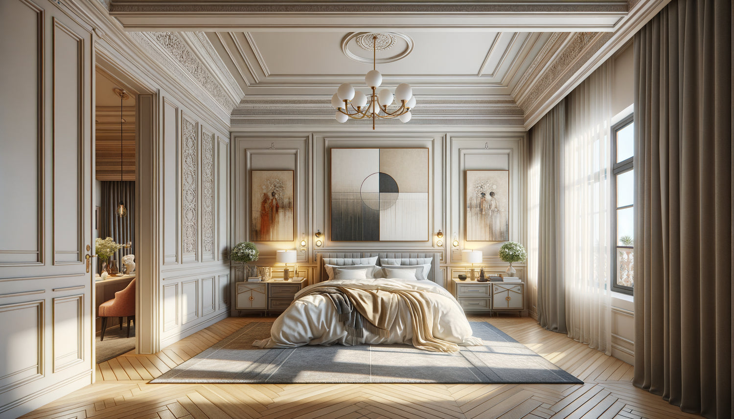
Each architectural style has a distinct visual personality. A Haussmannian bedroom breathes through its high ceilings, sculpted moldings, and herringbone parquet flooring. It naturally calls for framed paintings with structured dimensions and vertical proportions that echo this majestic verticality. I restored an apartment on Avenue Foch where we installed a series of romantic portraits in gold leaf frames – the effect was strikingly perfect.
Conversely, a loft with exposed beams and brick walls requires a radically different approach. Industrial architecture tolerates – no, it demands – XXL formats, raw works, metal frames or even the absence of a frame. The painting then becomes a contemporary counterpoint to the roughness of the materials.
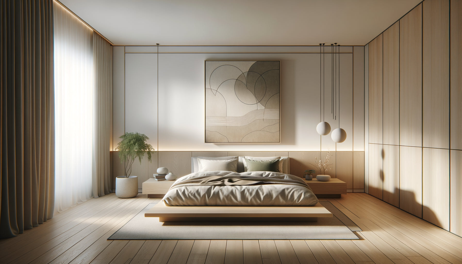
A minimalist contemporary bedroom, with its clean lines and smooth surfaces, finds its balance in graphic works, geometric compositions or black and white photographs with precise framing. Architectural simplicity demands visual sophistication.
Proportions: this invisible law that changes everything
I developed a simple rule after correcting hundreds of sizing errors: a painting should occupy between 60% and 75% of the width of the furniture it surmounts, or create a visual ensemble that respects this proportion. In a bedroom with imposing moldings, a small 40x50 cm painting seems lost, swallowed by the architectural grandeur.
Ceiling height also dictates your choices. With ceilings of 3.20 meters typical of old apartments, prioritize vertical formats or triptychs that create an upward movement. They naturally accompany the elevation of the space rather than contradicting it.
In a bedroom under eaves with marked roof slopes, I have learned to play with horizontal formats that counterbalance architectural diagonals. This visual compensation soothes the eye and creates a sense of balance where architecture imposes dynamism.
The dialogue of materials
A detail I systematically observe: the materials present in your architecture must be reflected in your choice of painting. A bedroom with light oak paneling will call for natural wood frames rather than lacquered black frames. Material harmony creates a visceral coherence that the brain perceives instinctively.
In a room with brushed metal and glass finishes, I installed photographs framed with matte aluminum – the painting became a natural extension of the architecture rather than an added element.

The color palette inscribed in the walls
Here is a truth that I took years to integrate: your architecture already has a dominant color palette. The warm tones of cut stone, the cool grays of polished concrete, the off-whites of old plaster – these architectural colors must guide your painting selection.
I apply the rule of thirds: 70% of colors in harmony with the architecture, 20% of complementary shades, 10% of contrasting touches to create dynamism. In a bedroom with beige walls and warm paneling, a painting dominated by ochre, sienna earth and deep blue accents will create this visual richness without brutal disruption.
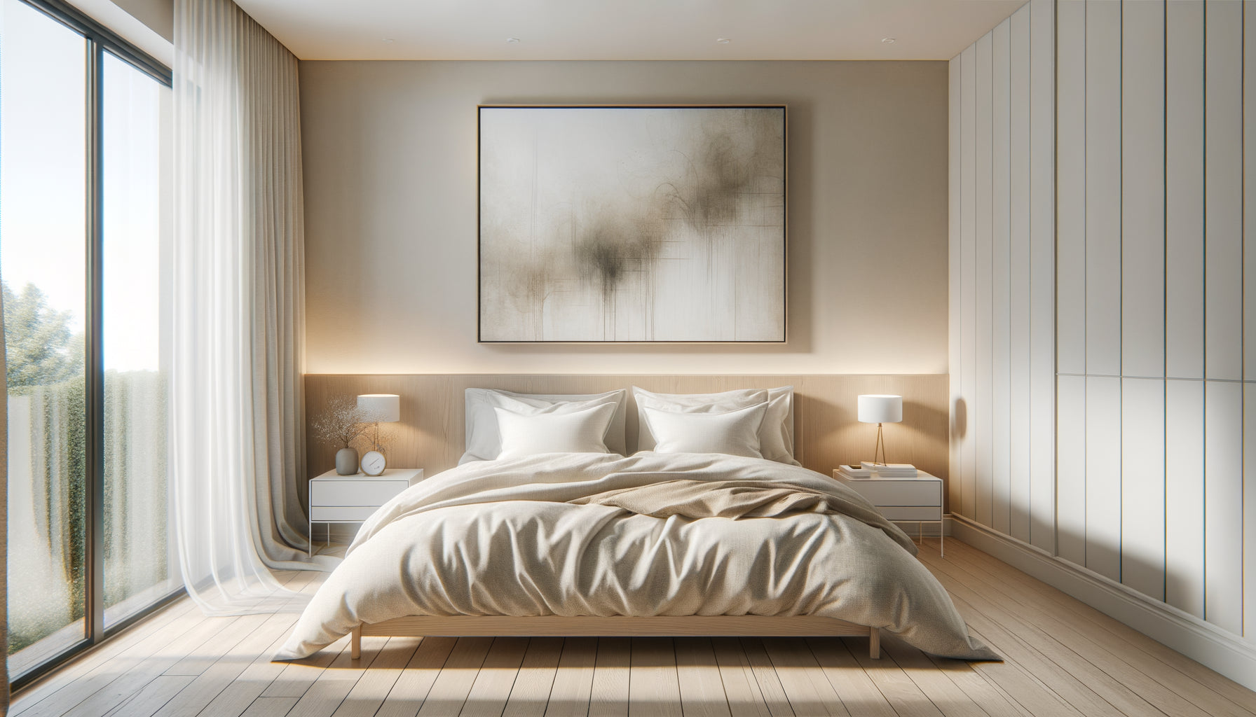
Conversely, in a Scandinavian space with immaculate white walls and light parquet flooring, a pastel or watercolor painting extends the architectural softness. I have seen bedrooms transformed by a simple triptych in shades of powdered rose, pearl gray and sky blue.
When historical style meets contemporary art
A recurring question in my consultations: can you install a contemporary painting in a classic architecture? My answer is always the same: absolutely, provided certain transition principles are respected.
In a Haussmannian apartment, I hung a contemporary abstraction with muted tones and a vertical format framed in a traditional gold frame. The contrast worked because the format and the frame dialogued with the architecture while the content brought modernity. It is this subtle negotiation between respect and boldness that creates memorable interiors.
For a Provençal bedroom with exposed stone walls, a black and white photographic artwork of modern architecture can create a fascinating temporal bridge – the patina of the old stones dialogues with contemporary geometry.
Mistakes that break the harmony
I have developed a mental list of recurring mistakes. A pop art painting with saturated colors in a romantic bedroom with powdery tones. Reproductions of old masters framed with transparent plexiglass in an industrial loft. These dissonances create a stylistic confusion that prevents the room from finding its identity.
Disordered accumulation represents another frequent mistake. In a bedroom with already ornate architectural moldings, multiplying paintings of different styles creates a visually exhausting saturation. The rule: the more ornate the architecture, the more streamlined your painting selection should be.

Architectural lighting as a revealer
An often overlooked aspect: your type of natural light drastically influences the perception of your painting's colors. A north-facing bedroom receives cold and constant light – prioritize paintings with warm tones that compensate for this coolness.
Conversely, a sun-drenched bedroom can accommodate paintings with cooler shades that will not be dimmed by the abundance of light. I installed a large seascape with deep blues in a Mediterranean bedroom – the intense light revealed nuances invisible in a gallery.
High windows typical of artists' studios create a zenithal lighting that enhances textures. In these spaces, dare to paintings with texture, impasto, reliefs that capture this grazing light.
Transform your bedroom into a cohesive work of art
Discover our exclusive collection of wall art for bedroom that naturally dialogues with every architectural style.
The final staging: hanging according to the architecture
The standard hanging height – 1.60 meter in the center of the painting – does not work in all architectural contexts. In a bedroom with high ceilings, I often hang it 10 to 15 centimeters higher to accompany the elevation of the space. The painting breathes, participates in the verticality instead of seeming crushed.
Above a bed, the rule changes: 15 to 25 centimeters above the mattress creates a visual connection without risk of physical shock. In a bedroom with low beams, I lower the hanging slightly to create harmony with the pronounced horizontality.
For a multiple wall composition, I mentally trace a grid aligned with existing architectural elements: moldings, window outlines, cornices. This discipline creates a coherence that soothes the eye even in asymmetrical compositions.
Visualize your architectural transformation
Imagine yourself entering your bedroom tomorrow morning. The light caresses this painting which seems to have always belonged to this space. The proportions are right, the colors naturally dialogue with your walls, the style respects the architectural soul of the room. This feeling of evidence, of absolute correctness, is exactly what a painting adapted to its architecture produces.
You no longer think « I hung a painting ». You feel « my bedroom has found its balance ». This subtle difference transforms a functional space into a personal sanctuary.
Start today: photograph your bedroom, identify its architectural style, note its dominant materials and color palette. This information is your compass for choosing the painting that will not decorate your bedroom, but reveal it.
Frequently asked questions about adapting paintings to architecture
Can we mix different styles of paintings in the same architectural bedroom?
Yes, but with a golden rule: maintain a unifying constant. This can be the format (all in portrait orientation), the frame (same finish for all), or the color palette (similar dominant colors). In a Haussmannian bedroom, I composed a gallery wall mixing photography, watercolor and engraving – but they all shared golden frames and sepia tones. This formal consistency allowed stylistic diversity without visual chaos. Classical architecture better tolerates this mix than minimalist architecture, which generally requires more uniformity. Limit yourself to a maximum of three styles and ensure that at least 60% of your paintings respect the architectural language of the room.
How to choose a painting for a bedroom with neutral and contemporary architecture?
Neutral architecture paradoxically represents the most exciting challenge: you have total freedom to create a visual identity. In these spaces with white walls and clean lines, the painting becomes the main architectural element. I recommend starting from your emotions rather than strict rules. Do you want to create a soothing atmosphere? Opt for abstract landscapes in soft tones. Are you looking for dynamism? A large format colorful artwork with marked contrasts. The key: choose a painting imposing enough to become the focal point – in a neutral space, visual timidity turns into blandness. A minimum size of 80x100 cm for a wall 3 meters wide. Neutral architecture offers you a blank page: write your story with boldness.
Should framed or unframed paintings be favored depending on the architecture?
The frame is an essential architectural mediator. Classical and traditional architectures generally require structured frames – they create a respectful transition between the artwork and existing moldings, cornices or paneling. A gold leaf frame, a patinated wood frame or a stuccoed frame extend the ornamental language of the space. Conversely, industrial architectures, lofts and minimalist spaces perfectly accommodate canvases without frames or with discreet metal frames. In a loft with exposed IPN beams, a canvas stretched on a thick chassis exposes its painted edges – this material frankness dialogues with the constructive sincerity of the space. For contemporary architecture, American box frames (space between canvas and frame) create modern elegance. Observe your baseboards and doors: their treatment (molded or flush) indicates the appropriate level of framing structure.