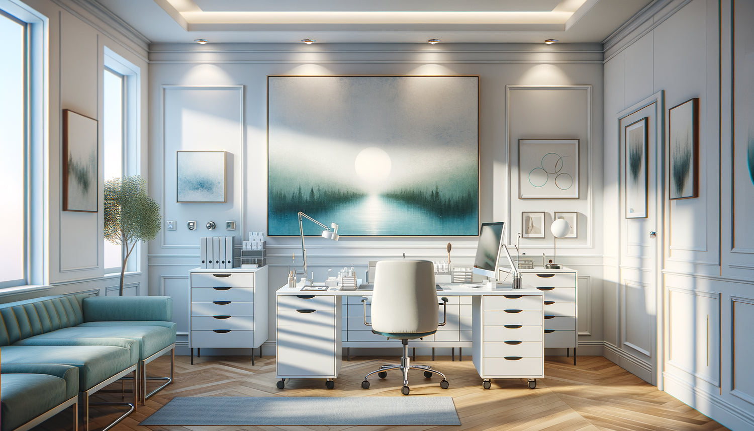
During my last consultation at a medical practice, I observed a patient looking up at the wall above the practitioner’s desk. Their gaze immediately softened. It wasn't by chance: a panoramic artwork depicting a misty forest occupied the space with remarkable precision. This scene reminded me how much choosing the right format for an artwork can transform the ambiance of a medical office.
Here's what a well-chosen artwork format for the space above a doctor’s desk brings: it visually structures the consultation by creating a soothing focal point, it establishes a spatial hierarchy that positions the practitioner in a reassuring professional environment, and it directly influences the perception of waiting time and the quality of interaction.
Frustration is nonetheless common: too many practitioners install an artwork that is too small to be seen on the wall, or conversely, a format that is too large which overwhelms the space and creates a feeling of oppression. The patient finds themselves facing a visual imbalance that, even unconsciously, generates additional tension.
Rest assured: a few simple principles allow you to choose the ideal format. The space above a doctor’s desk adheres to specific rules of harmony, derived from observing hundreds of medical offices where visual comfort directly contributes to the quality of care.
I propose that you discover how to select the perfect artwork format for this strategic space, taking into account the dimensions of the desk, ceiling height, and above all, the experience you want to offer your patients.
The rule of two-thirds: the mathematical harmony of the format
In the layout of a medical office, the format of the artwork above the desk adheres to a golden rule: it should occupy approximately two-thirds of the width of the desk. This proportion creates a natural visual balance that anchors the furniture in its environment.
For a standard desk from 120 to 140 cm wide, prioritize an artwork format between 80 and 100 cm wide. This dimension allows the artwork to dialogue with the desk without dominating it or disappearing. The patient, sitting facing the practitioner, then perceives a harmonious composition where each element finds its place.
The height of the artwork also deserves careful attention. A horizontal rectangular format, with an approximate ratio of 3:2 or 4:3, perfectly adapts to the space above the doctor’s desk. These proportions avoid the “postcard” effect of overly square formats and the excessive stretching of ultra-wide panoramas.
The frequent mistake of the square format
The square format, often chosen for its contemporary character, poses a problem in this space. Above a rectangular desk, it creates a visual break: the patient perceives two contradictory geometric shapes competing with each other. Result? A diffuse feeling of instability that undermines the atmosphere of trust sought.
When High Ceilings Dictate Vertical Format
Not all medical practices benefit from the same volumes. In spaces with high ceilings, typical of renovated old buildings, the format of the artwork must adapt. A ceiling reaching more than 3 meters allows, or even recommends, a more vertical format.
For these configurations, an 80 cm wide by 100 cm high painting creates a reassuring presence. This vertical format draws the eye upwards, giving a sense of elevation that counterbalances the imposing nature of the volume. The space above the doctor's desk then becomes a visual anchor point that humanizes the room.
Conversely, in practices with standard ceilings (2.40 to 2.60 m), a format that is too vertical visually overwhelms the space. A feeling of confinement sets in, exactly what you should avoid in a place of care. Opt for a classic horizontal format of 90 x 60 cm, which respects the proportions of the room.

The Triptych: When Three Formats Are Better Than One
A seductive alternative to a single painting: the triptych. This composition of three identical format paintings, arranged horizontally above the desk, offers remarkable flexibility. Three 30 x 40 cm panels each, spaced 5 to 8 cm apart, create a total width of approximately 100 cm.
This solution has specific advantages for the space above the doctor's desk. The rhythm created by the intervals between the paintings captures attention without imposing a single image. The patient can let their gaze wander, which facilitates relaxation during potentially anxious consultations.
The triptych also allows you to tell a visual story: a landscape that unfolds, a chromatic progression, or three variations on an abstract medical theme. This silent narration enriches the patient experience without weighing down the space.
Asymmetrical Composition for Corner Offices
In some configurations, the doctor's office is located in a corner. The format of the artwork must then adapt to this particular geometry. A composition of two paintings with slightly different formats – for example 70 x 50 cm and 50 x 40 cm – creates a dynamic balance that accompanies the angular arrangement of the furniture.
Panoramic Format: Calmness Through Horizontality
The panoramic format, characterized by a width/height ratio greater than 2:1, deserves particular attention for the space above the doctor's desk. A painting of 120 x 40 cm, for example, creates a feeling of openness and calm.
This pronounced horizontality subconsciously recalls the horizon line, a natural element universally soothing. For medical specialties generating stress – cardiology, oncology, diagnostic announcements – this format helps to lower the emotional tension of the consultation.
However, be careful: the panoramic format requires sufficient space. On a desk less than 120 cm wide, it visually overflows and loses its beneficial effect. Reserve this format for generous offices, at least 140 cm wide, where it can deploy all its soothing power.
The choice of subject represented amplifies the effect of the panoramic format. Marine landscapes, lavender fields, or forests in perspective flourish in this proportion, creating a visual window that mentally expands the space of the office.

Viewing distance: the format adapted to ergonomics
A parameter often neglected when choosing the format of the painting for the space above the doctor's desk: the distance between the patient and the artwork. This distance directly determines visual readability and emotional impact.
In a standard medical office, the patient sits approximately 1.50 to 2 meters from the wall where the painting is located. At this distance, a format of 80 x 60 cm offers optimal readability: large enough to be appreciated without effort, contained enough to be embraced with a single glance.
Formats that are too imposing – over 120 cm wide – force the eye to make lateral movements to grasp the entire composition. This visual activation, far from being relaxing, generates micro-eye fatigue which contradicts the goal of soothing.
Conversely, a format that is too modest – less than 60 cm – becomes an anecdotal decorative element. The patient must focus their attention to distinguish the details, which creates an involuntary concentration, not very compatible with relaxation.
The peripheral vision test
Here's a simple test: sitting in the patient's usual place, the painting should be entirely visible within your peripheral field of vision, without head movement. If you have to turn your head to see the ends, the format is excessive for this specific space.
Modular formats: evolving with your practice
Medical practice evolves, and the space above a doctor’s desk can follow these transformations. Modular formats – compositions of several identical-sized artworks that can be rearranged – offer this flexibility.
Four small 40 x 40 cm artworks arranged in a 2x2 grid create an ensemble measuring 90 x 90 cm. This configuration can be modified into a horizontal line (180 x 40 cm) according to the office’s rearrangements, changes in furniture, or simply the desire for renewal.
This modular approach offers a psychological advantage for the practitioner: it allows them to regularly refresh the visual environment without major investment. A subtly evolving practice room testifies to a living practice, attentive to its care setting.
Transform the patient experience from their very first glance
Discover our exclusive collection of art for medical offices that combines perfectly calibrated formats and soothing subjects, specifically designed for the space above your desk.
Does the ideal format really exist?
After exploring proportions, configurations, and adaptations, one question remains: does a universal format exist for the space above a doctor’s desk?
The answer lies in observing your own space. Measure the width of your desk, assess the available height to the ceiling, note the patient-wall distance. Then apply the two-thirds rule in width, and choose a height that keeps the artwork in the upper third of the wall.
Now visualize your practice room with this perfectly sized artwork. During the next consultation, your patient looks up for a fraction of a second. Their gaze meets a work whose proportions naturally dialogue with the space. This silent harmony they will never formulate, but it will contribute to that diffuse feeling of trust that underlies the therapeutic relationship.
The format of an artwork for the space above a doctor’s desk is not just an aesthetic issue: it is an indirect care tool, an attention paid to the setting that welcomes words and vulnerability. Take the time to make this choice; it will resonate in every consultation to come.
FAQ: Your questions about artwork format above a medical desk
Can I install several small artworks rather than one large one?
Absolutely, and it’s even an excellent option for the space above the doctor's desk. A composition of 2 to 4 paintings of identical size creates an interesting visual rhythm. The important thing is to respect the overall rule: the entire set of paintings, spaces included, should occupy about two-thirds of the width of the desk. Space the paintings 5 to 10 cm apart to allow the eye to circulate. This solution also offers more flexibility: you can change the layout or replace an element without changing everything. For a 130 cm desk, three 35 x 45 cm paintings spaced 8 cm apart create a set of 114 cm, perfectly proportioned.
My desk is in a corner, how do I choose the format?
A desk positioned in a corner presents a particular configuration for choosing the painting format. You have two main options: either center a single painting of classic size (80 x 60 cm) on the main wall behind you, ignoring the corner; or create an asymmetrical composition with two paintings of complementary sizes that follow the two walls. For example, a 70 x 50 cm painting on the main wall and a smaller one of 40 x 50 cm on the secondary wall, creating visual continuity. Avoid positioning a painting exactly in the corner: this creates visual tension. Favor a displacement of at least 20 cm from each side of the corner to respect the geometry of the space.
What height between the desk and the bottom of the painting?
The height of positioning the painting above the doctor's desk directly influences its visual impact. The standard rule recommends a space of 15 to 25 cm between the desk top and the lower edge of the painting. This distance allows you to place objects on the desk (lamp, computer, photo frames) without creating a visual clutter with the painting. If your desk is 75 cm high and you install a 60 cm high painting with 20 cm of space, the center of the painting will be approximately 1.35 m from the floor, an ideal height for the view of a seated person. Avoid sticking the painting to the desk: this creates a visual confusion where table and furniture merge. The breathing space between the two elements visually structures the composition and enhances each element.