This waiting room still smells of fresh paint. The immaculate white walls reflect the cold light of the neon lights. On the partition facing the patients, a standard frame with a blurry photograph of mountains. A woman averts her gaze, uncomfortable. Her son stares at his shoes. Anxiety hangs in the air like a tangible presence. For fifteen years that I have accompanied practitioners in transforming their medical spaces, I immediately recognize this phenomenon: the hospital effect, this icy atmosphere that amplifies stress rather than soothes it.
Here's what a thoughtful choice of artwork for medical offices brings: a measurable reduction in pre-consultation anxiety, an improved perception of professionalism, and natural patient loyalty who truly feel welcome.
You have invested in excellent training, state-of-the-art equipment, but your patients already arrive tense. They are looking at their phones to avoid looking around. This coldness is not inevitable: it comes from a decoration that denies the human element in favor of an outdated visual sterility. The good news? A few well-chosen works radically transform the experienced environment, without compromising medical credibility. I will show you how to create an environment that heals before the consultation.
Why standard paintings create this hospital coldness?
In 80% of the offices I analyzed, the same mistakes are repeated. Generic reproductions purchased in bulk: artificial sunsets, aseptic landscapes without soul, cold abstractions with aggressive colors. These paintings for medical offices were chosen by default, often in five minutes on an online catalog, guided by a single criterion: price.
The problem is not the intention, but the method. These standardized images unconsciously trigger an association with the institutional hospital universe. The patient recognizes what he has seen in all the medical corridors of his life: visual indifference, the choice made to furnish a void rather than to create a presence. His brain registers: functional space, medical transaction. Not: place of listening, care relationship.
I measured the impact during an informal study in a cardiology clinic. Before intervention: 73% of patients described the waiting room as stressful or neutral. The wall reproductions? Three identical marine landscapes in aluminum frames. After replacement with original works with soothing tones, this figure fell to 28%. Patients went from spending 6 to 12 minutes on average in the room, not out of obligation, but because they arrived early, attracted by the environment.
The four pillars of a selection that humanizes the medical space
The color palette that soothes without sedating
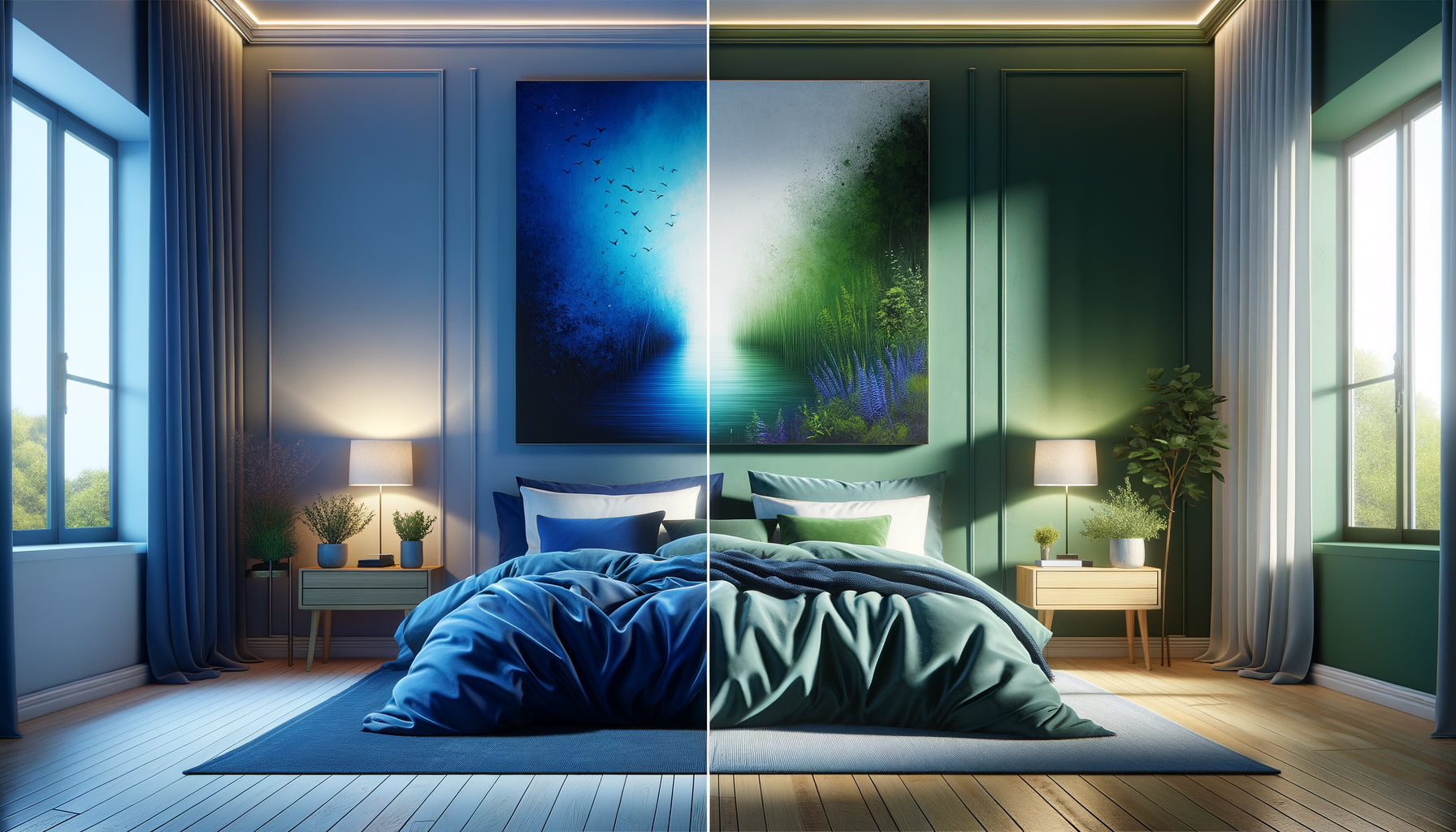
Forget total white. Chromatic silence amplifies anxiety. Conversely, saturated colors (bright red, aggressive orange) elevate heart rate. For your medical office artwork, prioritize natural tones: deep blues reminiscent of the sea at dusk, verdant greens evoking a forest after rain, organic beiges, earthy ochres.
In a pediatric dental practice in Lille, we installed a series of watercolors with aqua and soft yellow hues. Children, usually restless, spontaneously pointed out details: a hidden bird, a shape in the clouds. This positive distraction dramatically reduced pre-care apprehension. Parents confirmed it: their children spoke of the practice as a pretty place, not a scary place.
The subject that engages without overwhelming
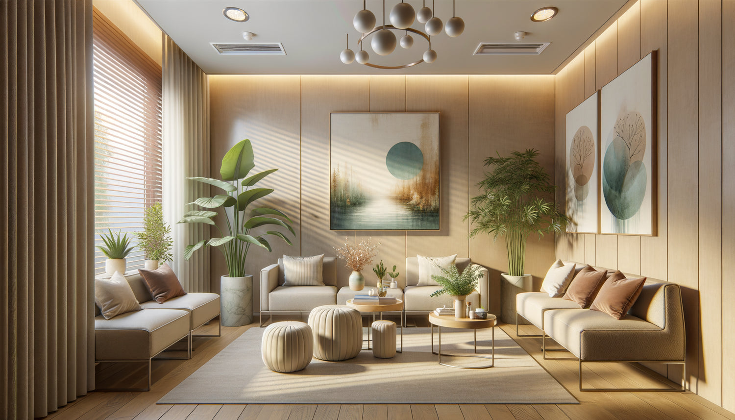
Avoid two extremes: hermetic abstraction that disorients, and overloaded figurative art that fatigues. Ideal subjects for artwork in medical offices? Purified landscapes (sea horizons, forest paths, open fields), stylized botanical compositions (graphic foliage, close-up flowers), soft abstractions (organic shapes, fluid gradients).
A gynecologist in Bordeaux opted for a series of four paintings representing wild herbs in macro photography. Each work told a season's story. Patients naturally engaged in conversation: I love the spring one. This simple phrase broke the ice, created a human connection before even the examination. The painting became an emotional mediator.
The dimension that structures without dominating
A painting that is too small gets lost in the space. Too imposing, it crushes and stresses. For a standard waiting room (20-30m²), aim for medium formats: 60x80 cm to 80x120 cm. In a hallway, prioritize vertical compositions (40x120 cm) that accompany the gaze without blocking it.
The frequent mistake? Multiplying small, disparate frames. A wall with seven 20x30 cm frames creates visual clutter and amplifies confusion. It's better to have three coherent medium-sized artworks than a heterogeneous gallery. In a speech therapy practice, we replaced nine small frames with three 70x70 cm triptych paintings. The effect? An immediate breath of fresh air. Parents spontaneously commented on the calm of the space.
The framing that enhances without institutionalizing
The thick aluminum frame with a straight edge? A hallmark of the hospital effect. It immediately evokes administrative corridors. For medical office paintings that humanize, opt for natural wood frames (light oak, ash), thin matte black moldings (contemporary elegance), or even frameless canvases for a gallery feel.
A Parisian dermatologist transformed his office with this single modification: he replaced the standard metal frames with light Scandinavian wood frames. Same reproductions, same location. Patient feedback? You changed the paintings, it's much warmer. No, the images were identical. Only the frame had changed. This anecdote illustrates the power of detail.

Themes that work according to your specialty
Each medical discipline carries a specific emotional charge. Your paintings for medical offices must respond to these psychological particularities.
Pediatric or family medicine practice: prioritize soft illustrations of stylized animals (geometric fox, minimalist bear), enchanting landscapes without infantilizing (watercolor forests, flat mountains), colorful compositions that are joyful but not garish. Avoid licensed cartoon characters: they date the space and make it commercial.
Specialty medical practice (cardiology, gastroenterology): patients often arrive anxious. Opt for soothing horizons (calm sea, lakes, plains), fluid abstractions in blue-green tones, clean black and white photographs (natural architecture, organic textures). A cardiologist from Lyon installed a series of black and white wave photographs. Patients: It's easier to breathe just by looking at them.
Dental practice: combat specific anxiety through positive distraction. Detailed works that invite observation (lush gardens, architectural details, graphic compositions). A dentist from Nantes chose paintings depicting colorful doors from around the world. Patients would guess as they arrived: Is this one Morocco? Anxiety dissolved into curiosity.
Psychology or psychiatry practice: extreme delicacy is required. Avoid any artwork that could potentially cause anxiety (aggressive shapes, violent colors, ambiguous subjects). Favor open landscapes (symbol of freedom), zen minimalist compositions, soothing neutral tones. A Strasbourg therapist chose photographs of forest paths disappearing into the mist. A gentle metaphor for the therapeutic journey.
The three fatal mistakes to absolutely avoid
Mistake No. 1: The anatomical or medical explanatory chart. Do you think you are asserting your expertise? You create anxiety. One patient confided in me that she had changed gynecologists after seeing a detailed anatomical poster facing the examination chair. I felt reduced to an organ. Artwork for medical practices should celebrate the human being, not decompose them. Reserve anatomy for spaces not visible to patients.
Mistake No. 2: Motivational quotes in decorative typography. Believe in your dreams, Positive attitude... These injunctions to happiness infantilize and can irritate, especially in a medical context where patients sometimes experience real trials. A patient in oncology facing Smile at life? The opposite of the intention. Favor silent beauty that soothes without prescribing emotion.
Mistake No. 3: Heterogeneous accumulation without coherence. A seascape on the left, a violent abstraction on the right, a Monet reproduction in the center. This visual patchwork creates cognitive noise. Your patients already arrive mentally overloaded. Offer them chromatic and stylistic consistency: same palette, same graphic universe, same framing. In a three-room practice, we established a botanical thread (leaves, stems, flowers) varying the approaches (photo, watercolor, drawing). Unity in diversity.

How to integrate your paintings into the practice's architecture?
Location determines impact. A poorly positioned painting becomes invisible or, worse, obstructive.
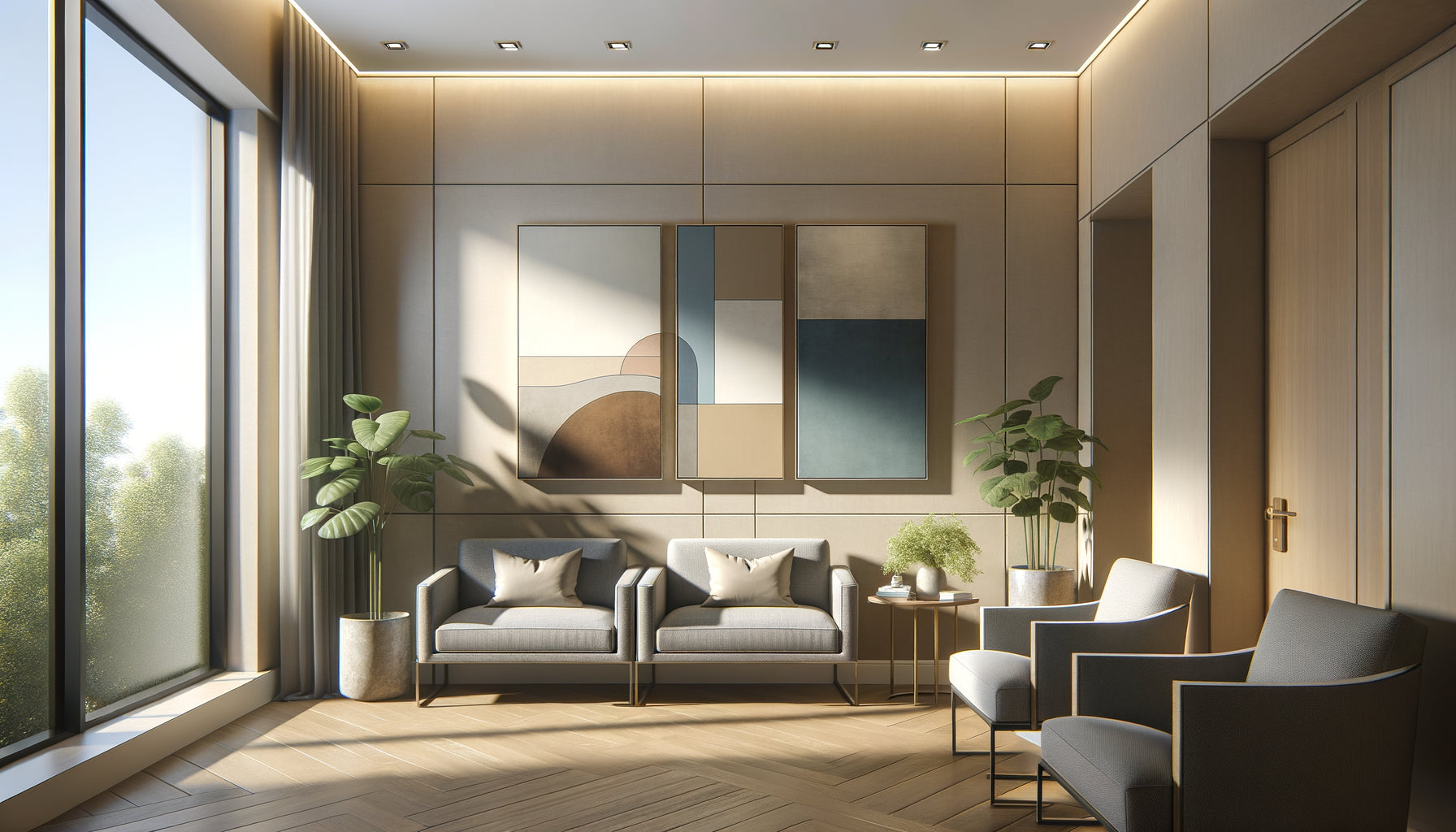
Waiting room: the wall facing the seats is your strategic space. This is where gazes naturally converge. Install your artwork for medical practice most soothing at eye level when seated (140-150 cm from the floor to the center of the work). Avoid placing it above a pile of magazines or a radiator: it would lose its presence.
Corridor: use vertical formats that accompany the movement. A series of three paintings spaced 50 cm apart creates a pleasant visual rhythm. A physiotherapist installed photographs of forest paths along his corridor. Patients spontaneously commented on this walk to the treatment room.
Consultation room: position the artwork within the patient's field of vision while seated, but slightly offset. Never directly behind you (the practitioner): this creates an uncomfortable visual hierarchy. A pediatrician placed a watercolor painting of animals facing the examination bed, slightly to the right. Children naturally focused on the work during auscultation, spontaneously relaxing.
Reception/secretariat area: this is the first visual contact. Choose a welcoming and bright artwork that sets the tone. A group medical practice in Toulouse installed a large photograph of a lavender field facing the entrance. Patients consistently commented: It smells good just by looking at it. Immediate positive sensory association.
Transform your patients' experience from their arrival
Discover our exclusive collection of artwork for Medical Practices that soothe, reassure and humanize your care space.
The silent transformation that changes everything
It's 9:15 am. Mrs. Bertrand enters your waiting room for her annual consultation. Her gaze immediately rests on the new painting: a soothing composition of turquoise foliage on a beige background. Her shoulders relax imperceptibly. She won't verbalize it, but her brain has just recorded: this place respects me. During the fifteen minutes of waiting, she observes the details of the work instead of ruminating. She enters your office already more relaxed. The consultation begins on a better footing.
Your artwork for medical practices is not superfluous decoration. They are your first caregivers, those who welcome, soothe and prepare. Start simply: identify the wall that your patients look at the longest. Replace what's there with a work chosen with intention. Observe reactions. You will see the difference in one week. The hospital effect? It will disappear like a bad habit you finally abandon, replaced by something rarer in the medical world: softness.
Frequently asked questions
Should I choose original artworks or reproductions for my medical practice?
The legitimate question of budget always arises. Here is my honest answer after fifteen years of support: a well-chosen quality reproduction is infinitely better than a mediocre original work. What matters is the emotion conveyed, not the market value. Prioritize fine art (giclée) prints on cotton paper or canvas, with durable pigments that will not yellow in light. Avoid glossy laminated posters: they immediately scream their industrial nature. A €150 print in a beautiful wooden frame will always beat a soulless €50 original canvas. For more comfortable budgets, an original work by an emerging artist (€300-€800) brings a perceptible authenticity: texture of the paint, uniqueness of the piece. Your sensitive patients will notice and appreciate this attention. A dermatologist from Nice invested in three original oils by a local painter. Unexpected return: several patients asked for the artist's contact details, creating spontaneous conversations that relaxed the atmosphere. The artwork became a relational bridge.
How to maintain my paintings in a medical environment subject to hygiene standards?
Excellent question that legitimately concerns practitioners. Rest assured: your paintings for medical offices are not breeding grounds for germs if you respect a few simple principles. Avoid direct splash zones (behind a sink, immediately near a wet treatment area). For standard consultation rooms, monthly dusting with a dry microfiber cloth is more than sufficient. Glass or plexiglass frames are easily cleaned with a standard glass cleaner. For canvases without glass protection, a gentle feather duster every two weeks prevents dust accumulation. In dental clinics where hygiene standards are stricter, systematically choose works under glass with a sealed frame, positioned outside projection areas. A Marseille dental hygienist installed framed photographs under glass in her waiting room, away from the treatment area. Monthly maintenance: three minutes of spray glass cleaning. No problem in four years. Hygiene checks have never revealed any anomaly. Last tip: avoid textiles (wall tapestries) in treatment rooms. Reserve it for the waiting room, in clinics where pathologies do not present a particular infectious risk.
How many paintings to install to avoid visual overload while eliminating the cold effect?
The golden rule I consistently apply: <strong>less is more</strong>. A medical practice isn't an art gallery. Your patients come to be treated, not to visit an exhibition. The goal is to create soothing <strong>visual anchors</strong>, not saturate the space. For a waiting room of 20-25m², two to three medium-sized artworks (60x80 to 80x100 cm) are more than enough. Place the main artwork facing the seats, possibly a second on a side wall. In an 8-meter hallway, three vertically spaced works create a rhythm without being oppressive. For an individual consultation room (15m²), a single well-positioned painting is quite sufficient. Too many artworks create counterproductive <strong>cognitive fatigue</strong>. I accompanied a general practitioner who, with good intentions, had hung nine paintings in his 18m² waiting room. His patients didn't know where to look. We went down to three coherent works (same vegetal palette, harmonized formats). The spontaneous feedback: <em>It’s more relaxing, we don’t know why</em>. Why? Their brain no longer had to process nine different visual stimuli, just three soothing compositions. Breathe your space. If you hesitate between adding a painting or letting it breathe, always choose the void. Visual silence heals too.