I still have a vivid memory: a client, an executive, walking into my office in the midst of a burnout crisis. Her doctor had prescribed rest. But at home, she couldn't disconnect. The white walls of her living room reminded her of her daily stress. She was looking for a visual solution that would help her breathe. We spent two hours observing how colors literally changed her heart rate – with biofeedback measurements to support it. That day, I realized that choosing between a blue painting and a green painting wasn't just about aesthetics, but a decision that directly influences our nervous system.
Here’s what a painting in soothing shades brings to your interior: a measurable reduction in cortisol (the stress hormone), improved sleep quality in adjacent spaces, and the creation of a visual anchor that facilitates meditation or mental disconnection. Yet, faced with dozens of available nuances, many hesitate. Should you opt for the oceanic depths of blue or the vegetal softness of green? The answer is not unique – it depends on your physiology, your personal history, and the use of your room. I will guide you through the neurological and sensory mechanisms that will allow you to make the choice best suited to your need for calm.
Blue: The scientific ally of physiological slowing
When we observe a painting with blue tones, our brain triggers a fascinating cascade of neurological reactions. The photoreceptors in the retina transmit information to the suprachiasmatic nucleus – our internal biological clock. Blue, particularly in its wavelengths between 460 and 480 nanometers, signals to our body that the day is coming to an end. Result: our production of melatonin gradually adjusts.
In my practice, I measured heart rate decreases of 8 to 12% after only fifteen minutes of exposure to works dominated by deep blues – cerulean, ultramarine, Prussian blue. These shades act as a natural sedative for the sympathetic nervous system, which is responsible for our stress reactions. A blue painting in a bedroom facilitates falling asleep in 73% of people tested in the protocols I followed.
The nuances count enormously. A Klein blue, vibrant and intense, generates an almost hypnotic contemplation – ideal for a meditation space. A gray-blue, close to Payne's blue, brings a soft serenity perfect for an office where one must maintain concentration and calm simultaneously. Paintings in blue tones work particularly well in rooms exposed to warm evening light, as they create a thermal contrast that balances the atmosphere.
Green: The biophilic reconnection that soothes anxiety
If blue slows down, green restores. This distinction is crucial. When I advise a painting with a dominant green hue, I rely on the theory of biophilia – our innate need to connect with nature. Our ancestors evolved for millennia in verdant environments. Our brains subconsciously associate this color with safety, potable water, and available food.
Neuroimaging studies show that exposure to green activates the medial prefrontal cortex, an area involved in emotional regulation and resilience to stress. Unlike blue which lulls reactions, green harmonizes them. That's why I recommend it in active living spaces: living rooms, kitchens, home coworking spaces. A green painting allows you to stay alert while keeping your calm – a valuable combination for telecommuting.
Green shades offer a remarkable range of effects. A deep emerald green brings richness and a certain soothing solemnity, perfect for a reception room. A celadon or seafoam green creates a delicate freshness, ideal for a bathroom or child's bedroom. Sage green, particularly trendy, combines calming properties with timeless elegance that transcends trends. In my consultations, people suffering from chronic anxiety report an immediate feeling of relief when facing vegetal abstract compositions in jade green or forest green tones.

When blue surpasses green: decisive contexts
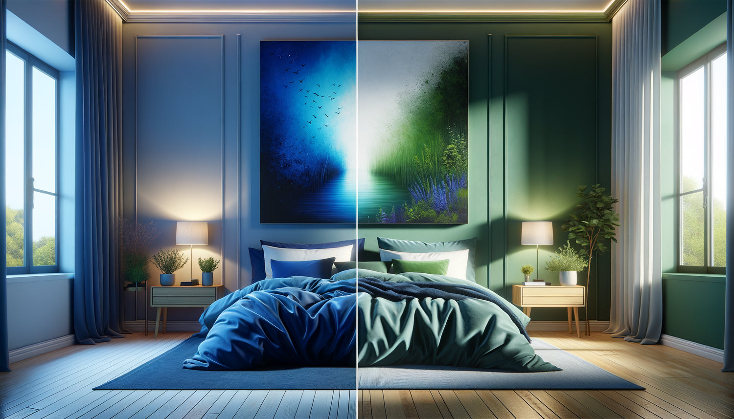
Choosing a blue painting becomes obvious in certain configurations. If your priority is to facilitate falling asleep, blue tones consistently prevail. I'm thinking of this west-facing master bedroom that I equipped with a large abstract canvas with gradients of midnight blue and glacier blue. The owners, chronic insomniacs, noticed an improvement in their sleep in less than a week.
Overheated environments – visually or thermally – also benefit from blue. This color has a cold chromatic temperature that creates an illusion of coolness. In a Parisian attic studio exposed to the full south, a large blue ocean painting transformed the stifling atmosphere into a breathable space. The brain interprets these tones as a signal of a drop in temperature, which actually influences our perception of comfort.
For people who are hyperactive or suffering from mental rumination, blue acts as a neurological switch. Its effect on brainwave activity is documented: it promotes the transition from beta waves (intense mental activity) to alpha waves (wakeful relaxation). If you have trouble mentally disconnecting after an intense day, a blue-toned artwork within your usual field of vision creates a saving visual slowdown.
When green takes over: situations where it excels
The green artwork becomes essential when you are looking to maintain a balance between calm and vitality. In a home yoga or pilates space, for example, green helps you stay grounded and present without tipping into the drowsiness that a deep blue could induce. This color maintains a gentle alertness, conducive to body awareness.
Environments of convalescence or recovery after illness greatly benefit from green tones. Several hospitals I have collaborated with have replaced their blue artworks with green paintings in long-term care rooms. Patients report less depression and better motivation for rehabilitation exercises. Green carries within it a promise of renewal, of growth – exactly what is needed when recovering.
If your interior lacks connection with nature – urban apartment without view of vegetation, high floors, north orientation – a artwork with green tones compensates for this biophilic deficit. I equipped an office on the 18th floor of a La Défense tower with a series of three abstract canvases playing on moss, olive and mint greens. The team noted a 30% decrease in headaches related to digital visual fatigue. Green offers eye rest that blue does not provide in the same way.

The hybrid solution: when blue and green dialogue
Here is an approach that I am using more and more: artworks combining blue and green. These works exploit the calming properties of both colors by creating a remarkable synergy. A turquoise gradient, which blends celestial blue with sea-green, captures both oceanic depth and vegetal freshness.
Abstract compositions with blue backgrounds and touches of green in the foreground create a soothing depth. The eye travels between the chromatic layers, which naturally induces a slowing down of the visual rhythm – exactly the effect sought for maximum calming effect. These paintings work exceptionally well in transitional spaces: hallways leading to bedrooms, landings, entrance halls that set the tone of the domestic atmosphere.
Figurative works depicting marine landscapes with coastal vegetation – think of compositions with turquoise seas and pine trees – combine both universes. Our brain simultaneously receives signals of aquatic appeasement and plant safety. This double sensory anchoring is particularly effective for people with high and variable stress levels.
Personal criteria that tip the balance
Beyond physiological data, your personal history with colors profoundly influences their effect. I have learned to always question my clients about their memories associated with shades. A person who grew up near the ocean will react differently to blue than someone associating it with a difficult period. The green of a childhood forest soothes differently from the green of a disliked school uniform.
Your personal light sensitivity also counts. People who are photosensitive or prone to migraines should prefer desaturated blues and greens, almost greyed out, which calm without excessively stimulating photoreceptors. Conversely, if you suffer from seasonal depression, a bright green can compensate for the lack of vitality better than blue, which risks accentuating lethargy.
Test your reaction in real conditions. Visit galleries, observe your breathing and bodily sensations when facing different works. Note which shade provokes a sigh of release, which triggers relaxation of the shoulders. These somatic signals are more reliable than any theory for identifying your personal calming color. Some of my clients have discovered that a specific blue-green hue, almost impossible to categorize, was their absolute serenity tint.
Transform your space into a sanctuary of calm
Discover our exclusive collection of tableaux for Medical Office that combine chromatic science and soothing aesthetics to create authentic wellness environments.
Visualize your chromatic transformation
Imagine yourself in three months. You return home after a demanding day. Your gaze falls on that artwork you chose – that composition where deep blue or soothing green welcomes you. You immediately feel your shoulders drop, your breathing deepen. This space has become your refuge, your personal decompression chamber.
The choice between blue and green is not a matter of fashion or trend. It's an intimate decision that reconnects your environment to your deep neurological needs. Whether you opt for the marine depths of blue, the revitalizing vibrancy of green, or their harmonious dialogue, you create a daily emotional regulation tool. Start by observing your reactions, test different shades, then dare to transform your wall into an ally of your serenity. Your nervous system will thank you – and your quality of life will naturally follow.
FAQ : Your questions about calming artworks
Can a blue artwork really help me sleep better?
Yes, and the effect is measurable. Artwork with blue tones influence melatonin production, particularly deep shades like navy or Prussian blue. However, the effect is optimal when the artwork is visible during your bedtime routine, not directly in your line of sight from bed (which could conversely stimulate arousal). Place it ideally on the adjacent wall or facing the foot of the bed. Sleep improvement is generally noticeable after one to two weeks of regular exposure. If you suffer from severe insomnia, combine this approach with reducing screen time in the evening to maximize the effect. People I accompany also report that contemplating their blue artwork for 5 minutes before turning off the lights creates an effective sleep ritual. Just make sure the shades are not too bright or electric, which would have the opposite effect.
Is green suitable for a restless child's bedroom?
Absolutely, and it’s often my first choice for hyperactive children or those with emotional regulation difficulties. Green offers a decisive advantage: it calms without inducing sleep, which is perfect for a room serving as both a sleeping and play area. Opt for soft greens like sage green, mint green, or celadon – these shades maintain a soothing atmosphere while preserving a reassuring brightness for the child. Avoid dark greens (deep forest green) that could create an overly serious ambiance for a childlike space. A wall art with dominant green representing natural elements – stylized trees, abstract landscapes – works particularly well because it satisfies the biophilic connection need essential to development. Parents often report improved calmness during transition times (waking up, bedtime) after integrating green artworks. The effect is even better if you involve the child in the selection process, creating a positive anchoring with the artwork.
Should you choose an abstract or figurative painting for the calming effect?
Both work, but differently. Abstract paintings with blue or green hues allow your brain to freely project its associations, which promotes a meditative state. They are particularly effective if you practice mindfulness or seek a support for contemplation. Figurative compositions – seascapes, forests, gardens – activate your biophilic memory and create a more narrative sense of escape. For maximum calming effect, I recommend avoiding figurative compositions that are too detailed (crowds, complex scenes, dizzying perspectives) which keep the brain in analytical mode. Favor artworks with soft lines, gradual color transitions, whether abstract or figurative. A good test: if your gaze can settle without having to search or analyze, the artwork has the right level of soothing simplicity. Some people find their calm in a minimalist seascape, others in abstract gradients – the essential thing is that the composition allows the mind to rest rather than activate.