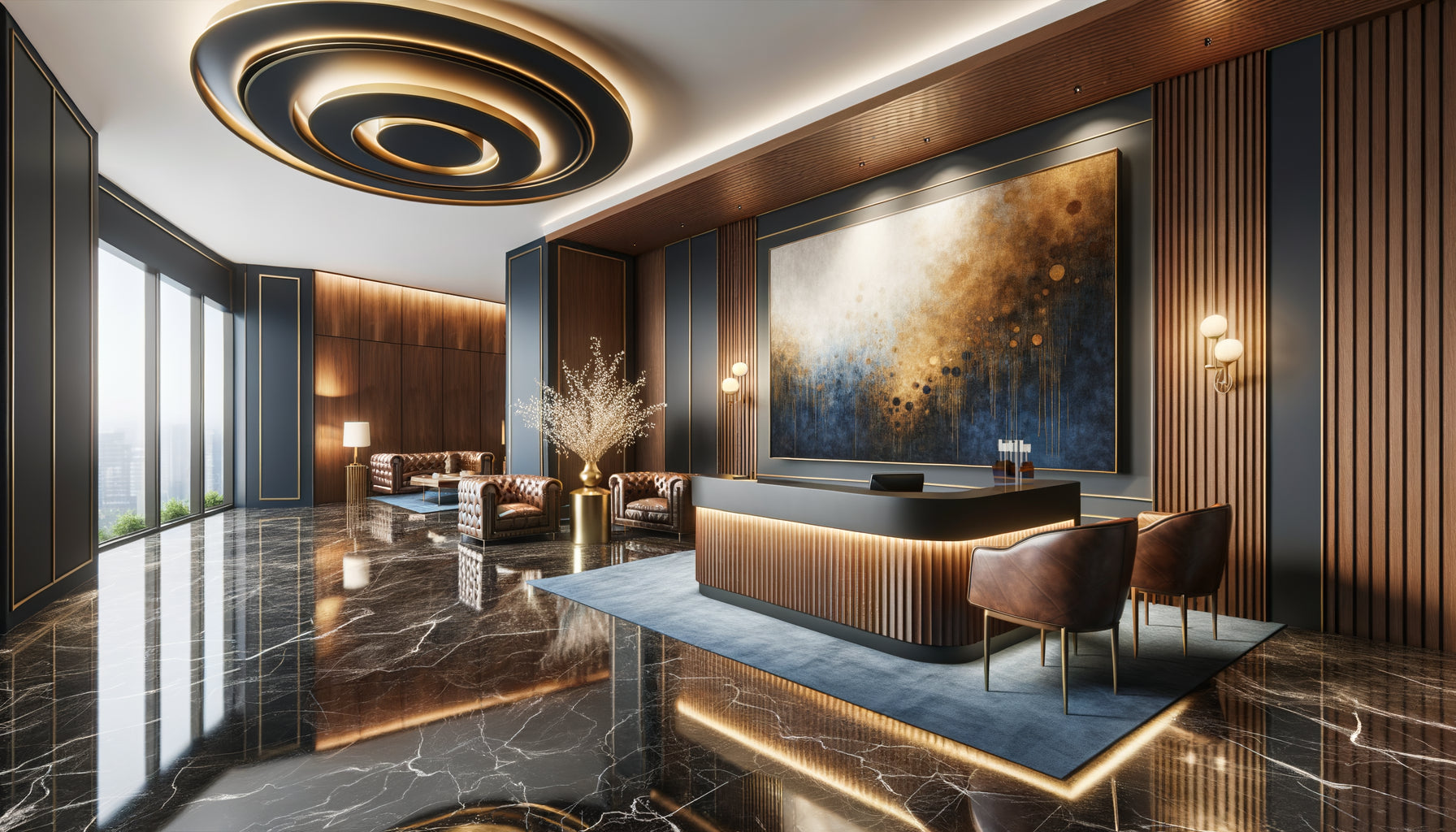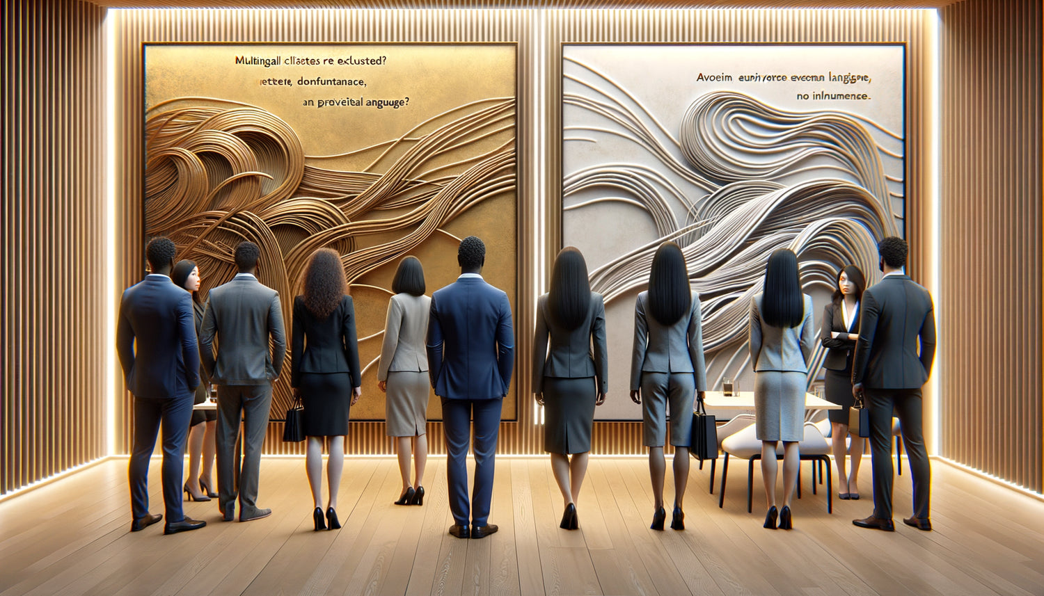
One morning, I received a call from a visibly embarrassed lawyer. Her new international law firm had just opened in Brussels, and the reaction of a Japanese client to a motivational painting in English in the waiting room had deeply marked her. Not that he protested – on the contrary, his polite silence was even more eloquent. This uncomfortable moment revealed a truth that I regularly observe in multicultural professional spaces: works containing written messages inadvertently create barriers where you are precisely trying to build bridges.
Here's what a text-free visual environment brings to your multilingual firm: authentic inclusivity that reassures all your clients, timeless elegance that transcends cultures, and a professional atmosphere where every visitor feels truly considered. These three pillars radically transform the perception of your space and the customer experience from the first seconds.
You may have already felt this tension: how to create an inspiring environment without inadvertently excluding part of your clientele? How to assert your professional identity while respecting the linguistic diversity of your clients? Many firms fall into the trap of motivational quotes or legal maxims in English, thinking they are thus projecting an international image. The result: some clients feel immediately excluded, unable to understand these messages intended to welcome them.
Rest assured: creating a visually rich and deeply welcoming environment for a multilingual clientele does not require multiplying language versions. On the contrary, the solution lies in a universally artistic choice that speaks to the humanity that unites us rather than the languages that separate us. I will reveal to you why paintings without textual messages constitute the most intelligent strategy for international firms.
The invisible trap of written messages in a multilingual context
Imagine the scene: your Chinese client arrives for an important consultation. His nerves are already on edge facing a foreign legal system. As he sits down in your waiting room, his gaze falls on a painting displaying a legal quote in French or English. Even if he has some knowledge of these languages, those few seconds spent deciphering the message create a micro-cognitive exclusion. His brain works twice as hard: managing his anxiety and mentally translating.
This additional mental load is exactly what you want to avoid. Multilingual firms welcome clients from Germany, Arabia, Russia, Korea – each with their own alphabet, their own reading direction, their own cultural references. A textual message, however inspiring it may be in your language, becomes an involuntary filter that segments your clientele between those who understand immediately and those who remain on the periphery of meaning.
I observed this phenomenon in a large Parisian law firm specializing in international law. Their magnificent calligraphic paintings in French created a sophisticated atmosphere for Francophone clients, but generated a form of distance with others. No hostility, simply an invisible psychological border materialized by these inaccessible words. After replacing these works with abstract compositions in soothing tones, customer feedback evolved significantly: the space was perceived as more welcoming, more professional, more inclusive.
When the message becomes misunderstood
Beyond simple linguistic understanding lies a more subtle risk: cultural interpretation. A motivational message perfectly suited to Anglo-Saxon culture can seem presumptuous or misplaced in an Asian context where modesty is valued. A Latin legal quotation, if respected in some European traditions, may appear archaic or elitist for clients from other legal systems.
One of my clients, an international arbitration firm in Geneva, had chosen paintings representing legal maxims in Latin. The intention was noble: to show the universality of Roman law. But several clients from the Middle East and Asia confided that they felt facing a hermetic system, referring to an inherited culture that was not their own. This feeling was diametrically opposed to the firm's objective, which advocated for a fair and multicultural approach to arbitration.
Universal elegance: when art speaks to everyone without uttering a word
Paintings without text possess a power that written messages can never equal: they address our common humanity directly. An abstract composition in blues and grays universally evokes calm and depth. A photograph of mineral landscape inspires solidity and permanence. These emotions cross linguistic borders without losing an ounce of their power.
In a London law firm specializing in international mergers and acquisitions, I recommended contemporary geometric works playing on contrasts and balance. These paintings visually communicate concepts that the firm wishes to embody – precision, structure, harmony – without a single word being necessary. The Russian client, the Nigerian client, and the Australian client receive exactly the same message, with the same immediate clarity.
This approach also releases an aesthetic dimension often constrained by textual messages. Instead of choosing a work for its verbal content, you can focus exclusively on its visual quality, its colors, its composition, its dialogue with your interior architecture. The result? A visually more coherent, more sophisticated, more memorable environment.
The silent language of shapes and colors
Neuroscience teaches us that our brain processes visual information 60,000 times faster than text. When faced with an abstract or figurative painting without text, your clients instantly access the atmosphere you want to create. This immediate communication is valuable in a context where your clients are often stressed, rushed, and need to feel confident immediately.
I worked with an immigration firm in Toronto, one of the most multicultural cities in the world. Their clientele literally spoke dozens of languages. We selected large-format photographs depicting architectural bridges – a perfect visual metaphor for their mission. Every client, regardless of origin, instantly understood this universal symbol. The feedback was unanimous: the space felt warmer, more welcoming, and more aligned with the firm's values.

Professionalism and neutrality: the delicate balance
In a law firm, every detail of your environment communicates your professionalism and impartiality. Paintings with textual messages can unintentionally compromise this perception of neutrality. A message in a specific language suggests a cultural preference, even if that is not your intention.
A Brussels-based law firm I advised was facing this acute problem. Located in the heart of European institutions, it welcomed French, Dutch and English-speaking clients daily. Displaying messages in one of these languages signaled a cultural affiliation that could be perceived as bias. The solution? Clean contemporary works, minimalist compositions, architectural photographs – a visually strong but linguistically neutral environment.
This neutrality is not an absence of personality. On the contrary, it allows your visual identity to express itself through pure aesthetic choices: your color palette, your artistic style, your relationship to tradition or modernity. These elements powerfully speak of who you are, without excluding anyone from the message.
Avoiding intercultural faux pas
Textual messages also carry risks related to specific cultural references. A Shakespeare quote, however prestigious in the English-speaking world, may not evoke anything for a South American client. A Confucian maxim, profound for some, may seem cliché for others. Worse, some messages may contain religious or political connotations that you did not anticipate.
A Singapore-based business law firm experienced this delicate situation. They had selected artworks with proverbs about honor and justice, translated into multiple languages to be inclusive. The intention was generous, but the execution clumsy: the translations were approximate, and some idioms completely lost their meaning from one language to another. The result gave an impression of amateurism that contrasted dramatically with their high-level legal expertise. By opting for visual artworks without text, they regained the consistency and elegance that correspond to their positioning.
Timelessness as a strategic investment
Beyond immediate cultural considerations, wordless artworks offer a considerable strategic advantage: their timelessness. Linguistic trends evolve, expressions become dated, formulations that seemed inspiring ten years ago can seem corny today.
I recently visited a firm that had invested in motivational paintings with corporate slogans from the 2000s. What was perceived as dynamic and modern at the time now seems dated and superficial. Conversely, a quality abstract composition, a timeless art photograph, a minimalist artwork transcends decades without aging. It is a durable aesthetic investment that protects your brand image from stylistic obsolescence.
This durability is particularly relevant in a legal context where you seek to project stability and permanence. Your clients entrust you with their most important issues; your environment must exude the same timeless solidity. Wordless paintings, by their pure visual nature, naturally embody this quality of anchoring in time.
Flexibility and scalability of your identity
Another advantage often underestimated: flexibility. If your firm evolves, if you merge with another firm, if you develop a new international specialization, your wordless artworks remain perfectly relevant. They carry no message that could become contradictory with your new strategic direction.
A Parisian firm I am working with has undergone three major restructurings in fifteen years. Their abstract works and landscape photographs have remained consistent throughout all these changes, creating a reassuring visual continuity for their long-standing clients. This aesthetic stability has helped to maintain a strong identity despite organizational transformations.
Your practice deserves a visual environment that truly welcomes all your clients
Discover our exclusive collection of wall art for Law Firms that communicates your excellence without language barriers.

Creating a truly inclusive client experience
The absence of textual messages in your artwork is part of a broader welcoming philosophy. It signals to your international clients that you have genuinely thought about their experience, that you understand the subtleties of intercultural communication, and that your commitment to diversity is not just rhetoric but a tangible reality.
A law firm in Luxembourg, a multicultural financial hub par excellence, radically transformed its approach after this realization. Beyond the artwork, they redesigned all their signage, favoring universal pictograms. Their wall art – sophisticated geometric compositions and large-format architectural photographs – create an atmosphere that is both professional and welcoming. Client feedback has been spectacular: a 40% increase in positive mentions regarding the firm's environment in satisfaction surveys.
This consistency between your stated values and your physical environment significantly strengthens your credibility. If you claim to excel in international law but your wall decor ignores the multilingual reality, the disconnect is noticeable. Conversely, a genuinely inclusive visual environment concretely validates your intercultural expertise.
The visual alternatives that speak universally
Now that we have established why to avoid textual messages, let's explore the alternatives that work beautifully in multilingual firms. Photographs of natural landscapes – mountains, oceans, forests – universally evoke concepts such as majesty, depth, and growth. These images resonate with our shared human experience, regardless of our cultural origin.
Abstract compositions offer semantic richness without imposing a single meaning. Each observer projects their own interpretation, creating a personalized experience that respects the diversity of perspectives. I have seen clients from different continents find completely different – but all positive – meanings in the same abstract work from a Zurich studio.
Architectural photographs, particularly of symbolic structures such as bridges, columns, and staircases, communicate concepts of structure, connection, and progression – all relevant in a legal context. These visual metaphors work intuitively without requiring verbal explanation.
The power of considered color palettes
Colors constitute a universal language that is particularly powerful. Blue and gray tones evoke professionalism, trust, and stability in virtually all cultures. Warm hues such as golds and earth tones bring sophistication and prestige. A consistent color palette throughout your paintings reinforces your visual identity much more effectively than a motley collection of inspirational quotes.
An international firm I accompanied in Amsterdam built its entire visual identity around a palette of deep blues and silver grays. Their paintings – abstract works and maritime photographs – decline these tones with subtlety. The result? An immediately recognizable, memorable environment that communicates exactly the values they want to project: serenity, depth of analysis, expert navigation in complex waters.
In conclusion, choosing paintings without text messages for your multilingual firm is not a compromise or a default solution. It's a sophisticated strategic decision that demonstrates your deep understanding of intercultural communication. It’s recognizing that authentic inclusivity begins with the details, that professionalism manifests in the consistency between your values and your environment, that aesthetic excellence transcends linguistic boundaries. Imagine your future clients, whatever their nationality, entering your space and feeling immediately understood, respected, welcomed – not despite the absence of words, but precisely because of it.
Frequently Asked Questions
Does removing text messages not make the space too impersonal?
It's a legitimate concern I regularly hear, but experience demonstrates exactly the opposite. Textless artworks actually allow you to express your personality in a more authentic and nuanced way. Instead of relying on generic quotes that hundreds of other firms also use, you can select works that truly reflect your values through their style, colors, and composition. An intellectual property law firm might choose innovative contemporary artworks. A family law firm could prioritize images evoking connection and continuity. An international business firm might opt for architectural compositions symbolizing structure and global vision. This visual personalization is infinitely more distinctive than yet another quote about justice or integrity. Moreover, your clients remember a unique visual atmosphere far better than another message among many. The emotion created by a visually powerful artwork anchors your firm in their memory much more durably. Several of my clients have reported that their clients spontaneously mentioned their distinctive artworks in conversations, proof that far from being impersonal, this environment creates a memorable signature.
Wouldn't it be enough to multiply translations on the same artwork?
This solution may seem logical in theory, but it creates several significant problems in practice. First, aesthetically, multiplying languages on a single artwork produces a visually cluttered, even chaotic result that compromises the elegance you seek to project. Imagine a message in French, English, German, Chinese and Arabic: the result looks more like an airport signage than a work of art in a high-end law firm. Second, you face an impossible dilemma: which languages to include? If you choose three or four, you inadvertently send the message that other languages – and therefore their speakers – are less important. A Polish or Portuguese client would immediately notice that their language was not deemed sufficiently prioritized. This visible linguistic hierarchy is exactly what you want to avoid. Moreover, translations of abstract concepts or wordplay are rarely equivalent. What sounds inspiring in English can become banal or awkward in Mandarin. You risk creating qualitatively unequal experiences depending on the languages, which is counterproductive. Finally, this approach remains fundamentally textual and does not solve the basic cognitive problem: your clients must read and process text instead of immediately absorbing an atmosphere. The elegance of the no-text solution lies precisely in this instant and egalitarian communication for all.
How to choose artworks without text that still communicate our professional values?
This is where the subtlety of a thoughtful artistic selection lies, and I understand that this may seem more complex than simply choosing a quote about integrity. Start by identifying the core concepts you want to communicate: trust, rigor, innovation, protection, balance, global vision? Then, look for visual metaphors that naturally embody these concepts. Trust can be expressed through images of solid bridges or open horizons. Rigor finds its echo in precise geometric compositions or architectural photographs. Innovation is manifested through bold contemporary art. Protection can be evoked by images of natural shelters or enveloping structures. Balance is beautifully translated into symmetrical compositions or harmonious landscapes. Colors also play a crucial role: deep blues evoke trust and professionalism, greens symbolize growth and balance, grays suggest sophistication and neutrality. Also work with size and placement: a large imposing artwork in your main meeting room communicates authority and importance, while more intimate compositions in waiting areas suggest personalized attention. Don't hesitate to consult an art advisor specializing in professional environments – the investment is well worth the consistency and impact achieved. The goal is to create an environment where each painting contributes to a consistent visual narrative that authentically expresses who you are, without a single word being necessary.