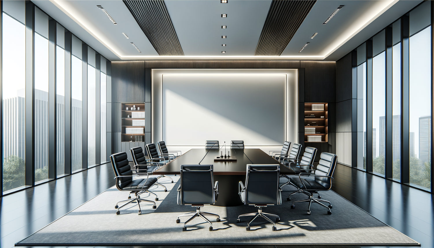
Silence reigns in your meeting room. Clients enter, settle in, and their gaze inevitably falls on this immense wall, white, almost aggressive in its emptiness. This blank surface screams a lack of character, an absence of identity. Yet, this wall could become the masterstroke of your firm, the element that transforms a simple functional room into a space of trust and prestige.
Here's what a properly sized artwork brings to your law meeting room: immediate visual legitimacy, a soothing atmosphere that facilitates sensitive exchanges, and an aesthetic signature that distinguishes your firm from all others.
You may have wondered why this space bothers you so much. It’s not by chance. A large empty wall in a professional setting creates a psychological imbalance. It amplifies the void, makes the room appear cold, almost unfinished. Your clients, already stressed by the nature of their appointment, subconsciously perceive this lack as a deficit of care and seriousness.
But rest assured: dressing up this wall doesn't require months of research or an excessive budget. It just takes understanding a few fundamental principles about artwork formats suitable for large professional spaces. Informed decisions that will radically transform the atmosphere of your meeting room.
I’ll guide you through the formats that really work in these particular contexts, those that create visual balance while respecting the solemn character of a law firm.
The rule of two-thirds: the secret of formats that assert without overwhelming
In a law meeting room, the artwork format must follow a golden rule often overlooked: cover between two-thirds and three-quarters of the wall's width. No less, because the artwork would appear lost, insignificant. No more, because it would stifle the space.
Let’s take a concrete example. Your wall is 4 meters wide? Aim for an artwork for meeting room of 2.60 to 3 meters in width. This proportion creates what is called in interior design an assertive presence: the artwork structures the space without dominating it.
The height naturally follows. For a standard ceiling height of 2.70 meters, a large artwork of 1.50 to 1.80 meters in height finds its natural balance. The optical center of the work should be at eye level for a seated person – about 1.20 meters from the floor – because let's remember, your clients will primarily discover this artwork from their chair.
This rule of two-thirds is not arbitrary. It’s based on the golden ratio that has guided our aesthetic perception for centuries. A format that respects this harmony brings an immediate sensation of visual comfort, almost unconscious.
The panoramic format: when horizontal creates serenity
In the legal world, where each appointment carries its share of anxiety, the panoramic format possesses a remarkable soothing virtue. These very wide and relatively low artworks – think of a 3:1 or 4:1 ratio – invite the eye to move laterally, creating a calm, almost meditative reading movement.
I’ve observed this phenomenon in many law firms. A panoramic artwork of 3 meters by 80 centimeters, installed behind the discussion area, literally transforms the atmosphere. The pronounced horizontality evokes stability, anchoring – fundamental values that you want to embody.
This format works particularly well with abstract compositions featuring horizontal lines or clean urban landscapes. Neutral tones – anthracite gray, deep beiges, navy blues – create a sophisticated backdrop that never distracts from ongoing discussions.
The advantage of the panoramic format? It effectively fills a large wall while leaving the upper and lower space to breathe. This visual breathing room is crucial in a meeting room where documents pile up and screens light up. The artwork becomes a visual anchor without creating saturation.

The polyptych: the elegant alternative that structures space
Rather than a single large artwork, have you considered the polyptych? This composition of several aligned panels offers remarkable flexibility to dress a large empty wall.
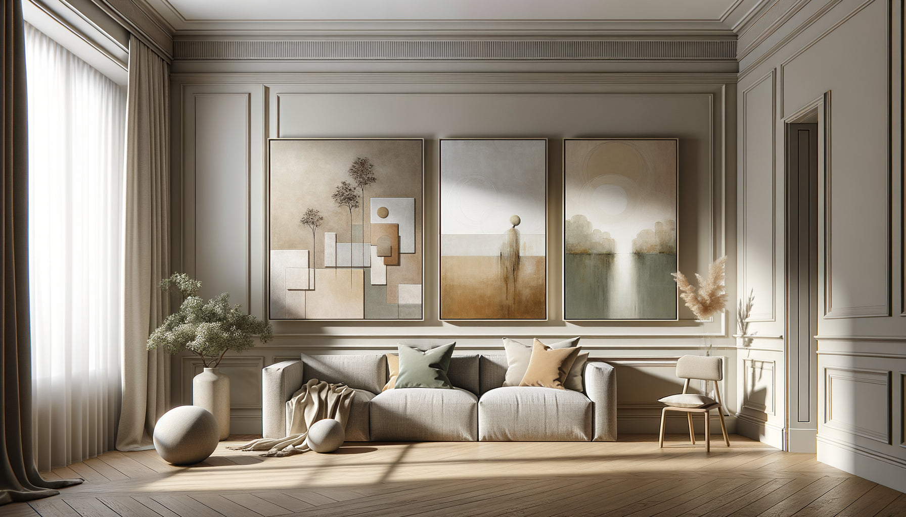
The triptych (three panels) remains the most balanced format for a law firm meeting room. Imagine three canvases of 100 x 150 centimeters, spaced 10 to 15 centimeters apart. The ensemble covers approximately 3.30 meters in width – a strong presence – while creating a sophisticated visual rhythm.
This segmentation presents a subtle but powerful psychological advantage. The polyptych evokes rigor, structure, methodical organization – exactly what your clients seek from legal counsel. Each panel can explore a variation of the same theme, creating a narrative coherence that resonates with the argumentative logic of your profession.
For a truly monumental wall, the pentyque (five panels) offers a spectacular solution. Five canvases of 80 x 140 centimeters, precisely aligned, generate a wall installation of nearly 4.50 meters that immediately commands respect. It's the choice of large international firms seeking a memorable visual signature.
Spacing makes all the difference
A crucial technical tip: the spacing between panels should represent 3 to 5% of their individual width. For canvases measuring 100 centimeters, maintain a gap of 3 to 5 centimeters. This mathematical precision creates optimal visual cohesion. Too much space, and the panels seem disconnected. Not enough, and the whole thing appears compressed, poorly ventilated.
Monumental square format: the bold geometric design that captures attention
If your meeting room wall is approaching a perfect square, dare to use the monumental square format. A 2 x 2 meter canvas has an incomparable sculptural presence. This pure geometry creates a remarkable focal point.
The square symbolically conveys balance, justice, symmetry – fundamental values in the legal world. A large square painting in a meeting room never goes unnoticed, but be careful: its impact requires a visually controlled composition.
For this format, prioritize geometric abstract works, minimalist compositions, or black and white architectural photographs. The square amplifies the strength of pure lines, clear contrasts. It is the painting format for assertive decisions, firms that assert a contemporary visual identity.
A crucial installation detail: a monumental square painting requires a perfectly centered wall. Use a laser level to guarantee perfect alignment. The slightest inclination, on such an imposing format, becomes visually disturbing and undermines the credibility of the whole.

When the vertical format is essential: height as a strategy
Counterintuitively, some large walls in meeting rooms call for the vertical format. If your ceiling exceeds 3 meters, an elongated canvas measuring 120 x 240 centimeters draws the eye upwards, enhancing the ceiling height.
This vertical strategy creates a sense of nobility, elevation – literally and symbolically. In renovated historic buildings converted into professional spaces, with their generous heights, the vertical format restores the harmonious proportions that the original architecture called for.
You can also create a vertical painting installation: two or three elongated formats aligned horizontally. Three canvases measuring 80 x 200 centimeters, for example, cover 2.70 meters in width while beautifully exploiting the available height. This composition creates an ascending rhythm that energizes the space without agitating it.
The vertical format works particularly well with architectural representations, vertical band abstractions, or photographic compositions in sequence. It naturally guides the eye, structures perception, and imposes a distinguished presence.
Human scale: why your instinct deceives you about dimensions
Here's the most common mistake when choosing a large wall art: consistently underestimating the necessary dimensions. What you imagine is sufficient will invariably seem too small once hung.
Why this perceptual distortion? In a store or gallery, you evaluate the artwork in a context saturated with objects, colors, and visual references. In your law firm meeting room, the same artwork finds itself isolated on a large white wall, surrounded by understated furniture. The empty space amplifies the need for presence.
An infallible technique before purchase: cut kraft paper to the dimensions you are considering and temporarily fix it to your wall. Live with this simulation for a week of meetings. You will probably find that you can – and should – increase the format by 20 to 30%.
For a standard meeting room wall of 3.50 meters wide, do not go below 2 meters in width for your main artwork. This is the minimum threshold to create a significant presence. The ideal is between 2.50 and 3 meters for optimal impact.
Transform your meeting room into a space of trust and prestige
Discover our exclusive collection of wall art for law firms that combine imposing dimensions, soothing compositions and high-end finishes adapted to demanding professional environments.
Materiality and finish: how format influences the support
The artwork format you choose also dictates the technical constraints of production. A 3-meter artwork cannot be designed as a small format enlarged – the physics of materials decide otherwise.
For large formats, prioritize printing on aluminum dibond or plexiglass. These rigid supports guarantee perfect flatness even over several meters, where a stretched canvas would risk sagging with humidity or temperature variations in an air-conditioned meeting room.
Thickness also counts. A large artwork should have some depth – between 3 and 5 centimeters – to project a shadow on the wall. This slight distance creates a floating effect that reinforces the sculptural presence of the work. An artwork flush against the wall, even monumental, loses this dimensionality.
For diptychs, ensure that each panel has exactly the same thickness and mounting system. The slightest variation creates a depth offset that breaks the harmony of the whole. This technical consistency makes the difference between an amateur installation and a professional execution.
Weight: a constraint to anticipate
A monumental artwork of 3 x 2 meters can weigh between 15 and 40 kilos depending on the support. Can your wall support this weight? Standard plasterboard partitions require specific fixings – reinforced Molly anchors or fixing rails distributed. On a load-bearing wall, chemical anchors guarantee absolute safety. This technical question must be resolved before purchase, not after.
Color according to format: adapt the palette to scale
Surprisingly, the format of an artwork changes the perception of colors. A shade that appears subtle on 50 centimeters becomes dominant on 3 meters. This chromatic amplification requires adaptation of the palette for large formats.
In a legal meeting room, where sobriety is paramount, favor desaturated palettes for monumental formats. Colored grays – bluish gray, taupe gray, greenish gray – offer visual richness without aggression. A deep blue becomes more intense on a large surface; opt for a version 20% less saturated than your initial instinct.
Contrasts must also be modulated. A strong contrast (pure black on pure white) creates an acceptable visual tension on a small format, but becomes tiring on a large wall. Prefer attenuated contrasts – anthracite on pearl gray, navy blue on beige – which maintain visual interest without creating eye fatigue during prolonged meetings.
A golden rule for large-size artworks: the dominant color should occupy at least 60% of the surface. This chromatic mass creates visual unity, while the remaining 40% introduces variation and interest. The opposite – touches of color scattered on a neutral background – loses impact on a large format.
Imagine your next meeting. Your clients enter the room and discover this wall transformed, dressed in a artwork with perfectly calibrated format. The space breathes confidence, mastered professionalism. Exchanges take place in a soothing atmosphere, structured by this balanced visual presence. You have transformed an uncomfortable void into a distinctive asset.
The choice of artwork format for your legal meeting room is not a secondary aesthetic decision – it is an investment in the image of your firm, in the comfort of your clients, in the identity of your professional space. Take the time to measure precisely, visualize with simulations, anticipate the long-term impact. A well-chosen large artwork will accompany you for years, gradually becoming the silent but powerful visual identity of your firm.
Start today: measure your wall, calculate two-thirds of its width, and explore the formats that will transform this space into a memorable visual signature.
Frequently Asked Questions
What is the minimum dimension for a painting in a large meeting room?
To create a significant presence, do not go below 2 meters wide on a wall of 3.50 meters or more. The common mistake is to underestimate the necessary dimensions. A painting that is too small on a large wall amplifies the emptiness instead of filling it. Ideally, it should be between two-thirds and three-quarters of the width of the wall. For example, on a 4 meter wall, aim for a painting from 2.60 to 3 meters. This proportion creates what is called an assertive presence: the work structures the space without stifling it. Use the kraft paper sticking technique temporarily to visualize dimensions before purchase – you will probably find that you can increase the format by 20 to 30% compared to your initial estimate. In a legal meeting room, where every detail counts for professional image, a generous format is better than a timid painting that would go unnoticed.
Is it better to have a single large painting or several smaller paintings?
Both approaches work, but respond to different intentions. A single monumental large painting creates an immediate impact and a strong sculptural presence – this is the choice of frank visual affirmation. This option is perfect for contemporary spaces and firms who want a clean visual signature. Conversely, the polyptych (composition of several panels) offers a structured sophistication that resonates particularly well with the legal world. A triptych of three 100 x 150 centimeter canvases spaced 10 centimeters apart creates an elegant visual rhythm while covering approximately 3.30 meters. This segmentation evokes rigor, methodical organization – fundamental values for a law firm. The polyptych also has a practical advantage: it facilitates transport and installation, and can be reconfigured if you change space. For truly monumental walls of more than 4 meters, the pentyque (five panels) offers a spectacular solution that immediately commands respect.
How to choose between horizontal and vertical format for my wall?
The horizontal panoramic format remains the most suitable for meeting rooms, as it creates a feeling of calm and stability – exactly what you are looking for in a legal context. A very wide and relatively low artwork (3:1 or 4:1 ratio) invites the eye to move laterally in a calm and meditative movement. This horizontality evokes anchoring, solidity. However, the vertical format is essential in two specific situations. Firstly, if your ceiling exceeds 3 meters in height, an elongated artwork magnifies this verticality and restores harmonious proportions. Secondly, in narrow and high rooms, the vertical format balances the proportions by creating a visual elevation. You can also compose an installation of two or three vertically aligned formats – three canvases of 80 x 200 centimeters create a sophisticated upward rhythm. The monumental square format (2 x 2 meters) constitutes a third bold option, perfect for almost square walls and offices that assert a strong contemporary identity.