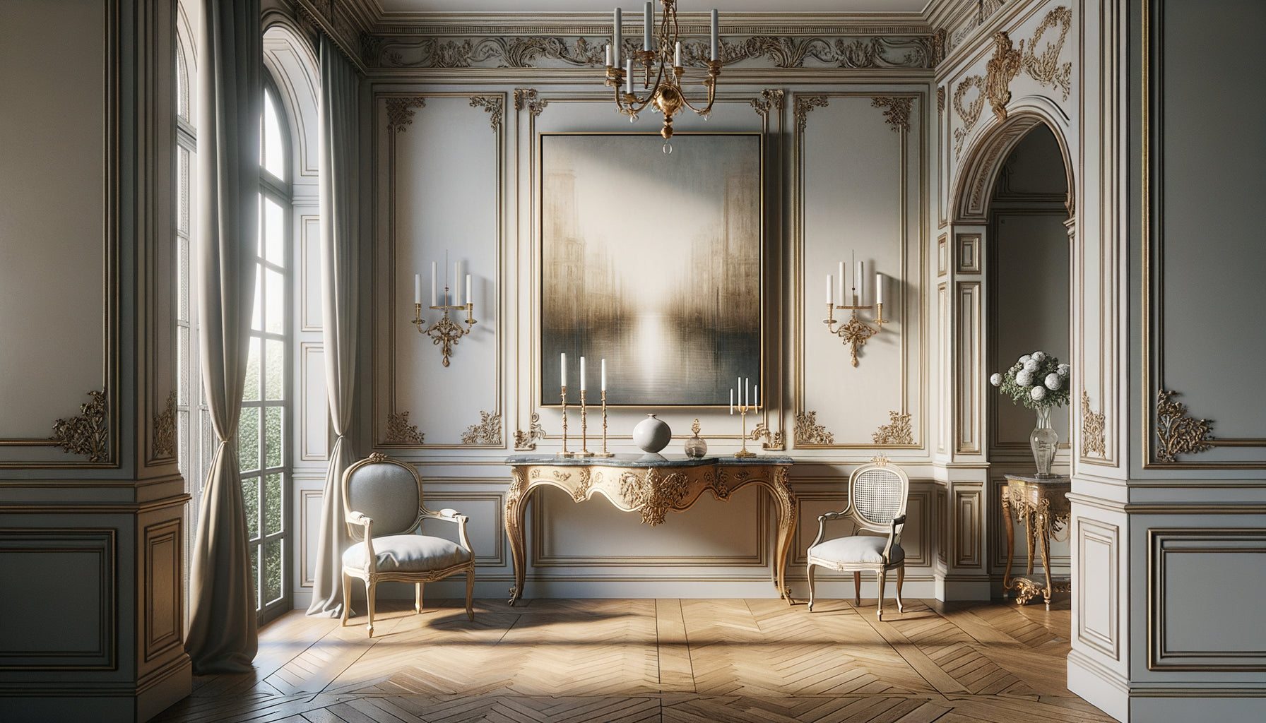
I accompanied a brilliant Parisian criminal defense lawyer in the design of her new office. Graduating with honors, she had chosen a flamboyant Ferrari red for her walls. Three months later, she called me urgently : her clients were arriving tense, several had mentioned an inexplicable malaise. Colors, in a criminal defense lawyer's office, are never neutral. They speak before you even open your mouth, influence the emotions of clients already weakened by serious accusations, and can sabotage the trust you have spent years building.
Here's what an unsuitable color palette provokes in a criminal law firm : it amplifies the anxiety of clients facing justice, compromises your professional credibility in matters of freedom, and creates a dissonance between your legal expertise and the atmosphere you offer. In a context where every detail counts, where your clients entrust you with their reputation or even their freedom, the chromatic environment becomes a silent but powerful argument.
You have invested in your training, your law library, your network. But you may feel that something is wrong in your professional space. Your clients seem on edge, consultations lack fluidity, and the atmosphere remains electric. The problem rarely comes from your expertise, but often from contradictory visual signals that you are sending unintentionally.
Rest assured: understanding chromatic mistakes that can be catastrophic in criminal law does not require design training. It is enough to grasp the particular psychology of your clientele and the tacit codes of your profession. In the lines below, I reveal the palettes to absolutely ban, those that have cost my lawyer clients dearly, and above all why they sabotage your practice.
The trap of red: when the color of danger invades the space
Red is the first mistake I encounter in poorly advised criminal law firms. This shade biologically activates our alert system, increases heart rate and triggers a primitive vigilance associated with danger. For a client accused of a crime, already overwhelmed by judicial stress, entering an office with red or burgundy walls is equivalent to a sensory aggression.
I observed this phenomenon in the office of a Lyon criminal lawyer who had opted for Pompeian red, believing he was asserting his tenacity. His clients visibly tensed up, their testimonies became confused, and preliminary interviews dragged on. Red also evokes anger, blood, violence – precisely the themes that your clientele wants to distance themselves from, not face in your decor.
Even in subtle touches, red disrupts. A scarlet armchair, carmine curtains, a lacquered red bookcase: each element adds an unnecessary tension. In a criminal defense attorney's office, where you must inspire mastery, thoughtful strategy and protection, red betrays your tacit promise of security. Your clients need an intellectual refuge, not a visual arena.
The glaring hues: when immaturity discredits expertise
Saturated and vibrant colors – electric orange, lemon yellow, fuchsia, neon turquoise – constitute the second chromatic disaster. These palettes convey a youthful, creative, sometimes playful energy that collides head-on with the gravity of criminal law. A client accused of involuntary manslaughter or embezzlement is not looking for a "fun" or "dynamic" space.
A young Parisian lawyer contacted me after decorating his office in bright orange and yellow tones, inspired by trendy coworking spaces. His rate of signing criminal cases was stagnating. Potential clients expressed doubts about his seriousness, despite his excellent training and early judicial successes. The glaring hues sabotaged his credibility before he even presented his argument.
These colors send a message of amateurism in a field where everything rests on trust in your judgment. Criminal law deals with irreversible consequences: loss of liberty, criminal record, social stigmatization. Your color palette should reflect this existential dimension, not resemble a technology startup space. Glaring hues subconsciously minimize the seriousness of the situations you deal with daily.

Total black: the error of excessive dramatization
Conversely, total black represents an equally damaging mistake. Some criminal lawyers think they assert their seriousness by creating dark, almost funereal spaces, with black walls, ebony furniture and minimal lighting. This approach turns the office into an oppressive space, reinforcing anxieties instead of soothing them.
Black evokes mourning, the end, a lack of solution – disastrous mental associations for clients precisely seeking a way out of crisis. I advised a Toulouse lawyer whose entirely black office was causing physiological reactions in her clients: shortened breathing, closed posture, difficulty maintaining eye contact. The space undermined the trust necessary for effective defense.
Black absorbs light and psychological energy. In a criminal defense law firm, where you must embody strategic hope and intellectual combativeness, this lack of brightness contradicts your mission. Your clients already arrive in the shadow of an accusation; your space should suggest a path to light, not accentuate the darkness. Black as the dominant color transforms your office into an anxiety-inducing cavern rather than a protective fortress.
Aggressive combinations: when contrast becomes visual violence
Beyond individual shades, certain combinations create particularly harmful visual aggression. Extreme contrasts – pure black and white, red and black, yellow and purple – fatigue the nervous system and keep your clients in a state of exhausting vigilance. An office is not a contemporary art gallery seeking to provoke.
A criminal lawyer in Marseille had opted for a radical black and white aesthetic: dazzling white walls, lacquered black furniture, no intermediate shades. His consultations became trying for everyone. Clients frequently blinked, complained of headaches, and several shortened their appointments. Brutal contrasts create visual instability incompatible with the concentration necessary for complex legal discussions.
Fluorescent combinations – apple green and shocking pink, orange and electric blue – fall into the same amplified error. They project an image of mental confusion, impulsivity, totally opposed to the analytical rigor that you must embody. In a criminal defense law firm, chromatic harmony reflects your ability to orchestrate a coherent defense. Visual chaos suggests strategic chaos, even if your practice is exemplary.
When pastel becomes infantilization
Pastel palettes – powder pink, sky blue, lavender, mint – work wonderfully in some medical or educational contexts. In a criminal law firm, they infantilize your adult clients facing serious situations. A Bordeaux lawyer specializing in financial crime had chosen pastel tones to “soothe,” unintentionally creating a luxury daycare atmosphere.
His senior executive and business leader clients accused of tax fraud felt uncomfortable, not respected in their status or in the seriousness of their situation. Pastels convey an inappropriate maternal softness when you must project protective authority. Your clientele needs a strategic warrior, not a visual lullaby. Pastel shades subconsciously diminish the perception of your judicial tenacity.

The Glimmering Gold and the "Superficial Luxury Office" Effect
Gold, shimmering gold finishes, ostentatious metallic accents represent a subtle but costly mistake. Some criminal defense lawyers seek to display their success through excessive golden decor: massive gilded frames, glittering light fixtures, gold-plated accessories. This approach turns the office into a materialist showcase, diverting attention from your competence towards your apparent wealth.
For a client accused, often in a financially fragile situation due to upcoming legal fees, this ostentation creates discomfort. A Parisian lawyer from the eighth arrondissement had overloaded his space with gold leaf, thinking to reassure through signs of success. The opposite effect occurred: his clients felt judged, presumed exorbitant fees, and several mentioned a superficiality incompatible with the expected depth of analysis.
The glimmering gold also evokes showiness, lack of substance behind appearance – exactly what a client in difficult legal proceedings seeks. In criminal law, where discretion and strategy are paramount, excessive decoration suggests a lack of focus on the essentials. Your clients want a brilliant advocate, not a glittering decor.
Transform your office into a sanctuary of trust and expertise
Discover our exclusive collection of wall art for law firms that strengthens your professional credibility while reassuring your clients in their most difficult moments.
Building a palette that serves your defense before the first word
After identifying these catastrophic errors, the question becomes: which direction to take? Effective palettes for a criminal defense lawyer revolve around reassuring and assertive tones: deep blues evoking reliability, sophisticated grays suggesting intellectual nuance, muted greens embodying balance and measured hope.
These colors create an environment where your clients can breathe, reflect, and trust you. They don't distract or agitate, but subtly support the message your expertise conveys. A well-thought-out chromatic cabinet becomes a silent ally in your relationship with vulnerable clients, amplifying your benevolent authority rather than contradicting it.
The transformation doesn’t necessarily require a complete renovation. Sometimes, replacing just a few key elements – repainting an accent wall, changing textiles, adjusting lighting – is enough to eliminate toxic dissonances. The investment remains modest compared to the impact on your conversion rate and customer relationship quality. Each client who immediately feels safe in your space is a client who will more easily open up, facilitating your defense work.
Imagine your next consultations in a space where every chromatic choice reinforces your professional message. Your clients step through the threshold and unconsciously breathe more freely. Conversations become smoother, information flows better, your expertise can fully express itself without being parasitized by a contradictory environment. Your cabinet becomes what it should be: an intellectual fortress where legal strategy takes shape in serenity.
Start by photographing your current space. Identify elements belonging to the catastrophic color palettes mentioned. Prioritize changes: dominant surfaces first (walls, large furniture), then accents. Consider consulting a professional understanding the specificities of criminal law, not just a general decorator. Your cabinet deserves a reflection as strategic as your pleadings.
What is the worst chromatic mistake in a criminal defense law firm?
Red constitutes the most damaging mistake in a criminal defense law firm. This color biologically activates our alert system, increases heart rate, and immediately evokes danger, violence, and blood. For clients already anxious about serious charges, a red environment amplifies their stress instead of calming it. I have accompanied several criminal lawyers who saw their client retention rate collapse after introducing dominant red into their decor. Consultations become tense, clients struggle to concentrate, and the necessary trust relationship for effective defense is difficult to build. Even in seemingly subtle touches – a chair, curtains, accessories – red distills a tension incompatible with your mission of strategic refuge. If your cabinet currently has significant red elements, their replacement should be your top priority to restore an atmosphere conducive to legal reflection and client confidence.
Why avoid bright colors in a criminal law context?
Bright and saturated colors – electric orange, lemon yellow, fuchsia, neon turquoise – project a youthful and playful energy totally unsuitable for the gravity of legal matters. A client facing criminal charges, the prospect of imprisonment or the threat of a criminal record seeks a professional embodying seriousness, in-depth analysis and strategic mastery. Screaming shades suggest immaturity, impulsiveness and lack of depth – disastrous qualities in the perception of a criminal defense lawyer. I have observed several brilliant young lawyers whose brightly colored offices sabotaged their credibility before even the first consultation. Potential clients expressed doubts about their experience and ability to handle serious situations. These palettes work wonderfully in creative or commercial contexts, but in criminal law where every decision can have irreversible consequences for an individual's freedom, your color environment must reflect the existential dimension of your practice. The mistake is subtle because these colors are objectively attractive, but their message fundamentally contradicts your professional promise.
Is an all-black office appropriate for a criminal defense lawyer?
No, total black represents a major mistake despite its sophisticated appearance. While black undeniably evokes seriousness and authority, its dominant use transforms your office into an oppressive and anxiety-inducing space. Black absorbs physical light and metaphorically psychological energy, creating an atmosphere of end, mourning and lack of solution. Your criminal law clients already come in the shadow of an accusation, often in a significant state of emotional distress. They are precisely looking for a light at the end of the tunnel, a crisis exit strategy. A black environment reinforces their feeling of confinement instead of suggesting openness and possibilities of defense. I advised a criminal lawyer whose all-black office caused negative physiological reactions in her clients: shallow breathing, closed posture, difficulty concentrating. After introducing brighter tones – sophisticated grays, deep blues with lighter accents – she noticed an immediate improvement in the quality of her interactions and the fluidity of consultations. Black can work in strategic touches to anchor and structure, but never as a dominant color in a criminal law office where rational hope must remain perceptible.