

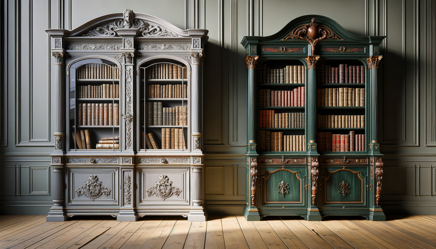
I spent fifteen years restoring heritage libraries across Europe, from Scottish castles to Venetian palaces. And each time I cross the threshold of a room, before even touching the wood or examining the moldings, it's the color that speaks to me first. That royal blue hue that immediately evokes the Empire, that characteristic bottle green of English style, or those nuanced grays typically Scandinavian. The chromatic palette of a painted library is much more than just an aesthetic choice: it's a stylistic signature, a secret code that instantly reveals its era, geographical origin and cultural influences.
Here's what a well-defined color palette brings you: the ability to approximately date a room and understand its historical context, the aptitude to recreate a consistent atmosphere in your interior, and above all, the possibility of making perfectly informed restoration or decoration choices.
Too often, I am asked to restore libraries repainted in totally anachronistic shades. A Louis XVI piece drowned in contemporary concrete gray, a Victorian library shining in tropical turquoise. This mismatch creates a visual dissonance that weakens the character of the room. You feel that something is wrong, without being able to put your finger on it.
Rest assured: identifying the style of a library by its colors does not require a degree in art history. It just takes knowing a few fundamental chromatic references and learning to observe methodically. In the lines that follow, I pass on to you the keys to reading that I have refined over hundreds of restorations, so that you can decode any painted library in minutes.
The revealing shades of French classicism
When you observe a library with off-white, ivory or pearl gray tones, combined with delicate gilding, you are probably facing a French classic style. These palettes particularly characterize the Louis XV and Louis XVI periods, where chromatic subtlety reflected aristocratic refinement.
White was rarely pure: pigments were added to create nuances such as linseed white, bone white or bluish white. These variations brought depth that avoided a clinical effect. I restored a Parisian living room library where seven layers of paint revealed this chromatic progression, each era adding its personal nuance.
Muted grays, slightly tinted with blue or green, are another signature of French classicism. They are particularly found in Directoire and Empire-inspired libraries. These neutral tones highlighted the gilded bronzes and leather bindings, creating an elegant setting for precious books.
How to recognize an original patina
On an authentic classic bookcase, the painting shows subtle subtle irregularities: slightly yellowed areas, fine cracks, wear on the corners. These imperfections tell the story of the piece. A too uniform palette usually signals a recent restoration or a contemporary reproduction.
The assertive character of British bookcases
Cross the English Channel, and the palette changes dramatically. English-style bookcases adopt deep and saturated colors: bottle green, navy blue, dark burgundy, or that famous library green which characterizes so many Victorian homes.
These dark tones were not just an aesthetic choice: they responded to a practical logic. In the humid British climate, dark colors better concealed stains and everyday wear. Moreover, these tones created a cozy atmosphere, conducive to reading and concentration.
I particularly remember a Edwardian bookcase in a Kent manor house, painted in a deep olive green accented with gold fillets. The color was achieved by layering glazes, creating a chromatic richness impossible to reproduce with modern single-layer paints.
The Georgian style is distinguished by bold combinations: Prussian blue with white moldings, Pompeian red paired with gilding, or that characteristic mustard yellow. These marked contrasts reflected the neoclassical taste for architectural clarity.

The Nordic luminosity of Scandinavian bookcases
When a bookcase features nuanced grays, warm whites or pale blues, it probably bears the mark of Scandinavian style. This palette developed in response to the lack of natural light during Nordic winters: light shades maximized light reflection.
The Swedish Gustavian style, born under the reign of Gustav III in the 18th century, particularly favors pale blue-gray associated with white. These bookcases exude a discreet elegance, without ostentation. Gilding, when it exists, remains minimal, often limited to fine fillets.
More recent Scandinavian bookcases adopt pure whites slightly grayed or natural tones such as linen, sand or taupe. These colors create continuity with the raw materials of contemporary Nordic furniture.
The importance of texture in Nordic palettes
On Scandinavian shelving units, matte finishes predominate, unlike the glossy French lacquers or satin English patinas. This texture absorbs light rather than reflecting it, creating a soft and soothing atmosphere.
The Bold Palettes of Art Deco Style
The 1920s-1930s revolutionized the color schemes of shelving units with bold geometric combinations. Black lacquer paired with gold, emerald green with silver accents, or deep burgundy enhanced with chrome: Art Deco was not afraid of contrast.
These shelving units are recognizable by their pronounced shine. Thick lacquers, often applied in fifteen to twenty coats and then polished, created shimmering surfaces. I restored a Parisian black lacquer library where each coat had been individually sanded, a work of several months.
Muted colors also find their place in Art Deco: chocolate brown, anthracite gray, deep navy blue. These sophisticated shades served as a setting for geometric marquetry and mother-of-pearl or ivory inlays.

How Light Reveals the True Chromatic Identity
Here's a restorer's secret: the same shelving unit changes radically depending on the lighting. What you perceive as a neutral gray under cold neon can reveal green undertones under warm incandescent light.
To correctly identify the style of a painted shelving unit, observe it at different times of day. Morning natural light reveals cool nuances, while evening light warms the tones. This variation was perfectly mastered by artisans of yesteryear, who formulated their paints taking into account the orientation of the rooms.
Historical pigments reacted differently to light than current synthetic paints. Prussian blue, for example, has a depth that varies depending on the angle of observation. Authentic vermilion vibrates in a way that is impossible to reproduce with modern acrylics.
The Effect of Aging on Palettes
Over time, colors naturally patinate. Whites yellow slightly, blues can turn green, reds can tarnish. This transformation is part of the authenticity of a piece. On a respectfully restored shelving unit, these testimonies of time are preserved rather than erased.
Decoding Structural Color Combinations
Beyond the dominant hue, the way colors combine also reveals the style. Classic French libraries use monochromatic harmonies: subtle variations around a single color, with moldings slightly lighter than the background.
The English style favors marked contrasts: dark body, light interior, moldings in opposition. This chromatic structuring highlights the architecture of the furniture, creating a clear visual reading of the different elements.
Italian neoclassical libraries often adopt a tricolor palette: a colored background (yellow ochre, terracotta, sky blue), white moldings, and golden accents. This combination creates decorative richness while remaining balanced.
In contemporary furniture, we observe a return to reduced palettes: one or two tones maximum, often in ultra-smooth matte finishes. This chromatic simplicity contrasts with the complexity of historical multicolored libraries.
Want to enhance your library with a work that dialogues with its palette?
Discover our exclusive collection of Library paintings that capture the light and reveal the subtle nuances of your painted woodwork.
Your gaze transformed, your space revealed
From now on, when you come across a painted library, you will no longer simply see a color. You will perceive a stylistic language, an era that dialogues with you, a cultural geography inscribed in the material. This grey-blue will instantly transport you to a Swedish Gustavian living room, this deep green will evoke Victorian libraries filled with smoke.
This ability to identify style by palette is not limited to analysis: it gives you the creative power to compose your own interior with coherence. You will know which shade truly honors your library, what chromatic accents enrich it, what overall atmosphere to create around it.
Start today: observe the libraries around you with this new gaze. Note the palettes that resonate with you, photograph them in different lights, build your own mental color library. This personal collection will become your best reference, more valuable than any industrial color chart.
FAQ: Your questions about identifying styles by color
Can you really date a library solely by its color?
Color alone is not enough to precisely date a bookcase, but it provides valuable chronological clues. Certain shades are inseparable from specific eras: the intense Prussian blue characterizes the 18th century, saturated pastel colors evoke the 1950s, mineral grays signal the 21st century. However, a bookcase may have been repainted several times throughout its existence. For reliable dating, combine chromatic analysis with observation of construction techniques, moldings, hardware, and overall patina. Color guides you towards a period and style; other elements confirm or refine this initial impression.
How to tell if the current color is original or if the bookcase has been repainted?
Several clues reveal an original paint finish. Examine hidden areas (inside doors, under shelves, back of the furniture): if the color is identical but better preserved, that's a good sign. Observe the moldings: recent paint often fills in sculpted details, creating less defined contours. Natural craquelure forms according to characteristic organic patterns, impossible to artificially reproduce. If you notice different colors in cracks or worn corners, the bookcase has been repainted. Finally, texture matters: old paints, applied with a brush in thin layers, exhibit subtle irregularities, while modern paints applied with a roller or spray gun create a more uniform surface. In case of doubt, a restorer can perform a stratigraphic test to reveal all successive layers of paint.
Is it necessary to scrupulously respect the original palette during a restoration?
This question divides purists and pragmatists. In a heritage restoration of an authentic piece of great value, respecting the original palette is essential for historical preservation. But for a decorative bookcase intended for contemporary domestic use, you have more freedom. The main thing is to maintain stylistic coherence: if you own a Louis XVI style bookcase, avoid tropical turquoise, but you can opt for a historically plausible gray-blue even if it differs from the original shade. Consider your overall interior: a slightly adapted palette that dialogues harmoniously with your current decor will be more satisfying than an archaeological reconstruction creating a visual break. Respect for style takes precedence over exact reproduction, especially if the original color no longer matches your lighting or contemporary tastes.


