When the pink doors of The Grand Budapest Hotel open on screen, something unexpected happens: we are no longer watching a film, but entering a living collection. Each frame functions as a museum display case, each shot as a reinterpreted Dutch still life. Wes Anderson didn't simply direct a feature film in 2014 – he composed a visual symphony where every decorative element, every chromatic nuance, every accessory tells the story of an obsessive collector.
Here’s what The Grand Budapest Hotel reveals about the art of composing an aesthetic universe: the narrative power of saturated colors that create an immediate spatial identity, the eloquence of carefully sourced vintage objects that build a quirky authenticity, and this ability to transform architectural symmetry into pure emotion. Anderson doesn't decorate; he collects, archives, and reinvents.
Many admire this film without understanding why it fascinates our senses so much. It is often described as “pretty,” “stylized,” or “mannered.” But behind this impeccable surface lies a philosophy of space that aligns with the most contemporary concerns: how to create a place that tells a story, evokes emotion, and becomes unforgettable?
Rest assured: you don't need a Hollywood budget to grasp these principles. Anderson’s visual composition techniques are intimately linked to interior design, domestic staging, and the creation of meaningful atmospheres.
In this article, we explore how The Grand Budapest Hotel functions as an applicable aesthetic manifesto – concrete lessons in spatial staging, chromatic hierarchy, narrative collection that you can transpose into your own decorative universe.
Pastel pink as a spatial signature
From the very first seconds, The Grand Budapest Hotel asserts its manifest color: this slightly powdered pink, halfway between Viennese confectionery and alpine twilight. This is not an innocent decorative choice. Anderson uses color as an architectural language in its own right, creating a visual signature that transcends anecdote.
The iconic facade of the hotel – filmed in miniature with manic precision – affirms this identity pink that dialogues with the surrounding snow-capped mountains. This color becomes the emotional guiding thread of the narrative, a reassuring constant in a film structured like Russian nesting dolls. When the story shifts to the 1960s, the hotel turns beige institutional: the chromatic loss reflects the degradation of the world.
This principle of narrative color applies directly to domestic space. Choosing a dominant hue for a room is not a whim: it's creating a sensory memory, a recognizable atmosphere that anchors the spatial experience. Anderson’s pink isn’t just aesthetic – it’s mnemonic.
Restricted palette as creative discipline
Anderson works with limited color palettes: dusty rose, plum purple, aged gold, carmine red. This voluntary restriction creates a hypnotic consistency. Each scene from The Grand Budapest Hotel functions as a perfectly mastered nuance chart, where no parasitic color comes to pollute the harmony.
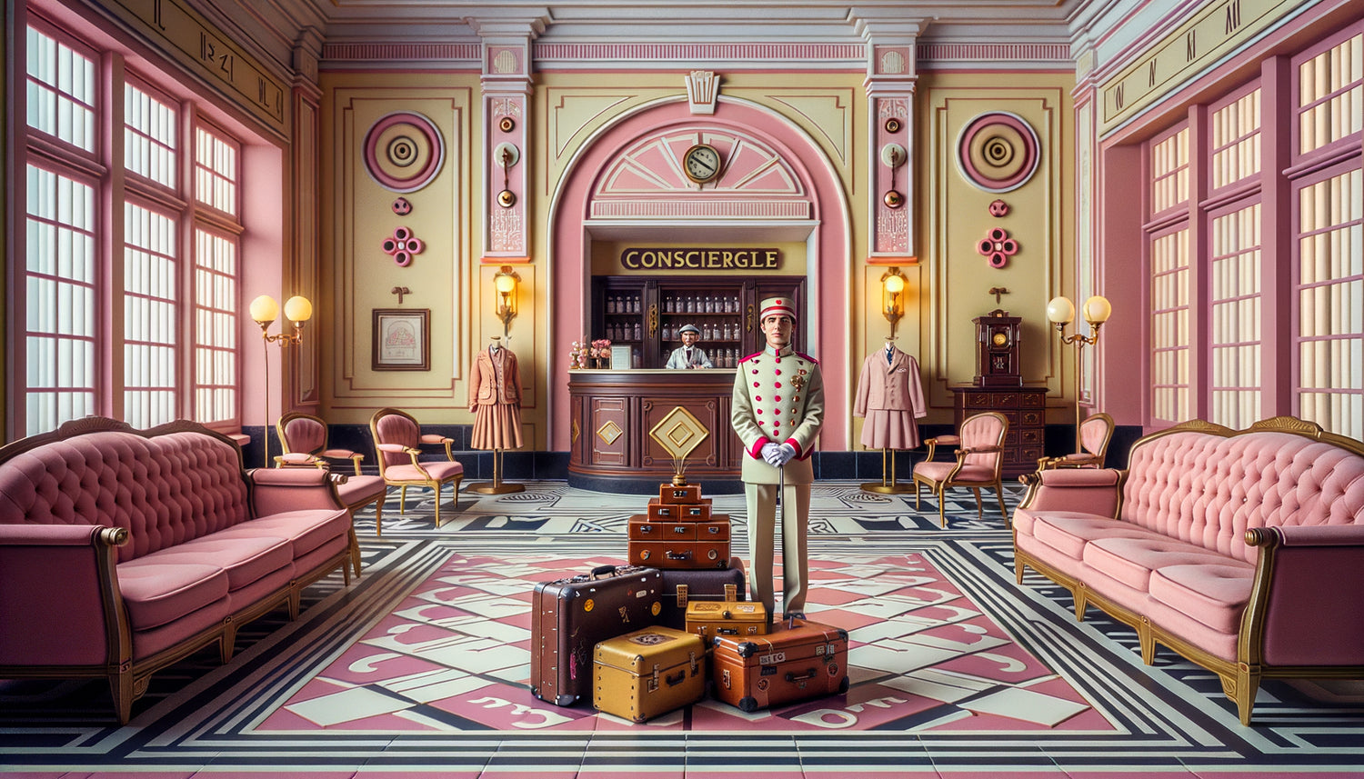
This approach echoes the principles of great decorators from the early 20th century: establish a chromatic family and explore it in all its variations rather than juxtaposing disparate shades. The hotel lobby declines pink from shell to salmon, creating a subtle tonal progression that guides the eye without jolting it.
Symmetry as visual grammar
It is impossible to talk about The Grand Budapest Hotel without mentioning its symmetrical obsession. Anderson centers each shot with an almost Kubrickian rigor: characters in the middle of the frame, corridors filmed in perfect central perspective, objects arranged in mirrors. This composition is not gratuitous – it transforms each image into a contemplable painting.
The famous funicular scene, where the characters go up and down in perfectly symmetrical cabins, illustrates this geometry narrative. The eye does not seek where to look: everything converges towards the center, creating a paradoxical visual comfort despite the intensity of the events. Andersonian symmetry reassures before surprising.
In arranging a space, this lesson translates into the importance of visual axes. A centered sofa under a window, two identical suspensions framing a mirror, a balanced bookcase on either side of a fireplace: these mirror compositions create an aesthetic stability that soothes the gaze. The Grand Budapest Hotel reminds us that symmetry is not rigidity – it is structural elegance.
Breaking symmetry with intention
But Anderson also knows when to decenter. The painting «Boy with Apple» – a key element of the plot – is never shown in a perfectly frontal way during action scenes. This occasional asymmetry creates suspense, signals danger. The lesson: a symmetrical composition gains impact when it is occasionally disrupted with intention.

The collector of eras and objects
Wes Anderson is fundamentally a cinematic collector. *The Grand Budapest Hotel* accumulates temporal references: Art Deco furniture from the 1930s, Austro-Hungarian inspired military uniforms, bakelite telephones, aged leather suitcases, wall clocks, ornamental keys. Each object is sourced, selected, justified.
This approach to narrative collecting transforms the decor into a character. Mendl's pastries in their iconic pink boxes, the "L'Air de Panache" fragrance, Mr. Gustave’s poetry – all become collectibles, pieces of a cinematic cabinet of curiosities. Anderson doesn't create a generic “1930s” universe: he invents a parallel 1930s, populated with objects that could have existed.
To create a meaningful interior, this method of the aesthetic collector is valuable. It’s not about accumulating, but about constituting a coherent collection: objects from the same era, the same color family, the same formal vocabulary. The living room in *The Grand Budapest Hotel* mixes Louis XVI and Art Nouveau, but in a deliberate harmony where each piece dialogues with the others.
Multiple formats as a time travel
Fascinating detail: Anderson changes aspect ratio according to the eras. The 1930s are filmed in Academy 1.37:1 format (almost square), the 1960s in scope 2.35:1 (very wide), the 1980s in 1.85:1. This formal variation creates a different spatial experience for each period.
The Academy format of the main sequences of *The Grand Budapest Hotel* – those with Mr. Gustave – creates vertical intimacy. We perceive better the height architecture of the hotel, the decorated ceilings, the verticality of the corridors. It's a lesson in perceptive scale: the proportion of a frame modifies our emotional relationship to space.
Transposed into decoration, this evokes the importance of wall proportions. A wall divided horizontally by moldings versus vertically by panels creates two radically different atmospheres. Anderson reminds us that the frame is not neutral – it sculpts emotion.
Theatrical frontality
Almost every shot in *The Grand Budapest Hotel* is filmed in perfect frontality, as if we were watching a theater scene. This assumed flatness transforms real depth into a two-dimensional composition – a living painting. The characters do not move “naturally”: they enter and exit the frame with precise choreography.
This approach joins the principles of interior scenography: to think of a room as a composition viewed from a specific point. Where is the spectator’s gaze placed? What is the natural “frame” from the entrance? Anderson invites us to design our spaces as habitable paintings.

The obsessive detail that creates credibility
What makes The Grand Budapest Hotel so immersive is the accumulation of unnecessary details to the narrative but essential to the atmosphere. Luggage labels, passport stamps, restaurant menus, wall posters – all are graphically designed with manic consistency. The film creates its own complete graphic universe.
This philosophy of detail signifying applies directly to decoration. An interior becomes memorable through its small consistencies: matching door handles, vintage switches on contemporary walls, coordinated book bindings. Anderson teaches us that true luxury is not in ostentation, but in aesthetic continuity down to the invisible detail.
The uniforms of the hotel grooms, with their golden buttons and purple piping, are never shown in close-up. Yet, their presence contributes to the visual density of the universe. Similarly, in an interior, it is the details that we do not consciously notice that create the overall impression of harmony.
Typography as a decorative element
The Grand Budapest Hotel makes extensive use of text on screen: signs, billboards, integrated generics. The chosen typography – primarily Archer and Futura – becomes a decorative element in its own right. This attention to lettering aligns with current concerns in interior design, where domestic signage (jar labels, framed posters, wall quotes) contributes to the visual identity of a place.
Transform your walls into a cinematic gallery
Discover our exclusive collection of paintings inspired by famous artists that capture the same aesthetic requirement, the obsessive attention to detail that makes each wall a meaningful scene.
The Anderson legacy: composing rather than decorating
The Grand Budapest Hotel leaves us with an essential lesson: the difference between decorating and composing. Decorating is adding elements; composing is creating a system where each element justifies the others. Anderson never chooses an object in isolation – he selects it for its ability to dialogue with the whole.
This systemic approach transforms the way we consider interior design. Before buying a piece of furniture, ask yourself: “What conversation does it have with what already exists?” The red armchair in the hotel lobby is not there because it is beautiful in isolation, but because it chromatically responds to the carpets, anticipates the uniforms, echoes the pastries.
The film also reminds us that aesthetics are not superficial – they are narrative. Every visual choice in The Grand Budapest Hotel tells something: the nostalgia for a lost world, elegance in the face of barbarity, beauty as an act of resistance. Our interiors also tell stories. What does your color palette express? What do your collected objects say? What era do you evoke?
Anderson finally invites us to become conscious collectors of our own visual environment. Not accumulators, but curators of our living spaces. Each piece can become a room in this grand imaginary hotel, each wall a carefully composed frame.
Imagine yourself in your living room, transformed by these principles. A coherent color palette replaces the colorful chaos. Objects collected with intention tell a common story. Subtle symmetry soothes the eye. Invisible – but present – details create that indefinable impression of a “right” place. You no longer live in an apartment: you occupy a meaningful universe, a living collection that resembles you. And like Mr. Gustave wandering through the pink corridors of his estate, you become the inspired curator of your own intimate museum.
Start small: choose a signature color for a room. Establish an axis of symmetry. Collect three objects from the same era. The Grand Budapest Hotel does not ask you for immediate perfection – it invites you to the conscious aesthetic gesture, repeated until creating that coherence which transforms a space into a work.
FAQ : Creating Your Wes Anderson Universe
How to choose a signature color without getting tired?
The fear of tiring of a strong color is legitimate, but The Grand Budapest Hotel teaches us a subtlety: Anderson doesn't use a shade of pink, but a family of pinks. From powdery to salmon, from pale to saturated. The solution isn't to avoid color out of caution, but to choose a hue you can decline in five shades. Start by identifying a color that moves you viscerally – not intellectually. Test it on a wall for two weeks, at different times of the day. If it soothes you in the morning and stimulates you in the evening, it has this tonal complexity that avoids fatigue. Always pair it with neutrals (off-white, warm gray, beige) that allow it to breathe. The signature color doesn't invade everything – it punctuates, it rhythms, as pink appears and disappears in the different eras of the film.
Can symmetry be applied in a small space?
Absolutely, and it's even particularly effective. Andersonian symmetry doesn't require large surfaces – it works through focal points. In a small bedroom, centering the bed under the window with two identical bedside tables immediately creates this visual harmony. In a narrow kitchen, aligning containers symmetrically on a shelf transforms the functional into the aesthetic. The trick: choose a single axis of symmetry per room. There's no need to symmetrize everything (it would be oppressive), but identifying the main wall and composing it in mirror creates a visual anchor. In The Grand Budapest Hotel, even exterior shots show that symmetry works at all scales – from the immense hall to the tiny cabins of the funicular. Symmetry doesn't physically enlarge the space, but it structures it mentally, creating an impression of order that soothes the eye even in 15 m².
How to collect without cluttering?
Anderson shows us the way: <strong>collect a single family of objects</strong>. Not «vintage items», but «metal boxes from the 1930s» or «oval gilded frames» or «frosted glass perfume bottles». This thematic restriction creates the visual coherence that differentiates the collection from clutter. In <em>The Grand Budapest Hotel</em>, every object belongs to an <strong>aesthetic system</strong>: even anecdotal accessories respect the palette and era. Define your own system: one color + one material + one era. Example: «1950s duck blue ceramic objects». This triple constraint naturally limits the quantity while creating a strong identity. Display your collection in a <strong>grouped and symmetrical</strong> manner rather than scattered: five identical frames aligned produce more visual impact than a heterogeneous gallery wall. Finally, apply the curator's rule: for every new object entering, an old one leaves. The collection remains alive, purified, meaningful – exactly like the carefully composed window displays of Mendl’s bakery.