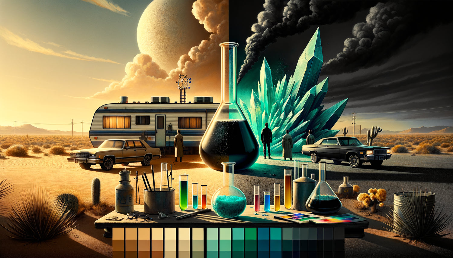
When Walter White first puts on this beige cardigan vest in Breaking Bad, no one suspects that a masterful chromatic symphony is about to begin. As an art director who has deconstructed more than 200 series for their visual choices, I have rarely seen such powerful colorimetry as that of Vince Gilligan. Each shade tells a transformation, every nuance predicts a shift.
Here's what Breaking Bad’s expressionistic palette brings: a grammatical emotional language where colors translate moods, a narrative architecture where each costume becomes a chapter, and an inexhaustible inspiration for those seeking to infuse meaning into their living spaces.
The problem with most visual analyses? They remain superficial, vaguely noting that “green represents money” without grasping the complexity of the system in place. But Gilligan and his cinematographer Michael Slovis created a chromatic language as rigorous as a musical score.
Rest assured: you don't need to have studied color theory to understand how this approach can transform your perspective on interior design. What Breaking Bad teaches us goes far beyond the screen – it’s a masterclass in the emotional impact of colors in any visual environment.
Walter White's chromatic transformation: from beige to obsidian
In the early episodes, Walter literally bathes in muted colors – beige, khaki, pale brown. His iconic beige cardigan is not a random aesthetic choice: it’s the color of erasure, social invisibility. Gilligan uses this desaturated palette to embody professional mediocrity and masculine impotence.
But observe the progression: as Heisenberg emerges, black seeps into his wardrobe. First timidly – a dark t-shirt under the cardigan. Then resolutely – the legendary porkpie hat, the leather jacket, aviator sunglasses. This chromatic migration towards darkness visually translates the character's moral descent.
What I have applied in my decoration projects inspired by this approach? The idea that color tells an evolution. An apartment can also “evolve” chromatically according to the rooms – from light tones in public spaces to more assertive shades in private sanctuaries. This spatial narrative creates a rare emotional depth.
The omnipresent green: much more than a reference to money
Yes, green represents money in Breaking Bad – the stacks of bills, obviously. But Gilligan's sophistication goes infinitely further. Green embodies greed, but also illness, corruption, latent danger.
Notice how greenish hues progressively contaminate Walter’s environment: the wall of his chemistry classroom, the lighting of certain key scenes, even the White family pool which turns a worrying green. This color acts as a visual virus, infiltrating every corner of his life.
Jesse Pinkman, in his dealer phase, constantly wears green and yellow – this color combination creates a visual dissonance that translates his instability. When he tries to redeem himself, guess what? Cool colors – blues and grays – reappear in his clothes.
Green in your interior: expressionist inspiration
This use of green inspired a golden rule in decoration for me: use greenish tones sparingly and intentionally. A sage green accent wall in an office can evoke creative growth. But saturate a room with bright green, and the atmosphere becomes anxiety-inducing. Gilligan reminds us that every color carries an emotional charge – it is up to us to dose it consciously.

The red of violence and destructive passion
No color in Vince Gilligan's palette is as violent as red. And I’m not just talking about blood. Red systematically predicts violence in Breaking Bad – it's the color of moments when everything irreversibly shifts.
Remember Hank Schrader constantly wearing these orange hues tending towards red – burnt orange, rust, terracotta. Hank embodies macho passion, masculine aggression, even destructive energy when he thinks it is justified. His environment reflects this chromatic temperature: his DEA office bathes in warm tones, almost stifling.
Walter's wife, Skyler, wears blue – a cool, rational, loyal color in the early days. But during her affair with Ted, red bursts into her wardrobe. This moral transgression is first chromatic before it is narrative.
What this approach has taught me for living spaces: red must be handled as a dramatic accent, never as a base. A blood-red cushion on a gray sofa creates an electric focal point. But saturating a room with red generates unbearable tension – exactly what Gilligan seeks in his most violent scenes.
The crystalline blue: Heisenberg's deadly signature
The crystalline blue of the methamphetamine produced by Walter has become iconic. But this color runs throughout the series with a deeper meaning: blue represents the calm before the storm, calculating coldness, toxic loyalty.
The expressionistic colors of Breaking Bad use blue in a fascinating dialectic. Skyler in blue embodies family loyalty. The White's blue pool becomes a place of morbid contemplation. Even the New Mexico sky – that relentless, unshaded blue – acts as a silent witness to the crimes.
What struck me when analyzing the color palette of the series: Gilligan carefully avoids comforting blues. His blues are cold, clinical, almost surgical. This distinction is crucial for anyone who wants to create an atmosphere inspired by the universe of Breaking Bad – prioritize petrol blue, Prussian blue, slate blue rather than naive sky blue.
Transposing the Breaking Bad blue into your decoration
In my interior design projects inspired by this serial aesthetic, I use blue as an intellectual anchor color – perfect for an office or library. Combined with touches of raw wood and raw metal, it creates that atmosphere of intense concentration that Walter exudes in his clandestine laboratory.

The toxic yellow: the visual contamination of the desert
The desert yellow of New Mexico is not simply a backdrop – it's a chromatic character in its own right. Gilligan uses these sandy hues, these burnt ochres, these dusty yellows to create a feeling of environmental toxicity.
The mobile laboratory in the camper van? Saturated with artificial yellow by the hazmat suits. These canary yellow suits become the uniform of chemical transgression, creating a violent contrast with the blue of the desert and the immaculate white that symbolizes the chimera purity of their product.
Marie Schrader, in her obsession with purple, creates a deliberate dissonance with this dominant yellow-blue universe. Her chromatic world apart translates her detachment from reality – she lives in a mauve bubble while the yellow and red chaos consumes everything around.
The immaculate white: the illusion of purity
White in Breaking Bad is always ironic. Walter claims to produce drugs “99.1% pure” – this obsession with chemical purity violently contrasts with total moral corruption. The white spaces of the series – Gus Fring's industrial laboratory, for example – are aseptic temples of crime.
This use of white has profoundly influenced me: in contemporary decoration, white is often sanctified as a synonym for virtuous minimalism. But Gilligan reminds us that white can also embody denial, emotional sterility, and a pathological obsession with control.
When I design monochrome interiors, I now avoid total white. I prefer off-whites, creams, and ecru – whites that admit their imperfection rather than pretending to an impossible purity.
Ready to infuse the narrative power of colors into your space?
Discover our exclusive collection of artwork inspired by famous artists that transform your walls into true emotional statements thanks to thoughtful color palettes.
Applying the Gilligan method at home: the secret language of colors
What the expressionistic palette of Breaking Bad teaches us goes far beyond passive admiration. It's a method applicable to any visual environment – including your interior.
Firstly: assign an emotional intention to each color before introducing it. Don't choose green “because it’s pretty” – ask yourself what energy that shade brings. Growth? Anxiety? Renewal?
Secondly: create a chromatic progression throughout your spaces. Just as Walter evolves from beige to black, your apartment can tell a story – from soft hues in the entrance to more assertive colors in intimate rooms.
Thirdly: use dissonant colors sparingly to create points of creative tension. A red element in a blue-gray environment generates an electric energy – exactly what Gilligan seeks in his most memorable visual compositions.
Finally: never forget that colors interact. The green in Breaking Bad wouldn't have this toxicity without the contrast with cold blues and dead beiges. Your palette must be a coherent system, not a collection of isolated shades.
Conclusion: when color becomes language
The palette of Vince Gilligan is not just an aesthetic choice – it's a complete language where each shade is a word, each chromatic transition a sentence, and each costume a narrative statement. Breaking Bad proves that colors can tell stories as powerful as dialogues.
Imagine your interior as a series in which you are the showrunner. Each room is an episode, each color a character. What story do you want to tell? What chromatic transformation embodies your personal evolution?
Start today: identify the dominant color of your main space. Is it intentional or accidental? Does it tell the story you want to live? If Breaking Bad teaches us one thing, it's that nothing in our visual environment is neutral – everything communicates, everything resonates, everything transforms.
Now, look around with new eyes. Your personal palette awaits you.
FAQ: Understanding the Expressionist Palette of Breaking Bad
Why does Vince Gilligan use such a rigorous color system in Breaking Bad?
Gilligan and his team developed this chromatic grammar to create an additional narrative layer that the viewer perceives intuitively without necessarily analyzing it consciously. As he explains in the audio commentary, each costume is chosen weeks in advance based on the character's emotional arc. This approach transforms each image into a true expressionist painting where color predicts and reinforces emotion. For your interior, this means that a thoughtful color system creates an emotional consistency that your guests instinctively feel – your space communicates before you even speak.
How can I concretely transpose the Breaking Bad aesthetic into my decor without falling into pastiche?
The key is not to literally reproduce the colors of the series, but to adopt its philosophy: each color must have an emotional reason for being. Start by defining the atmosphere you want to create in each room – concentration, relaxation, creativity, conviviality. Then, look for shades that naturally embody these energies. For example, for an office inspired by Gilligan's approach, prioritize cool blues and industrial grays that promote analytical focus. Add a red element (cushion, lamp, artwork) as a focal point of energy. The essential thing is intentional coherence – each chromatic choice must serve the overall atmosphere rather than simply "looking good".
What are the common mistakes when drawing inspiration from cinematic palettes for your decor?
The main mistake is to neglect the difference between a screen and a lived space. On a screen, saturated colors create a dramatic impact in two dimensions during scenes of a few minutes. In an interior where you live daily, these same shades can become exhausting. I have seen projects inspired by the Breaking Bad green by painting an entire wall bright green – the result was oppressive. The smart approach is to borrow the color principles (progression, contrast, symbolism) rather than the exact colors. Use the Breaking Bad hues as accents – cushions, artworks, decorative objects – on neutral bases that allow your eye to breathe. Think balanced composition, not faithful reproduction.