When I designed the sets for my first immersive exhibition on alternative futures, I spent entire nights dissecting each episode of Black Mirror. This Netflix series is not just a dystopian science fiction exercise: it's a visual manifesto on our relationship with digital design. Each episode builds a consistent aesthetic universe where architecture, interfaces and objects tell a story parallel to the script. In ten years of creating narrative environments, I have rarely seen such mastery of digital aesthetics in service of dystopia.
Here’s what the digital aesthetics of Black Mirror brings to our perception of design: a visceral reflection on technological coldness, a color palette that amplifies narrative anxiety, and an interior architecture that predicts our future domestic environments. This series transforms each set into a character in its own right.
The problem? Most analyses of Black Mirror focus on the scripts without ever dissecting the visual intelligence that supports them. We talk about technological dystopia without understanding how aesthetic choices construct this oppression.
Yet, understanding the digital aesthetics of this series is acquiring a new perspective on contemporary design. It’s identifying the visual codes that shape our collective imagination of the future. This article invites you behind the scenes of a series that reinvents the language of dystopian design.
Icy minimalism as a dystopian language
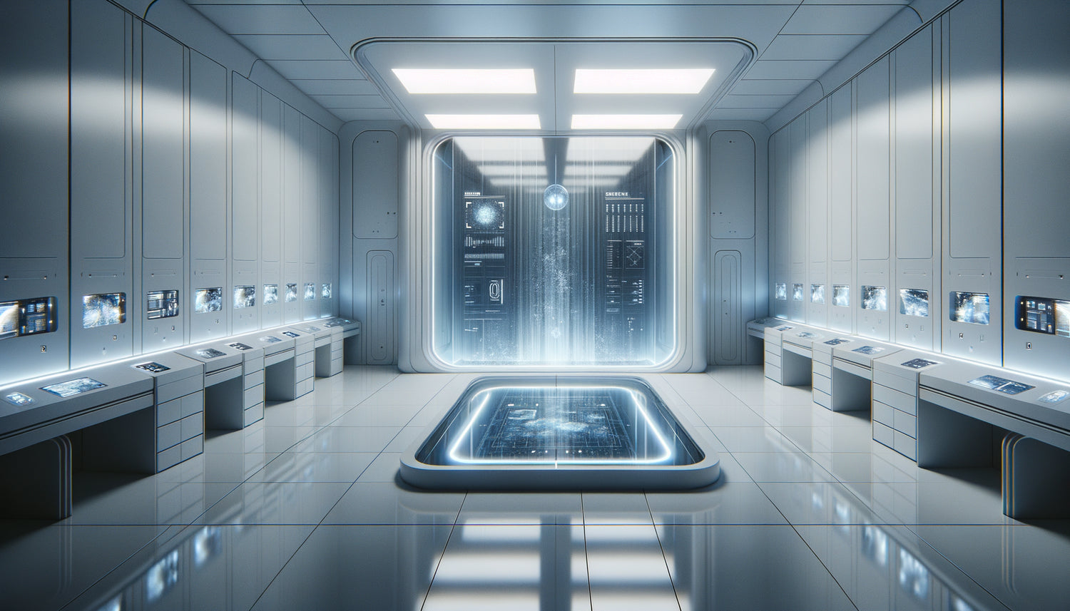
In Black Mirror, minimalism is never synonymous with serenity. Charlie Brooker and his art directors understood something essential: excess purity becomes toxic. Take the episode Nosedive, where pastel and streamlined interiors create a more oppressive atmosphere than an industrial bunker. Smooth surfaces, perfect right angles, total absence of texture: this digital aesthetics hypercontrolled reflects a society where humanity has disappeared behind algorithms.
I noticed during my research for an installation on digital surveillance that Black Mirror systematically uses immaculate white to signify danger. Unlike classic dystopias with dark and dilapidated universes, this series shows us bright, almost medical spaces. Scandinavian furniture becomes unsettling, open-plan kitchens resemble sterilized laboratories. This inversion of domestic comfort is brilliant: it forces us to question our own decorative choices.
The color palette of technological anxiety
The digital aesthetics of the series relies on a remarkable science of colors. Dystopian episodes favor desaturated tones: bluish grays, cold whites, deep blacks. But what fascinates is the occasional use of saturated colors as warning signals. The bubblegum pink of San Junipero, the aggressive neon lights of USS Callister: each palette tells a specific form of dystopia.
In Fifteen Million Merits, wall-sized screens broadcast garish colors while the real environment remains uniformly gray. This contrast perfectly visualizes our era: hyper-colored screens in increasingly neutral living spaces. This observation transformed my approach to integrating technology into exhibition projects.
Interfaces and screens: when digital devours physical space
Black Mirror’s obsession with user interfaces goes beyond mere technological credibility. Every touchscreen, every holographic projection, every notification system is conceived as an architectural element. In White Christmas, the mental control interface literally transforms the perception of space. Floating menus are not accessories: they become the new partitions of our habitat.
What strikes me about this Netflix series is the materiality given to digital elements. Interfaces have a visual weight; they project colored lights on faces; they create interaction zones in space. When I design immersive installations, I draw directly from this approach: digital is not immaterial; it sculpts space as would a wall or a piece of furniture.
The architecture of constant surveillance
The dystopia of Black Mirror is embodied in modernized panoptic architectures. Open spaces without intimacy, omnipresent glass walls, cameras integrated into the design: each architectural element reinforces the feeling of surveillance. In Arkangel, the traditional family home becomes a transparent prison thanks to geolocation technology. The domestic space, theoretically a refuge, transforms into a glass cage.
This approach has radically changed my perception of open spaces and smart homes. Black Mirror shows us the dark side of architectural transparency: the impossibility of intimacy, the dissolution of boundaries between private and public life. The series’ sets function as visual warnings about the possible excesses of our current trends in interior architecture.

Object design as social critique
Each gadget in Black Mirror is a masterpiece of speculative design. The grain of the episode The Entire History of You – that small implant behind the ear – has an Apple-esque minimalist aesthetic that makes it immediately desirable. That's precisely what makes it terrifying. The seductive digital aesthetics masks a functional dystopia.
The objects in Black Mirror borrow from the codes of contemporary premium design: noble materials, impeccable finishes, careful ergonomics. This narrative strategy is brilliant: it prevents us from rejecting these technologies as distant science fiction. When I see a consciousness cookie in White Christmas with its zen pebble design, I immediately think of connected speakers that populate our living rooms. The series transforms our familiar objects into dystopian premonitions.
The tyranny of seamless design
One detail fascinates me in the digital aesthetics of the series: the absence of cables, visible screws, visible joints. Everything is seamless, without seam. This formal perfection reflects a design ideology that erases all traces of manufacturing, repair, technical understanding. Objects become elegant black boxes. This visual critique of contemporary design is one of the most subtle in Black Mirror.
In my installations, I have begun to voluntarily expose cables, circuits, mechanisms. It's my direct response to this dystopia of invisible design that the Netflix series denounces. Showing how things work is keeping power over them.
When nostalgia becomes dystopian aesthetics
San Junipero remains the most visually fascinating episode: a dystopia paradoxically colorful and nostalgic. The aesthetics of the 80s and 90s are recreated with obsessive precision. But this nostalgia is itself a form of prison: a digital paradise frozen in an idealized past. The series asks us: what if our past aesthetic references became the only imaginable futures?
This reflection resonates deeply with current retro-futuristic design trends. Black Mirror shows us that endlessly recycling the aesthetics of the past is giving up on inventing new visual languages. Nostalgia as creative paralysis: here's a form of dystopia rarely explored in visual science fiction.

The influence of Black Mirror on contemporary design
It is impossible to deny the impact of this Netflix series on the imagination of today's designers. Since its launch in 2011, I have seen a new aesthetic current emerge that I call digital critical design. Entire exhibitions take up the visual codes of Black Mirror: dystopian interfaces, panoptic architectures, familiar objects made unsettling.
Design schools now teach the series as a reference in speculative design. The digital aesthetics developed by Charlie Brooker and his teams has become a common language for thinking about technological futures. This cultural influence goes far beyond the realm of fiction: it is actually shaping our critical relationship to the design of interfaces, objects and connected spaces.
Brands like Apple or Google have even had to react to this critical aesthetic. Some recent advertising campaigns explicitly attempt to reassure: no, our products will not create a world like Black Mirror. This need to defend themselves proves the visual and conceptual impact of the series on our collective perception of technological design.
Transform your interior into a narrative gallery
Discover our exclusive collection of paintings inspired by famous artists that dialogue with digital and futuristic aesthetics to create spaces full of meaning.
Living after Black Mirror: towards a conscious design
The great aesthetic lesson of Black Mirror is not to reject technology or contemporary design. It is to exercise a critical gaze on the formal choices that shape our everyday environments. Every interface, every connected object, every smart space conveys an ideology. Digital aesthetics is never neutral.
Since I integrated this perspective into my practice, I design differently. I systematically question: does this design make the user autonomous or dependent? Does this interface reveal its operation or obscure it? Does this connected space preserve privacy or dissolve it? Black Mirror offers us a visual reading grid to evaluate the design that surrounds us.
The series reminds us that aesthetics is not superficial: it embodies values, power relationships, worldviews. Understanding the digital dystopian aesthetic of Black Mirror is acquiring the tools to imagine alternatives. To design spaces, interfaces and technological objects that respect our humanity rather than compromise it.
Imagine your living room in ten years. Will it be populated with connected objects whose operation you do not understand? Your walls will they be screens that watch you as much as they entertain you? Or will you have chosen a transparent, repairable, respectful domestic technology? Black Mirror does not show us an inevitable future, but possible futures. It is up to us to choose which aesthetics we want to inhabit. Start with a simple gesture: observe the technological objects in your home with the critical eye that the series has taught us. Then ask yourself: what do their designs say about my values?
Frequently asked questions about the Black Mirror aesthetic
Why does Black Mirror use so many white and minimalist spaces?
The white minimalism in Black Mirror is not a simple trendy aesthetic choice. It is a deliberate narrative strategy to reverse our positive associations. We are conditioned to perceive clean and bright interiors as healthy and soothing. The series diverts these codes: the immaculate white becomes sterile, oppressive, dehumanizing. This digital aesthetic aseptic reflects societies where technological efficiency has erased all human imperfections. Minimalist spaces function as empty shells, showroom sets where no one really lives. It is precisely this uninhabitable perfection that creates anxiety. Minimalism thus becomes the visual language of a gentle dystopia, where oppression wears the mask of contemporary good taste.
How does Black Mirror actually influence interface design?
The impact of Black Mirror on interface design goes far beyond fiction. Many UX/UI designers use the series as a reference to illustrate the possible pitfalls of their creations. The dystopian interfaces of Black Mirror – social scoring systems, mental control interfaces, matching algorithms – have become case studies in design ethics. Several design schools organize Black Mirror workshops where students must imagine the negative consequences of their interfaces. This critical approach has given rise to the movement of ethical design, which integrates social and psychological impacts from the outset. The Netflix series has thus contributed to professionalizing criticism of technological design, transforming designers into ethical guardians rather than mere executors.
Can we draw inspiration from Black Mirror to decorate our interior without creating a dystopian atmosphere?
Absolutely, and it's even fascinating! The digital aesthetic of Black Mirror offers valuable lessons for conscious and sophisticated interior design. The approach is to borrow the formal rigor and chromatic consistency of the series while avoiding its coldness. Prioritize domestic technologies whose design reveals function rather than obscuring it. Integrate natural and textured materials to counterbalance smooth surfaces. Create screen-free zones to preserve intimacy. Use lighting to humanize technological spaces. The idea is to draw inspiration from the visual sophistication of Black Mirror – its controlled palette, its intentional minimalism – while rejecting its underlying ideology. You create an interior that celebrates the human rather than diminishing it. This is what I call post-dystopian design: aware of the dangers, but resolutely optimistic.