I recently installed a reproduction of The Birth of Venus in a Parisian apartment with anthracite gray walls. The owner, a thirty-year-old lawyer, expected a violent contrast. Instead, this cascade of golden hair and this pearly pink transformed her minimalist living room into a sanctuary of timeless elegance. Three weeks later, she wrote to me: "My guests remain frozen in front of it. It has become the heart of my interior."
Here's what Botticelli in decor brings to your spaces: a narrative sophistication that transcends trends, a rare chromatic palette that softens contemporary interiors, and this unique ability to create a focal point that tells a story without ever shouting.
You may feel that the Italian Renaissance belongs in museums, that these monumental works have nothing to do with a modern living room. You fear the mismatch, the pompous effect, that impression of turning your interior into a dusty exhibition hall. I understand this hesitation. For years, decorative codes have conditioned us to separate ancient art from daily life.
But something has changed. The most visionary interior architects are reintroducing Botticelli into their contemporary projects, not as nostalgic quotation, but as an emotional counterpoint to our hypermodern environments. And it works beautifully.
Let me show you why this Italian Renaissance is now finding its most natural place in our living rooms, and how to integrate it with just the right touch.
When Quattrocento meets Scandinavian design
The first time I paired a reproduction of Botticelli with Muuto furniture, I understood something fundamental: the clean lines of contemporary design simply ask to be inhabited by a warm human presence. Spring, with its graceful figures and flowing draperies, brings exactly what minimalist interiors desperately seek: soul.
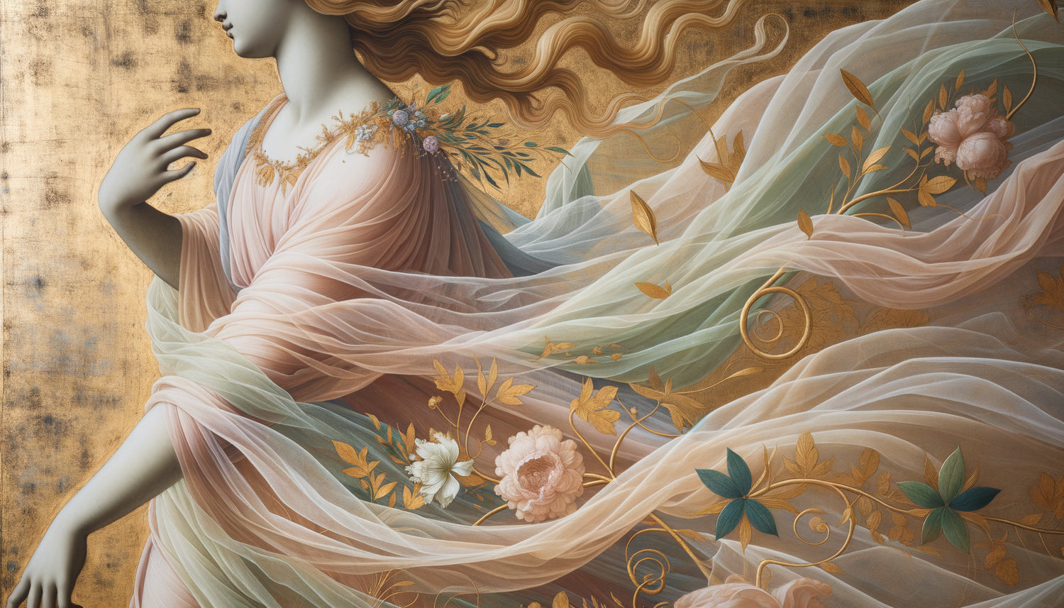
The Italian Renaissance excels in a register that our era has almost forgotten—the representation of idealized beauty without aggressive artifice. No saturated colors, no violent contrasts. Just this milky luminosity, these porcelain complexions, these celestial blues that wonderfully dialogue with contemporary neutral palettes.
In a living room with beige, linen and terracotta tones, a scene from Botticelli acts as a revealer. It doesn't dominate the space, it elevates it. I have observed this phenomenon in about fifteen projects: the artwork creates a visual breath, a moment of grace that slows down the gaze without ever blocking it.
The chromatic palette that soothes overloaded interiors
Our environments suffer from a stimulating overdose. Screens, notifications, urban rhythms. Interiors become refuges, and that's where Botticelli in decor reveals its contemporary genius.
Analyze the tones of a Botticelli's Madone: pale roses, pastel blues, aquamarine greens, faded golds. This color palette has a documented soothing property by interior designers. It naturally lowers visual tension, unlike saturated works that, even beautiful, can be fatiguing.
I installed The Madonna of the Magnificat in a master bedroom with sage green walls. The owner suffered from insomnia. Six months later, she attributed part of her improvement to “this gentle presence that beautifully closes my day”. Coincidence? Perhaps. But I have stopped underestimating the emotional impact of antique palettes in our hyper-connected lives.
Color combinations that work
To integrate Italian Renaissance consistently, prioritize these pairings:

- With anthracite gray : the contrast enhances the luminosity of complexions
- With terracotta and earthy tones : you recreate authentic Florentine atmosphere
- With off-white and linen : the effect is airy, almost dreamlike
- With deep midnight blue : for a sophisticated library living room
Why our living rooms are calling for this Renaissance today
There is a profound reason for the return of Botticelli in contemporary decor, and it goes beyond a trend. We live an era of progressive disembodyment: remote work, virtual interactions, dormitory city. Our interiors become the only spaces where we can still anchor our humanity.
The Italian Renaissance celebrated precisely that — the dignity of the human figure, the beauty of the living, embodied spirituality. Hanging Botticelli in a modern living room is reaffirming that our domestic spaces are not just functional capsules, but places of elevation.
I have noticed this trend among my youngest clients, paradoxically. A 28-year-old entrepreneur confided to me: “I'm tired of algorithm-friendly design. I want something that existed before Instagram, something real.” She chose The Birth of Venus for her home office. Not as a poster, but as a large-format textured canvas reproduction. The message was clear: to regain possession of one’s visual environment.
How to Incorporate Botticelli Without Turning Your Living Room into a Museum
The main concern? Creating a stuffy effect, that impression of decorative disguise which kills all authenticity. Here are the principles I consistently apply to avoid this pitfall.
The Principle of Uniqueness
One Botticelli artwork per room only. Never more. Accumulation dilutes the impact and veers into historical reconstruction. Let the artwork breathe, surrounded by empty space or plain walls. It must be the unique focal point, the element that naturally captures the eye upon entering.
The Assumed Contrast with the Furniture
Don't try to harmonize it with Renaissance furniture. On the contrary. Botticelli in decor works beautifully with sleek contemporary furniture. A Flexform sofa, a Noguchi coffee table, minimalist lighting — this temporal contrast creates a fascinating creative tension.
The Format Adapted to the Architecture
For a standard living room (25-30m²), aim for a minimum format of 90x120cm. Too small, the artwork loses its presence and becomes decorative in a reductive sense. Too large in a small space, it overwhelms. In lofts with generous volumes, dare to go for 150x200cm. Spring in a very large format literally transforms the atmosphere of a room.

Botticelli Works That Really Transform an Interior
Not all compositions work equally well in a domestic context. After dozens of installations, here are the ones that consistently create the desired effect.
The Birth of Venus remains the obvious choice for a main living room. Its horizontal composition adapts perfectly above a sofa or console. The central figure of Venus creates a powerful focal point without aggression. In contemporary interiors with lots of gray and concrete, it brings a sophisticated femininity.
Spring is best suited for bright rooms with high ceilings. Its vertical composition and narrative density require space to step back. I installed it in a dining room with glass walls: the work captures changing natural light throughout the day, revealing different nuances.
The Madones (particularly the Madonna of the Magnificat) excel in intimate spaces—bedrooms, libraries, personal offices. Their circular format (tondo) pleasantly breaks up the ubiquitous rectangular geometry in our interiors. And their restricted palette makes them easy to integrate chromatically.
The mirror effect: when Italian Renaissance reveals your decorative identity
There is something fascinating that happens when you introduce Botticelli into a modern interior. The work acts as a revealer of personality. It forces the other decorative elements to position themselves, to assert their legitimacy or to reveal their superficiality.
I have seen clients spontaneously remove decorative objects accumulated over the years, suddenly realizing that they had never really liked these elements. The presence of Italian Renaissance raises the aesthetic requirement level of the entire space. You can no longer cheat with low-end filler decor.
This is also why Botticelli in decoration is experiencing this comeback: in an era saturated with cheap objects and disposable trends, a timeless work forces consistency. It becomes the cornerstone around which everything else naturally organizes itself.
Ready to invite the Renaissance into your living room?
Discover our exclusive collection of wall art inspired by famous artists that will transform your interior into a space of daily elevation.
Your living room deserves this conversation with beauty
The real question is not whether the Italian Renaissance has its place in our contemporary interiors. It always has. The question is rather: are you ready to offer your space the narrative depth that only five centuries of history can bring?
Imagine your living room tomorrow morning. Daylight caresses Venus's complexion, revealing those subtle glazes that Botticelli mastered like no other. Your coffee tastes different in this transformed environment. Your guests don’t quite know why your interior soothes them, but they stay longer and talk more calmly.
It is not nostalgia. It is decorative intelligence. Using what history has produced most beautifully to create spaces that truly resemble us.
Start with a single piece. Choose it for its tones, for the emotion it evokes in you. Give it the space it deserves. And watch how your living room gradually becomes what you've always wanted: a sanctuary that resembles you, a space that tells who you are, beyond fleeting trends.
The Italian Renaissance has not returned to our living rooms. It never really left. We had just forgotten that it was still speaking to us.
FAQ: Integrating Botticelli into your decor
Doesn't a Botticelli reproduction make a room feel too much like a museum in a modern interior?
This is the most common concern, and I understand it. But the museum effect rarely comes from the artwork itself, but rather from how it is integrated. If you frame it with a rococo gold molding and surround it with pseudo-antique objects, yes, you will create a pastiche. On the other hand, a Botticelli reproduction on canvas, with a clean frame or even without a frame, hung on a solid wall in a contemporary environment, creates a sophisticated contrast. The artwork becomes a bridge between eras, not a reconstruction. I installed The Birth of Venus in an industrial loft with exposed brick walls and metal beams: the effect was spectacular, absolutely not museum-like. The secret? Let the work breathe on its own, without decorative accumulation around it.
Aren't the pastel colors of the Italian Renaissance likely to clash with my colorful interior?
On the contrary, the soft tones of Botticelli often act as a visual regulator in overly stimulating interiors. If your living room mixes several bright colors (mustard yellow, duck blue, terracotta), an artwork with pastel shades creates a necessary breath. It doesn't compete with your color choices, it soothes them. I worked with a client whose living room combined powder pink, emerald green and gold brass—a bold mix. Adding a Madonna by Botticelli unified the whole by creating a calm visual anchor. The Renaissance palette contains enough nuances to dialogue with almost all contemporary ranges. If your interior is really saturated, opt for the brightest compositions like The Birth of Venus which bring clarity.
What budget should you expect for a quality reproduction that does justice to Botticelli?
The price range varies considerably depending on the reproduction technique. A simple poster print (30-50€) will give a flat and disappointing result — to be absolutely avoided if you want to recreate the depth of Botticelli. Canvas reproductions with texture (100-300€ depending on the size) offer excellent value for money: they recreate the relief of brushstrokes and give presence to the artwork. For a result almost identical to the original, giclée canvas reproductions with varnish finish (300-800€) are superb. I generally guide my clients towards the mid-range (150-350€), which already offers sufficient quality to transform an interior. My advice: invest in a generous format rather than a small premium reproduction. In decoration, Italian Renaissance needs physical presence to deploy its emotional impact. A 120x90cm of average quality will always outperform a 40x30cm premium.