Pairing Bedding and Artwork for a Bedroom Worthy of a 5-Star Hotel
By Alexandre MARY
⏱️ Reading time: 8 minutes
You look at your bedroom and feel that dull frustration: despite your efforts, it lacks the sophisticated elegance of hotel suites you admire. The sheets are fine, you've chosen harmonious colors, but something is off.
In the morning, when opening your eyes, instead of that discreet luxury you seek, you find yourself facing a set lacking character. Your gaze falls on that empty wall above the bed, on the bedding that seems "flat" despite its quality, on an atmosphere that remains desperately... ordinary.
You may have already tried hanging a random picture or invested in high-end bedding thinking it would be enough. But the result disappoints you: either the effect is garish, or it lacks that visual coherence that makes all the difference.
Rest assured, this isn't a lack of taste on your part. The problem is simply that you’ve never been shown the science of decorative harmony behind the most beautiful hotel rooms.
By the end of this article, you will master the art of matching bedding and paintings to transform your bedroom into a true 5-star hotel suite - and awaken that pride every morning when opening your eyes.
Why doesn't your room still look like a luxury hotel?
The uncomfortable truth: waiting any longer means accepting to live in a space that doesn't inspire you every day. It’s like wearing clothes that don’t flatter you - the impact on your mood is real, even if you don’t realize it. The longer you wait, the more you get used to this visual mediocrity which becomes your new norm.
🏨 Hotelier revelation: Sophie, a decorator in a Parisian palace, recently confided in me: "Our clients often ask us the secret of our rooms. They think it's the price of the linen or the brand of the furniture. In reality, 80% of the effect comes from three specific combinations between textiles and wall art that we systematically apply."
💬 Conversation with a decor expert
"I'm afraid my paintings will clash with my bedding... How can I be sure they go well together?"
This fear is understandable, but think about your favorite outfit: you don’t choose your shirt and jacket randomly, you follow an intuitive color harmony. For your bedroom, it's exactly the same! There are simple rules that eliminate any risk of a wrong note.
"I've always been told to use neutral colors in a bedroom for better sleep..."
This rule dates back to the era when colored pigments were aggressive. Today, sophisticated sophisticated colors (deep blues, sage greens, shadow tones) instead create a soothing and refined atmosphere. The finest hotels understand this!
The fundamental principle of hotel harmony: Create a visual dialogue between your textiles and artworks, like an orchestra conductor tuning their instruments. The result? An enveloping and refined atmosphere perceptible from the first steps in the room, in just 48 hours after installation.
What's really happening in your room (and why it's not working)
Do you recognize these three situations? Your gaze glides over the entire space without stopping anywhere, you feel a sense of "emptiness" despite the presence of objects, and your guests give polite compliments but without real enthusiasm.
What's really happening: your brain instinctively seeks visual anchor points and harmonious connections. When it doesn't find them, it classifies the space as "ordinary". The problem isn’t your taste, but the lack of a decorating strategy.
It's like trying to create a melody by playing random notes: individually, each note is right, but together they don't tell any story.
The real reason: you decorate with isolated elements
Here’s what no one has told you: professional decorators never choose a single element. They think in terms of a decor ecosystem where each piece dialogues with the others. You, you buy a beautiful painting and then some linens, without creating a bridge between the two.
Imagine a gourmet restaurant: the chef doesn't choose each ingredient for its individual qualities, but for the harmony they create together on the plate.
The impact in your daily life? You live in a space lacking strong personality, which doesn’t tell your story or reflect your refinement. Worse: you miss this daily opportunity to feel inspired in your own room.
🔍 Revealing test: Take a photo of your current room, then look at it as if it were someone else's room. What attracts your eye first? If your gaze "jumps" from one element to another without fluidity, it’s a sign of a lack of visual dialogue.
The proportion error everyone makes
The popular belief says “a large bed requires a large painting”. That's wrong! Luxury hoteliers often use several works of different sizes that create a visual rhythm, like a musical composition with its climaxes and breaths.
Think of a jewelry store window: it’s not the largest diamonds that create elegance, but the way they are staged with more discreet pieces.
Consequence at your home: either your painting dominates and overwhelms the linens, or it is forgotten. In both cases, you lose this balanced sophistication that characterizes prestige suites.
The trap of perfect coordination
Here's the secret magazines never reveal: seeking perfect color agreement paradoxically creates a flat and lifeless effect. Luxury hotels always introduce a subtle "discordant note" that energizes the whole.
You can check this at home: observe what details you lack - a contrasting texture, a pleasantly surprising nuance, a material that breaks the monotony without shocking.
In your daily life, this translates to an atmosphere that is certainly harmonious, but which lacks that spark that makes a space memorable and photographable.
The 3 signals of a room lacking visual dialogue:
The gaze wanders: Your eyes don't find an agreeable resting point and dart around like in a crowded train station
The catalog effect: Each element seems isolated from the others, giving the impression of a showroom rather than a personal cocoon
Instant oblivion: Your guests have trouble describing your room after their visit, a sign that no memorable detail has etched itself into their memory
The trigger element: the rule of three levels
What really makes the difference in exceptional suites is the superimposition of three visual levels: the base (linens), the relief (wall art), and the link (an element that bridges the two). It's this sense of depth that instantly creates the impression of luxury and sophistication. At home, identify which level is missing: often it’s the linking element that is lacking.
The hotelier's golden rule: "Never two identical elements, never two completely opposite elements." Create subtle echoes between linens and wall art - a color that responds to each other, a texture that complements. Check immediately: do your elements speak to each other or ignore each other?
❌ Amateur approach
✅ Hotel vision
💡 Why it changes everything
🎯 Immediate benefit
Choose the linens first, then look for a matching wall art
Design an overall color universe and then decline each element
Avoids the "matched" effect and creates natural coherence
Obvious harmony at first glance
Prefer neutral colors out of caution
Dare to use a signature color declined in different intensities
Brings character and memorability without the risk of bad taste
Room that tells your personality
Hang a single large wall art above the bed
Create a wall composition with different sizes
Generates visual dynamism and sophistication
Personal gallery effect
Seek perfect coordination everywhere
Introduce a subtle contrasting note that energizes
Avoids monotony while maintaining elegance
Relief and character without chaos
The 3-Step Method to Create Your Personal Suite
Great news: transforming your bedroom doesn't require a complete overhaul. Like a pastry chef who masters their fundamental techniques, you will learn to build your harmony layer by layer. First the solid foundations (your palette), then the visual architecture (layout), finally the finishing touches that make all the difference (connection details). In 3 weeks, you'll look at your bedroom with that discreet pride felt in the finest hotels.
🎯 Overview of Your Transformation: Step 1 - Define your color universe (weekend 1), Step 2 - Create the visual architecture (weekend 2), Step 3 - Refine subtle connections (weekend 3). Each step builds on the previous one, like building a melody: first the basic chord, then the melody, finally the ornaments that sublimate the whole.
Step 1: Create Your Color Signature (Like Luxury Hotels)
Starting with color is no coincidence: it's your decorative DNA that will guide all your future choices. Like a perfumer who first chooses their heart note, you will identify the shade that will be the guiding thread of your bedroom. Once this base is laid, you’ll already feel that reassuring coherence that characterizes well-thought-out spaces.
The Elements of Your Personal Palette
Dominant Color: Choose a sophisticated shade that soothes you (midnight blue, sage green, Sienna earth). It will represent 60% of your space mainly through linens. Avoid overly saturated colors that are tiring in the long term - prefer powdered or deep tones found in palaces, as they age well and remain elegant in all circumstances.
Secondary Color: A nuance that dialogues with the dominant color without copying it - think musical harmony rather than unison. It will appear in 30% of the space through paintings and accessories. The principle: close enough to be harmonious, different enough to create relief and visual interest.
Accent Color: The little surprise that awakens the whole without disrupting it - a maximum of 10% via precious details. It's what transforms a beautiful ensemble into a memorable and sophisticated decoration.
Now, let’s move on to building your harmony
Practical Application of Your Palette
Test Your Dominant Color: Place your current or envisioned bedding near a window at different times of the day. The color must remain flattering even in full light and retain its elegance in the evening. This longevity test is what separates an amateur choice from a professional one.
⏱️ Time: 1 day of observation | ✅ Successful when: The shade pleases you as much in the morning as in the evening | ⚠️ Attention: Colors that "shout" in stores quickly become tiring - prefer those that whisper elegantly
Identify your secondary color: Use the "not forward, not backward" rule - if your dominant hue is a gray blue, your secondary could be a more vibrant blue or a warmer gray. The goal: create a natural progression rather than a brutal contrast.
⏱️ Time: 30 minutes of reflection | ✅ Successful when: The two colors side by side create an obvious harmony | ⚠️ Attention: Avoid choosing the pure complementary color (red/green) which would create visual tension
Define your precious accent: Look for a color that "makes sparkle" your first two without dominating them - often a more intense or lighter version of your palette. Test with a small object (cushion, frame) before deciding. This color will be your personal signature.
⏱️ Time: 1 hour testing with objects | ✅ Successful when: The accent pleasantly attracts the eye without creating discord | ⚠️ Attention: More than 10% of accent turns elegance into decorative overload
✅ Validation of your palette: Your three colors together should evoke a refined vacation spot or a pleasant memory. If they leave you indifferent, it's because they lack emotion. Adjust until you feel that little satisfaction one feels in front of a beautiful harmony. Once found, this palette will become your decorative compass for all your future purchases.
OUR RECOMMENDED PRODUCTS
Step 2: Build the visual architecture of your space
Now that your palette is defined, you are going to create the visual structure that transforms a simple assemblage into a refined composition. This is when your room really starts to look like a hotel suite: each element finds its logical place and contributes to the overall effect. You will feel this satisfaction grow as harmony takes shape before your eyes.
The pillars of your decorative architecture
Home linen structure: Choose pieces in your dominant color with at least two different textures (smooth percale + crinkled linen, for example). This tactile variation creates richness without color chaos. Favor natural materials that age well and bring this nobility found in prestigious establishments.
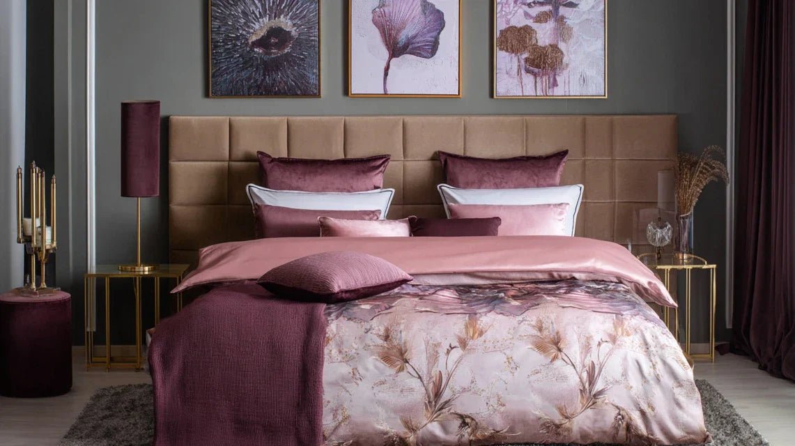
Main wall composition: Plan an ensemble of 3 to 5 artworks of different sizes that dialogue with your bedding. The golden rule: the central artwork should represent approximately 60% of the width of your headboard. The adjacent pieces create rhythm and balance, like the accompanying instruments in an orchestra.
Transition elements: Objects that bridge the gap between bedding and wall art - cushions in your secondary color, textured throws, or small artworks that pick up common nuances. These visual connectors are the secret of the most beautiful harmonies.
Building your harmonious ensemble
Strategic wall layout: Start by marking on the wall the location of your central piece 20-25 cm above your headboard. Then arrange the other artworks to create an asymmetrical balance - more lively than perfect symmetry. The ensemble should form a harmonious imaginary rectangle.
⏱️ Time: 45 minutes of positioning | ✅ Successful when: The eye naturally moves from one piece to the next | ⚠️ Attention: Hanging too high disconnects the art from the bed - maintain visual proximity
Texture orchestration: Alternate materials on your bed like a chef would alternate instruments - smooth sheet, slightly textured duvet cover, more marked throw. This tactile progression adds sophistication without visual clutter.
⏱️ Time: 20 minutes of adjustment | ✅ Successful when: Each texture stands out without creating cacophony | ⚠️ Attention: More than 3 different textures risk creating a sense of disorder
Colored bridges creation: Add your transition elements by picking up the colors present in your paintings. A cushion that picks up a shade, a small frame that echoes - these subtle repetitions weave the coherence of the ensemble like a decorative thread.
⏱️ Time: 30 minutes of finishing | ✅ Successful when: Each color appears at least 2 times in different supports | ⚠️ Attention: Too many repetitions create a "coordinated" effect that lacks naturalness
🎨 Overall look test: Photograph your ensemble and observe it like a painting. Your eye should be able to move smoothly from point of interest to point of interest without snag or shadow. If an area attracts too much attention or lacks it, adjust the balance. The goal: create this visual fluidity that is felt in the most beautiful hotels.
You are now entering the realm of expert finishes that transform a beautiful set into exceptional decor. This is where your decorative sensibility reveals itself: those almost imperceptible details that make you feel immediately comfortable in a space. Your bedroom acquires that natural sophistication that cannot be imitated, only cultivated with care.
The subtleties that make the difference
Indirect lighting play: Integrate light sources that reveal your textures and enhance your works without assaulting them. Accent lamps with natural material shades, discreet LED lighting behind the headboard - light becomes a decorative material in its own right that transforms the atmosphere according to the moments.
Signature objects: A few selected pieces that tell your personal story while respecting your palette - art book, delicate vase, quality candle. These intimate details transform a perfect decor into a living and endearing space.
Natural vegetation: One or two plants that bring this organic life often missing from overly controlled spaces. Choose them for their sculptural form as much as for their color - they become living works of art.
Finalizing your exceptional atmosphere
Ambient lighting calibration: Test different lighting at sunset - a crucial moment when your bedroom must remain welcoming. Adjust the intensity to create that cocooning atmosphere found in prestige suites, neither too weak nor too harsh.
⏱️ Time: 1 evening of adjustment | ✅ Successful when: The atmosphere remains warm even without natural light | ⚠️ Attention: Lighting that is too contrasting breaks the overall harmony of your composition
Integration of personal details: Arrange your signature objects according to the rule of odd numbers and at different heights. Create small scenes that tell something - as a stylist would arrange a still life for a magazine.
⏱️ Time: 40 minutes of styling | ✅ Successful when: Each detail seems naturally in its place | ⚠️ Attention: Too many personal objects dilute the impact of your main composition
Vegetation finalization: Place your vegetation so that it dialogues with your works without competing with them - often slightly offset, never in a straight line. Plants bring this living imperfection that humanizes technical sophistication.
⏱️ Time: 15 minutes of positioning | ✅ Successful when: The greenery enriches without distracting from your composition | ⚠️ Attention: A poorly placed plant can unbalance all your color harmony
🌟 Final expert validation: Allow yourself 48h to live in your new space before any adjustment. Observe how your gaze settles, how you feel when you wake up, what is the reaction of your loved ones. If the whole thing provides that discreet satisfaction one feels in a beautiful hotel, you have succeeded in your transformation. Otherwise, identify the element that still catches your eye and refine it with patience.
The expert's progression rule: Master each step perfectly before moving on to the next - solid palette before architecture, mastered architecture before finishing touches. Eager to see the final result? Resist: it is this patience that separates an amateur result from a professional achievement. Each well-executed step multiplies the impact of the next.
You have just discovered the secret codes that luxury hotel decorators apply instinctively. Now, let's enrich your expertise with these insider subtleties that will make you a true connoisseur - and impress your guests for years to come.
🎭 Palace secret: The greatest hotels always create a "controlled imperfection" - an element slightly offbeat that breaks the perfect symmetry and brings humanity. A cushion deliberately misplaced, a picture slightly tilted, a plant overflowing from its intended space. This calculated imperfection transforms a perfect decor into a living and endearing space. Test it on a detail: the effect is striking!
🤔 "But if I already have white linens, do I need to buy everything new?"
"I love my current white linens, but I'm afraid they won't match colorful paintings..."
Excellent question that reveals a true sensitivity! White is actually the best ally of works of art - think of art galleries which use white walls to sublimate their collections. Your white linens become a neutral frame that enhances your paintings without competing with them. Simply add some colored connecting elements (cushions, plaid, small accent piece) that pick up the colors of your main paintings. Result: maximum sophistication with minimal investment!
💡 Immediate action: Test this harmony by temporarily placing a colored fabric (scarf, towel) near your white linens and your future paintings. You will instantly see how white magnifies colors rather than dulling them.
The 5 mistakes that break the luxury hotel effect (and how to avoid them)
Attention: these mistakes are so common that they seem natural, but they instantly sabotage your efforts. I reveal them to you to save you months of trial and error and protect your decorative investment. Even experienced decorators have gone through these pitfalls at the beginning.
🎯 Hanging too high: The desire to "protect" your artwork by hanging it high creates a fatal disconnection from your bed. Your paintings float in the void instead of dialoguing with your bedding. Keep a maximum of 15-20 cm between the top of your headboard and the bottom of your main work. It's closer than you think, but it's this proximity that creates the intimacy of the most beautiful suites.
🌈 The perfect match trap: Wanting everything to match perfectly paradoxically kills elegance. True professionals always introduce a calculated dissonance - a nuance that cuts slightly, an unexpected texture. Without this breath, your room looks like a catalog rather than a living space. Dare to add 10% of the unexpected to your harmony!
⚖️ Forced balance at all costs: Seeking perfect symmetry (two identical lamps, paintings aligned to the millimeter) creates a rigid effect that lacks soul. Charming hotels prefer dynamic balance - same visual weight but freer and more natural distribution. A large work can balance two small ones, a rich texture compensate a paler color.
💡 Functional lighting only: Settling for the central ceiling light transforms your beautiful composition into a store decor with a flat rendering. Indirect and multiple lighting reveals textures, creates depth, metamorphoses the atmosphere. Minimum 3 different light sources to recreate the magic of hotel lighting.
📏 Poorly calibrated proportions: A tiny painting on a large wall or a gigantic work that overwhelms the space breaks the harmony of volumes. The rule: your wall composition should occupy 60-75% of the width of your headboard to create this proportional accuracy that is intuitively felt in the most beautiful spaces.
🛡️ Anti-error verification system: Photograph your room under different lighting conditions and at different times. A successful composition remains harmonious in all conditions. Warning signs: shadow areas that "break" the whole, elements that excessively attract the eye, feeling of emptiness despite the presence of objects, difficulty describing the overall atmosphere in a few words.
Because you took the time to inform yourself, enjoy 10% discount on your first order:
ART10
⏰ Valid 72h after reading • Applicable to all our products
❓ Practical questions about your decor transformation
💰 What budget should I allocate to completely transform my bedroom in this spirit?
Great news: you can create a spectacular effect from €300-€500 by starting with the essentials (1-2 quality artworks + some textile linking elements). For a complete palace-level transformation, allow €800-€1200 spread over 2-3 months. The pro tip: start with your wall composition that sets the tone, then gradually complement it. Each addition amplifies the effect of the already in place elements!
⏰ How long does it take to really see a difference?
The visual impact is immediate upon hanging your first well-positioned artwork! But to fully master your new ambiance and fine-tune it, allow yourself 3-4 weeks. This is the time needed to live in the space, observe how the light evolves, and refine the details. Patience rewarded: the final result will surprise you with its natural sophistication.
🎨 I don't know much about art, how do I choose artworks that go together?
Rest assured: "good taste" in decoration is cultivated, but your emotional instinct is already an excellent guide! Start with works that evoke a positive emotion in you, then apply our color rules. Our advice: first choose for the emotion, then adjust for harmony. A painting that touches you will naturally find its place in an environment designed with method.
🔄 Can I adapt this method if I often change my decor?
Absolutely! It's even an advantage: mastering these fundamental principles allows you to evolve your decor without ever losing that hotel consistency. Keep your color scheme as a stable base, and vary the details according to your desires. Thus, your bedroom evolves while retaining this sophisticated signature that characterizes you.
🏠 Does this approach work in a small bedroom?
Even better! Small spaces benefit enormously from this method because every element counts double. Color harmony visually expands the space, and the well-thought-out wall composition creates an impression of height. Secret of chic Parisian studios: focus on quality rather than quantity. Fewer elements, but perfectly orchestrated for maximum impact.
Your 5-star hotel room awaits you
In 3 weeks, you will open your eyes every morning in a space that truly resembles you - this refined version of yourself that you wanted to express. Your guests will immediately notice this natural elegance emanating from your bedroom, without being able to exactly say why. This is the sign of a truly mastered decoration: it acts subtly, creates emotion without apparent effort.
Beyond aesthetics, you will have developed a decorative eye that will serve you in all your future design projects. This ability to see harmonies, anticipate balances, create coherence in diversity - it is a lasting know-how that transforms your relationship with space and beauty.
The most difficult part was understanding the hidden mechanisms behind hotel elegance. Now that you've mastered them, all that remains is to take action! Start this weekend by defining your palette - this first victory will give you the momentum to completely transform your room.
🌟 Your decor glory moment: In a few weeks, you'll feel that subtle pride of living in a space that truly honors you. Your room will tell your story with that natural sophistication that cannot be bought, only cultivated with method and sensitivity.
📚 Continue your decor transformation
Now that your room is taking on the look of a hotel suite, discover how to extend this sophistication throughout your entire home - living room, dining room, entrance. The same principles of harmony apply, with their own specificities for each living space.