

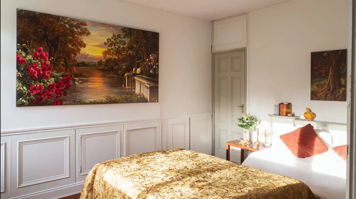
Composez votre galerie d'art

Des tableaux qui racontent votre histoire
Code d'initiation
ART10
10% offerts sur votre premiĆØre acquisition
DƩcouvrir la collection

Hotel Colors: Decorating Tones to Use in Your Wall Art

Couleurs d’hĆ“tel : les teintes dĆ©co Ć  utiliser dans vos tableaux muraux
ā±ļø Reading time: 8 minutes

You've been looking at your walls for weeks, hesitating between that "safe" beige painting and the artwork with vibrant colors that excites you. You dream of that sophisticated luxury hotel ambiance, but fear of making a mistake paralyzes you.

You imagine your guests judging your choice, worry that the colors clash with your furniture, or worse, that your interior looks like a waiting room rather than a refined cocoon.

You may have already tried "one-size-fits-all" solutions: off-white, gray, beige... Result? An interior lacking personality that leaves you wanting more, far from the chic hotel atmosphere you crave.

This is perfectly normal: the color schemes of prestigious establishments are not improvised. They obey a subtle psychology that few people master.

By the end of this article, you will know how to choose the perfect luxury hotel hues for your wall art and transform your interior into a true presidential suite.

Why do hotel colors instantly create this impression of luxury?

Hotel palettes are not chosen at random. They result from in-depth studies on the psychology of color and their impact on our well-being. Each shade is selected to create a precise emotion: serenity, sophistication, or escape. It's like the difference between a Michelin-starred dish and a homemade sandwich: the ingredients may be similar, but it’s the art of combining them that creates the magic.

šŸØ Revelatory testimonial: Sarah, an interior designer, says: "I reproduced the exact color palette of the Four Seasons in my client's living room. Result? Her guests systematically ask her if she hired a palace decorator. Yet, her paintings come from a classic online store!"

šŸ’¬ Conversation with a decor expert

"I'm afraid that colors too sophisticated will look pretentious in my living room. People will think I’m trying to be..."
Think again! True luxury colors are precisely those that go unnoticed at first glance, but create an immediate feeling of well-being. It's like a quality perfume: you don’t notice it, you just feel better in its presence.
"I've always been told to stick with neutral tones so as not to get tired of them. Colors are risky..."
This rule dates back to an era when changing your decor cost a fortune! Today, a simple change of paintings is enough to completely transform an atmosphere. Luxury hotels have understood this: they dare the signature colors that mark the spirits.

The secret of hotel palettes: They create an emotional hierarchy where each color has a specific role. Like an orchestra, it's the harmony of the whole that produces the perfect melody. Visible result: a feeling of discreet luxury in less than 24h.

Why haven’t your previous attempts worked?

Do you recognize yourself? You chose "safe" colors thinking you were doing the right thing, but your interior lacks character. Or conversely, you cracked for vibrant shades that clash with the rest of your decor. Maybe you even multiplied the small touches of color without ever achieving that consistency that makes all the difference.

What's really happening? You are suffering from the incomplete palette syndrome. Luxury hotels never choose a color in isolation: they create chromatic ecosystems where each shade dialogues with the others.

Imagine preparing a meal by choosing each ingredient separately, without thinking about the whole dish. The result is likely to be... surprising! That's exactly what happens with your current decor choices.

The first hidden cause: you don’t know "anchor" colors

Contrary to what one might think, the most effective hotel colors are not the most flashy. These are the discreet but powerful shades that serve as a base for the entire palette: golden beiges, warm grays, sophisticated off-whites.

It's like the foundations of a house: invisible, but essential. Without them, even the most beautiful accent colors will appear out of place or garish.

The impact on your daily life? You feel this constant impression that "something is wrong" in your decor, without being able to put your finger on it. Your eye subconsciously seeks this chromatic stability that would allow it to rest.

šŸ” Instant test: Look at your room and count how many dominant colors you see. More than 3? Your eye can't settle. Now identify the color that occupies the most space: this is your "anchor" currently.

The mistake of the "color crush" in isolation

You cracked for this magnificent petrol blue or this emerald green that makes you dream. But in your living room, it stains rather than sublimes the space. Why? Because a color, even splendid, needs companion colors to reveal its full potential.

It's like wearing a precious jewel with an outfit that doesn’t do it justice: the jewel loses some of its splendor instead of revealing it.

Consequence? You end up abandoning these colors that you liked so much, falling back on "neutral" shades out of convenience. You miss the opportunity to create that signature hotel ambiance that you want so much.

The trap of the "moment's trend"

You followed the advice of decor magazines and adopted the Pantone Color of the Year. But a few months later, this shade already seems dated. True professionals in luxury hospitality never fall into that trap.

How do you spot them in your decoration? Your artworks seem disconnected from the rest of your interior, as if they belonged to another era or style. You feel like you're enduring your decor rather than enjoying it.

The daily impact? This constant feeling that your interior doesn’t really reflect you, that it follows a trend rather than expressing your deep personality.

The 3 warning signs of a failed palette:

  • The eye doesn't know where to settle: Your gaze "jumps" from one element to another without finding rest, indicating a lack of visual hierarchy
  • Guests notice "something" but don’t know what: They sense that your decor lacks coherence, revealing the absence of a chromatic thread
  • You never photograph your interior: Instinctively, you know the result won't be up to par, unlike hotel atmospheres which are always photogenic

The decisive factor: color temperature

Here’s what truly makes the difference between a bland interior and a luxury hotel atmosphere: mastering color temperatures. It's the domino effect that transforms a simple room into a true sophisticated cocoon. In your current situation, check if your colors are all in the same "thermal family": rather warm (leaning towards yellow/red) or rather cool (leaning towards blue). A chaotic mix creates this sense of incoherence that you may be feeling.

The golden rule of hotel palettes: 70% neutral warm colors, 20% signature color, 10% contrasting accents. Check immediately: take a photo of your room and observe these proportions.

āŒ Amateur approach āœ… Hotel method šŸ’” Why it works šŸŽÆ Visible benefit
Choosing colors I like Creating a chromatic hierarchy The eye needs areas of rest and points of interest Immediate feeling of harmony
Following current trends Drawing inspiration from timeless codes Signature colors create a lasting identity Interior that never goes out of style
Adding touches of color everywhere Concentrating color on strategic points The 70-20-10 rule structures the space Maximum impact with elegance
Perfectly matching all elements Playing on subtle nuances and contrasts Variations create visual richness Natural sophistication

The 3-layer method for a perfect hotel palette

Don't worry: creating a palette worthy of a palace doesn't require any particular artistic talent. Just follow the proven method of the 3 chromatic layers, like a chef who builds their sauce by respecting the order of ingredients. Each layer has its precise function, and it is their harmonious superposition that creates this visual magic. In the end, your interior will exude that natural sophistication which characterizes the most beautiful hotels.

šŸŽØ Method overview: Layer 1 (foundation) = warm neutral colors • Layer 2 (character) = signature color • Layer 3 (sparkle) = contrasting accents. Logical progression from stable to bold, like building a decorative pyramid solid.

Step 1: Lay the foundations with the anchor color

Starting with the anchor color is like choosing the ground on which you will build your decorative universe. This color will represent 70% of your palette and must create that feeling of a soothing cocoon characteristic of luxury suites. Once this base is laid, you'll immediately feel that visual stability which transforms any room into a true haven of peace.

Anchor colors of palaces

  • Champagne off-white: This shade looks like white, but with a subtle golden touch that warms the atmosphere. It brings brightness without the coldness of pure white. Find it in the "off-white" ranges of paint manufacturers. Quality criterion: it should appear slightly golden near a window. Avoid pure white which would create a clinical ambiance.
  • Greige beige: Perfect fusion between beige and gray, this sophisticated color avoids the pitfall of traditional "dull" beige. It works like a chromatic chameleon that adapts to all lights. Recognize the right shade: it should lean slightly towards violet in cold light. Its impact: it visually enlarges the space while retaining its warmth.
  • Pearl gray: More sophisticated than classic gray, it contains a pearly touch that gives it depth. Unlike cold grays, it remains warm and welcoming. The quality indicator: it should subtly reflect light like a real pearl. Visible benefit: it instantly enhances all your furniture and objects.

Now let's move on to putting this first layer into practice

How to identify your ideal anchor color

Analyze your natural light: Observe your room at different times of the day and note whether the light tends towards warm (yellow) or cold (blue). Reason: your anchor color must compensate for imperfections in your exposure. Technical detail: a north-facing room needs golden beiges, a south-facing room can handle pearl grays. It's simpler than it seems!

ā±ļø Time: 1 day observation | āœ… Successful when: You clearly identify the warm or cool dominant of your light | āš ļø Attention: Do not rely solely on artificial lighting, as it distorts the perception of natural colors

Test on a small surface: Apply your chosen anchor color to a 50cm square on the wall that will receive your artwork. This step avoids unpleasant surprises and allows you to adjust if necessary. Pro tip: test next to existing elements to check for harmony.

ā±ļø Time: 2 hours | āœ… Successful when: The color seems natural and restful after 48h | āš ļø Attention: Common mistake = judging too quickly, let your eyes get used to it

✨ Validation of step 1: Your room exudes a feeling of immediate calm as soon as you enter. Checks: the color looks different depending on the lighting but remains harmonious • your existing furniture seems "more beautiful" • you want to spend more time in this room. If it's blurry, don't panic: the eye needs time to adapt!
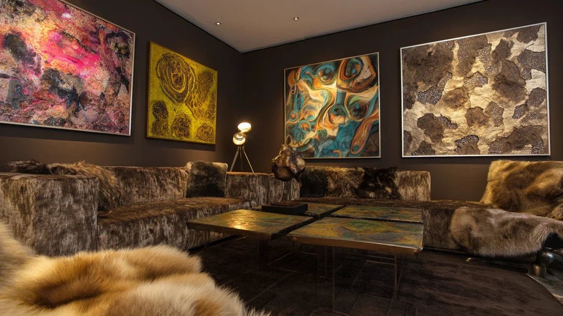
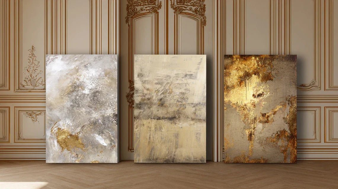
OUR RECOMMENDED PRODUCTS

Step 2: Introduce your signature color

Now that your foundations are solid, you can afford to be bold! This second layer (20% of your palette) will give your interior its unique character and create that visual signature that distinguishes true connoisseurs. This is where the magic happens: your signature color dialogues with your anchor to create this sophistication found in the most beautiful palaces.

Signature colors of luxury hotels

  • Deep navy blue: This shade evokes maritime elegance and nocturnal serenity. More sophisticated than royal blue, it adds character without being aggressive. Where to find it: look for "navy blue" or "midnight blue" references with manufacturers. Quality criterion: it should appear almost black from afar, reveal its richness up close. Impact: it visually anchors elements and creates depth.
  • Sophisticated forest green: Different from basic "nature" green, this nuance contains a hint of gray that makes it more urban and refined. It evokes luxury spas and London private clubs. Recognition: it should be very slightly drawn towards blue. Its principle: it soothes the nervous system while stimulating creativity. Visible benefit: immediate feeling of well-being and connection to nature. Modern Terracotta: A contemporary reinterpretation of orange, this warm color evokes Mediterranean sunsets and trendy boutique hotels. Unlike traditional terracotta, it contains more sophistication and less rusticity. Quality indicator: it should be velvety, never garish. Decorative impact: it instantly warms the atmosphere and creates a luxurious cocooning ambiance.

Integrate your signature color harmoniously

Choose the strategic location: Your signature color should occupy the focal points of the room: the main wall, a large painting, or a striking architectural element. Reason: it is what guides the eye and structures the space. Technique: it must be visible from the entrance of the room but not omnipresent.

ā±ļø Time: 30 minutes of reflection | āœ… Successful when: Your eye naturally directs itself to this color upon entering | āš ļø Attention: Do not disperse it in small touches, a strong and controlled impact is better

Check harmony with your anchor: Place samples of your two colors side by side under different lighting conditions. They should create a chromatic dialogue rather than competition. Pro tip: photograph the duo and observe the rendering on screen.

ā±ļø Time: 1 hour of testing | āœ… Successful when: The two colors enhance each other | āš ļø Attention: If one color "kills" the other, adjust the proportions rather than changing shades

Step 3: Finalize with contrasting accents

This final layer (maximum 10%) provides the finishing touch that differentiates an amateur from a true connoisseur. These contrasting accents create points of brilliance that attract the eye and energize the whole, like jewelry that enhances an elegant outfit. Mastering this step will give you that decorative confidence that art directors of the finest establishments have.

The accents that make the difference

  • Discreet golds: Forget flashy gold! True luxury hotels use patinated or brushed golds that subtly capture the light. Find them in "aged brass" or "bronze gold" finishes. Excellence criterion: they must evoke richness without ostentation. Where to place them: frames, fixing elements, painting details.
  • Deep blacks: A luxury hotel's black is never flat: it contains charcoal or anthracite nuances that give it sophistication. It structures and visually anchors the whole. Ideal application: picture outlines, graphic elements. Its power: it makes all other colors stand out.
  • Spotless pure whites: Used sparingly, they create points of light that aerate the composition. Difference with the base off-white: it is truly pure and bright. Expert use: details, highlights, visual signatures. Guaranteed effect: they give relief to the whole.

šŸŽÆ Final validation of your palette: Your interior breathes natural sophistication. Success test: your guests ask who did your decoration • you feel like photographing your interior • the colors seem to change subtly with the light • you feel a quiet pride when you come home. It's a success!

The rule of progression for experts: Wait 2 weeks between each layer so that your eye gets used to it and validates each step. Objective criteria: immediate feeling of well-being + photographic harmony + spontaneous compliments. Balance patience and ambition: it's better to progress surely than to redo everything!

Congratulations! You now master the color codes of the most beautiful establishments. But real professionals know a few more subtleties that make all the difference between "very successful" and "absolutely exceptional".

šŸ’Ž Palace decorator's secret: The rule of chromatic reflection - place a small element of your signature color opposite its main placement. This ā€œcolor responseā€ creates a visual echo that subtly structures the space. Concrete example: if your navy blue painting is on the right, add a cushion or object of the same shade to the left. The eye subconsciously perceives this balance and instantly feels appeased.

šŸ’­ Reader question

"I'm afraid these colors will be too 'charged' for my small living room. How can I adapt it for a reduced space?"

I perfectly understand this concern! It’s even the opposite that happens: good hotel colors visually enlarge the space by creating depth. The small suites of palaces are living proof that sophistication and small surfaces go hand in hand. The secret? Respect the 70-20-10 rule even more strictly and favor light anchor colors. Your small living room will immediately appear more spacious and luxurious than with white everywhere.

šŸ  Small space test: First paint one wall in your signature color and observe for 3 days. You will see that, far from shrinking, this color structures and enlarges your room visually!

The 5 mistakes that sabotage a hotel palette

Before you start, I want to protect you from the classic pitfalls that turn a good intention into a decorative disaster. These errors are so common that even experienced decorators sometimes fall for them. Fortunately, they are easily avoidable when you know them!

  • 🚫 Choosing your signature color in a store : The artificial lighting of stores completely distorts the perception of colors. That blue that seems perfect under neon lights may appear dull at home. Solution: always test at home with samples under your own light. It's a very understandable beginner’s mistake!
  • 🚫 Wanting to perfectly match all elements : Contrary to what one might think, palaces avoid perfect matching which would create a "showroom" effect. They prefer subtle variations within the same color family. Consequence of perfect matching: a frozen, lifeless interior. Alternative: play on the nuances and textures of the same color.
  • 🚫 Neglecting lighting when choosing colors : Your most beautiful colors can appear dull under poor lighting. Luxury hotels adapt their lighting to their colors, not the other way around. Common mistake: choosing your colors under a cold ceiling light. Correction: test under different types of light (natural, warm, cool).
  • 🚫 Distributing your signature color in "confetti" : Scattering your flagship color in small touches everywhere completely dilutes its impact. Result: instead of an elegant signature, you get a colorful mess. Winning approach: concentrate on 1-2 strong elements rather than sprinkling them everywhere. The impact will be 10 times stronger!
  • 🚫 Ignoring the 70-20-10 proportion rule : This is THE fundamental rule that all great hotels respect. Violating it guarantees a visual imbalance. Common consequence: the eye doesn't know where to rest, you feel uncomfortable without knowing why. Verification method: photograph your room and observe the color proportions on screen.

šŸ›”ļø Checks before finalization : Live with your colors for 48h before definitely validating • Photograph at different times of the day • Ask a trusted person for their opinion • Check that you feel a sense of well-being when entering the room. Warning signs: visual fatigue, desire to close your eyes, feeling of "too much" or "not enough".

šŸŽØ Discover all our wall art collections

šŸŽ Special readers offer

Because you took the time to inform yourself, enjoy 10% discount on your first order:

ART10

ā° Valid for 72h after reading • Applicable to all our products

Your questions about hotel colors in paintings

šŸ•’ How long does it take to completely transform the atmosphere of my living room?
Allow 2 to 3 weeks for a complete transformation, but you'll see the first effects within 48 hours! The three-layer method allows you to spread out the investment: start with the anchor color (paint budget: €50-100), then gradually add your signature artworks. Optimization: take advantage of sales for gold or black accents. Concrete example: Sophie transformed her 25m² living room for less than €400 in total.

šŸŽØ Do these colors work with my current furniture?
That's the magic of hotel palettes! They are designed to enhance what already exists rather than impose it. Your wooden furniture will look more noble, your grey sofa will regain character, even your basic objects will seem more refined. Verification technique: test your anchor color first, which represents 70% of the visual impact.

šŸ’° What budget should I plan for artworks in the right colors?
Good news: you don't need to break the bank! A single quality artwork in your signature color (€150-300) will have more impact than 5 small, disparate artworks. Intelligent distribution: 60% of the budget on the centerpiece, 40% on accents. Economical tip: start with ONE perfect artwork, add the others gradually. The palace effect is immediate!

šŸ  Can these principles be used in all rooms?
Absolutely! Luxury hotels apply this method to their bedrooms, suites, lobbies and restaurants. Simple adaptation: keep the same anchor color throughout for overall harmony, vary the signature colors according to use (soothing blue for the bedroom, stimulating green for the office). Result: your entire home will breathe this hotel coherence.

šŸ”§ How do I know if I have applied the method correctly?
Three infallible signs of success: your guests ask you who did your decoration • you spontaneously want to photograph your interior • you feel a quiet pride when returning home. Technical test: your eye should be able to "rest" on your anchor color and be "energized" by your signature color. If it's blurry, adjust the proportions rather than the colors!

Your new daily life in an interior worthy of a palace

In a few weeks, you will return home with that satisfied smile we have when opening the door to a beautiful hotel suite. Your guests will exclaim about this sophisticated atmosphere, ask you your decor secrets, and you will feel that discreet pride of those who master the codes of refinement.

Beyond visual beauty, you will have acquired that expert eye which instantly deciphers a successful palette. This color competence will serve you in all your future decor choices, giving you that quiet confidence of true connoisseurs.

The hardest part was understanding the secret mechanisms of hotel palettes. Now that you have mastered them, your first step will be to choose your anchor color and begin this transformation that will transform your daily life. Your new decor chapter begins today!

✨ Your moment of transformation: You now have all the keys to create the hotel atmosphere you dreamed of. This sophistication is waiting for your first step: choose this anchor color that will change everything. Your personal palace is reaching out to you!

Read more

Tableaux et design hƓtelier : inspirations scandinaves, japonaises, italiennes
Style hƓtel 5 Ʃtoiles : des tableaux sobres Ơ fort impact visuel