Your new artwork is up, but something feels off. The effect isn't what you expected: the edges curve slightly, the surface lacks sharpness, and instead of having that professional and modern look you imagined, your piece looks more like an amateur print stuck to the wall.
Daylight reveals every imperfection: microscopic folds that break the visual harmony, this rough texture that scatters reflections in a disordered way, and above all that general impression that something is wrong with your carefully thought-out decor.
You've probably tried different types of prints, changed formats, adjusted lighting... But the problem persists: your artworks lack that impeccable finish that transforms a simple wall into a true art gallery.
It's not your fault, nor is it the fault of your artistic taste. The secret lies in the choice of support: the difference between an amateur result and a professional finish often comes down to a technical detail that few people really know.
By the end of this article, you will know exactly how to achieve that museum-quality finish that instantly transforms the atmosphere of your interior, with concrete solutions that you can apply with your next purchase.
Why does the choice of support immediately determine the perceived quality of your decor?
The first impression is made in 3 seconds when someone enters a room. If you wait any longer, you miss the opportunity to create that "wow" effect that makes an impact. It's like choosing between a wrinkled shirt and a perfectly ironed shirt: even if the fabric is the same, the visual impact is completely different. Every extra day with an approximate result is one less day enjoying the satisfaction of an interior that truly resembles you.
🏠 Customer testimonial: "I spent weeks choosing my visuals for the living room. When I received my prints on standard paper, I was disappointed: they looked like student posters. The same day, I ordered the same image on acrylic glass. The effect was striking: vibrant colors, a perfectly smooth surface, that depth... My guests now think I hired a professional decorator."
💬 Conversation with a decor expert
The 3-meter rule: A professional support is recognized by its ability to maintain its visual quality even when viewed up close. You should be able to admire every detail without seeing technical imperfections, and feel that immediate satisfaction of a choice that enhances your space in less than a week of installation.
What's really behind your decorative disappointments
Your frustration doesn't come from a lack of taste, but from three specific signals: your paintings lack depth (colors seem dull despite good lighting), the surface attracts dust and requires constant maintenance, and above all the overall lacks visual coherence with the rest of your carefully decorated space.
The real problem isn't your choice of images or their placement, but the support itself which does not allow colors and details to fully express themselves. It’s like trying to listen to classical music on an old car radio: the content is magnificent, but the medium drastically limits the rendering.
Imagine a slightly foggy mirror: you recognize your reflection, but it lacks that crystalline sharpness that makes all the difference. That's exactly what happens with an unsuitable support.
The first cause: light absorption instead of reflection
Contrary to what one might think, a painting should not absorb light but reflect it in a controlled manner. Porous or matte supports literally “swallow” the brightness of colors, while a suitable surface acts as a natural light amplifier.
It's the difference between looking at a photo in a book and seeing it displayed on a high-definition screen: same image, completely different visual impact. The physics of light reflection literally transforms the perception of colors.
This discovery changes your approach to lighting: instead of multiplying light sources, you optimize the surface of your paintings so that it itself becomes a source of brightness and depth in the room.
✨ Quick test: Place a sheet of white paper next to your current painting under the same light. If the paper looks brighter, then your support is absorbing light instead of reflecting it - you can notice this in less than 30 seconds.
The illusion of necessary texture
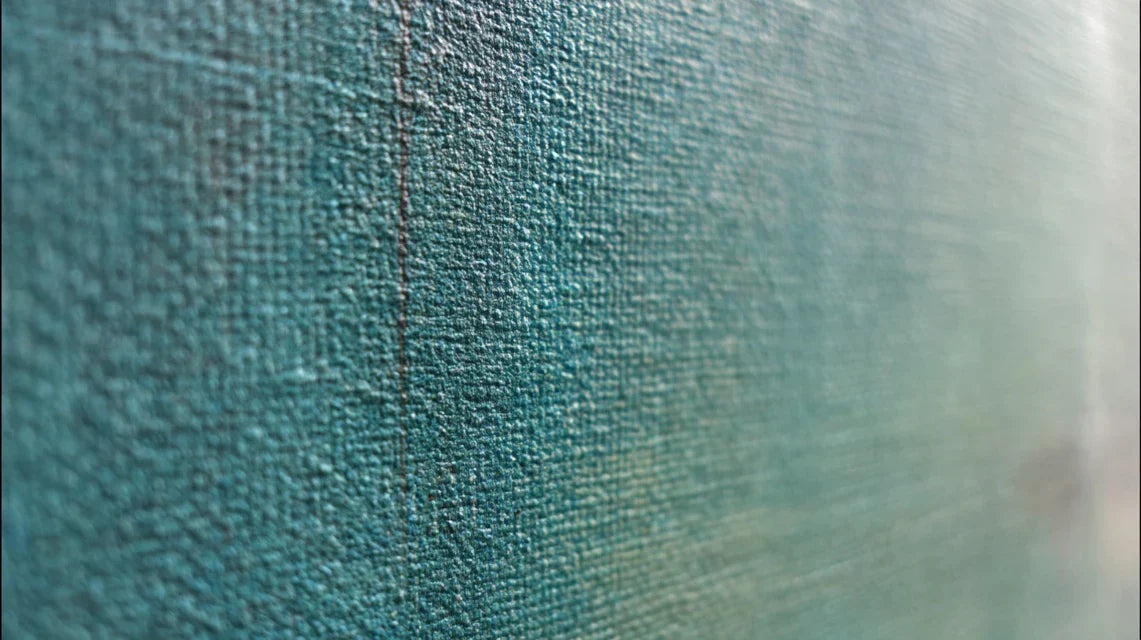
Many people think a painting should have grain to look "authentic", but this texture quickly becomes a dust trap and a brake on sharpness. Modern art galleries systematically prefer smooth surfaces for a specific reason.
It's like the difference between a paved road and a highway: both lead to the same place, but the experience of travel is completely different. Your eye literally rolls more easily over a perfectly smooth surface.
This realization explains why your current artworks tire your eyes after just a few minutes of observation, and why you never quite recapture that initial sense of wonder.
The trap of apparent savings
The cheapest support initially often becomes the most expensive in the long term: premature replacement, constant maintenance, chronic dissatisfaction. It's a detail that most people only discover after trying several alternatives.
You can easily check this: note how many times per month you clean your current artworks, and imagine the time saved over several years. Multiply by the frustration of never achieving a perfect result.
This awareness changes your relationship with decor investment: it's better to have one perfect artwork than three approximate ones that never do justice to your refined tastes.
🔍 3 signs of an unsuitable support:
- Reflection test: If you see a blurry reflection of yourself in the artwork, it means the surface does not reflect light well - a sign of an amateur finish
- Dust test: If you have to dust more than once a month, the texture retains particles - an indicator of lifelong maintenance
- Distance test: If details become blurred at more than 2 meters, the support's definition limits sharpness - proof of insufficient quality
The trigger factor: consistency with your level of requirement
The real turning point happens when you realize that your artworks are the only element in your interior that doesn't reflect your general level of requirement. It’s a domino effect: once you have experienced the difference, it is impossible to go back. You can identify this precise moment when you start automatically noticing the quality of supports in others, like an expert eye forming naturally.
The rule of decreasing investment: The higher the quality of the support from the outset, the less you will spend on corrections, replacements and frustrations over the long term. Check this by calculating the total cost over 5 years of your current solutions.
| ❌ Common misconception | ✅ Technical reality | 💡 Simple explanation | 🎯 Concrete benefit |
|---|---|---|---|
| "The more textured it is, the more authentic it looks" | Smoothness reflects fine details better | Like a mirror vs sandpaper | Maximum sharpness of images |
| "Glass is fragile and dangerous" | Modern acrylic is ultra-resistant | Automotive windshield technology | Safety + lightness + durability |
| "All supports are the same in the end" | The support transforms the perception of colors | Like an HD screen vs an old TV” [HTML] | Immediately visible visual impact |
| "It's a detail, no one notices the difference" | It’s the first thing the eye notices | Like a well-ironed outfit | Immediate recognition of refinement |
The foolproof method to transform your walls into a professional gallery
Now that you understand the mechanisms at play, the transformation becomes remarkably simple. There’s no need to revolutionize everything at once: a logical progression leads you from current dissatisfaction to the museum-quality result you are aiming for. It's like building a house: solid foundations first, then the finishing touches that make the difference. Within 30 days maximum, you will have this deep satisfaction of looking at your walls and thinking "now, it’s exactly what I wanted".
🎯 Overview of the transformation : Three progressive steps lead you from diagnosis to perfection. First identify your priorities (immediate satisfaction), then choose the appropriate supports (visible transformation), finally optimize the whole thing (professional gallery effect). Each step builds on the previous one and gives you motivating results to continue.
Step 1: Precise assessment of your real needs
Starting with this step avoids costly mistakes and saves you valuable time. It’s like laying a proper foundation before building: you create a solid base for all your future decisions. Once this step is complete, you immediately feel that reassuring clarity of knowing exactly where you are going and why.
🔍 What you need for a reliable assessment
- A meter stick or ruler: To precisely measure your available wall spaces. Avoid estimating by eye which leads to 80% of proportion errors - get a folding rule from any hardware store. Make sure it is graduated in centimeters for more accuracy. Approximate formats ruin the desired professional effect.
- A camera or your smartphone: To capture natural lighting at different times of the day. Light changes dramatically the perception of colors - the device reveals nuances that your eye naturally accommodates. Photograph in the morning, midday and evening to see the evolution. This documentation guides you towards the right choice of support.
- A notebook or a notes app: To note your observations and avoid oversights that cost money. Your memory plays tricks on technical details - write down immediately what you notice. A precise note now saves you costly hesitations later.
Now, let's move on to concrete action:
🎯 How to proceed step by step
Photograph each candidate wall: Take 3 photos of each potential location (morning, noon, evening) to reveal natural lighting variations. Position yourself 2 meters from the wall and frame wide to include surrounding elements. This objective documentation avoids unpleasant surprises after installation.
⏱️ Time: 15 minutes per room | ✅ Success when: You clearly distinguish shadows and light areas on your photos | ⚠️ Attention: Do not use flash, which masks the actual natural lighting - this is the classic mistake that skews all diagnostics
Measure and note available dimensions: Measure the width and height of each free wall area, then subtract 20 cm from each dimension to obtain the recommended maximum size. This technical margin guarantees visual balance and avoids the "too large for the space" effect. Also note the possible viewing distance.
⏱️ Time: 10 minutes per wall | ✅ Success when: You have the usable net dimensions | ⚠️ Attention: Always measure from existing furniture, not from the bare wall - forgetting a radiator or shelf skews all calculations
Evaluate the overall style of the room: Identify the 3 dominant colors and the level of refinement of the existing furniture to ensure perfect stylistic consistency. A support unsuitable for the general standing of the room creates an immediate visual dissonance. Also photograph finishing details (handles, lighting fixtures) which indicate the required level of requirement.
⏱️ Time: 5 minutes per room | ✅ Success when: You can describe the atmosphere in 3 precise words | ⚠️ Attention: Look at finishing details, not just colors - a living room with chrome handles requires a different level of finish than a living room with wooden handles
✅ Validation of step 1: You must have a complete photo folder, precise measurements for each location, and a clear vision of the style to be respected. If any information is missing, take 5 minutes to complete it now - this solid foundation greatly facilitates the rest and avoids frustrating backtracking.
OUR RECOMMENDED PRODUCTS
Step 2: Selecting the optimal support according to your criteria
You are now moving up a level: transforming your observations into precise technical choices. This step is more rewarding as you begin to visualize the final result concretely. The snowball effect begins here: each good decision facilitates the next and brings you closer to that professional satisfaction you seek.
🎨 The supports that really make a difference
- Acrylic glass (Plexiglas): Perfectly smooth and shiny surface that amplifies colors and creates a striking depth. Available in specialty stores or online - check for a minimum thickness of 4mm to avoid deformations. An alternative to traditional glass which is too heavy: acrylic offers the same optical quality with 1/10th of the weight. High-definition stretched canvas: Flexible support that perfectly hugs the frame and eliminates wrinkles and deformations. The tensioning system distributes stress evenly across the surface. Look for the "gallery wrap" mention which guarantees a professional finish on the edges. Visible impact: perfectly flat surface that reveals every detail of the image. Dibond aluminum: Ultra-light metal composite offering perfect flatness and exceptional resistance to moisture. The support of choice for modern galleries due to its color neutrality. The smooth surface reveals subtle nuances that porous supports completely erase.
🎯 How to choose according to your situation
Analyze the lighting of your space: If your room receives a lot of direct natural light, choose acrylic glass which transforms this light into an asset. For more subdued spaces, high-definition stretched canvas reveals fine details better. Test by holding a shiny sheet then a matte sheet in the same place: the effect naturally guides you to the right choice.
⏱️ Time: 5 minutes per location | ✅ Successful when: You clearly see which support enhances your lighting | ⚠️ Attention: A glossy support facing a window can create annoying reflections - position yourself as a visitor to check
Adapt to the style of your interior: Contemporary furniture = acrylic glass to accentuate modernity. Warm atmosphere = stretched canvas to preserve the cozy aspect. The support should amplify the existing atmosphere, not contradict it. Look at the finishes of your lighting and appliances: they indicate the level of refinement to maintain.
⏱️ Time: 3 minutes of reflection | ✅ Successful when: The chosen support naturally harmonizes with the existing | ⚠️ Attention: Do not mix finish levels in the same room - an ultra-smooth surface with rustic furniture creates a dissonance
Check technical compatibility: Calculate the total weight (artwork + support + frame) and make sure your wall can handle it without problems. Simple rule: maximum 2 kg per standard fixing point. For XXL formats, provide a distribution system over several points. This prior check avoids unpleasant surprises during installation.
⏱️ Time: 10 minutes of calculations | ✅ Successful when: You know the exact weight and necessary fixing | ⚠️ Attention: Plasterboard partitions require special anchors - do not neglect this technical aspect which determines safety✅ Validation of step 2: You have identified the optimal support for each location, verified the technical feasibility and confirmed the stylistic consistency. Your choice is now informed and you can place your order with confidence - no more hesitations or possible regrets.
Step 3: Installation and final optimization
You are now reaching expert level: transforming your choices into visible reality and optimizing every detail for a perfect result. This step reveals the difference between an informed amateur and a true connoisseur. The final result you will be proud of for years to come is determined by these last technical details that few people really master.
🔧 Professional finishing tools
- Professional spirit level: Essential for perfect alignment which avoids the visible "off-center" effect from 10 meters away. Invest in a minimum 60cm level - available in hardware stores. Check its accuracy on a known flat surface. A 2mm deviation is enough to spoil the sought-after professional effect.
- Reinforced fixing system: Anchors and screws adapted to the weight and type of wall for maximum safety and long-lasting hold. The standard system supports 5kg, the reinforced one up to 15kg per point. Golden rule: always oversize the fixing to avoid progressive sags that ruin the alignment.
- Additional lighting if necessary: Adjustable LED spotlights to reveal colors even in low light. A color temperature of 3000K respects natural nuances without distorting. Good lighting can transform an average support into an exceptional rendering.
🎯 The installation that makes the difference
Position and mark with precision: Use the rule of thirds to place the optical center of the artwork at eye level for a person of average height (1m60 from the floor). Mark the fixing points with pencil, checking three times for horizontality. This step determines the final visual impact: a well-positioned painting immediately attracts attention, a misplaced one goes unnoticed.
⏱️ Time: 15 minutes per artwork | ✅ Successful when: The marks are perfectly aligned and at the right height | ⚠️ Attention: Measure from the finished floor, not from a piece of furniture that could move - this common mistake shifts everything
Mount with the professional method: Drill in percussion mode for hard walls, insert force anchors (never by tapping), then screw gradually to avoid cracks that weaken the whole structure. Test the solidity by pulling gently: no play should be perceptible. An approximate fixing always reveals itself through a progressive sagging.
⏱️ Time: 20 minutes per artwork | ✅ Success when: Zero movement during the traction test | ⚠️ Attention: Respect the indicated spacing on the packaging - improvising the distance between fixings can crack the support
Adjust optimal lighting: Position light sources to eliminate distracting reflections while revealing colors. Ideal angle: 30° from the surface to avoid shadows. Test by standing at different viewpoints in the room. Perfect lighting makes the artwork luminous without creating visual fatigue.
⏱️ Time: 10 minutes of adjustments | ✅ Success when: No distracting reflections from observation positions | ⚠️ Attention: Lighting that is too close creates hot spots that distort color perception - keep a minimum distance of 50cm
✅ Final validation: Your artworks are perfectly aligned, securely mounted and optimally lit. Step back 3 meters and admire the result: you should feel that immediate satisfaction of impeccable work. If something still bothers you, now is the time to adjust it - once you get used to it, you won't notice it anymore.
The rule of mastered progression: Move on to the next step only when you completely master the current one. Objective criterion: you must be able to explain your choice in 30 seconds to someone else. Balance technical patience and aesthetic ambition for a result that you will be proud of for a long time.