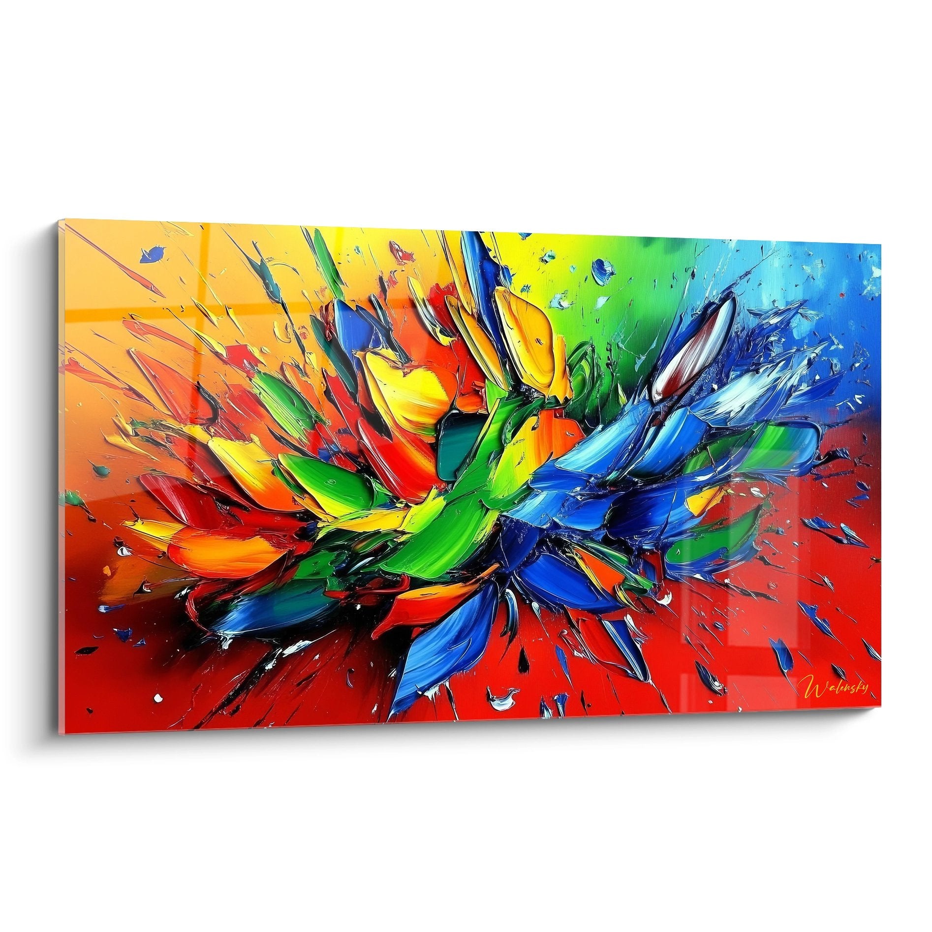
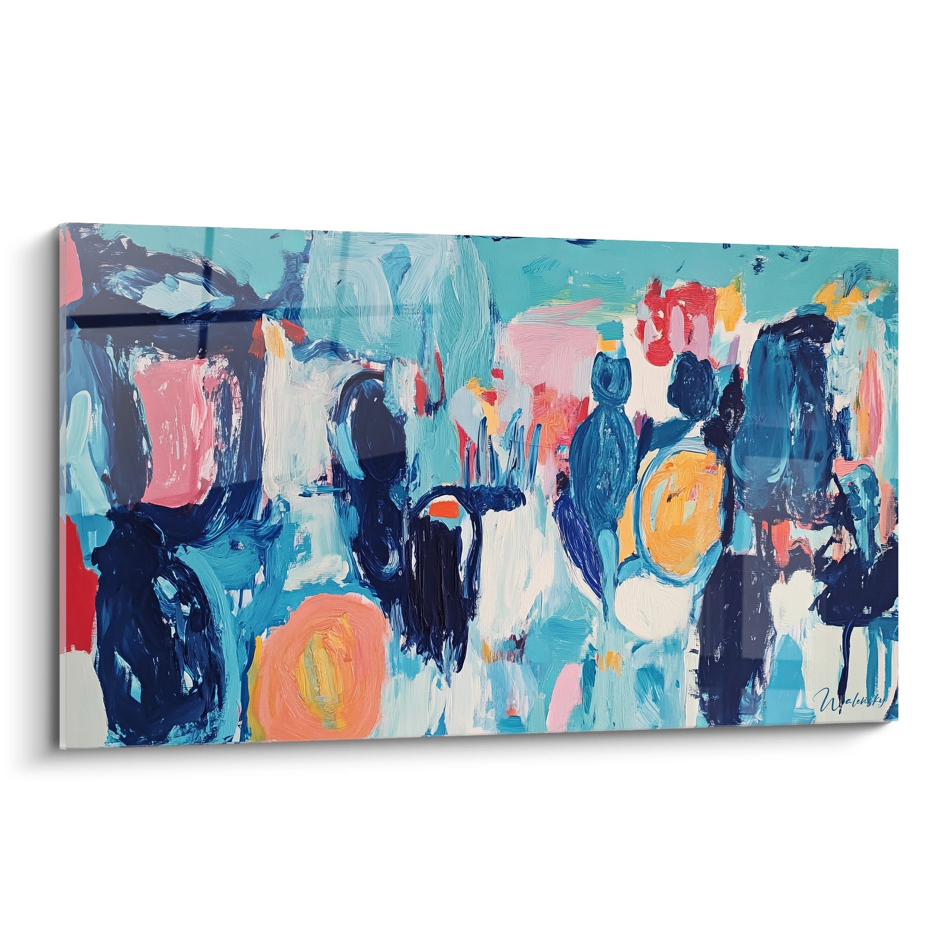
A library wall artwork radically transforms your reading space by creating an environment where mural art engages with your literary collections. These monumental works, specifically designed for private cultural spaces, establish an atmosphere conducive to concentration while preserving the visual balance necessary for extended reading sessions. Integrating modern library wall decor addresses the unique challenges of these spaces: imposing ceiling heights, visual density of book spines, and the need for intellectual ambiance without excessive stimulation.
How a Library Wall Artwork Influences Your Reading Experience
Installing a library wall artwork responds to psychological imperatives rarely considered in other spaces. Unlike transitional areas or social zones, your reading room demands a delicate balance between intellectual stimulation and mental calm. Monumental works designed for these environments act as visual anchors that promote prolonged immersion in reading.
Which color tones promote concentration in a private library?
Deep tones such as midnight blue, forest green, or anthracite gray create a protective visual envelope around your reading space. A large-scale mural in these hues partially absorbs ambient light, reducing harsh contrasts that can strain the eyes during prolonged reading sessions. This color management specific to private libraries allows your eyes to navigate effortlessly between white pages and your visual environment.
Abstract geometric compositions offer mental rest points during reading breaks. Your brain finds refuge in these non-figurative patterns that don't require narrative interpretation, unlike complex scenes. This characteristic makes library wall artwork fundamentally different from works intended for living rooms where narrative stimulation is desired.
The Overlooked Acoustics of Large-Scale Mural Art
A rarely discussed aspect concerns the acoustic impact of large-format wall decor on your library's sound quality. Monumental formats, particularly those featuring subtle texture or relief, modify how sound reverberates through the space. The rustling of pages, the gentle creaking of old book bindings, or silence itself acquires a different quality.
This acoustic modification proves particularly beneficial in libraries with bare walls where sound propagates unpleasantly. The mural work creates absorption zones that soften the sonic environment without requiring unsightly acoustic panels. Collectors of rare books especially appreciate this advantage, allowing them to handle fragile volumes in qualitative silence.
Psychological Delimitation of Concentration Zones
Reading space mural art functions as a spatial marker that mentally signals entry into a zone dedicated to intellectual activity. This visual boundary proves crucial in contemporary homes where multifunctional spaces proliferate. Your brain progressively associates the artwork's presence with the concentration state required for deep reading.
Imposing formats accentuate this psychological threshold effect. When a monumental work visually dominates the library space, it establishes clear spatial hierarchy. This delimitation particularly helps individuals practicing scholarly reading or research by facilitating the mental transition to a specific cognitive mode.
Visual Rhythm and Reading Duration
The internal composition of library wall artwork directly influences your endurance during literary marathons. Works featuring slow visual rhythm—broad fields of color, gradual transitions, soothing repetitive patterns—support extended reading sessions. Conversely, dynamic compositions with strong contrasts can generate additional cognitive fatigue.
This consideration becomes paramount for libraries dedicated to study or professional research. Monumental formats with restricted palettes—subtle variations around two or three dominant tones—create a stable visual environment. Your attention remains available for literary content rather than being solicited by overly prominent decorative elements.
- Favor horizontal compositions that accompany the natural visual sweep during reading
- Select works whose visual intensity decreases toward the edges, creating a fade effect
- Avoid figurative narrative representations that demand constant interpretation
- Opt for visual textures that subtly echo paper grain
How Does Ambient Lighting Interact with Your Wall Decor?
The interaction between mural art and your dedicated reading light sources deserves particular attention. A well-positioned large-scale mural can subtly diffuse light from reading lamps, creating a soft halo that envelops the space. This indirect reflection reduces harsh shadow zones often present in densely furnished libraries.
Libraries with extensive glazing benefit from works with slightly satin surfaces rather than glossy finishes. These finishes capture changing natural light without creating distracting glare during reading. Wall art becomes a passive light regulator, softening intensity variations throughout the day without technical intervention.
Creating Visual Coherence Between Wall Art and Literary Collections
Installing a library wall artwork raises the complex question of dialogue between the monumental work and the hundreds, sometimes thousands of visible book spines. This unique chromatic and graphic density found in libraries constitutes a decorative challenge absent in other spaces. Your wall decor must engage with this visual abundance rather than compete against it.
Chromatic Balance Facing Multicolored Book Spines
Diverse literary collections inadvertently create a complex chromatic mosaic. Book edges generate a color spectrum ranging from neutral tones of classic editions to vivid hues of contemporary works. A large library wall artwork must integrate this reality by adopting either a complementary palette or a strong monochromatic approach.
Libraries rich in antique editions with leather bindings present ochre, brown, and burgundy dominants. A monumental work in deep blues or emerald greens creates sophisticated contrast that simultaneously enhances aged bindings and mural art. This chromatic opposition brings visual breathing room without disrupting overall harmony.
Conversely, collections with contemporary graphic covers benefit from understated mural works in extended neutral tones. The library wall artwork becomes a visual rest zone allowing your eyes to recover between graphic stimulation from modern book covers. This inverse strategy works particularly well in libraries dedicated to art, design, or graphic literature.
Dialogue Between Visual Scales
Libraries present a unique particularity: the infinite multiplication of identical small elements (books) facing the singularity of a monumental work. This tension of scales creates a visual dynamic found nowhere else. Your large-scale mural art must assert its presence without overwhelming the richness of your collections.
Minimalist compositions with simple but large geometric forms establish this balanced dialogue. A single monochrome form occupying two to three meters of height possesses sufficient visual strength to engage with thousands of book spines without dominating them. This approach respects your collection's intelligence while providing necessary visual punctuation.
- Prefer vertical formats that mirror the natural orientation of shelved books
- Choose works whose visual complexity remains less than the overall collection arrangement
- Select tones absent from your primary collections to create a distinct focal point
- Avoid repetitive motifs that compete with book spine alignment
Which Visual Theme Strengthens My Library's Identity?
Thematic coherence between your library wall decor and your shelf contents amplifies the space's identity. A collection specializing in travel literature finds resonance in abstract cartographic representations or stylized landscape evocations. This thematic resonance creates an immersive experience that enhances reading pleasure.
Scientific libraries benefit from works evoking enlarged molecular structures, refined constellations, or representations of natural phenomena. These subtle visual references establish an intellectual thread connecting literary content to visual environment. Library wall artwork becomes a conceptual extension of your collections.
Managing Residual Spaces Around Shelving
Wall-mounted libraries frequently leave residual zones above or beside shelving, creating disproportionate bare surfaces. These empty spaces visually unbalance the room, creating an unfinished impression. A strategically positioned monumental work elegantly solves this architectural challenge.
Mural art transforms these structural constraints into decorative assets. Rather than multiplying small decorative elements that would accentuate visual disorder, a single large format unifies the composition. This solution proves particularly relevant in custom libraries where atypical dimensions complicate arrangement.
Wall Protection Behind High Shelving
A practical aspect often neglected concerns protecting walls behind upper shelves. Installing a library wall artwork of considerable size above shelving preserves the wall surface from friction when accessing high-placed books. This protective function complements the aesthetic dimension.
Libraries requiring ladders or step stools benefit particularly from this dual function. The artwork's support absorbs inevitable micro-shocks and friction during high-altitude volume manipulation. This practical consideration proves crucial for long-term wall preservation in heavily used spaces.
Exploiting the Imposing Verticality of Libraries with Monumental Wall Art
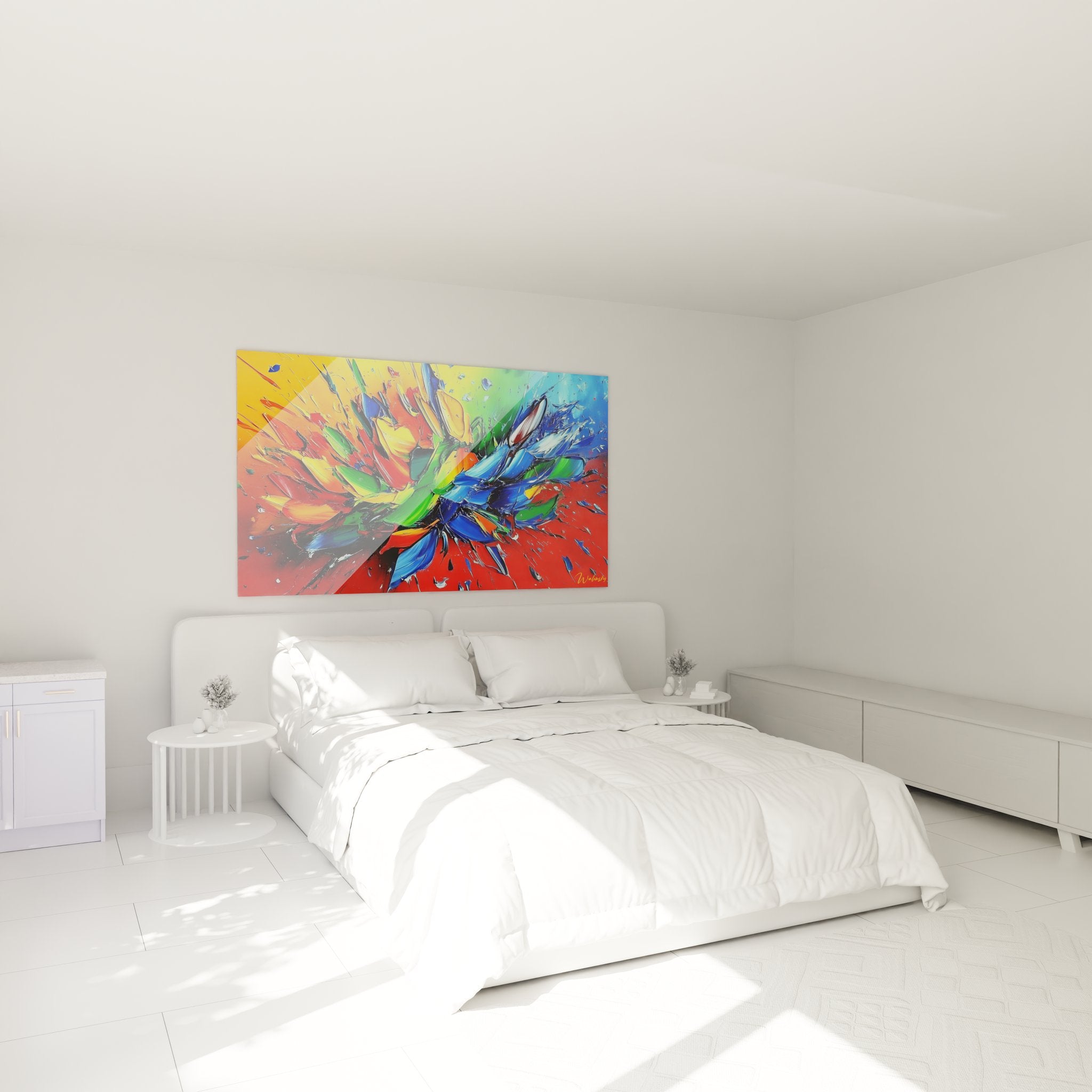
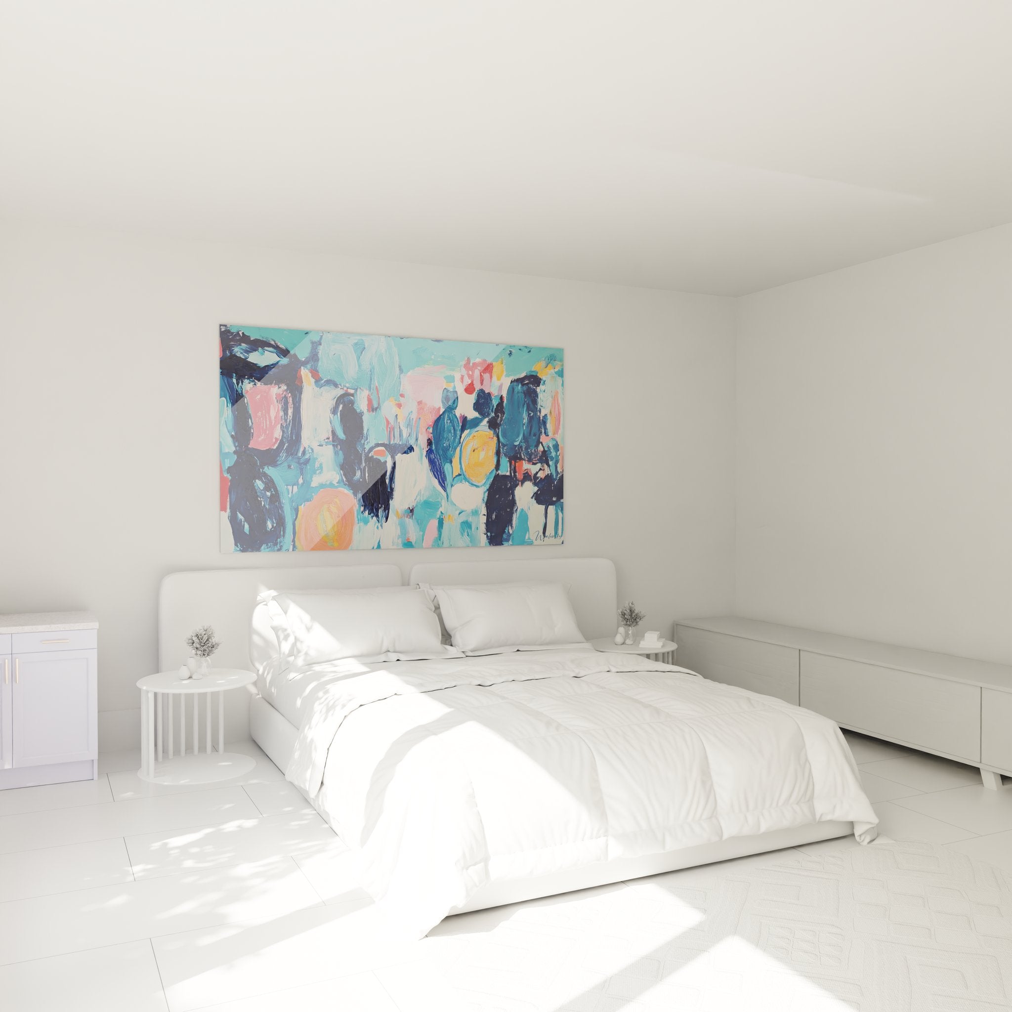
Residential libraries present a unique architectural characteristic: verticality maximized by shelving that often extends to the ceiling. This ceiling height utilization creates disproportionate bare wall space above collections. A library wall artwork in monumental format brilliantly resolves this specific spatial problem.
Why Monumental Formats Transform High Libraries?
Three-meter or higher ceilings, frequent in period properties or contemporary renovations, create a major decorative challenge in libraries. Shelves rarely exceed two meters twenty, leaving bare wall spaces that visually unbalance the room. This upper empty zone creates an unfinished impression despite collection richness.
Installing a mural work of one hundred fifty to two hundred centimeters tall elegantly fills this architectural void. The monumental format creates visual continuity between shelf-top and ceiling, unifying overall composition. This solution avoids multiplying small decorative elements that would accentuate visual fragmentation.
Large-format wall decor also provides psychological protection and envelopment. High ceilings can generate coldness or immensity impressions unsuitable to library intimacy. Monumental art brings visual proportions to a more human and welcoming scale.
Display Strategies for Double-Height Libraries
Library spaces featuring double heights or mezzanines require specific display approaches. The library wall artwork must be positioned for appreciation from different levels simultaneously. This three-dimensional constraint exists in no other residential space.
Ideal placement sits slightly above ground-level visual height, allowing comfortable viewing from below while remaining visible from the mezzanine. This intermediate position, generally between two and two-point-five meters from the floor, creates a focal point accessible visually from all library angles.
- Calculate display height based on primary viewpoint (reading chair, desk, mezzanine)
- Favor compositions without strong directional orientation for multidirectional viewing
- Anticipate natural and artificial lighting across multiple levels to avoid troublesome shadow zones
- Consider perspective effect from stairways leading to the upper level
Compatibility with Ladders and Functional Furniture
Libraries requiring sliding ladders or step stools present accessibility constraints ignored in other spaces. Your large-scale wall artwork must coexist with these functional elements without impeding their use. This practical requirement directly influences format and placement selection.
Mural art positioned above ladder access zones completely liberates vertical circulation space. This high placement transforms a functional constraint into decorative opportunity, the ladder itself becoming a graphic element dialoguing with the artwork. Rail-mounted libraries benefit particularly from this visual complementarity.
How Large Formats Modify Space Perception?
Space perception in libraries changes dramatically with monumental format introduction. Narrow but tall rooms, frequent configuration for libraries arranged in former bedrooms, gain apparent depth. Mural art creates a back visual plane that structures room perception.
This perceptual modification proves particularly valuable in elongated libraries where shelving accentuates hallway effect. A library wall artwork positioned at the rear vertically breaks this oppressive linearity. The gaze finds an anchoring point that balances perspective and brings visual breathing room.
Optimizing Dead Spaces Above Doorways
Libraries often integrate French doors or openings whose headers create fragmented wall zones difficult to exploit. These spaces above openings, typically forty to eighty centimeters tall, remain frustratingly empty. An appropriately sized horizontal format transforms these dead zones into valued decorative areas.
This residual space strategy presents dual advantages: it maximizes available surface utilization while creating visual coherence across different library zones. Multiple works with complementary dimensions can engage chromatically while respecting specific architectural constraints.
Which Formats for Alcove Libraries?
Libraries arranged in alcoves or wall recesses present unique dimensional challenges. Available space above shelving becomes laterally constrained, creating a narrow vertical niche. This configuration demands precisely calibrated formats maximizing visual impact without overflow.
Modern library wall decor in narrow vertical format adapts perfectly to these constraints. A work thirty to fifty centimeters wide yet one hundred fifty to two hundred centimeters tall fits alcove verticality. This atypical proportion, rarely relevant elsewhere, finds both functional and aesthetic justification here.
The depth effect created by monumental format in an alcove visually amplifies available space. Rather than accentuating niche narrowness, properly selected artwork creates visual breakthrough impression. Compositions with suggested perspective or vertical gradients particularly enhance this spatial extension effect.
Resistance to Library-Specific Conditions
Libraries generate a particular environment: paper dust accumulation, hygrometric variations from cellulose volumes, warmth from prolonged reading lighting. Your library wall artwork must withstand these specific conditions without premature degradation.
Adapted protective finishes preserve the work from fine particle accumulation from book handling. This surface protection also facilitates regular maintenance necessary in intensively used cultural spaces. Durability becomes a selection criterion as important as aesthetics in this particular usage context.
Frequently Asked Questions About Library Wall Artworks
What minimum dimension for a library artwork in double-height space?
For double-height libraries, prioritize dimensions of at least one hundred fifty centimeters tall to establish balanced visual presence facing imposing shelving and architectural verticality.
Can library wall artwork improve reading space acoustics?
Monumental formats indeed contribute to softening sound reverberation in libraries with hard surfaces, creating a muffled acoustic environment conducive to prolonged concentration.
How to choose colors for library artwork with antique bindings?
Facing warm tones of traditional leather bindings, opt for cool ranges like deep blues or emerald greens that create sophisticated contrast simultaneously enhancing mural art and heritage collections. To enrich your interior decoration, consider browsing our collections offering works with complementary styles.
Do library wall artworks require specific maintenance?
Paper dust accumulation requires regular dusting with microfiber cloth, ideally monthly in intensively used libraries, to preserve your library wall decor brilliance.