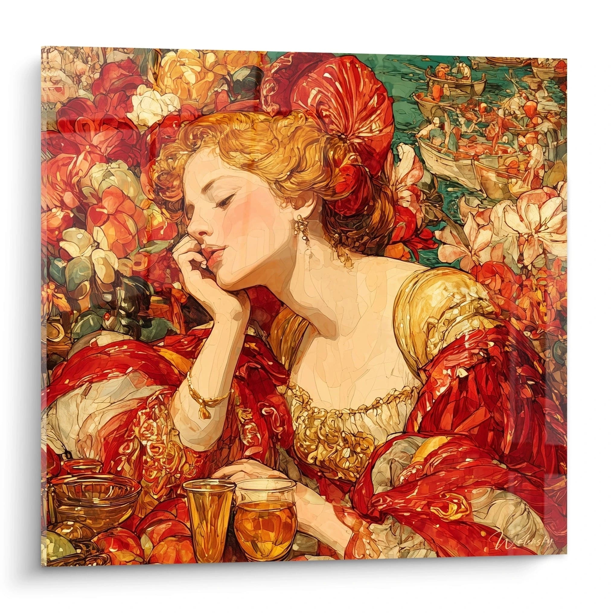
The Italian Renaissance Red painting embodies the quintessence of Venetian and Florentine magnificence, a period when mastery of carmine and vermillion pigments revolutionized artistic expression. These monumental reproductions capture the dramatic intensity of original works created between the 15th and 16th centuries, when Italian workshops developed revolutionary techniques for treating deep reds. Intended for refined interiors seeking powerful visual presence, these grand format creations instantly transform reception halls, private libraries and prestigious spaces into veritable patrician galleries. The acquisition of such a mural masterpiece constitutes a strategic decorative investment for anyone wishing to affirm their attachment to European cultural heritage while creating a striking focal point.
Red Predominance in the Italian Golden Age
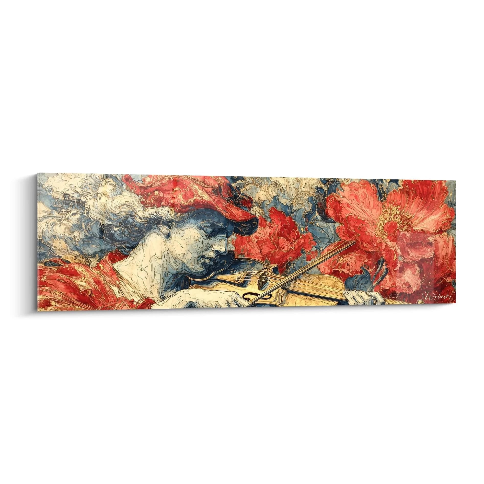
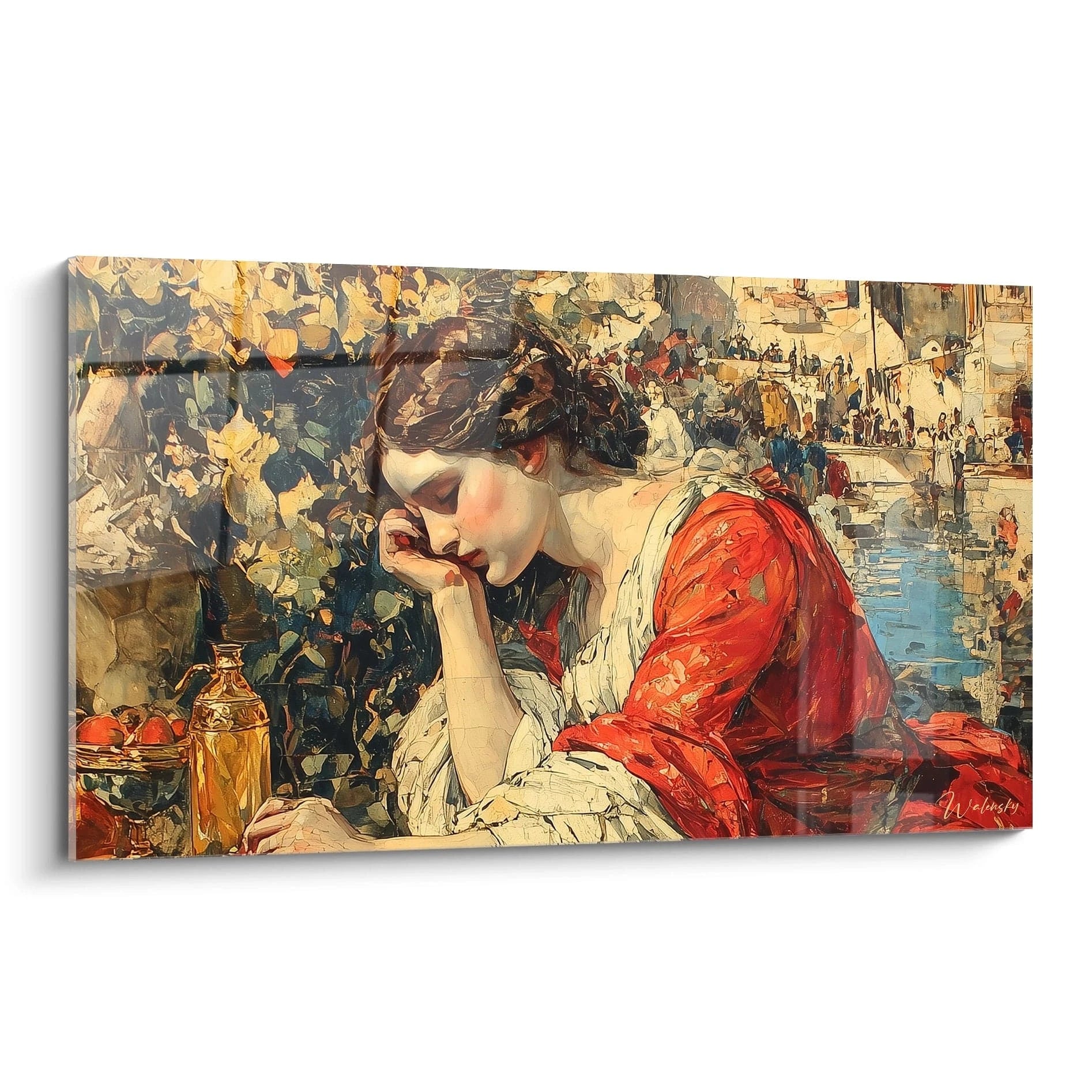
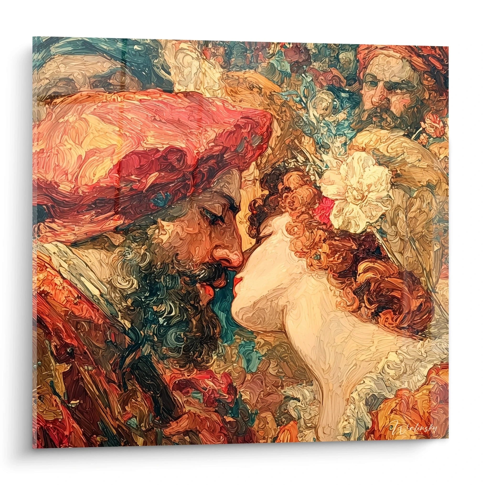
The Italian Renaissance Red painting distinguishes itself through masterful use of scarlet tonalities that characterized commissions from Florentine and Venetian patrician families. Unlike golden compositions where gold symbolized divine transcendence, works dominated by red embodied temporal power, human passion and earthly wealth. This chromatic preference finds its roots in the growing accessibility of precious red pigments such as vermillion and madder lake during the Quattrocento.
What pigments gave Italian masters this intense red quality?
Renaissance Italian artists primarily employed vermillion (mercury sulfide) to obtain these characteristic bright reds. This costly pigment rivaled ultramarine in terms of value, explaining why its extensive use signaled the patron's prestige. Contemporary large formats faithfully reproduce this chromatic depth through advanced printing technologies capable of restoring subtle nuances between Venetian carmine and Tuscan red. Discerning collectors specifically seek these monumental reproductions to create authentic palatial atmospheres.
Psychological Impact of Red Renaissance Compositions
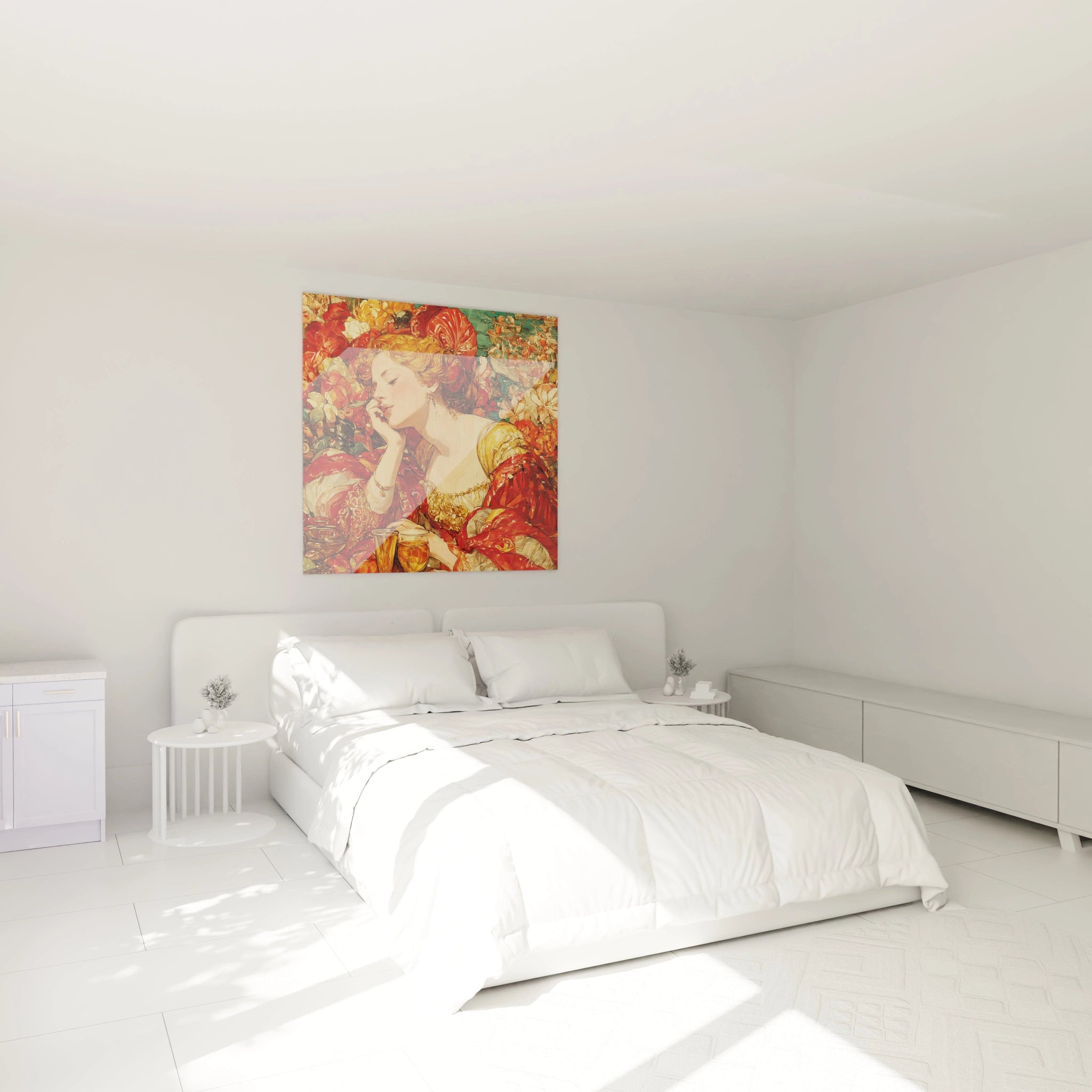
In contemporary interiors, a large-format Italian Renaissance red painting generates emotional dynamics radically different from works with cool tonalities. The dominance of purple and vermillion hues creates an atmosphere of theatrical opulence particularly suited to reception spaces where immediate visual impression takes priority. Environmental psychology studies confirm that warm reds stimulate conversation and social interaction, transforming a living room into a veritable Italian-style camera di conversazione. Interior designers favor these compositions for private libraries and formal dining rooms, where their monumental presence visually structures the space while evoking the great halls of historic palazzi.
Association with Golden Renaissance Collections
The discerning enthusiast often considers the visual dialogue between red and golden compositions as a refined decorative strategy. While an Italian Renaissance Golden painting brings celestial luminosity and spiritual elevation, red-dominant versions anchor the space in more immediate earthly sensuality. This chromatic complementarity reproduces the sophisticated balance of patrician galleries where sacred and profane coexisted harmoniously. Astute collectors frequently acquire both typologies to create contrasting visual sequences between different living spaces.
Symbolism and Iconography of Red Renaissance Works
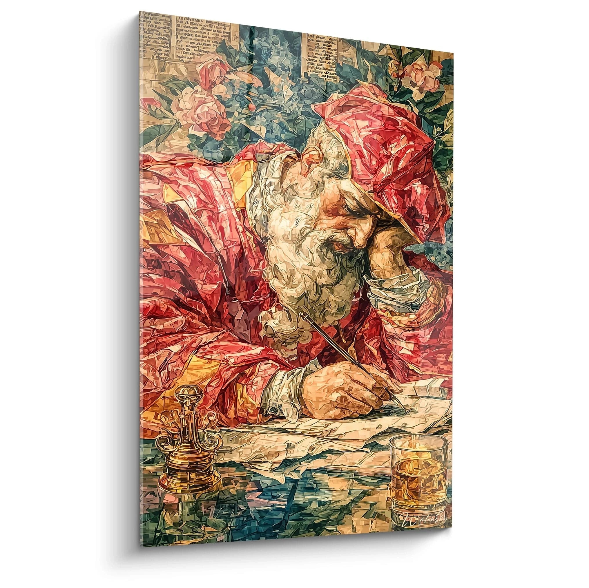
The Italian Renaissance Red painting carries symbolic charge historically distinct from other chromatic palettes. In Florentine and Venetian context, red predominance generally signaled themes related to secular power, portraits of dignitaries or mythological scenes where human passion expressed itself freely. This intensive coloration also served to represent the rich damascene fabrics and Genoese velvets that visually manifested the social status of patrons.
How to identify typical subjects of red compositions?
Contemporary reproductions of Italian Renaissance red paintings generally privilege three major iconographic categories: portraits of condottieri and magistrates in scarlet clothing, bacchic mythological scenes with sumptuous purple drapery, and allegorical representations of temporal power. Unlike golden compositions centered on religious themes, these works celebrate triumphant humanism and aristocratic affirmation. A collector seeking an audacious visual statement will favor these profane subjects that naturally integrate into private residential spaces without devotional connotation.
Preferred Architectural Contexts
Installation of a monumental Italian Renaissance red painting responds to specific spatial considerations rarely applicable to other palettes. Deep reds absorb more natural light than reflective golden compositions, requiring volumes with high ceilings and controlled ambient luminosity. Interior architects recommend these imposing formats for spaces with dark walls or wood paneling, where red creates striking contrast rather than tonal fusion. Large reception rooms with northwest orientations, less exposed to direct fading rays, constitute the ideal environment to preserve chromatic intensity over the long term.
Acquisition Strategies for Discerning Collectors
Purchase of an authentic Italian Renaissance red painting in large format requires understanding of regional stylistic variations. Venetian compositions favored warm reds with orange undertones reflecting Byzantine influence, while the Florentine school preferred cooler vermillions with bluish nuances. This knowledge enables selection of a work harmonious with existing architecture: interiors with warm Mediterranean stone accommodate Venetian tonalities better, while minimalist contemporary spaces benefit from Florentine formal rigor. Specialized markets now offer museum-certified reproductions guaranteeing chromatic fidelity to originals preserved in Italian public collections.
Creating Palatial Atmospheres through Renaissance Red
Integration of a monumental Italian Renaissance Red painting radically transforms spatial perception and emotional atmosphere of a contemporary interior. Contrary to common assumptions, these vibrant compositions do not visually overload the space but function as structuring visual architectures, provided certain decorative staging principles inherited from historic palatial layouts are respected.
What furniture ideally accompanies these red compositions?
Decorators specializing in heritage integration recommend contrasting rather than matching furniture associations. An Italian Renaissance red painting visually flourishes when surrounded by furniture in cream, pearl gray or deep black tones, allowing chromatic intensity to dominate without competition. Contemporary furniture with clean lines creates a fascinating temporal dialogue with the baroque exuberance of compositions, while Empire or Restoration antiques establish coherent historical continuity. The frequent error consists of multiplying red accessory elements that dilute the focal impact of the monumental painting.
Architectural Lighting Adapted to Historical Pigments
Optimal valuation of a large-format Renaissance red painting requires a lighting system specifically calibrated for these absorptive tonalities. Lighting designers advocate warm color temperature sources (2700-3000K) positioned in lateral grazing illumination, a technique revealing the depth of stratified reds while minimizing surface reflections. Unlike golden works that shimmer under direct lighting, Renaissance red compositions benefit from diffuse indirect illumination supplemented by discreet directional accents. This lighting strategy recreates the perception conditions of historic galleries illuminated by candelabras and filtered natural light.
Property Valuation through Patrimonial Art
Beyond aesthetic satisfaction, acquisition of a monumental Italian Renaissance red painting constitutes tangible patrimonial investment. Real estate agents specializing in prestigious properties confirm that interiors presenting significant artwork valuate differently in the high-end market. An authentic museum-quality large-format reproduction immediately signals the owner's cultural refinement and attention to overall decorative coherence. Potential buyers of exceptional residences consider these permanent artistic installations as indicators of general quality, similar to noble materials and bespoke finishes.
Why choose an Italian Renaissance Red painting rather than a contemporary reproduction?
The Italian Renaissance Red painting offers historical depth and iconographic richness impossible to reproduce in contemporary creations. Classic Italian compositions benefit from several centuries of universal cultural recognition, conferring immediate patrimonial legitimacy on interiors. Their codified symbolic system remains decipherable by cultured visitors, creating conversational opportunities absent with modern abstraction.
How to maintain chromatic intensity of a monumental Renaissance red painting?
Preservation of vermillion tonalities requires primarily protection against direct ultraviolet solar exposure and extreme hygrometric variations. Installation in climate-controlled rooms maintained between 18-22°C with stable relative humidity (45-55%) guarantees optimal longevity. Semi-annual dusting with antistatic microfiber cloth generally suffices, absolutely avoiding liquid cleaning products that would alter printed surfaces.
What dimension to favor for an Italian Renaissance Red painting in a reception room?
Monumental formats exceeding 120 centimeters in width suit spacious reception rooms where visual distance permits overall composition appreciation. Traditional rule recommends painting width equivalent to two-thirds of the length of primary furniture it overlooks. In volumes with ceilings exceeding three meters, imposing vertical formats accentuate architectural verticality while creating aristocratic presence comparable to historic palatial galleries.