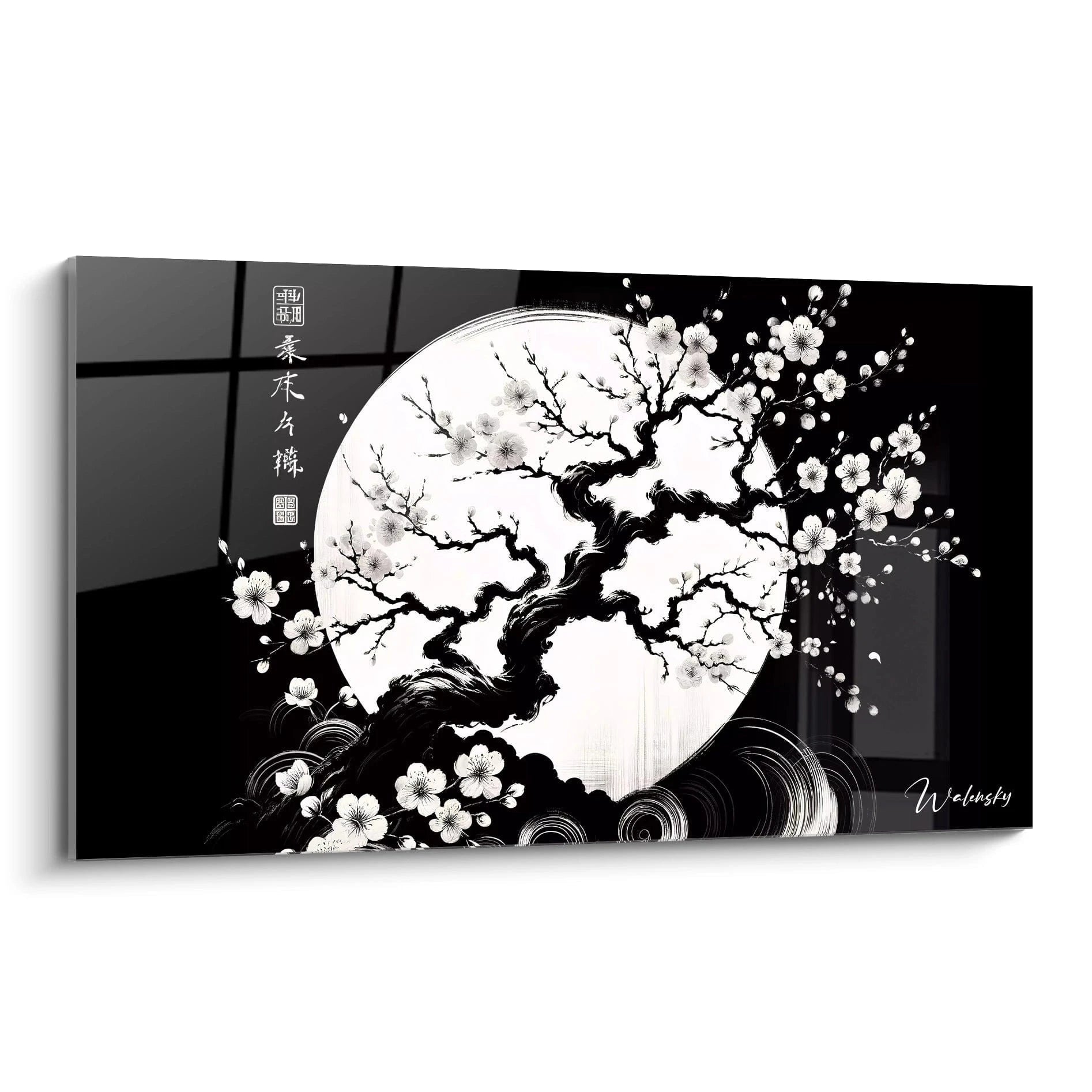
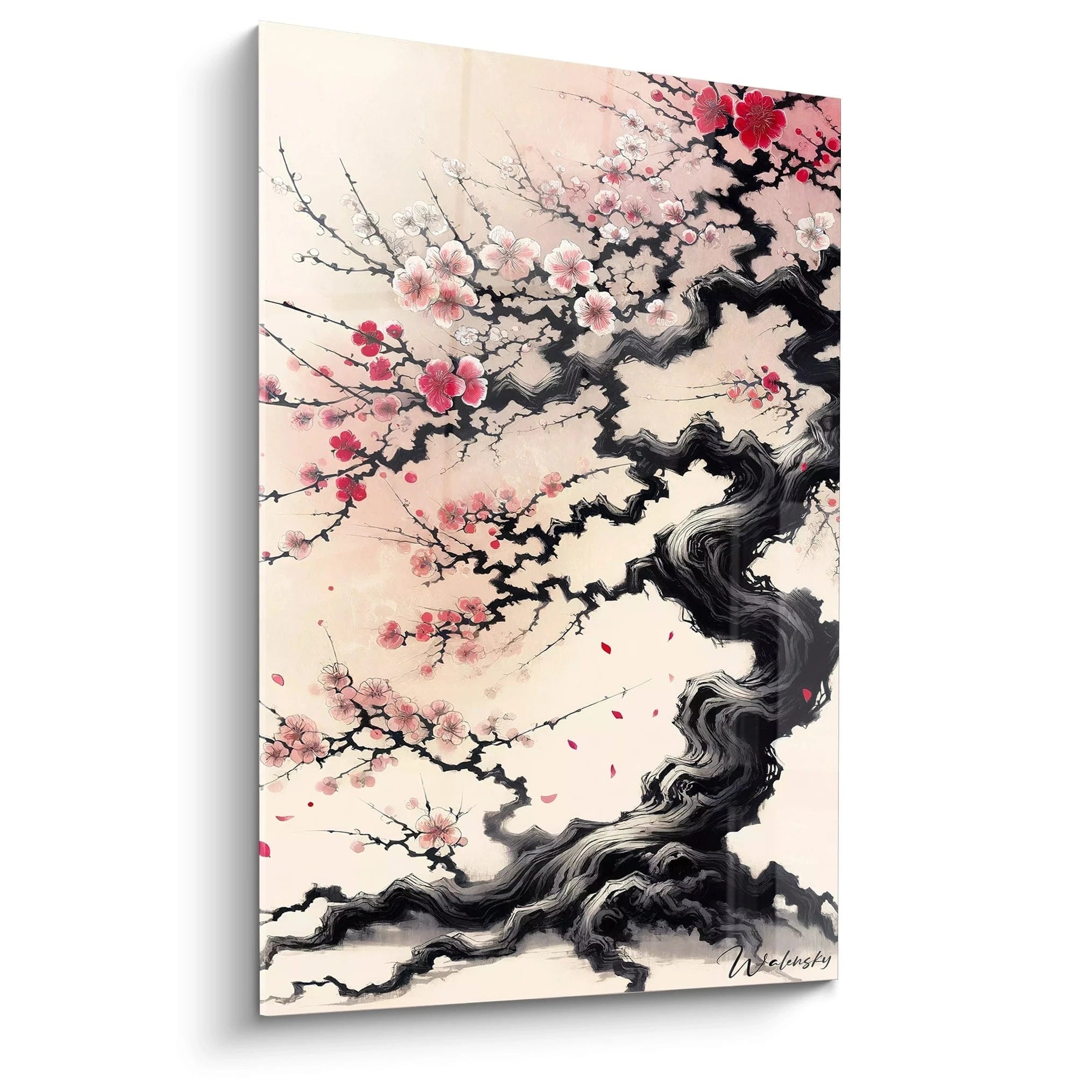
The black and white Japanese cherry blossom wall art embodies the essence of Japanese minimalism by capturing the refined beauty of sakura through a monochromatic lens. This graphic representation privileges powerful contrasts between shadows and light to reveal the delicate structure of branches and the ephemeral nature of blossoms. Unlike traditional colorful depictions, this timeless approach transcends decorative trends to embrace contemporary artistic practice. The panoramic large-format options available create a captivating visual immersion, transforming any wall into a contemplative window onto Japanese gardens. The absence of color amplifies the perception of textures, forms, and composition, creating a sophisticated visual dialogue with modern interior architecture.
The Art of Contrast: Black and White in Service of the Japanese Cherry
The black and white Japanese cherry blossom wall art rests on a visual dynamic founded on chromatic opposition. Dark branches unfold like vegetative calligraphy against clear backgrounds, creating a graphic tension that immediately captures the eye. This duality echoes the Zen concept of yin and yang, where each element finds its balance in its opposite.
Why choose a monochromatic representation of the Japanese cherry blossom?
Reduction to two tones eliminates chromatic distractions and concentrates attention on the natural architecture of the tree. Complex ramifications, branch nodes, variable density of blossoms: all these structural details become the true protagonists of the composition. This approach is rooted in the tradition of Japanese sumi-e ink painting, where economy of means reveals the essential.
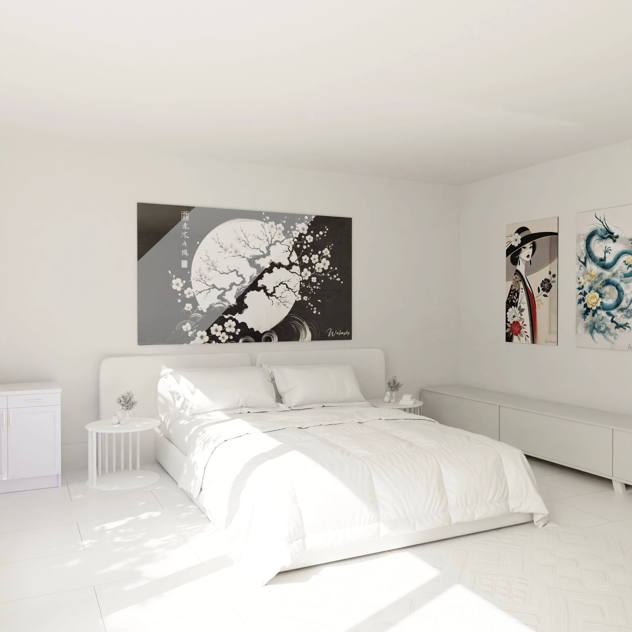
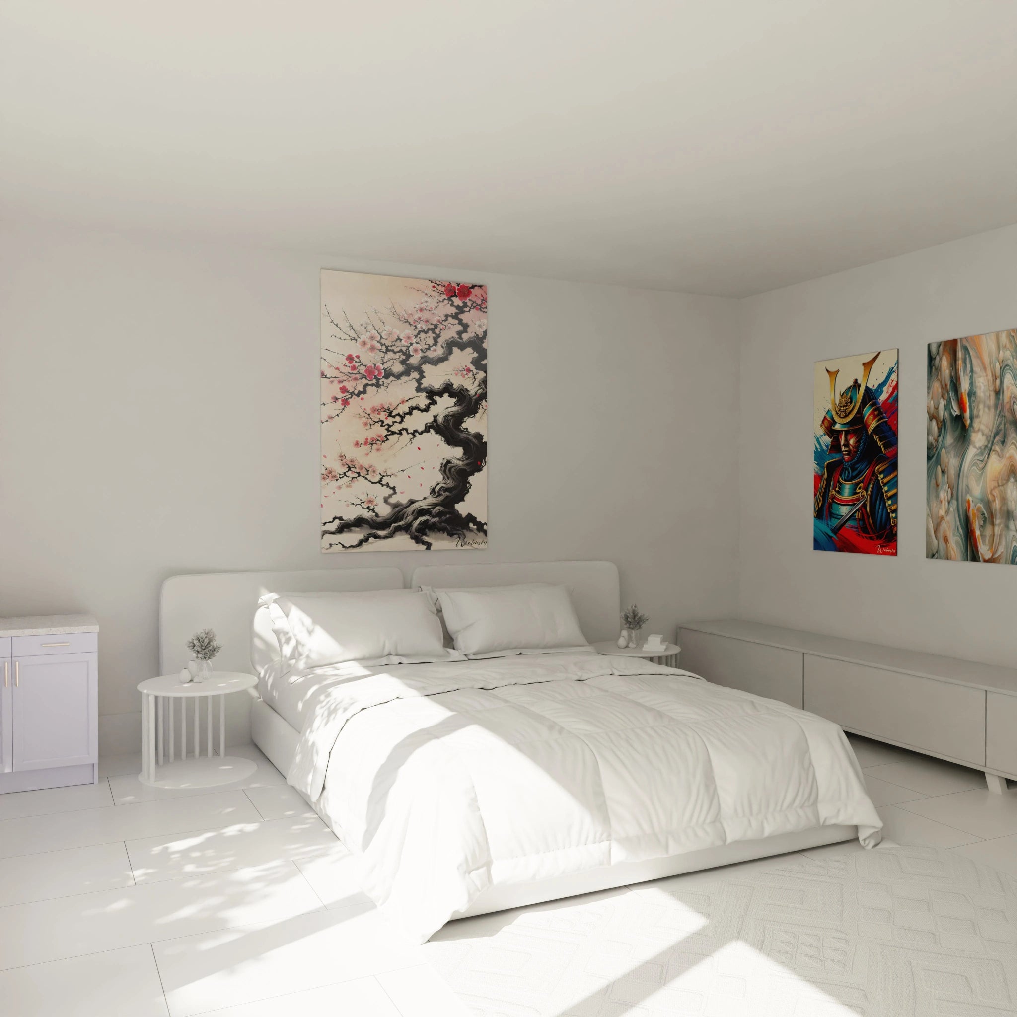
Large-format sizes amplify this dramatic effect. On a contemporary living room wall or in a refined professional space, a panoramic black and white Japanese cherry blossom wall art creates a focal point that structures the entire space. Depth of field is built through gray gradation, simulating the atmospheric perspective of traditional prints.
Shades of gray as visual language
Contrary to popular belief, black and white is never binary. A monochromatic Japanese cherry blossom wall art exploits the full palette of intermediate values: from pearl gray to deep charcoal, each nuance translates a distance, a texture, a density of petals. Contemporary artists use these gradations to suggest morning mist enveloping cherry trees, or the chiaroscuro of a full moonlit night.
This tonal richness harmonizes naturally with Scandinavian, industrial, or Japanese-inspired interiors, where neutral palettes dominate. The artwork becomes a bridge between Asian tradition and Western modernity, offering timeless sophistication that transcends seasonal decorative trends and never goes out of style.
Architectural Integration of Black and White Japanese Cherry Blossom Art
The placement of a black and white Japanese cherry blossom wall art in a living space follows specific principles linked to its monochromatic nature. Unlike colorful artworks that must dialogue with textiles and accessories, this representation functions as an architectural element in its own right, capable of redefining the visual proportions of a room.
How does monochromatic wall art transform spatial perception?
The horizontal branches of a cherry blossom tree, rendered in black and white, accentuate the perceived width of a wall. In narrow spaces or corridors, this illusion of horizontal expansion visually compensates for physical limitations. The monumental formats available make it possible to create visual continuity between multiple zones of an open space, unifying the whole through a coherent aesthetic signature.
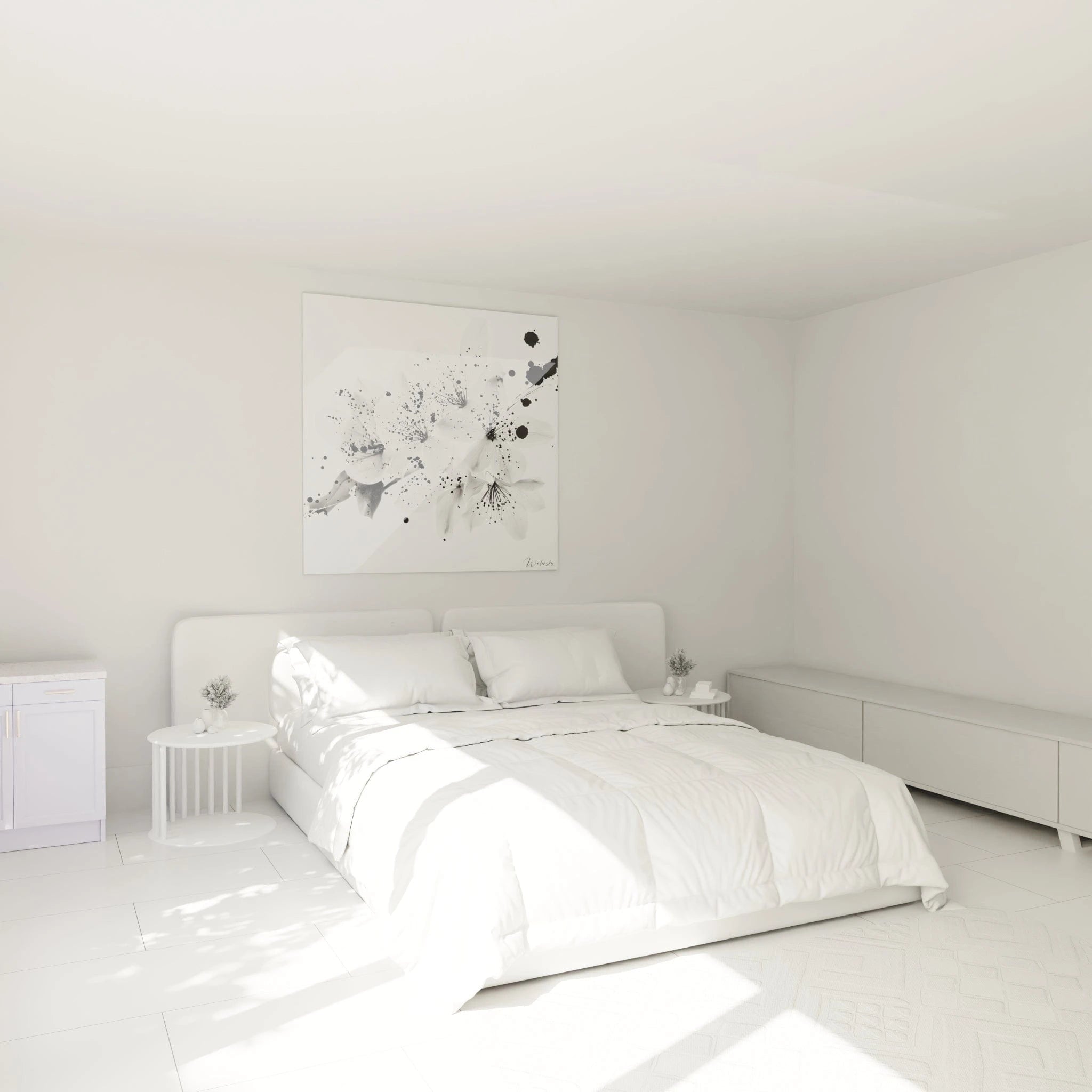
Minimalist environments particularly benefit from this strong graphic presence. A minimalist black and white Japanese cherry blossom wall art adds visual complexity without compromising overall simplicity. The interplay of natural shadows and light on the artwork's surface creates subtle variations throughout the day, transforming the piece into a decorative sundial.
Material and textural associations
The black and white Japanese cherry naturally dialogues with raw materials: polished concrete, aged wood, brushed metal, natural stone. This material affinity allows the artwork to be anchored in contemporary interiors without stylistic rupture. Surrounding textures gain increased importance: a Berber rug, a natural linen sofa, wild silk cushions create tactile counterpoints to the smooth surface of the artwork.
In meditation spaces or offices requiring concentration, this chromatic sobriety promotes visual calm. The absence of color stimulation allows the eye to rest without agitation, facilitating introspection or intellectual focus. Interior architecture professionals frequently recommend these pieces for medical offices, high-end waiting areas, or premium co-working spaces where the ambiance must remain neutral yet inspiring.
Artistic Composition and Symbolism of Monochrome Cherry Blossom
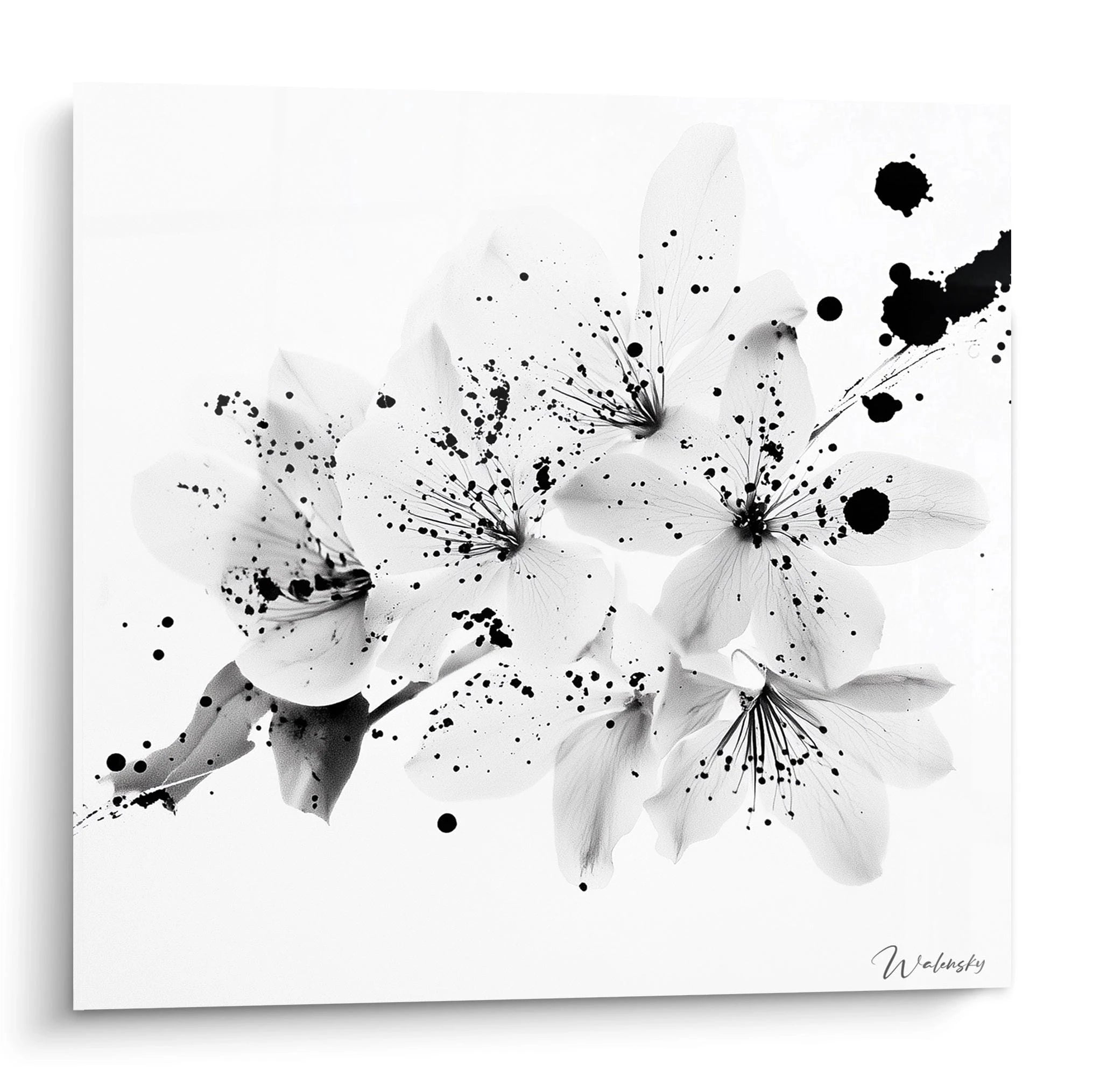
The translation of the Japanese cherry blossom into black and white represents a deliberate artistic choice that profoundly modifies the symbolic weight of the work. While pink representations immediately evoke spring and exuberance, the monochromatic version introduces a contemplative and philosophical dimension, close to wabi-sabi aesthetics that celebrates imperfection and impermanence.
What composition techniques do contemporary artists privilege?
Creators of black and white Japanese cherry blossom wall art exploit several distinctive compositional approaches. The high-contrast technique isolates precise branches against a uniform background, creating graphic silhouettes that evoke paper cutouts. Conversely, the subtle gradient method mimics diluted ink wash, where contours progressively dissolve into the background, suggesting atmospheric depth.
Some pieces adopt a close-up perspective, tightly framing a branch segment laden with blossoms, transforming the natural motif into near-abstraction. Others privilege the complete landscape, where the entire tree is inscribed in a context suggesting mountains, lakes, or traditional architecture. For those seeking a more fluid approach, a black and white Japanese cherry blossom watercolor wall art combines transparency and contrast.
The spiritual dimension of Japanese monochrome
In Zen tradition, black and white transcends simple color absence to become a metaphor for mental clarity. A monochromatic Japanese cherry blossom wall art stripped of its pink tones compels the viewer to deeper interpretation: it is no longer a matter of capturing a spring moment, but of expressing the very essence of blooming, its fleeting and precious character. This philosophy of "mono no aware" (sensitivity to ephemeral things) permeates each composition.
Collectors particularly appreciate versions where subtle gold elements punctuate the monochrome, creating luminous focal points that evoke divine light filtering through branches. To explore this variation, gold Japanese cherry blossom wall art offers a refined alternative preserving overall sobriety while adding a touch of discreet luxury.
Why does black and white resist decorative trends?
Timelessness constitutes the major asset of these works. Where chromatic trends evolve rapidly (from turquoise to terracotta, millennial pink to sage green), black and white remains an aesthetic constant. A black and white Japanese cherry blossom wall art acquired today will retain its decorative relevance in a decade, adapting to all ambient renewals without requiring replacement.
This adaptability makes it a judicious decorative investment for evolving spaces: rental apartments, regularly reconfigured offices, or simply for people who enjoy frequently modifying their décor. The artwork functions as a visual score on which one can superimpose different chromatic harmonies according to seasons or desires, while maintaining fundamental aesthetic coherence. For complete calming ambiance, pairing this type of work with a Zen Japanese cherry blossom wall art in color creates an interesting balance between sobriety and softness.
What size black and white Japanese cherry blossom wall art suits a large wall?
For spacious walls exceeding 3 meters in width, prioritize panoramic formats surpassing 150 cm. These dimensions allow for balanced visual presence that appears neither lost nor overwhelmed in the space. The general rule is to cover approximately 60 to 75% of available width to create optimal impact without clutter.
Does black and white Japanese cherry blossom wall art fit within colorful décor?
Absolutely. Monochrome functions as a visual neutralizer that calms chromatically charged environments. In a colorful interior, it offers a visual rest zone where the eye can stabilize, creating necessary balance. Surrounding hues stand out with even greater intensity through contrast with the artwork's sobriety.
How to maintain large-format black and white Japanese cherry blossom wall art?
Monthly dusting with a dry microfiber cloth is generally sufficient. Avoid direct sunlight exposure which can alter contrasts over time, particularly on photosensitive supports. For textured surfaces, a soft brush eliminates accumulations in relief areas without damaging the composition. Maintain stable humidity between 40 and 60% to prevent potential deformations.