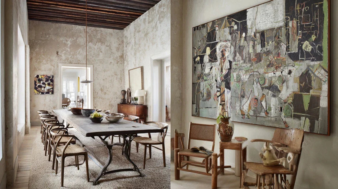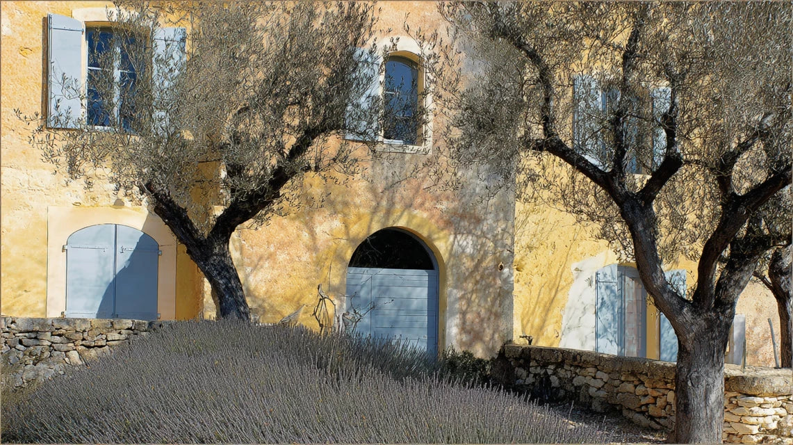
You’ve just moved into your Provençal home with its light stone walls and exposed beams, but every time you look at your walls, something feels off. Those modern paintings you loved so much in your old Parisian apartment seem completely out of place here.
The vibrant colors clash with the ochre tones of your walls, and that golden light from the Midi which should enhance your interior only accentuates the unpleasant contrast. You feel like your artworks detract from the authenticity of your Mediterranean home.
You’ve tried moving your paintings, changing the lighting, even buying new gold frames... But nothing works. The problem persists and you start wondering if you need to completely restart your wall decor.
It's normal to feel lost! The problem isn't your artistic taste, but simply that Provençal art adheres to very specific aesthetic codes linked to the terroir, light and history of this region.
By the end of this article, you will know exactly what types of paintings to choose for your Provençal home and how to arrange them to create that Mediterranean harmony authentic atmosphere you are looking for.
Why is the choice of paintings crucial in the art of living à la provençale?
In a Mediterranean home, every decorative element dialogues with the architecture and natural light. A poor choice of paintings can break this harmony in seconds, like a false note in a melody. Even more seriously: you risk missing out on that Provençal serenity that so many people seek and that your home could naturally exude.
🏡 Authentic testimonial : Marie, owner of an 18th century mas near Aix-en-Provence, confides to us: "I hung my collection of contemporary art in the living room. Visitors were uncomfortable without knowing why. Since I opted for Provençal landscapes and still lifes with warm tones, the atmosphere has completely changed. Even my husband, who was resistant to decor, told me that the house finally breathed."
💬 Conversation with a decor expert
The Provençal golden rule: Your paintings should seem to have always been part of the house, as if they had grown with the stones and beams. This natural harmony can be felt from the first few minutes of observation.
Understanding why your current paintings don't work
You are probably feeling this diffuse discomfort when you look at your walls: your urban artworks seem to "float" in space, the colors appear too aggressive in the morning at breakfast, and your guests unconsciously avoid sitting facing certain paintings.
This malaise is not due to a lack of taste on your part, but to an aesthetic conflict between the energy of your works and the Mediterranean soul of your home. It's like wearing a three-piece suit on a beach: technically correct, but fundamentally unsuitable.
Imagine your house as a musical instrument: the stone walls, the beams, the light create a natural acoustic resonance. Your paintings should harmonize with this frequency, not disrupt it.
The color temperature war
Here's something few people realize: cool colors (electric blues, intense purples) conflict directly with the limestone and terracotta that naturally vibrate in warm tones.
It’s exactly like mixing cold water and hot water in a bath: instead of getting a pleasant temperature, you create visual turbulence zones that tire the eye.
This chromatic dissonance explains why you feel less relaxed in your living room than expected, and why some rooms seem less welcoming than others.
Immediate test: squint slightly (to blur the details). If the dominant colors seem to "extinguish" or cool the atmosphere of the room, you have just confirmed the chromatic conflict.
Provence houses have particular volumes: high ceilings with beams, generous openings, thick walls. Many make the mistake of choosing paintings with urban proportions, too small for these majestic spaces.
It’s like wearing a ladies' watch on a rugby player's wrist: the object may be beautiful, but the harmony of proportions is broken.
Result: your paintings seem lost on the wall, the space appears empty despite the presence of artworks, and the overall impression lacks prestige and character.
Ignoring Mediterranean light
Southern sunlight is more intense and golden than elsewhere. It ruthlessly reveals chromatic imperfections and radically transforms the appearance of your paintings depending on the time of day.
You have surely noticed that some works that you liked in the evening under artificial lighting become aggressive or dull in full daylight. This is the implacable revealer of Provençal light.
This specific luminosity explains why artists from the region have developed such particular palettes, and why your "Parisian" paintings lose their magic under the southern sun.
The 4 warning signs to recognize:
- The "storefront" effect: Your paintings attract attention but break the atmosphere, like neon lights in a cathedral
- Unexplained visual fatigue: You naturally avoid looking at certain walls without knowing why, your brain fights against aesthetic cacophony
- The "small museum" syndrome: Your living room looks more like an art gallery than a place to live, the accumulation harms Provençal serenity
The trigger factor: emotional authenticity
What really makes the difference is the emotional resonance between your paintings and the soul of your home. Like a perfect musical chord, when it's right, you feel it immediately in your body: peace, feeling "at home", wanting to spend time in the room. You will recognize this accuracy by these signals: your guests naturally settle facing the works, conversations become more relaxed, and you yourself are surprised to admire your walls with the same pleasure as a sunrise.
The rule of natural harmony: If you have to "justify" why a painting goes with your Provençal decor, it's not right. The right work imposes itself as a visual evidence from the first glance.
| ❌ Common mistakes | ✅ Provençal approach | 💡 Explanation | 🎯 Benefit obtained |
|---|---|---|---|
| Accumulating small works scattered around | Favoring a few large-format pieces | Provençal volumes require stature | Strong and majestic visual impact |
| Choosing according to urban trends | Drawing inspiration from the Mediterranean palette | Each region has its chromatic signature | Natural harmony with architecture |
| Ignoring orientation and light | Adapting colors to exposure | The southern light reveals everything | Constant beauty at all hours |
| Copying decor catalogs | Personalize according to your taste | Each home has its unique character | Authenticity and personality assumed |
The 3-step method for choosing your Provençal paintings
Now that you understand the mechanisms at play, I will guide you step by step to transform your walls into a true Mediterranean gallery. This progressive approach will avoid costly mistakes and give you the confidence to create an interior that breathes authentic Provence. At each stage, you will see your home metamorphose and regain its true soul.
🎨 Transformation overview: We'll proceed like a chef composes a menu: first the basic ingredients (palette and style), then the harmonious assembly (layout and formats), finally the master touches (lighting and finishes). Each step will gradually reveal the unique character of your home.
Step 1: Define your personalized Provence palette
This first step is crucial as it lays the chromatic foundations for all your wall decor. Like a perfumer who creates their signature scent, you will identify the nuances that will make your home vibrate in harmony with its architecture. Once this base is established, all your future choices will become obvious and natural.
🎨 Reference elements to identify
- The dominant color of your walls: Observe it at different times of the day as it evolves with the light. Note if it tends towards ochre, pink beige or off-white. This shade will be your mother color which must be echoed in your paintings, even subtly. Avoid choosing solely based on artificial lighting which distorts perception. The noble materials present: Examine your beams, your tiles, your wrought iron elements. These materials naturally carry certain nuances (warm browns, blue-gray of the iron, terracotta...) which must dialogue with your works. A painting that ignores these references will always seem artificial in the space. Orientation and light intensity: A south-facing room cannot support the same colors as a north-facing room. Mediterranean light intensifies reds and oranges, softens blues and makes ochres vibrate. Test your ideas at 11 am and 4 pm to see the variations.
Let's move on to the practical analysis of your space
🔍 Execution of your chromatic diagnosis
Create your "color identity card": Take a photo of your main room at 2 pm in good weather, without flash. Print it and circle the 3 dominant colors with pencil (walls, floor, woodwork). These colors must represent 70% of your future paintings to guarantee harmony.
⏱️ Time: 15 minutes | ✅ Success when: You can precisely name your 3 reference colors | ⚠️ Attention: Don't rely on your color memory, it varies enormously depending on mood and fatigue
Test the 30% accent rule: Identify 2 complementary colors that could add depth without breaking harmony. They should be present in the Provence region (lavender, olive, Sienna earth...) and represent a maximum of 30% of the painted surface of your future artworks.
⏱️ Time: 10 minutes | ✅ Success when: Your accent colors "speak" with your base colors | ⚠️ Attention: Resist the temptation of "love at first sight" colors that clash with your base
Validate with natural light: Place samples of your selected colors against the wall at different times of the day. The true Provence color remains beautiful even under the intense light of 1 p.m. in summer.
⏱️ Time: 1 day of observation | ✅ Success when: Your colors remain harmonious at all hours | ⚠️ Attention: Beware of colors that "dirty" or become aggressive in full sun
✨ Validation of step 1: You must be able to describe your palette in one sentence: "My home vibrates with [base color] with accents [color 1] and [color 2]". If it's blurry or complicated, repeat the analysis. This clarity will guide you for all your future purchases.
OUR RECOMMENDED PRODUCTS
Step 2: Select authentic styles and subjects
Now that your palette is defined, you will choose the artistic themes that give meaning to your decor. This step is more rewarding because you begin to see the final atmosphere of your home taking shape. The goal is to create a narrative coherence that tells the story of your region while reflecting your personality.
🎨 Styles to prioritize
- Contemporary Mediterranean landscapes: Look for works that capture the essence of Provence without falling into the picturesque. Favor artists who enhance olive trees, cypresses and lavender fields with a modern approach. Mixed techniques (painting + collage) bring texture that dialogues well with stone walls.
- Still lifes with local products: Fruits of the Midi, Provençal ceramics, wicker objects... These subjects create a warm intimacy perfect for kitchens and dining rooms. Choose works where shadows and lights recall the particular quality of southern lighting.
- Abstraction inspired by local materials: Textures reminiscent of stone, patinated wood, lime plaster... These modern works integrate perfectly into contemporary Provençal interiors creating a subtle dialogue with the architecture.
🎯 How to identify the right artworks
Apply the authenticity test: When faced with a work, ask yourself if it could have been painted by an artist who has lived in Provence for 10 years. Authenticity is felt in the details: quality of the light represented, accuracy of local colors, respect for the natural proportions of Mediterranean landscapes.
⏱️ Time: 30 seconds per work | ✅ Successful when: The work "breathes" Provence | ⚠️ Attention: Beware of tourist clichés that lack subtlety
Check the thematic balance: For a living room, mix a maximum of 2 themes (e.g., landscapes + abstractions). For a kitchen, prioritize still lifes. For a bedroom, opt for soothing subjects such as olive groves or soft abstractions. This distribution avoids visual cacophony.
⏱️ Time: Planning of 20 minutes | ✅ Successful when: Each room has its own coherence | ⚠️ Attention: Never mix Breton marine and Provençal landscape, even if you like both
This final step transforms your artistic choices into a true interior staging. You will learn to play with Provençal volumes to create scenes that enhance both your works and your architecture. It is here that your home reveals its true personality and that you feel this pride in the work accomplished.
📏 The specific proportion rules for the Provence style
- Monumental formats for character walls: On a 4-meter wall, a minimum of 80x60cm canvas is essential. Provençal houses have generous volumes that swallow small formats. Dare to use large canvases that dialogue on equal terms with the architecture. Triptychs for long lengths: A composition in 3 parts allows you to rhythm a long wall without overwhelming it. Leave 10-15cm between each part so that the whole breathes and each work retains its individuality. Mediterranean hanging height: Hang the center of your works at 1.60m from the floor (against 1.50m usually). The high ceilings of Provençal houses allow this boldness which visually enlarges the space.
🏠 Perfect setup
Create "contemplation zones": Identify in each room where your gaze naturally rests (facing the sofa, upon entering, near the window). This is where your star paintings should be placed. The other walls will accommodate more discreet works that complement the atmosphere.
⏱️ Time: 10 minutes per room | ✅ Successful when: Your locations create a natural visual path | ⚠️ Attention: Do not overload the space in front of the dining table, prioritize serenity
Harmonize with existing lighting: Your artworks should benefit from natural light without being backlit. Test different times of the day and adjust artificial lighting as needed to reveal colors in the evening.
⏱️ Time: 1 day of testing | ✅ Successful when: Your works are highlighted at all hours | ⚠️ Attention: A poorly lit artwork loses 70% of its visual impact
The rule of harmonious progression: Start by installing your main artwork (the most imposing), then gradually add secondary works, checking at each step that the whole remains balanced. If an addition disrupts harmony, you need to review its location or size.
Congratulations! You now master the fundamentals of Provence wall decor. But allow me to share with you some expert secrets that will make the difference between a successful interior and an exceptional one. These subtle details distinguish true character homes from simple magazine copies.
🎨 Tip from an experienced collector: Invest in a work by a local emerging artist rather than several reproductions. Not only do you support living art, but you create a real personal signature. A single authentic canvas transforms the atmosphere of a room and becomes a fascinating conversation starter with your guests.
💭 "What if I make mistakes in my choices?"
"I'm afraid of investing in expensive artworks and regretting it afterwards..."
This concern is perfectly legitimate and shows that you take the arrangement of your home seriously! The beauty of the Provence approach is that it relies on safe values: earth colors, natural materials, Mediterranean light. These elements transcend trends without ever becoming outdated. To reassure yourself, start with a work in your main living room. Live with it for a few weeks. If it gives you that feeling of peace and harmony we described, you are on the right track to completing your collection.
🛡️ Secure strategy: First choose a medium-sized artwork in your validated palette and observe how it transforms the atmosphere of the room. This experience will give you the confidence needed for subsequent acquisitions.
The 5 mistakes that ruin everything (and how to avoid them)
After supporting hundreds of homeowners in their decor projects, I have identified the recurring pitfalls that turn a promising interior into an aesthetic disaster. These errors are all the more frustrating because they are avoidable with a little method. I prefer to tell you about them now to spare you these costly disappointments.
- 🚫 The "urban crush" mistake: You fall in love with a piece in a Parisian gallery without thinking about your Provence home. It's tempting because the emotion is strong, but transplanting an urban aesthetic to Provence creates a visual cultural shock. Wait until you are at home to validate your desires with your real environment.
- 🚫 The "small economical format" syndrome: To reduce the budget, you multiply small pieces. As a result: your walls look like a flea market and lose all stature. It's better to have one quality canvas than five small mediums. The visual impact will be incomparably superior.
- 🚫 The thematic overload: Provence landscapes + Breton marine art + contemporary abstract art in the same room... Your living room becomes an inconsistent artistic catalog. Choose a maximum of 2 complementary styles and respect this rule religiously.
- 🚫 Ignoring architectural scale: Hanging a 40x30cm painting on a 5-meter wall under 3.5m high ceilings. The work literally disappears and the wall appears bare despite its presence. Systematically adapt your formats to Provence volumes.
- 🚫 Neglecting lighting: Installing a painting without checking how the Mediterranean light affects it according to the hours. Some colors become garish at 2pm in summer or dull at 6pm in winter. Always test before final installation.
🔄 Anti-error verification system: Before any definitive purchase, apply the "24-hour hindsight" rule: live with your selection in image in your space (photo collage) for a full day. If the desire persists and harmony seems obvious to you, you can validate. Watch out for these warning signs: persistent hesitation, need to justify your choice, feeling that "something is wrong".
🎁 Special readers offer
Because you took the time to inform yourself, enjoy 10% discount on your first order:
⏰ Valid for 72h after reading • Applicable to all our products
🙋♀️ Frequently asked questions about Provence wall art
Count between 800€ and 2500€ according to your ambitions and the number of rooms to equip. To optimize: prioritize 2-3 quality works rather than 10 reproductions, start with the main living rooms, and spread out your purchases over 6-12 months to refine your choices. Sarah, owner of a mas near Gordes, transformed her living room with a single 80x120cm canvas for €650.
Your Provencal home transformed into a character gallery
In a few months, when you walk through your living room bathed in this particular golden light so typical of the Midi, you will feel that deep satisfaction of having created an authentic interior. Your guests will immediately notice this particular harmony: they will feel appeased as soon as they cross the threshold, naturally settle down facing your artworks, and compliment you on this "so Provencal atmosphere" that they struggle to define but feel intensely.
More than just decoration, you will have developed a true Mediterranean aesthetic eye which will serve you for all your future choices: furniture, textiles, lighting... This acquired sensitivity will gradually transform your entire home into a showcase of the art de vivre Provençal, and you will discover the pleasure of receiving in a place that truly resembles you.
The hardest part was understanding the codes and mechanisms. Now that you master them, start by photographing your main room to define your personalized palette. This first step will trigger a transformation that you will feel from the first days, and give you the momentum to create the Provencal house of your dreams.
🌿 Your new Provencal life begins now: You have all the tools to create this authentic Mediterranean harmony that will transform your daily life. Every glance cast on your walls will now be a source of serenity and well-deserved pride.