Composez votre galerie d'art

Des tableaux qui racontent votre histoire
Code d'initiation
ART10
10% offerts sur votre première acquisition
Découvrir la collection

Create a Strong Visual Brand with a Well-Placed Artwork

Créez un branding visuel fort avec un tableau bien placé
⏱️ Reading time: 8 minutes
You're entering your office for an important video call, and then... disaster. Behind you, a sadly empty white wall that makes you look like someone lacking professional personality.

This unpleasant feeling of appearing faded and impersonal when you know you have so much to offer. Your colleagues have sophisticated backgrounds, your competitor displays decor that breathes success, and you... you disappear into an anonymous setting.

You may have tried a few decorative objects here and there, changed the lighting, repositioned your desk. But nothing works: your space desperately lacks that presence that marks minds and inspires confidence.

It's perfectly normal! The problem isn’t your lack of taste, but the absence of a true visual anchor point - that famous focal point that transforms an ordinary space into a memorable personal signature.

By the end of this article, you will know exactly how to choose and position the perfect artwork to create a powerful visual branding that instantly sets you apart.

Why can a simple piece of art revolutionize your professional image?

In our era of permanent video conferences, your background has become your silent business card. In 3 seconds, it communicates your status, your values, your attention to detail. Waiting any longer means missing out on crucial first impression opportunities with clients, partners or employers. It's like wearing a wrinkled suit: technically, it works, but the impact is not the same.

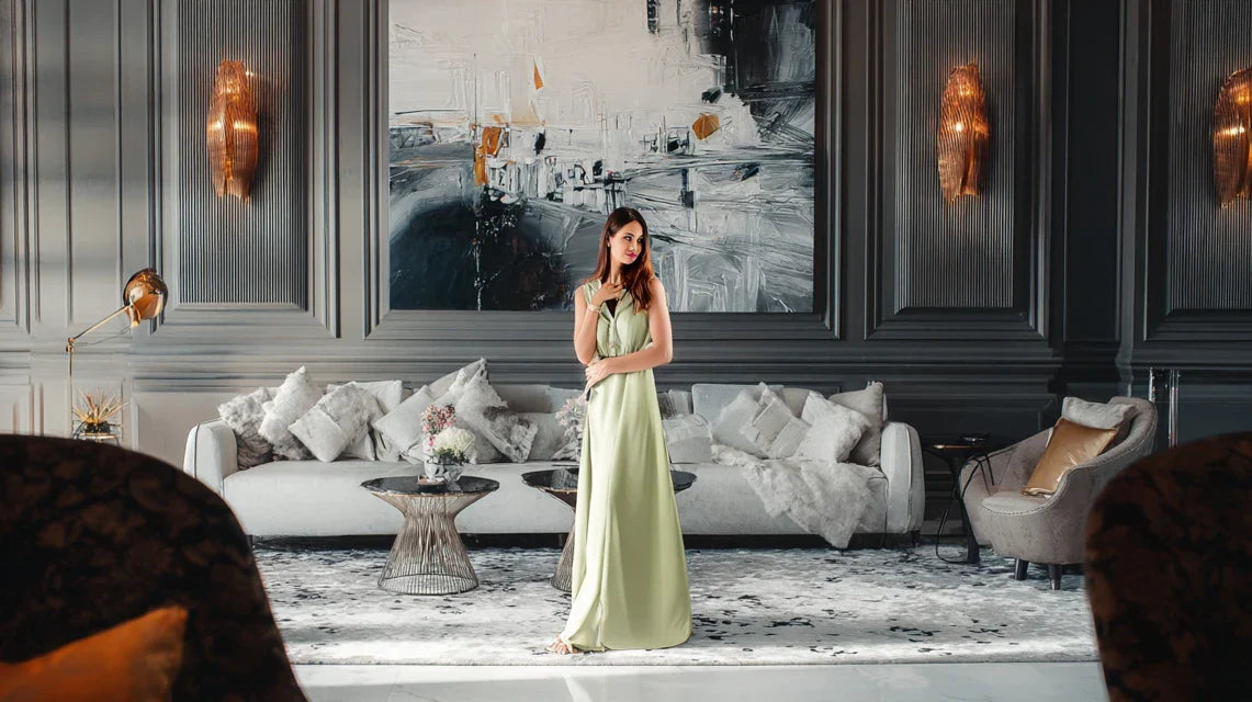
🎯 Revealing client case: Sarah, a strategy consultant, told me that after installing an abstract painting with golden tones behind her desk, her clients began to spontaneously comment on her "inspiring office". Result: +40% of recommendations in 6 months.

💬 Conversation with a decor expert

"I'm afraid my new artwork won’t match if I change my wall color..."
Relax! It's exactly the opposite. A true artistic crush adapts and even reveals itself with new colors. It's like a diamond that shines differently depending on the lighting!
"But I was told you always had to match colors..."
Who told you that? Modern decor plays on subtle contrasts. A painting with warm tones on a cool wall is like a fireplace in a blue room: magical!

The principle of visual anchoring: A well-chosen artwork becomes the reference point that organizes all the space around it, instantly creating a professional coherence. Within a maximum of 2 weeks, your new positioning will be naturally integrated.

What really hides behind a characterless space

Perhaps you recognize yourself in these situations: avoiding turning on your camera during meetings, feeling less credible from home, or worse, feeling like your workspace is pulling you down rather than lifting you up.

The way you feel isn't excessive perfectionism, but the logical consequence of an environment that doesn’t represent you. Your brain instinctively knows that a key element is missing to project your true personality.

It's like trying to cook a refined dish with mismatched utensils: technically possible, but harmony is lacking. Your talent deserves a setting worthy of it.

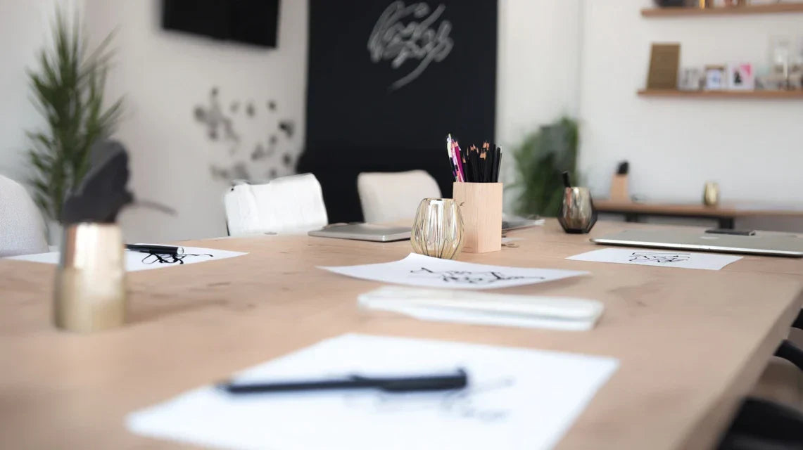
🎨 First hidden cause: The illusion of decorative accessories

Most people accumulate small decorative objects thinking they are creating character. But contrary to popular belief, multiplying scattered elements dilutes your message rather than reinforcing it.

Imagine an orchestra where each musician plays their own melody: guaranteed cacophony! You need a visual conductor - your artwork - to harmonize the whole thing.

As a result, instead of expressing your sophistication, your space looks cluttered and amateurish. As soon as you understand the power of a single focal point, everything will become clear.

🔍 Quick test: Take a photo of your current workspace. Where does your eye land first? If it hesitates between several elements, you have your explanation!

🧠 Second hidden cause: The myth of reassuring neutrality

Many think that a neutral space avoids "taste mistakes." In reality, total neutrality communicates the absence of personality - exactly the opposite of the desired effect for strong personal branding.

It's like wearing exclusively beige out of fear of dressing badly. Technically harmless, but completely forgettable. Zero risk is maximum risk when it comes to image.

Direct consequence: you go unnoticed in a world where capturing attention has become a decisive competitive advantage. A touch of controlled boldness will distinguish you infinitely better.

⚡ Third hidden cause: The "default wallpaper" effect

Here's what almost no one notices: our brains automatically associate an impersonal background with a lack of personal investment. It’s unconscious but powerful.

Spot it at home: when you see someone with the standard virtual background in video calls, what's your first impression? Exactly. Your brain does the same thing with your environment.

Daily impact: this subliminal perception influences your self-confidence and the confidence others have in you. Your environment shapes your mindset as much as your image.

🎯 3 signals that your space is holding you back:

  • You often cut your camera : Sign that your background doesn’t inspire confidence
  • People forget your meetings : Lack of visual memorability = lack of professional memorability
  • You feel "less professional" at home: The environment directly influences your state of mind

🎭 The Triggering Rule: The "Magnetic First Glance" Rule

What really makes the difference is your space's ability to create a moment of admiring pause for your interlocutor. Like a visual magnet, the right artwork generates that subtle "wow" effect which positively marks memory. In 2 seconds, you go from "ordinary" to "interesting person". Identify it in the leaders you admire: they all have that little extra something that naturally attracts attention and inspires respect.

Law of Visual Impact: A remarkable element is better than ten correct elements. Check this by observing the spaces that mark you: they all have a strong focal point.

❌ Dispersed Approach ✅ Focused Approach 💡 Mechanism 🎯 Practical Benefit
I accumulate lots of decorative objects I bet everything on a strong artwork The brain prefers a clear message Immediate memorable impact
I play it safe and neutral I assume a visual personality Differentiation creates attraction Professional recognition
I focus on the furniture I take care of the camera background The eye follows the visual hierarchy Natural authority in video calls
I adapt my style to each trend I create a recognizable signature Consistency builds trust Strong personal brand

The 3-Step Method to Create Your Visual Signature

Rassurez-vous, we will proceed methodically and without stress. Think of building a house: first the foundations (choice of style), then the structure (dimensions and placement), finally the finishing touches (lighting and harmony). At each step, you will see the evolution concretely and feel a growing satisfaction. The final result? A space that perfectly represents you and inspires confidence in all your interlocutors.

🗺️ Overview of Your Transformation: We will first identify your "visual DNA" (30min), then optimize the strategic location (45min), and finally refine the overall impact (30min). Each step brings you closer to your goal of impactful personal branding.

🎨 Step 1: Decoding Your Professional Visual DNA

We begin with this stage of reflection because it determines everything else. It's like choosing the right foundations: if it is solid from the start, the rest builds naturally. Once this base is laid, you will already feel a liberating clarity on your aesthetic direction.

🔍 The Diagnostic Elements to Gather

  • Your professional color palette: Observe your favorite clothes for important meetings + analyze the dominant colors of your industry + note the shades that flatter you. Avoid "trendy" colors that don't really suit you.
  • Your level of aesthetic boldness: Evaluate your tolerance for others' opinions on your decor choices + measure your need to stand out versus blend in + test your reaction to works that are out of the ordinary. The more you embrace your tastes, the more authentic the impact will be. Your key professional message: Identify the 3 qualities you absolutely want to communicate + clarify whether you aim for innovation, tradition, creativity, or reliability + define the emotion you want to evoke in your interlocutors.Now, let's move on to practice with your self-diagnosis:

    🎯 How to identify your authentic style

    Analyze your instinctive reactions: Browse 20 different painting images and note your 3 immediate favorites + identify the common point between your choices + ignore what you "should" like according to codes. Your first emotion reveals your true style.

    ⏱️ Time: 15 minutes | ✅ Successful when: You can describe your style in 3 precise words | ⚠️ Attention: Don't censor yourself for fear of judgment - authenticity is your best asset

    Test the harmony with your personality: Imagine explaining your choice to an important client + visualize this painting behind you for 6 months + check that it corresponds to your professional ambitions. Consistency avoids future regrets.

    ⏱️ Time: 10 minutes | ✅ Successful when: You feel aligned and proud to represent this style | ⚠️ Attention: Beware of "to please" choices that don't resemble you

    Validate with your existing environment: Observe the colors already present in your space + identify dominant materials and textures + identify what is already working well. Building on the existing guarantees a natural integration.

    ⏱️ Time: 5 minutes | ✅ Successful when: You can clearly see how the painting will fit in | ⚠️ Attention: A total contrast may seem artificial - dose subtly

✨ Validation of step 1: You must be able to explain your choice in a clear sentence and feel positive excitement at the idea of displaying it. If you are still hesitating, take 24 hours to reflect - the right intuition always prevails.

RECOMMENDED PRODUCTS

📐 Step 2: Mastering strategic placement

Now that your style is defined, we enter the crucial technical phase. This is where your vision takes on a concrete dimension and the impact begins to be measured. This step is particularly satisfying because each adjustment visibly improves the result.

📏 Tools for measurement

  • A measuring tape: Essential to respect harmonious proportions + choose a 3m minimum model to measure without constraint + check that the graduations are legible. A 10cm error can ruin the visual balance of the whole.
  • A spirit level: Guarantee of perfect horizontalness which subconsciously reassures the eye + opt for a 60cm model for optimal precision + test it before use on a known surface. A tilted painting communicates a lack of professional rigor.
  • Kraft paper or newspaper: To preview without making holes in the wall + cut to the exact dimensions of your future painting + temporarily fix with repositionable tape. This step avoids 90% of definitive placement errors.

🎯 Technique for optimal placement

Determine the ideal height: Place the center of the painting at 145-150cm from the floor (standard eye level) + adjust according to your height if you are often standing in this space + check the effect from your usual work position. This height optimizes impact during video conferencing.

⏱️ Time: 15 minutes | ✅ Successful when: The painting naturally attracts the eye without effort | ⚠️ Attention: Too high = impression of domination, too low = lack of stature

Calculate harmonious spacing: Respect a distance of 15-20cm between the painting and any furniture below + leave at least 30cm with the ceiling to avoid an "crushed" effect + create a visual balance with other elements in the room. The golden proportions create an unconscious harmony.

⏱️ Time: 20 minutes | ✅ Successful when: The whole appears naturally balanced | ⚠️ Attention: Don't rely only on your eye - measure to validate the impression

Optimize camera viewing angle: Test your video conferencing position + check that the painting appears partially but distinctly + avoid it cutting off your head or disappearing completely. The goal: create a professional signature background.

⏱️ Time: 10 minutes | ✅ Successful when: The painting enhances your image without competing with it | ⚠️ Attention: A painting that is too present can distract from your message

✨ Step 3: Perfect the overall impact

You are now reaching the expert finishing level that differentiates an amateur from a connoisseur. These final adjustments transform a "nicely placed painting" into a true professional visual signature. It is at this stage that you will feel the pride of work accomplished and the confidence of your new environment.

💡 Optimizing lighting to enhance

Eliminate parasitic reflections: Position yourself in your usual spot + identify light sources that create reflections on the artwork + adjust orientation or add indirect accent lighting. A well-lit painting breathes and naturally attracts attention.

⏱️ Time: 15 minutes | ✅ Success when: Colors are vibrant and uniform | ⚠️ Attention: Direct lighting creates unsightly shadows

Harmonize with natural light: Observe the evolution of brightness throughout the day + adapt your artificial lighting to maintain consistency + prioritize color temperature that enhances your artwork. Consistent lighting is reassuring during video conferences.

⏱️ Time: 25 minutes spread throughout the day | ✅ Success when: The rendering remains impeccable from morning to evening | ⚠️ Attention: Drastic variations in brightness disrupt the visual impact

Rule of mastered progression: You can move on to the next step when you feel an instinctive satisfaction when looking at your space and when your first reflex is to show off the result rather than hide it.

Congratulations! You now master the fundamentals of visual branding through art. Here are some expert subtleties that will give you that edge that is immediately noticed by connoisseurs and naturally inspires professional respect.

🎭 Professional decorator's tip: Add a discreet LED lighting behind the artwork to create a subtle luminous halo. This "back-lighting" technique used in galleries instantly gives your space a museum dimension. Guaranteed effect during video conferences!

🤔 "What if my painting doesn't please my clients?"

"I'm afraid that my artistic choice will be poorly perceived or divert attention from my professional message..."

I perfectly understand this concern! It’s even proof that you take the impact of your image seriously. The reassuring reality: a quality painting never divides, it intrigues positively. Think about the offices of leaders you admire - they all have a strong personality that reinforces their credibility. The secret: choose a work that authentically represents you rather than following generic "rules". Authenticity always inspires more confidence than conformity.

🔍 Social validation test: Discreetly show your choice to 3 trusted people from different backgrounds. If 2 out of 3 have an immediate positive reaction, you've got a winner!

⚠️ The 5 mistakes that sabotage your investment

I want to avoid the common pitfalls I regularly see. These mistakes are understandable and common, but they can compromise the desired effect. The good news? They are easily avoidable with the right reflexes!

  • ❌ Choosing only according to trends: It's tempting to follow what "works" for others, but you risk a impersonal result that quickly becomes outdated. Prioritize your authentic favorite - it will transcend trends and faithfully represent you. Remember: it’s your signature, not a temporary decor.
  • 📏 Underestimating the importance of dimensions: Many people say "I'll see how it looks once hung," but a picture that is too small disappears, too large overwhelms. Measure carefully and respect the 2/3 rule: your artwork should cover about 2/3 of the width of the furniture below. It’s mathematical and undeniable!
  • 💡 Neglecting lighting from the start: We focus on the artwork and forget that poor lighting can ruin even the most beautiful masterpieces. Think about lighting at the same time as placement - it's an inseparable duo for a professional result.
  • 🏃 Wanting everything to be perfect from the first try: Impatience leads to rushing without testing. Take the time to preview with kraft paper - 30 minutes of anticipation avoids weeks of regrets and unnecessary holes in your walls.
  • 🎨 Multiplying artworks "to do more" : More is not better! One strong artwork is worth three mediocre ones. Resist the temptation of accumulation - your goal is impact, not quantity. A single remarkable element makes a stronger impression.

🔒 Safety checklist before installation: You've been excited about your choice for more than 48 hours? ✓ The dimensions respect the proportions? ✓ Lighting is anticipated? ✓ You fully embrace this choice in front of your professional contacts? ✓ If 4/4, go for it!

🎨 Discover all our wall art collections

🎁 Special offer for readers

Because you took the time to inform yourself, enjoy 10% discount on your first order:

ART10

⏰ Valid 72 hours after reading • Applicable to all our products

❓ Your practical questions, our expert answers

💰 "What budget to plan for a truly professional result?"

Allow between €200 and €800 for a gallery-quality artwork that will lastingly impress your contacts. The optimization: start by defining your style with an average budget (€300-€400), then invest in the framing and lighting (€100-€200 extra). A €300 artwork well presented often surpasses a €1000 artwork poorly showcased.

⏰ "How long between order and visible impact?"

Immediate results upon installation (day one), natural integration in 1 week, full professional impact deployed within 3 weeks. The magic happens from the first video conferences - your interlocutors instantly notice the change without necessarily verbalizing it. Your confidence evolves alongside their perception.

🔧 "Is this really accessible to someone with little DIY experience?"

Absolutely! 90% of the success comes from choosing and placing, not the hanging technique. With modern fixing systems (no-drill hooks, magnetic rails), installation has become accessible to everyone. If in doubt, investing in a professional (50-80€) is negligible compared to the image stakes.

🎨 "How can I be sure my style will still please me in 2 years?"

Prioritize timelessness over trends: abstract compositions, stylized landscapes, or black and white art photographs transcend decades. The trick of the professionals: choose works that genuinely move you; they resist trends better than following this season's "must-haves". Your instinct is your best long-term guide.

📱 "What is the real impact on my business while working remotely?"

The numbers speak for themselves: +25% average memorability, noticeable improvement in perceived professionalism, and above all, strengthening of your own confidence that naturally shines through. It's an ROI investment that is invisible but measurable: more client reminders, easier recommendations, and negotiations conducted with greater assurance. The environment shapes the mindset.

🌟 Your new professional signature awaits you

Imagine yourself in 3 weeks: you naturally turn on your camera with pride, your interlocutors remember your exchanges, and you feel that subtle confidence that changes everything in your professional interactions. Your artwork has become this discreet but powerful signature that instantly sets you apart. Positive comments multiply, your natural authority asserts itself, and you realize that this simple change has transformed your relationship with your workspace.

Beyond aesthetics, you have developed a sure eye for visual harmony that shines through in all your professional choices. This new confidence is felt in your communication, your presentations, your overall presence. You've gone from "someone working from home" to "a professional who masters their environment".

The hardest part was understanding the mechanisms - now that it’s acquired, all that remains is to choose and install. Your first step? Define your authentic style according to method 1. In one week, you'll already have your new signature workspace frame!

🚀 Your moment is now: Every day spent in an environment that doesn’t represent you is a missed opportunity to express your true value. Your talent deserves its perfect setting!

Share

Read more

Fond mural impactant : boostez vos shootings UGC ou produits
Les tableaux qui cartonnent dans les home tours tendance