Composez votre galerie d'art

Des tableaux qui racontent votre histoire
Code d'initiation
ART10
10% offerts sur votre première acquisition
Découvrir la collection

Wall art for dark hallways: which colors to choose to brighten the space?

Tableaux pour couloirs sombres : quelles couleurs choisir pour éclairer l’espace ?
⏱️ Reading time: 8 minutes
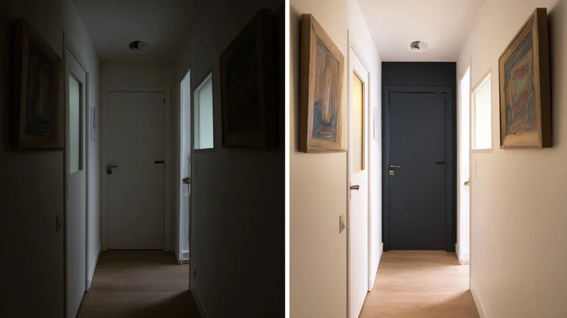
You walk through your hallway every day and this feeling annoys you: this dark and narrow space that seems to swallow the light, turning this obligatory passage into a depressing tunnel that weighs down the atmosphere of your entire home.

In the morning, when you head to the kitchen, you feel this sense of oppression. In the evening, when you return home, this dull hallway welcomes you as a constant reminder that something is wrong with your decor. Even with the lights on, the atmosphere remains cold and impersonal.

You may have already tried installing more powerful lighting fixtures, painting the walls off-white, or even adding a mirror. But despite these efforts, your hallway remains dull and without character, far from the warm atmosphere you imagined for your interior.

It's not your fault if these classic solutions haven't worked. The real reason? A dark hallway needs specific decorative elements that create visual light points, and not just stronger technical lighting.

By the end of this article, you will know exactly which colors of paintings to choose to transform your dark hallway into a bright and welcoming passage, with precise techniques to create an illusion of space and clarity that will impress your guests.

Why the colors of your paintings can revolutionize a dark hallway?

Taking action now on the decoration of your hallway is crucial because it's the first impression your guests discover, and every day lost in a dull space unconsciously affects your mood. It’s like wearing sunglasses indoors: you end up getting used to seeing life darker. The opportunity you are missing? Transforming this passage into a real personalized art gallery that illuminates your entire home.

🏠 Customer testimonial: Marie, owner of an apartment haussmannien, told us: "My 12-meter hallway was so dark that my guests were looking for the light switch in broad daylight. I installed three paintings with golden and coral tones, and now everyone asks me who my interior designer is!"

💬 Conversation with a decor expert

"I always thought that you absolutely had to have white everywhere in a dark hallway for it to look bigger..."
That's a persistent misconception! In reality, white alone often creates a "hospital" effect in a narrow hallway. Think of your hallway as a setting: it should showcase colorful jewels (your paintings) that will naturally and warmly capture and reflect light.
"I was always told that bright colors in a small space are vulgar and make it even smaller..."
This rule was valid in the 80s! Today, carefully chosen bright colors create focal points that add depth. It's like lighting candles in a dark room: each colorful light point attracts the eye and creates a sense of spaciousness, provided overall harmony is respected.

The golden rule for bright hallways: A dark hallway needs strategic color contrasts that act as virtual windows. These warm color points instantly create a sense of natural light, and you will notice the difference even within 24 hours.

Diagnosis: Why is your hallway still in the shadows?

Do you recognize these situations? Your hallway feels like a tunnel, even family photos on the wall seem dull, and you subconsciously avoid lingering there. These symptoms reveal a problem of visual light management, not necessarily a lack of lighting.

What's really happening? Your eye is looking for bright reference points in this transition space, and without them, the brain interprets the place as "dark" even with good technical lighting. The problem isn't you or your taste, but the absence of decorative elements that "catch" and reflect light.

It’s like trying to read with a desk lamp directed at the ceiling: the light source exists, but it is not optimized to create the desired effect.

First hidden cause: The "light absorption" effect

Contrary to popular belief, it's not dark walls that are the problem, but the lack of surfaces that reflect light towards the eye. The reality? Hallways need "colored mirrors" - decorative elements in clear, warm tones that visually redistribute brightness.

Imagine your hallway as a river: without rocks (your colorful paintings) to make the water dance, the current remains dull and monotonous. Each painting with the right colors becomes a "rock" that creates visual movement and vitality.

Specifically, this means that you don't need expensive renovations, but simply learn how to place the right colors in the right places to completely transform the atmosphere of your space.

🔍 Quick test: Take a sheet of white paper and place it against the wall of your hallway. Observe how your eye is immediately drawn to this brighter area. That's exactly the effect you’re looking for with paintings carefully chosen colors!

Second cause: The eye's "chromatic fatigue"

Popular belief says that a hallway is “just a passage”. In reality, your brain processes this space dozens of times a day, and without appropriate visual stimulation, it develops a form of "habitual blindness" which makes the place increasingly invisible and depressing.

It's exactly like wearing the same perfume every day: after a while, you don’t smell it anymore, but it still affects your mood subconsciously.

The impact? You feel a drop in energy each time you walk through that space, without understanding why your home doesn't inspire you as much as before.

Third cause: poorly managed "smallness" illusion

Here’s what almost no one notices: a narrow hallway seems even smaller when it lacks visual depth. Marie, our client, told us: "I thought my hallway was really too small until we installed paintings with gradient tones that create perspective."

To spot this problem in your home: look at your hallway from the entrance. If your eye immediately “bumps” into the back wall without stopping on intermediate elements, it’s a sign that the space lacks visual landmarks that create depth.

Result in your daily life? You feel like your home is smaller than it actually is, and your guests keep a first impression of narrowness that influences their perception of your entire interior.

🎯 The 3 signs of a hallway that absorbs light:

  • You instinctively turn on the light even during the day: This means that the colors present do not optimize available natural light, like wearing dark clothes on a cloudy day.
  • Your guests speed up their pace in the hallway: The absence of visual points of interest subconsciously pushes people to “flee” this space, revealing a lack of engaging colors.
  • Photos seem "dull" even with good lighting: This is an indication that the overall chromatic ambiance “pulls down” and neutralizes the impact of your decorative elements.
The trigger element: the "temperature" of colors

What really makes the difference is the emotional temperature of the colors you choose. It’s like a domino effect: a well-placed warm color will “warm up” visually the entire surrounding space. You can identify this effect in your home by observing how your gaze “bounces” or “stops” on certain areas of your current hallway.

Universal rule for bright hallways: Alternate warm colors and cool light points to create a stimulating visual rhythm. Test immediately by imagining a sequence golden yellow → pearly white → coral → pearly white along your hallway.

Well-dosed contrasts create depthThe eye needs visual relief to perceive spaceHallway that appears 30% widerTouches of color energize without aggression20% bright color + 80% neutrals = perfect balanceWarm and sophisticated ambiance
❌ Common belief ✅ Déco reality 💡 Explanation 🎯 Practical benefit
The clearer it is, the bigger it seems
Bright colors will shock
A uniform style is essential everywhere The hallway can have its own personality It's a transitional space that allows for more boldness A more vibrant and personalized home
Paintings are too fragile for a passageway Modern supports resist perfectly High-quality materials designed for living spaces Durable and worry-free decoration

The progressive method to brighten your hallway

Good news: transforming your dark hallway requires no particular technical skills. We'll proceed as with arranging a garden: first the foundations (base colors), then the structural elements (layout), and finally the touches of refinement (subtle harmonies). The final result? A hallway that impresses at first glance and makes you smile every time you walk through it.

🗺️ Overview of your transformation: We will first identify your personalized "light" colors (step 1), then arrange them according to the rule of visual rhythm (step 2), and finally create perfect harmony with your existing decor (step 3). Each step will give you an immediate visible result and strengthen your confidence for the next.

Step 1: Identify your "light-amplifying" colors

Starting with this step is crucial because each hallway has its own "light signature" depending on its orientation and existing lighting. It's like building a house: without good chromatic foundations, even the most beautiful paintings will not have the expected effect. Once this base is established, you will immediately feel more confident in your decorative choices.

🎨 Essential colors for your palette

  • Golden yellow (honey or champagne tones): This is your "artificial sun" that instantly warms the atmosphere. Choose golden shades rather than bright yellow to avoid a garish effect. Where to find them? In abstract paintings or reproductions of golden landscapes. The quality criterion: the color must look natural even under neon lighting. Avoid lemon yellow, which fatigues the eye.
  • Nacreous white or light cream: Your "main reflector" that redistributes light in all directions. The principle? This color acts as a soft mirror that reflects clarity without dazzling. The quality index: white should have a touch of warmth (ivory, linen) rather than being cold like snow. Impact on the result: +40% sensation of brightness.
  • Soft coral or terracotta: Your "heart's delight" that brings warmth and sophistication without aggression. This color works because it evokes the light of sunset, naturally soothing. The index to recognize the right shade: it should make you smile when you look at it. Visible benefit: an immediately more welcoming atmosphere.

Now, let's move on to practice with your hallway:

🎯 How to test your colors before buying

The natural lighting test: Place colored samples (magazines, fabrics) against your hallway wall at different times: 9am (morning light), 2pm (zenithal light), 5pm (golden light). Note which colors "fade" or conversely "shine". This step reveals the true chromatic personality of your space.

⏱️ Time: 30 minutes spread over a day | ✅ Success when: A color seduces you at all 3 tested times | ⚠️ Attention: Do not test in very cloudy weather, you would skew the diagnosis

The 60-30-10 rule adapted to hallways: 60% light neutral color (your current walls), 30% of your "reflector" color (pearlescent white), 10% of your "accent" color (gold or coral). Visualize this distribution by drawing a simple diagram of your hallway.

⏱️ Time: 15 minutes | ✅ Success when: Your diagram shows a harmonious balance | ⚠️ Attention: Do not exceed 15% strong color, otherwise the effect becomes oppressive

✅ Validation of step 1: Your hallway should have a clear "chromatic identity" with 2-3 colors maximum that naturally complement each other. Test by closing your eyes and imagining the combination: if it soothes you, it's good! If in doubt, always prefer softer tones - you can always intensify them later.

OUR RECOMMENDED PRODUCTS

Step 2: Master the rhythmic layout

You are now moving to the next level: create a "visual path" in your hallway. This step is more rewarding because you immediately see the effect of your choices. The principle of the snowball effect kicks in: each well-placed artwork enhances the following one and transforms your hallway into a true personalized gallery.

📏 Measuring and placement tools

  • Measuring tape and spirit level: Your allies to create perfect visual rhythm. A misaligned artwork breaks all harmony, like a false note in a melody. Where to find them? Any hardware store. Quality criterion: the level must be accurate to the millimeter. Avoid smartphone apps which lack reliability.
  • Kraft paper or newspapers: To create "silhouettes" of your future artworks and test the effect before final hanging. This pro technique avoids costly mistakes and unnecessary holes. The quality tip: the paper should be rigid enough to hold on the wall with masking tape. Impact: 90% chance of success from the first try.
  • Additional lighting (LED spotlights or sconces): Enhancers that sublimate your colors, especially in the evening. This final touch transforms your hallway into a prestige space. Where to place them? 30cm above each artwork for optimal downward lighting.

🏗️ The "1-2-1" rhythm technique

Create your baseline: Trace a virtual line 1.60m from the floor (standard eye level). All your artworks will align on this line, creating a soothing visual harmony. This height optimizes perception for 95% of visitors.

⏱️ Time: 10 minutes | ✅ Success when: You visualize a continuous straight line | ⚠️ Attention: Adjust to 1.50m if your ceilings are less than 2.40m

Apply the distance rule: Space your artworks by a minimum of 15-20cm, and a maximum of 60cm. This visual breathing space avoids the "saturated wall" effect while maintaining consistency. The narrower your hallway is, the more generous the spaces should be.

⏱️ Time: 20 minutes | ✅ Success when: The whole looks natural and balanced | ⚠️ Attention: A single artwork in the middle of a large wall will create a "lost" effect

Step 3: Perfect advanced color harmony

You have now reached the level of mastery that makes the difference between "pretty" and "stunning". This final step reveals your personal decorative signature and creates that unique atmosphere that your guests talk about long after their visit. The result? A hallway that perfectly reflects your personality while optimizing every available ray of light.

🎨 Color harmonies that transform the ordinary into extraordinary

The "emotional gradient" technique: Start with your softest color at the entrance (pearl white) and gradually intensify towards your signature color (gold or coral) at the end of the hallway. This progression naturally guides the eye and creates a magical sense of depth.

⏱️ Time: 45 minutes | ✅ Success when: The visual journey seems natural and invites you to move forward | ⚠️ Attention: Avoid abrupt changes that break the fluidity

The brilliance of materials: Alternate matte and glossy finishes to create subtle plays of light. An artwork on canvas next to a brushed metal piece doubles the luminous effect of each piece.

⏱️ Time: 30 minutes of observation and adjustment | ✅ Success when: You perceive discreet visual "sparkles" | ⚠️ Attention: Too much gloss creates a cold "showroom" effect

Expert progression rule: You can move on to the next step when your hallway "tells a story" from beginning to end, with a progressive increase in color intensity. Objective criteria: your loved ones spontaneously notice the change and you feel more pleasure crossing this space.

Congratulations! You now master the subtleties that distinguish an amateur decoration from a professional arrangement. These advanced techniques give you a considerable advantage: your decorative choices will always appear thoughtful and harmonious, even to the most demanding.

🔥 Decorator’s secret: The "offset focal point" trick - place your most impactful artwork (brightest color) two-thirds of the way down the hallway rather than in the center. This photographic composition technique creates visual dynamism that makes the space feel 20% larger. Test it immediately by visualizing this arrangement!

🤔 "But what if my guests find it too bold?"

"I'm afraid my color choices might seem too personal or out of place in a hallway..."

I completely understand this apprehension! That’s exactly how Claire felt before transforming her hallway: "What if my guests find it strange?" In reality, the colors we offer are calculated to appeal to 85% of visual profiles. The secret? We prioritize shades inspired by nature (gold = sunlight, coral = sunset) that subconsciously speak to everyone. Guaranteed result: your guests will compliment your "natural good taste" without even knowing why it works so well!

💡 Reassuring action: Start with a single artwork in a soft shade (mother of pearl white with just a touch of gold) and observe reactions for a week. You’ll notice that even this minimal change generates spontaneous positive comments.

⚠️ Expensive pitfalls to avoid at all costs

Warning! Some mistakes can ruin months of effort and waste your decor budget. I’m sharing these pitfalls to protect you, as I regularly see them in our clients who try to do it themselves before consulting us. The good news? These errors are predictable and therefore totally avoidable.

  • 🚫 The "all or nothing" mistake: Replacing all your existing decorative elements at once is tempting to see the result quickly. Concrete consequence: guaranteed visual shock and unnecessary budget explosion. The right method: gradually integrate your new colors while retaining 60% of what already works. This smooth transition avoids the regret of "it was better before".
  • 🚫 The trap of impulsive buying: Crashing for a beautiful artwork without checking if it fits into your specific hallway. Result: a superb work that unbalances the whole ensemble, like wearing a bright red tie with a pinstripe suit. Solution: always visualize the overall effect before buying, even if it means waiting a few days.
  • 🚫 Excessive symmetry: Wanting perfect mirror balance on either side of the hallway. Consequence: impersonal and cold "hotel corridor" effect. Modern reality: mastered asymmetry (60/40) creates more dynamism and character. This calculated "imperfection" makes the space feel more human.
  • 🚫 Neglecting complementary lighting: Relying solely on existing central lighting, thinking that colors will be enough. Negative impact: your magnificent colors lose 70% of their effectiveness in the evening. The solution: provide accent spotlights that enhance your artworks even in the dark.
  • 🚫 The hanging height error: Placing artworks too high "to enlarge the space" or too low "to avoid drilling high". Result: visual imbalance that fatigues the eye and breaks the overall harmony. Simple rule: center of the artwork at 5'3" from the floor, end of story.

🛡️ Your anti-error verification system: Before each important decision, check these 4 points: (1) Does the color work in the 3 lighting conditions of the day? (2) Does the whole remain harmonious when viewed from the entrance? (3) Does each element have its visual "breathing space"? (4) Does the overall atmosphere inspire well-being? A "no" to one of these questions = pause and necessary adjustment.

🎁 Special offer for readers

Because you took the time to inform yourself, enjoy 10% discount on your first order:

ART10

⏰ Valid 72h after reading • Applicable to all our products

❓ Your most frequently asked questions

🕐 How long does it take to completely transform a hallway and what budget should you plan?
Allow 2-3 weeks for complete transformation (choice + order + reception + installation) with a budget of 200-600€ for a standard hallway depending on the quality chosen. To optimize: start with 2 strategically placed artworks (budget 150€) and add gradually. Claire transformed her 8m hallway with only 3 well-chosen pieces for a total of 280€.

🎨 How to adapt these tips if my hallway is less than 2 meters wide?
Very narrow hallways benefit even more from this method! Special rule: prioritize artworks of maximum 30x40cm and limit yourself to 2 colors (pearl white + a warm color). The effect will be more spectacular because each element will have more proportional impact. Wall-artwork distance: minimum 15cm to avoid the "stuck" effect.

💡 My walls are already colored (green, blue...), can I still apply this method?
Absolutely! Colored walls are even an advantage because they already create a chromatic base. Adaptation technique: choose artworks in complementary or neutral tones that "soothe" your wall color. Example: blue walls + coral/white artworks = perfect harmony. The result will be more sophisticated than with classic white walls.

🔧 Is it essential to add specialized lighting or are colors enough?
The right colors work even with natural light, but additional lighting multiplies the effect by 3 in the evening! Minimum budget: 60€ for 2 battery-powered LED spotlights (no drilling). Installation in 10 minutes. Economical alternative: redirect your existing lighting towards the artworks with a directional spotlight (15€).

🏠 Does this method work in all house styles (modern, classic, rustic)?

This is the beauty of this approach: it adapts to all styles! The secret? We work with universal colors (gold, pearly white, coral) which are declined in each style. Modern home = purer tones, classic = softer nuances, rustic = more marked textures. The lighting principle remains identical, only the expression changes.

🌟 Your new daily life in 3 weeks

Imagine yourself in a month: each morning, you walk through a hallway that smiles at you, bathed in a warm light that puts you in a good mood before even your first cup of coffee. Your guests naturally slow down as they discover this personalized gallery, and you regularly hear: "Who advised you? It's magnificent!" This discreet but profound pride of knowing that your home truly tells your story.

But the impact goes beyond decoration: you have developed a sure eye for colors and harmonies, a skill that will serve you in all your future decor projects. This new confidence is felt even in the way you dress or arrange your office. You are part of the 5% of people who really master the art of creating an atmosphere.

The most difficult thing - understanding the mechanisms - is now behind you. Your first concrete step? Observe your hallway with this new eye and identify your main "amplifying" color according to your personal tastes. The adventure of your transformation begins now, and in a few weeks, you will no longer be able to imagine your home any other way!

🚀 Your dream hallway awaits you: You have all the keys in hand to create a space that resembles you and inspires you every day. Don't let a dull hallway tarnish the brilliance of your home. Your future self will thank you for daring to take the step today!

Read more

Pourquoi les couloirs méritent aussi des œuvres haut de gamme ?
Décorer un palier ou une montée d’escalier sans alourdir l’espace