What’s Really Going on in Your Head (and Why It's Normal)
Do you recognize these situations? You pace around your living-dining room, smartphone in hand, endlessly scrolling through Pinterest. You save dozens of contradictory inspirations. You hesitate between three completely different styles, and finally... you close the app.
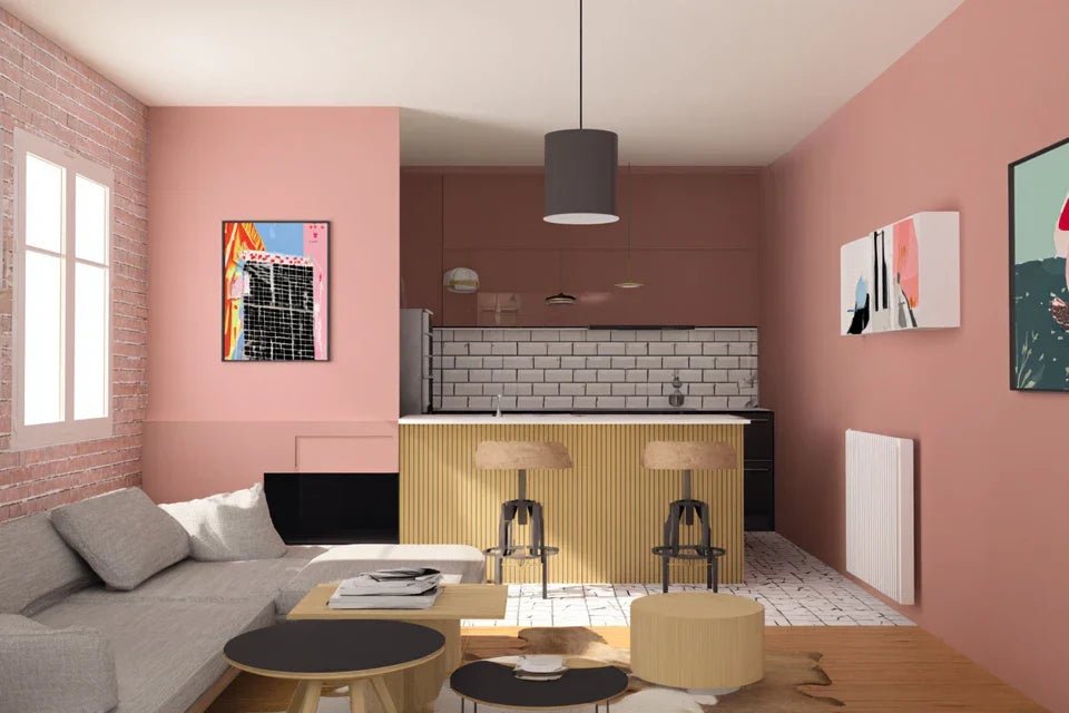
What’s happening is that your brain is processing a complex volume as if it were a classic piece. But an open space functions according to specific visual rules, like a unique architectural ecosystem. It's normal to feel overwhelmed: you've never been taught these codes!
Imagine that you’re learning to drive: at first, it’s impossible to manage the steering wheel, pedals, and mirrors simultaneously. Your living room requires the same progressive and methodical approach.
First Hidden Cause: The Illusion of a Single Space
Contrary to what we believe, an open living-dining room is NOT one space, but several interconnected zones. Most people try to decorate "globally", whereas each zone has its own visual needs while having to dialogue with the others.
It’s like trying to light a large room with a single bulb in the center: technically possible, but completely ineffective. Each zone requires its own “decorative lighting” while participating in the overall harmony.
This misunderstanding leads you to choose either artworks that are too small (lost in the immensity) or too imposing (which overwhelm one of the zones). The result: this permanent feeling that "something is wrong" without knowing what.
🔍 Quick test: Standing in the center of your room, slowly turn around. Count how many “visual zones” you perceive. Most people discover 3 to 5 zones where they only saw one!
Second Hidden Cause: The "Main Wall" Syndrome
Many think that you need to identify THE main wall and concentrate all the attention there. But in an open space, this traditional logic creates visual imbalances. It’s like putting all the instruments of an orchestra on one side!
The real trick is visual circulation: your gaze must be able to travel naturally from one zone to another, guided by harmonious anchor points. A well-placed painting becomes a “visual relay” that facilitates this circulation.
Without this understanding, you create “dead zones” (neglected corners) and “hot spots” (visually overloaded areas). Your guests then feel uncomfortable without knowing why.
Third Hidden Cause: Forgetting the Mobile Perspective
In a closed room, you admire your painting from a fixed sofa. In an open space, you move constantly: preparing meals, passages, different points of view. Your artwork must be beautiful from all angles!
Observe your daily routine: from your kitchen island, from the entrance, from the sofa... Each position offers a different perspective on your future painting. A successful choice will sublimate each of these views.
Ignoring this reality explains why some artworks that look "beautiful in the store" disappoint once installed. They don't withstand this multitude of daily points of view.
🎯 The 3 signals of a harmonious space:
-
The "breathing" effect: Your gaze circulates naturally without ever "bumping" into a disruptive element
-
Multi-angle consistency: The atmosphere remains pleasant regardless of your position in the room
-
Balance of forces: No area "pulls" excessive attention at the expense of others
The trigger element: The notion of progressive scale
What really transforms an open space, is mastering progressive scale. Like a composer who gradually increases musical intensity, your artwork should create a visual progression that naturally guides the gaze without jolting it. It's this "crescendo" effect that differentiates enthusiasts from true connoisseurs. You’ll recognize it by that immediate feeling of “rightness” when you enter the room.
The rule of fluid gaze: If your eye hesitates or "catches" somewhere, it's because the scale is not mastered. Test by closing your eyes for 10 seconds, then opening them: the first impression never lies.
| ❌ Classic approach |
✅ Open space approach |
💡 Why it works |
🎯 Concrete benefit |
| A single large central artwork |
Balanced multi-zone composition |
Respects the natural flow of gaze |
Immediate feeling of harmony |
| Colors "matched" to furniture |
Subtle and complementary contrasts |
Creates visual depth |
Living and sophisticated room |
| Placement according to decor "rules" |
Adaptation to real life flows |
Integrates your daily habits |
Renewed pleasure every day |
| “Safe” and neutral choice |
Assumed and coherent personality |
Expresses your identity without aggression |
Guests impressed by your taste |
The 3-step method to transform your space
Don't worry, we will proceed systematically. Like an architect who starts by analyzing the terrain before drawing, we will first understand your space, then define your needs, and finally choose the perfect artwork. Each step will give you increasing satisfaction, and you will feel your confidence grow.
🗺️ Your roadmap: Step 1 - Map your visual zones (satisfaction: clarity), Step 2 - Define your guiding style (satisfaction: consistency), Step 3 - Select and place your artwork (satisfaction: accomplishment). Like a puzzle that gradually resolves!
Step 1: Mapping your visual territory
Before choosing anything, you need to understand your space as a landscape. This step is crucial as it lays the foundation for everything else. It's like learning to read a map before embarking on a journey: essential so you don’t get lost. Once completed, you will see your room with completely new eyes.
🧰 Your analysis tools
-
Your smartphone (photo mode): Take photos from 5-6 different positions in your room. The camera reveals details that your accustomed eye no longer sees. Prefer photos to sketches: they are more objective and reveal the true proportions.
-
A meter or a measurement app: Note the dimensions of your main walls and ceiling height. This data will determine possible artwork sizes. A 20cm error can ruin the desired effect.
-
Your lifestyle: Observe your daily routines for 2-3 days. Where do you stop? From where do you most often look? This information is more valuable than any generic advice.
Now let's move on to concrete practice
📋 Your reconnaissance mission
Photograph your viewing angles: Take a photo from each place where you regularly pass (entrance, island, sofa, dining table). These photos will reveal the natural "visual corridors" of your space, crucial information for optimal placement.
⏱️ Time: 15 minutes | ✅ Successful when: You have 5-7 photos showing different perspectives | ⚠️ Attention: Don't always photograph from the same height, vary (standing/sitting)
Identify your functional zones: On your photos, mentally outline each "zone": living area, dining area, kitchen area, passage... Each zone has its own visual “personality” that must be respected.
⏱️ Time: 10 minutes | ✅ Successful when: You clearly distinguish 3-5 zones on your photos | ⚠️ Attention: Zones sometimes overlap, that's normal
Spot your "candidate" walls: Identify the 2-3 walls that could accommodate a work without hindering circulation or openings. Measure their width and note what surrounds them (doors, windows, furniture).
⏱️ Time: 20 minutes | ✅ Successful when: You have a "shortlist" of walls with their dimensions | ⚠️ Attention: A central wall is not necessarily the best choice