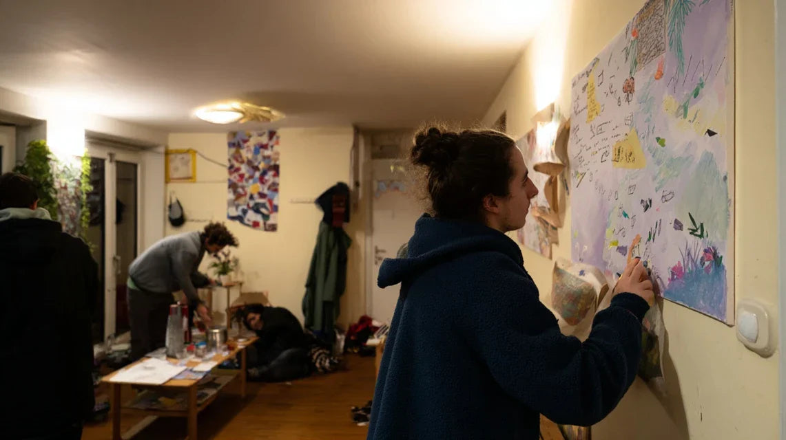
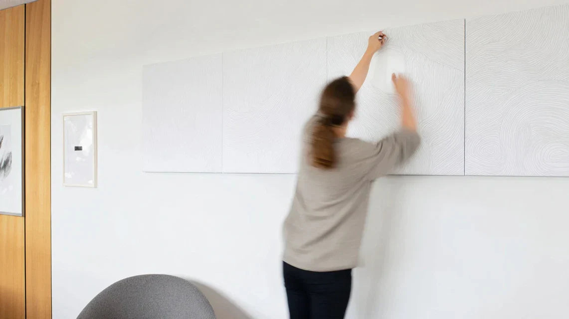
Guests rush through without even looking up, your own children dash off to their rooms without noticing your decorating attempts. This missed first impression frustrates you every day.
You've probably tried a few randomly chosen paintings, a plant or a decorative mirror perhaps. But nothing really manages to transform the atmosphere of these transition spaces.
That’s perfectly normal, and it’s not your fault. Passageways follow specific decorating rules that no one has ever explained to you.
By the end of this article, you will know exactly which visuals to choose so that your passageways become moments of daily pleasure, where each crossing brings you a small dose of beauty and pride.
Why do your passageways deserve special attention?
Passageways are the first and last spaces you see every day. If you neglect their decoration now, you’ll miss the opportunity to create small moments of happiness that accumulate and transform your daily life. It's like ignoring the welcoming melody of your home.
🏠 Revealing testimonial: Sarah, a Parisian interior architect, says: "I visited a magnificent Haussmann apartment, but I knew from the entrance that the owners didn't understand their space. A huge modern abstract painting completely overwhelmed the 1m20 wide hallway. Guests felt oppressed before even reaching the living room."
💬 Conversation with a decor expert
The "3 second impact" rule: An effective visual in a passageway must create a positive impression in less than 3 seconds, the average crossing time. You'll immediately see the difference in the overall atmosphere of your interior.
Understanding What’s Really Happening in Your Transition Spaces
You're likely experiencing one of these situations: the feeling that your hallways "swallow" the light, the sensation that your guests walk through your entryway without noticing it, or still this frustration of never managing to create a visual coherence between your different spaces.
What’s really happening is that transition areas function as "visual breaths" between your main rooms. The problem isn't your taste or budget, but the fact that these spaces require a specific decorative approach.
It’s like trying to create a bouquet with the same rules as for landscaping a garden: the basic principles differ.
First Hidden Cause: Scale Errors That Sabotage Everything
Contrary to what 90% of people think, a small artwork in a large hallway creates more emptiness than a bare wall. The reality is that transition areas need generous proportions to balance the movement.
Imagine wearing a pocket watch with a modern suit: technically it’s a watch, but the scale no longer matches contemporary use.
This disproportion unconsciously creates a feeling of incompleteness that follows you throughout the day. When you adjust the dimensions, you'll immediately feel that your home “breathes” better.
✋ Quick Test: Look at your hallway with squinted eyes. If the decorative elements "disappear" in the blur, they are too small for the space. Your guests barely notice them either.
The Illusion of “Overcrowding” That Limits You
Most people believe that a passage should remain minimalist to avoid visually "cluttering". In reality, an empty passage gives the impression of a neglected space, like a musical interlude without melody.
It’s like fearing that a smile is “too expressive”: authenticity creates connection, not excessive restraint.
This belief deprives you of daily moments of pleasure and turns your transitions into dull parentheses instead of being harmonious links between your living spaces.
The Trap of “Universal” Decoration
Many choose "neutral" visuals thinking they will adapt everywhere. But a transition space without personality resembles an impersonal hotel lobby, even in your own home.
You can spot this trap when your guests comment on your main rooms but never notice your transition areas, or when you yourself feel no emotion when crossing these zones.
The impact on your daily life: you lose every day dozens of opportunities for micro-aesthetic pleasures that nourish your well-being without you realizing it.
3 Signals That Don’t Lie:
- The Gliding Gaze: Your eyes never stop in these spaces, as if there was nothing to see
- Lighting that "eats" colors: Your visuals appear dull even with good lighting - they are not suitable for artificial light
- The feeling of a "hospital corridor": The space feels functional but completely devoid of soul or identity
The trigger factor: The speed of perception
What really makes the difference is immediate visual impact. In a passageway, you only have a few seconds to create a memorable impression. This is the "wow" effect: l ike fireworks, it must mark from the first second. You can identify this factor in your space by observing what naturally attracts your gaze as you quickly enter the room.
The "wow" rule: A visual in a passageway should naturally make you slow down, even when you are in a hurry. Test it by crossing your hallway while thinking about something else.
| ❌ Common belief | ✅ Reality | 💡 Explanation | 🎯 Practical benefit |
|---|---|---|---|
| Passageways should remain neutral | They can express your personality | It's your daily decorative signature | Each crossing becomes a moment of pride |
| Better a small picture than a large one | Generous scale creates impact | The eye perceives proportions before details | The space appears larger and more mastered |
| You should avoid bright colors | Colors energize transitions | They create positive emotional connections | Your mood naturally improves |
| Artificial lighting damages artworks | Good materials resist perfectly | Quality is more important than excessive caution | You enjoy your visuals without stress |
The 3-step method to transform your passageways
Rassurez-vous : decorating effectively a passageway is simpler than you think. We will proceed as when composing a melody: first the tempo (the scale), then the harmony (the colors), then the personality (the style). At each step, you will see your space gain in coherence and character.
🎯 Overview of the transformation: Step 1 - Mastering proportions (the space appears balanced), Step 2 - Creating visual harmony (everything harmonizes naturally), Step 3 - Affirming your style (the space resembles you). Each step builds on the previous one for a final result where each passage becomes a daily pleasure.
Step 1: Mastering the art of proper proportions
Starting with proportions is like laying the foundations of a house: everything else will depend on it. This step will immediately give you the satisfaction of seeing your space "make sense" visually, even before adding colors and style.
What you need to evaluate your proportions
- A measuring tape: The basic but essential tool that looks like a small, retractable metal case. It is used to precisely measure the width and height of your walls. Find it in hardware stores for 5-10€. Make sure it measures at least 3 meters. Avoid fabric tapes that distort and skew proportion calculations. Your smartphone with camera: Your phone becomes a visualization tool for photographing the space and virtually testing different sizes. The principle is that the lens reproduces proportions as your eye perceives them. Use the "square" mode to capture the correct proportions. A clear photo immediately reveals visual imbalances. Newspaper or kraft paper: These large, inexpensive sheets allow you to simulate the actual dimensions on your wall. It's like making a pattern before cutting the final fabric. The advantage is that you see the real impact without investing or drilling the wall.Now, let’s move on to practice with confidence
- Photos of your adjacent rooms: Clear pictures of the spaces surrounding the passage, showing dominant colors and style. They serve to identify the shades and materials that will create natural consistency. Take them with the same light as your passage. Proper lighting reveals the true nuances to harmonize.
- Color samples: Color charts or small objects featuring your main colors, resembling colored business cards. The principle: test associations before making a final choice. Collect them in decor stores or via high-definition photos. A color changes depending on its environment - always test in situ.
- ⚠️ The pitfall of impulse purchases: It's tempting to splurge on a beautiful visual without checking if it suits your space. Result: a lovely object that creates more frustration than pleasure. Always keep your measurements with you and visualize before buying. This precaution avoids costly regrets.
- ⚠️ The mistake of neglected lighting: Many choose their visual with the natural lighting of the store, then discover it's "dull" under their artificial lighting. Photograph your options in your true light or request a home trial. The investment is worth this check.
- ⚠️ The inappropriate fixing: A beautiful picture poorly hung can fall and be damaged, or worse, injure someone in a passageway. Invest in professional hardware suitable for the weight and wall. Safety always comes before economy.
- ⚠️ The "for later" syndrome: Postponing decoration waiting for the "ideal budget" or the "perfect room". Your daily life is lived now - start with a reasonable budget rather than waiting indefinitely. A first step will motivate you for the rest.
- ⚠️ Forgetting maintenance: Choosing a beautiful visual but impossible to clean in a frequently trafficked area. Prioritize practical materials: washable canvas, protective glass, resistant finishes. Lasting beauty requires a minimum of practicality.
The gestures that change everything
Measure and photograph your space: Measure the height and width of your passageways, then photograph them from the main entrance. This combination reveals the actual proportions versus your perception. The narrower your passage, the more visual surface area it should occupy to create balance.
⏱️ Time: 10 minutes | ✅ Successful when: You have photo + precise measurements | ⚠️ Attention: Many underestimate the necessary height - your eye perceives "large" differently in motion
Apply the rule of thirds: Your visual should occupy about 2/3 of the width of the main wall and 1/2 of its height. Cut newspaper to the correct dimensions and temporarily attach it. This proportion creates the necessary visual impact without overwhelming, like an accent that carries the voice without shouting.
⏱️ Time: 15 minutes | ✅ Successful when: The space looks balanced even from afar | ⚠️ Attention: Timidity leads to choosing too small - dare to be generous
Test the "glance" effect: Stand at the entrance of your passageway and quickly look towards your paper simulation. Your gaze should stop there naturally, like being drawn to a smile in a crowd. If you have to "search" where to look, the proportions are not yet right.
⏱️ Time: 5 minutes | ✅ Successful when: Your eye instinctively goes towards the visual | ⚠️ Attention: Don't confuse "striking" and "balanced" - harmony is more important than surprise
✅ Step 1 validation: Your passageway now has balanced proportions that create a natural focal point. You should feel that the space "makes sense" visually. If this is not yet the case, readjust the dimensions of your simulation - it's better to take your time now than regret it after purchase.
OUR RECOMMENDED PRODUCTS
Step 2: Create visual harmony with your interior
Now that you have mastered your proportions, you will create aesthetic continuity which makes your passage dialogue naturally with your other spaces. This is the step that transforms a simple hallway in a true decorative link between your rooms.
Elements to create harmony
Actions for perfect harmony
Identify your dominant palette: Analyze your photos to spot the 3 main colors of your adjacent spaces. Note them down and look for a visual that contains at least one of these shades. This color connection subconsciously creates the feeling that everything belongs to the same decorative universe.
⏱️ Time: 20 minutes | ✅ Success when: You clearly identify your 3 key colors | ⚠️ Attention: Don't count white/beige - look for colors that give character
Choose the level of intensity: If your rooms are rather soft, your passage can dare to have more character without breaking the harmony. If they are already expressive, stay in the same intensity. It's like tuning instruments: you need to balance the volumes to create a coherent melody.
⏱️ Time: 10 minutes | ✅ Success when: The visual energy level corresponds | ⚠️ Attention: A too-wise passage in a dynamic interior breaks the rhythm
Step 3: Affirm your decorative signature
This final step transforms your passage into a true expression of your personality. You now master proportions and harmony: it's time to choose what really suits you and will make this space a genuine reflection of your tastes.
Affirm your unique style
Define your emotional intention: Ask yourself what feeling you want to evoke when passing through this space: energy, serenity, sophistication, conviviality? This intention naturally guides you towards the right visual style. A passage should amplify the emotion you want to experience in your home every day.
⏱️ Time: 15 minutes | ✅ Successful when: Your intention is clear in one word | ⚠️ Attention: Avoid mixing multiple intentions - stay focused on a main feeling
Select your signature visual: Choose from the styles that express your intention: geometric abstract for modern energy, landscapes for serenity, stylized portraits for sophistication. Your instinct will immediately recognize the visual that "speaks" to you - trust it.
⏱️ Time: 30 minutes | ✅ Successful when: You feel an emotional connection | ⚠️ Attention: Don't give in to trends if they don't suit you
Final validation rule: You are ready when your choice respects your proportions (step 1), harmonizes with your interior (step 2) AND makes you smile spontaneously (step 3). All three criteria must be met.
You now master the fundamentals that separate an amateur decoration from a thoughtful arrangement. These expert subtleties give you the advantage of creating des spaces that positively mark everyone who passes through them.
🎯 Pro secret: Interior designers use the "eye-level rule": in a passageway, place your visual slightly higher than in a living room (120-130cm from the floor vs 100-110cm). This height naturally captures attention in motion and visually expands the space.
💭 Reader question
"I'm afraid my guests will find my choices too personal or too bold for a simple hallway..."
This hesitation is completely natural - we all want our guests to feel comfortable in our homes. But remember that people remember houses with character, not those that remain anonymous decoratively. A passage with personality creates a memorable first impression and shows that you truly live in your space. Start with a visual that you really like - your authentic enthusiasm will be contagious.
✨ Reassuring advice: Test your choice for a week with the paper simulation. If you still smile seeing it after 7 days, it's the right one! Your daily well-being is more important than the hypothetical judgment of others.
Avoid pitfalls that ruin everything
Now that you know what to do, let's protect your investment in avoiding common mistakes that turn a beautiful project into disappointment. These traps are predictable and therefore perfectly avoidable.
🛡️ Safety checklist: Before finalizing your choice, check: 1) The dimensions match your measurements, 2) The style harmonizes with your reference photos, 3) The lighting enhances the colors, 4) The fixing is suitable and solid. If any of these points are off, take the time to readjust.
🎁 Special readers offer
Because you took the time to inform yourself, enjoy 10% discount on your first order:
⏰ Valid 72h after reading • Applicable to all our products
🤔 Your most frequent questions
Allow between €80 and €300 for a quality visual suitable for a standard passageway (2-3m²). This range includes high-quality printing and framing. To optimize: start with a budget of €150 which will already give you excellent results. Concrete example: Sarah transformed her 8m² hallway with a triptych of €180 - the impact was well worth the investment.
The visual effect is immediate, but the full psychological impact develops over 2-3 weeks. Your brain gradually gets used to this new daily beauty. Many customers notice that they naturally slow down when crossing the space from day one - it's a sign that it works perfectly.
Your new life begins with these transformed passages
In a few weeks, you will cross these spaces with a spontaneous smile. Your guests will immediately notice the attention to detail, this decorative signature that reveals your personality from the entrance. You will feel this discreet pride of someone who truly inhabits their space, without compromise or approximation.
Beyond aesthetics, you will have developed a sure eye for proportions and visual harmony, skills that will enrich all your future decorative projects. This new confidence will transform your approach to interior design: you will dare more, you will make fewer mistakes, you will create spaces that truly resemble you.
Understanding was the most difficult step - you've overcome it! All that remains is to take your measurements and trust your enlightened instinct. Your first transformed passage will be the catalyst for a new relationship with your interior, where every space counts and contributes to your daily well-being.
🌟 Your moment has arrived: You now have all the keys to create passages that resemble you and inspire you every day. Daily beauty is waiting for your first gesture - it starts today!