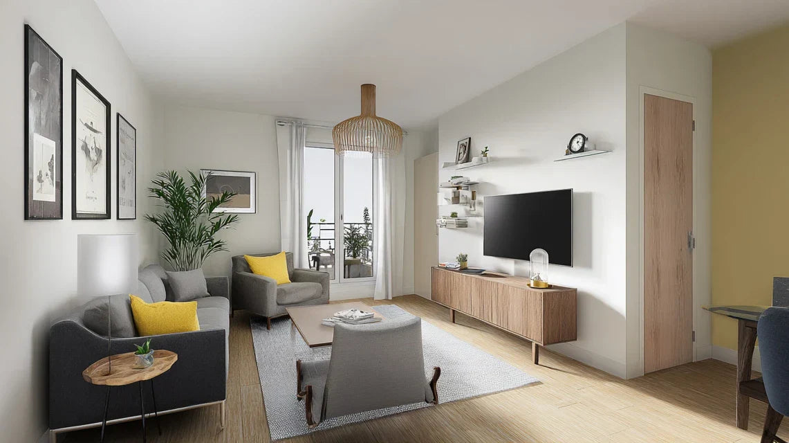
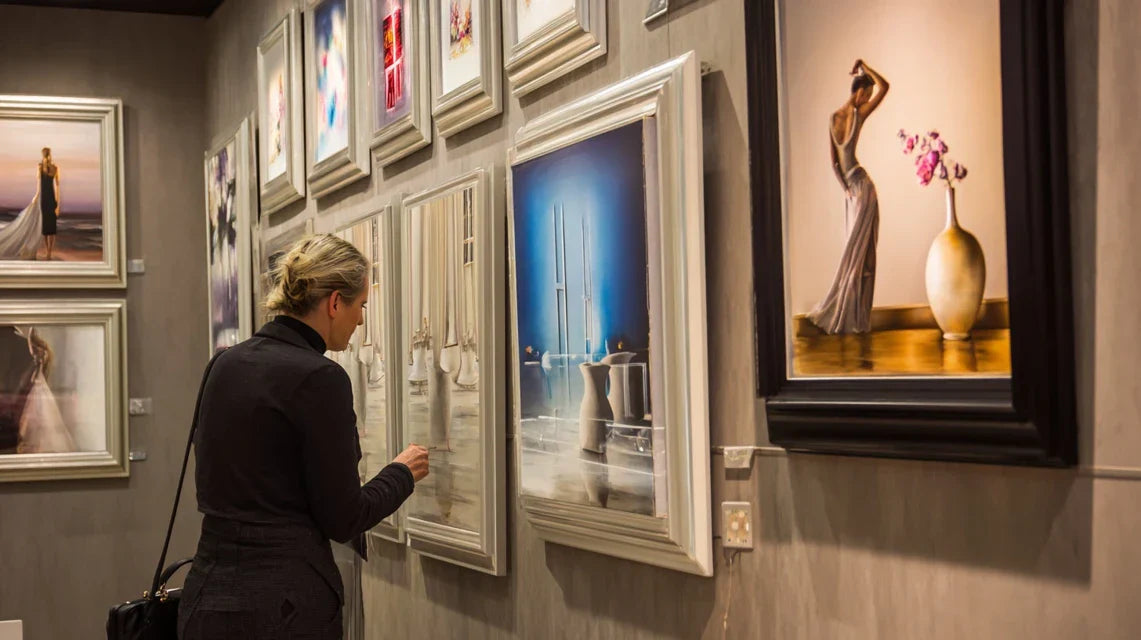
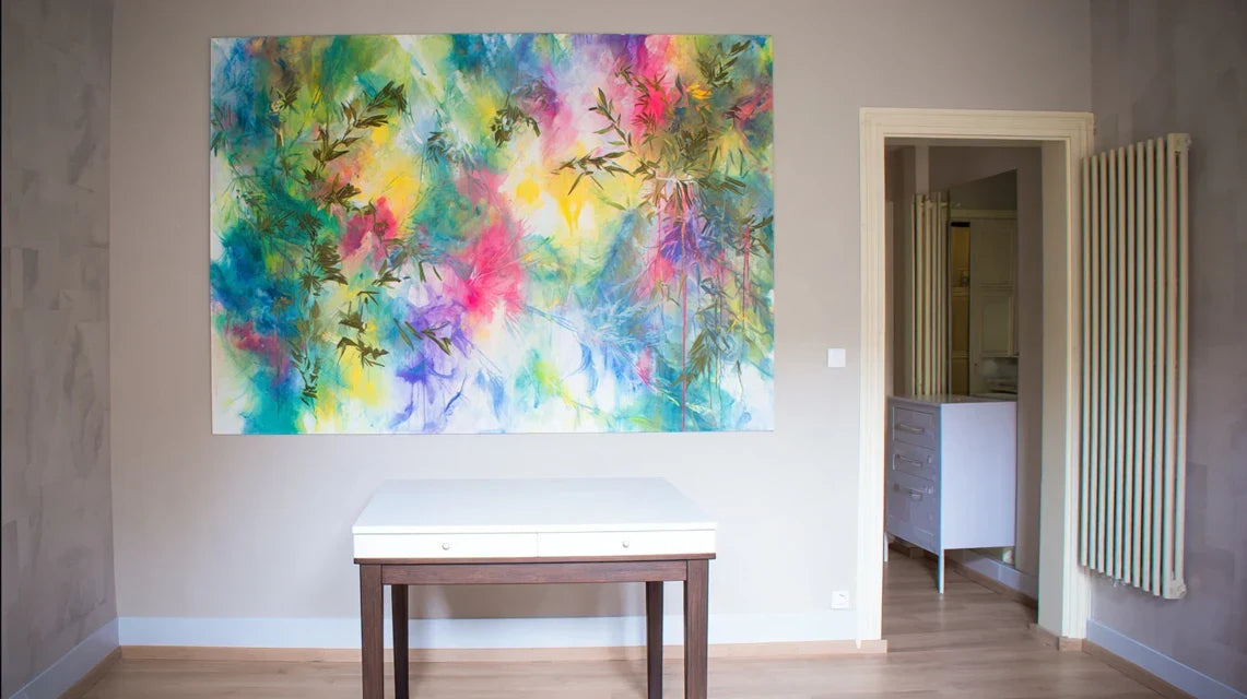
You've just visited your umpteenth furnished apartment and there it is, that familiar feeling: these impersonal white walls, these cold spaces that look like all the others. It’s impossible to imagine yourself living in a place that lacks soul.
Standard IKEA furniture, basic lighting, this impression of temporary housing where no one would really want to unpack their bags. You know something's wrong, but it's hard to pinpoint what would truly transform the atmosphere.
You may have already tried some candles, colorful cushions or green plants. But ultimately, the effect remains superficial and the apartment retains that “showroom” feel that doesn’t invite you to settle in permanently.
That's normal: decorative accessories are not enough to create a true visual identity. What's missing is a vertical element that structures the space and immediately captures the eye: wall art.
By the end of this article, you will know exactly how to transform any impersonal furnished apartment into a warm interior with wall art, and why this decor strategy instantly multiplies the perceived value of your rental.
Why bare walls sabotage the attractiveness of your furnished apartment?
In today's rental market, a furnished apartment without personality immediately loses 30% of its appeal compared to the competition.
It’s like serving a gourmet dish on a cardboard plate: the content may be perfect, but the first impression determines everything.
A landlord who neglects the visual impact of their walls misses the opportunity to create that decisive emotional connection during the visit.
🏠 Landlord testimonial: "It took me 4 months to rent out my two-room apartment on Avenue de la République. Yet, perfect location, recent furnishings, correct price. Then I hung 3 modern paintings in the living room and bedroom. Result: rented in 15 days at the same rate, with tenants who told me they had 'fallen in love' with the atmosphere."
💬 Conversation with a decor expert
"But honestly, do people really pay attention to paintings when they visit? They mostly look at the kitchen and bathroom, don't they?"
Don’t be fooled! Our brains process visual information in 150 milliseconds. The walls are the first thing you notice when entering a room, long before functional details. It's like the difference between a 2-star hotel and a boutique hotel: same size, same equipment, but wall art completely changes the perception of standing.
"I’ve always been told that it’s better to stay neutral in rentals to please everyone..."
This rule dates back to before Airbnb and Instagram! Today, tenants are looking for "Instagrammable" spaces that reflect their personality. An interior that is too neutral becomes invisible on the market. Well-chosen wall art creates this differentiation without excluding anyone, provided you prioritize contemporary and soothing styles.
The 7-second rule: A visitor forms a definitive opinion of a property in less than 7 seconds. Strategically placed wall art directs their gaze to the assets of the space and creates that "home" impression that triggers the desire to settle.
What's Really Going on in Your Visitors' Minds
Do you recognize these situations? You organize visits that run one after another without positive feedback. Candidates remain polite but distant. They take a few photos out of obligation, but you sense they are mentally comparing with something else.
What is really happening is an unconscious psychological process: emotional projection. A space without visual identity prevents the brain from creating positive memories and life scenarios in the place.
It's exactly like trying to connect with someone who wears a white mask: it’s impossible to create a connection because there is nothing to latch onto emotionally.
The First Hidden Cause: The "Hospital Corridor" Effect
Contrary to what one might think, it's not the lack of furniture that makes an apartment feel cold, but the absence of vertical focal points.
Bare walls create a visual echo that unconsciously recalls institutional spaces: hospitals, administrative offices, waiting rooms.
Imagine two identical restaurants: same cuisine, same service, same price. In one, white walls with just basic lighting. In the other, a few carefully chosen works of art. Which seems warmer, more reliable, more desirable to you?
This difference in perception translates directly into rentals: visitors subconsciously associate wall art = attention to detail = owner who takes care of their property = quality rental where they will feel valued.
🧠 Instant test: Close your eyes and visualize the living room of your parents or grandparents. What comes to mind first? Probably those paintings or photos that gave the space a unique personality. That's the power of wall art!
The Second Hidden Cause: The Illusion of Empty Space
Many owners think that a stripped-down space looks bigger. In reality, it’s the opposite that happens: without visual landmarks, the eye struggles to "measure" the space and the brain perceives it as smaller and less structured.
It's like looking at a landscape in fog: even if the terrain is vast, you get the impression of a restricted and anxious space. Wall art acts as visual beacons that reveal and organize the architecture of the room.
Concrete result: your visitors struggle to visualize the layout and subconsciously underestimate the potential for life in your apartment. They leave with a vague feeling that "something was missing".
The third hidden cause: lack of visual hierarchy
In a standard furnished property, all elements have the same visual importance: table, chairs, bed, wardrobe. No element naturally guides the eye to the assets of the space. It's like a speech without intonation: technically correct, but impossible to remember.
What are the telltale signs? Your visitors wander around rooms, take unconvincing photos, and only ask technical questions (charges, deposit, inventory). They treat your apartment as a functional product, not as a future home.
This utilitarian approach naturally leads them to the price criterion as the sole differentiator, whereas a well-crafted atmosphere would lead them to accept a rent increase of 8 to 12% according to industry studies.
🎯 3 signals that don't lie:
Expedited visit: Candidates stay for less than 10 minutes and avoid eye contact. Translation: no emotional connection has been created with the space.
Only practical questions: Parking, charges, notice period... No projection on daily life. Translation: they evaluate your property as a simple shelter, not as a place to live.
Systematic negotiation: All candidates try to lower the price. Translation: they perceive no added value justifying your rate.
The trigger element: the emotional anchor point
What really makes the difference is the creation of an "emotional anchor point" in each main room. Like a magnet, this point attracts the eye, structures the space and triggers a positive projection.
Quality wall art are the most effective tools for creating these anchor points, as they combine immediate visual impact and perceived sophistication.
You can easily spot it: it's where your visitors naturally stop and start asking questions about the layout rather than about constraints.
The "Wow factor" rule: Each room must contain an element that makes visitors say "oh, I like it!" A well-chosen and well-placed painting fulfills this function 100% and is immediately verified by the expression on their face and the time spent in the room.
❌ Furnished property without wall art
✅ Furnished property with paintings
💡 Psychological mechanism
🎯 Impact on rental
Functional and cold visit
Immediate emotional connection
Art activates the pleasure areas of the brain
More engaged and motivated candidates
Perception of a temporary space
Projection into a real home
Works create identity markers
Improved rental stability
Systematic price negotiation
Acceptance of the rate as justified
Art elevates the perception of standing
Optimized profitability (+8 to 12%)
High tenant turnover
Attachment to the place of life
A beautiful environment naturally fosters loyalty
Reduced vacancy periods
The progressive method to transform your rental property
Rassurez-vous : pas besoin d'être expert en art contemporain ou d'investir des sommes considérables. Effective wall art in rentals follows a simple, progressive and measurable logic.
Pensez à la construction d'une maison : fondations solides d'abord, puis structure, puis finitions. Ici, nous allons créer the visual identity of your apartment step by step, starting with maximum impact for minimum effort.
At each level, you will immediately notice the difference during visits: looks that linger, more personal questions, less systematic negotiations.
🎨 Overview of the transformation: 3 logical steps that transform any rental property into a desirable space. Step 1: Create immediate impact (living room). Step 2: Reinforce identity (bedroom and hallway). Step 3: Perfect harmony (kitchen and bathroom). Each step multiplies the effect of the previous one and creates a memorable visit journey.
Step 1: Immediate impact in the living room
Starting with the living room is no coincidence: it's the first room visited and the one where candidates spend the most time projecting themselves. Once the impact is created here, the halo effect naturally spreads to the rest of the apartment.
It’s like planting a majestic tree in a garden: even if the rest is still under construction, the whole thing immediately takes on another dimension. You will feel this satisfaction from the first successful hanging, when the space finally “clicks” visually.
🛠️ What you need to succeed
1 statement artwork of 70-100cm: Your masterpiece, visible as soon as you enter the living room. Choose a soothing contemporary style (geometric abstract, stylized landscape, modern botanical illustration). Absolutely avoid reproductions of masters or personal photos: you are creating an identity, not a museum. Where to find it: affordable art galleries, specialized online platforms, or local artist studios. Quality criteria: rigid support (stretched canvas or dibond), colors that do not fade in the light. Why not a framed poster? Because the texture and thickness of the artwork contribute as much as the image to the impression of quality.
Secure mounting system: Wall fixings suitable for the weight and wall type (drywall, concrete, brick). The principle: distribute the weight across multiple anchor points and use appropriate plugs. Quality indicator: The fixings should never "move" when testing the mounted artwork. Impact on result: A tilted or unstable painting immediately destroys the desired effect and subconsciously worries visitors.
Targeted accent lighting: Adjustable LED spotlight or wall lamp that highlights the work without creating reflections. Why it's crucial: Light transforms a simple painting into a true architectural element. Think of art galleries: even a modest work becomes precious under good lighting. Visible benefit: The living room space instantly gains sophistication and warmth, especially during evening visits.
Now let's move on to the concrete implementation
📐 The hanging that makes all the difference
Optimal positioning: Hang your statement painting above the sofa or facing the entrance, 1.65m from the floor (center of the work at eye level). This rule comes from museums and guarantees optimal visual comfort. Measure with a meter and mark with a pencil: 2cm of error is enough to unbalance the entire effect.
⏱️ Time: 20 minutes | ✅ Successful when: The work naturally attracts attention from the entrance and seems "to be part" of the wall | ⚠️ Attention: Never hang too high for fear of impacts - this is mistake n°1 that makes the space look like a waiting room.
Visual impact test: Go out of the room, come back and note your first impression. The work should capture your attention effortlessly, creating a focal point that structures the space. If your gaze drifts elsewhere, reposition slightly. The goal: create this "art gallery effect" that instantly elevates the perception of space.
⏱️ Time: 5 minutes | ✅ Successful when: You feel that the room has a "personality" that didn't exist before | ⚠️ Attention: Resist the temptation to immediately add other elements - let this first work "breathe" and do its effect.
Harmonization with lighting: Install your adjustable LED spotlight at a 30° angle to the painting to avoid reflections. Test the effect in the evening: the work should remain visible and attractive even with artificial lighting. This is crucial because many visits take place after 6pm.
⏱️ Time: 15 minutes | ✅ Successful when: The work remains the focal point of the room even with artificial lighting only | ⚠️ Attention: Lighting that is too direct creates reflections that break the effect; too indirect, the work disappears into the gloom.
✨ Level 1 Validation: Your living room should now have a recognizable "visual signature." Test it by inviting someone over: they should spontaneously comment positively on the atmosphere without you directing their attention. If you feel this satisfaction of seeing your space transformed, you are ready for the next step. If in doubt, let it sit for 48 hours: your eye will adjust and you can better assess the real impact.
OUR RECOMMENDED PRODUCTS
Step 2: Reinforce Identity (bedroom and hallway)
Now that your living room is a hit, you need to create a narrative consistency throughout the apartment. The goal is no longer immediate impact, but the construction of a harmonious identity that invites exploration and settling in.
This step is more rewarding because you begin to see your apartment as a true decor project rather than a simple functional furnished space. The snowball effect starts: each new room enriches the overall impression and multiplies the global appeal.
🎨 Materials for Overall Harmony
2-3 complementary medium-sized artworks (40-60cm): They should dialogue with your masterpiece without competing with it. Same color palette or same artistic style, but different subjects. Think "collection" rather than accumulation. Where to find them: the same source as your first artwork to ensure consistency. Selection criteria: when placed side by side, they should create an obvious visual harmony.
Coordinated frames (optional but recommended):Same frame style or deliberate absence of frame for all artworks. This technical consistency reinforces the impression of a thought-out collection rather than a haphazard accumulation. Natural wood, matte black metal, or no frame: choose and stick to it throughout the apartment.
Measuring tape and spirit level: Perfect alignment of artworks becomes crucial when you have several. A 1cm difference in alignment is enough to create a neglected impression that cancels out all the desired effect.
🏠 Bedroom Strategy: Sophisticated Intimacy
Headboard placement: Hang a horizontal artwork above the headboard, centered and 20cm from the mattress. Ideal size: 60-80cm wide for a double bed. This position immediately creates a "hotel suite" atmosphere without impersonality. Choose a soothing subject: stylized landscape, soft abstraction, botanical illustration.
⏱️ Time: 15 minutes | ✅ Success when: The bedroom exudes an atmosphere of sophisticated cocooning | ⚠️ Attention: Avoid artworks that are too stimulating or colorful which subconsciously disrupt sleep.
Alternative wall facing the bed: If impossible above the headboard, choose the wall facing the bed - the first thing you see when you wake up. Follow the same height rule and prioritize a vertical format to elongate the room. The psychological effect: transform waking up into a pleasant moment rather than just a routine.
⏱️ Time: 15 minutes | ✅ Success when: The eye is naturally drawn to this artwork from the bed | ⚠️ Attention: Check that the artwork remains visible even with varying light levels at different times of day.
🚪 Corridor strategy: the connecting thread
Linear gallery: Align 2-3 works of identical size along the corridor, spaced 50-80cm apart depending on available length. Same height for all (center at 1m65). This "domestic gallery" technique transforms a simple passage into an artistic journey that makes your apartment a culturally enriching place.
⏱️ Time: 30 minutes | ✅ Success when: The corridor becomes a pleasant transition space, not just functional | ⚠️ Attention: Measure the spacing precisely - the eye immediately detects irregularities in a linear space.
🏡 Level 2 validation: Your apartment should now tell a "visual story" from room to room. Simple test: take the classic tour and check that each transition between spaces feels natural and enriches the experience. Goal achieved: your visitors start asking about your "decorator" or your "artistic taste".
Step 3: Perfecting harmony (kitchen and bathroom)
You are now reaching the level of sophistication of high-end apartments. This step separates amateur owners from true professionals in furnished rentals. Art in functional spaces (kitchen, bathroom) transforms your apartment into a real "lifestyle product" that your future tenants will want to show off to their loved ones.
The final result: an apartment so carefully thought out that it naturally justifies a premium rent and fosters tenant loyalty who develop a genuine attachment to the place.
💎 High-end finishes
Humidity resistant artworks: Dibond, plexiglass or anti-humidity treated canvases for the bathroom. Smaller format (30-40cm) but proportionally greater impact as it's unexpected in these spaces. Recommended style: clean, graphic, colors coordinated with existing tiles.
Invisible fixings: Discreet rail system or magnetic fixings for a more modern "floating" effect. These technical details make the difference between amateur and professional.
Splash protection: Transparent film or protective glass for artworks in the kitchen area. Art should be visible and protected, never hidden out of fear of splashes.
🍳 Kitchen zone: the art of everyday life
Strategic placement:Wall perpendicular to the cooking area, visible from the dining space but protected from direct splashes. A stylized culinary illustration or abstraction in tones matching your backsplash creates that magazine-worthy kitchen feel that greatly enhances the space.
⏱️ Time: 10 minutes | ✅ Success when: The kitchen becomes a place where you want to spend time, not just function | ⚠️ Caution: Check for long-term compatibility with cooking fumes.
🛁 Bathroom: the sophisticated surprise
The "urban spa" effect:Facing the mirror or side wall depending on the layout. A soothing artwork (zen motifs, abstraction in blues/greens) transforms daily routine into a moment of well-being. This is where your tenants spend time every morning: make it inspiring!
⏱️ Time: 10 minutes | ✅ Success when: The bathroom evokes more of a spa than just a functional space | ⚠️ Caution: Opt for waterproof supports and stainless steel fixings.
The rule of qualitative progression: Each new decorated space must maintain the same level of finish as the previous ones. Consistency and gradual upgrade create that "high-end apartment" effect which naturally justifies a higher rent. Indicator of success: your visitors spontaneously use terms like "refined", "well-kept", "warm" in their feedback.
Congratulations! You now master the art of rental staging. Beyond the decorative aspect, you have just learned to create emotional value, which distinguishes savvy professionals in real estate investing.
🎯 Expert level - The pros' trick: Photograph your apartment under different lighting and angles. These photos will serve as a "book" for your listings, but more importantly, they will reveal visual weak points that the accustomed eye no longer sees. Many high-end property managers use this technique to continuously optimize their assets.
💭 Question from a beginner landlord
"I'm afraid my paintings will be stolen or damaged by tenants. How can I protect myself?"
This concern is perfectly normal and shows that you care about your investment! In reality, tenants respect a well-cared-for space more than an impersonal apartment. It's paradoxical but verified: we are more likely to damage what doesn't seem valuable to us. To reassure yourself concretely: choose quality artworks but not unique ones (limited editions, artist reproductions), include them in the inventory with photos, and consider that the rent increase largely compensates for this minimal risk. The investment pays off in less than a year through reduced vacancy rates and the possibility of premium rent.
🛡️ Reassuring action: Start with a single piece of moderate value (€50-100) in the living room and observe behavior during initial visits. You'll quickly see that wall art inspires respect, not neglect.
The 5 mistakes that sabotage your decor efforts
Even well-intentioned, some choices can completely cancel out the desired effect and sometimes even degrade the overall impression. These errors are easy to avoid when you know them, but destructive when committed through ignorance.
⚠️ The chaotic accumulation: Adding too many works out of enthusiasm, without an overall plan. Consequence: The space becomes cluttered and loses its impact. Instead of sophistication, you get a "flea market" effect that looks amateurish. Alternative: Always prioritize quality over quantity - 3 beautiful pieces well placed are better than 10 disparate items. This is the most common mistake among enthusiastic beginners.
🎨 The anarchic mix of styles: Combining classic art, personal photos, posters and reproductions without a guiding line. Result: Visual confusion that prevents visitors from projecting themselves. Solution: Choose an artistic direction and stick to it throughout the apartment. It's better to have an assumed style than a personality-less patchwork.
📏 Proportion errors: Works too small that get lost, or too large that overwhelm the space. Impact: Visual imbalance that makes the whole thing uncomfortable. Simple rule: The width of the artwork should represent 60-75% of the width of the furniture below it. This proportion automatically creates harmony.
💡 Neglected lighting: Works in the shade or with annoying reflections. Effect: The art becomes invisible in the evening and loses all its impact during late visits. Solution: Systematically test artificial lighting - this is often where decisive visits take place.
💰 The obsession with low prices: Choosing only based on budget without considering the visual impact. Trap: A cheap artwork can devalue the entire space and cost more than it brings in. Profitable approach: Calculate the return on investment - €200 well invested that generates +€50/month pays for itself in 4 months.
🔍 Final validation checklist: Your apartment is ready when: (1) Each room has a personality while harmonizing with the whole (2) Visitors ask questions about the decor, not just about technical aspects (3) You yourself feel proud to show it around (4) Listing photos naturally highlight the created atmosphere. Warning signs: Hesitation on a piece, impression of "too much" or "not enough", negative comments during initial visits.
Because you took the time to inform yourself, enjoy 10% discount on your first order:
ART10
⏰ Valid 72h after reading • Applicable to all our products
❓ Frequently asked questions
💰 What budget should you plan and how long does it take to pay for itself?
For a standard F2, count 300-500€ of initial investment (3-4 artworks + hanging + lighting). The return on investment is almost immediate: reduction in rental period (saving 1-2 months of vacancy = €1000-2000), possibility to increase rent (+€50-80/month), and improved tenant retention. Typical ROI: 4-6 months. To optimize: start with a statement artwork in the living room (€150) and gradually add more based on results.
🎨 I don't know anything about art, how can I be sure to choose well?
Excellent question! The secret: don’t choose based on your personal taste but with the rental objective. Prioritize soothing contemporary styles (geometric abstraction, stylized nature, modern illustrations) in neutral but warm tones. Avoid figurative art that is too marked or very bright colors. Infallible test: show your selection to 3 different people - if they all have a positive or neutral feedback, it's good.
🔧 Is the hanging complicated? Should I call a professional?
Not at all! With the right tools (level, drill, suitable anchors), it's accessible to any handy landlord. Allow 1 hour for 3 artworks once you master the technique. Only exception: reinforced concrete walls or very heavy artworks (+10kg) where a professional may be advisable. Artisan budget if necessary: €50-80 for 3-4 hangings, largely offset by the added value generated.
📐 How do you adapt the method to a studio or an atypical apartment?
The principles remain identical, but concentrate your efforts on a maximum of 2 focal points: entrance/living room and bedroom area. In a studio, one large artwork well placed has more impact than several small ones. For atypical spaces (sloping roofs, mezzanine), use art to reveal architectural assets rather than fight against them. Asymmetry can become a charm with the right artwork in the right place.
🎯 How do you measure the effectiveness of your decor?
Easy to track objective indicators: average visit duration (should increase by 30-50%), number of applications per visit (improved ratio), rental period (significant reduction), and lease renewal rate (tenant retention). Subjectively: type of questions asked (less technical, more projection), spontaneous feedback from visitors, ease of justifying your price. A successful decor is also measured by your own pleasure in showing it!
🏡 Your apartment, your success story
In a few weeks, when opening the door to your visitors, you will observe this magical transformation in their eyes. No more furtive and technical glances: a true wonder, questions about the atmosphere, spontaneous projections onto their future life in these places. They are no longer visiting a simple functional accommodation, but discovering a real living cocoon carefully thought out.
Beyond the direct financial benefits, you will have developed genuine expertise in property enhancement. This skill will serve you for all your future investments, distinguish you from amateur landlords, and give you that particular confidence of those who master all the levers of rental profitability. Your tenants will spontaneously recommend you, and your reputation for excellence will build naturally.
The transformation only takes a first step: choose this first artwork that will change everything. You now have all the keys to succeed, it remains only to take the plunge. Your apartment awaits its metamorphosis, and your future tenants are waiting to be charmed!
✨ Your next success starts now: Every great rental enhancement project began with a landlord who dared to go beyond the "functional" to create emotion. You have everything you need to succeed - join today the circle of landlords who transform their properties into market references!
📚 To go further in rental investment
Now that you master wall art, discover the other enhancement strategies that maximize the profitability of your real estate assets: tax optimization, choice of sustainable materials, amenities that foster loyalty, and all the tricks of professional investors.