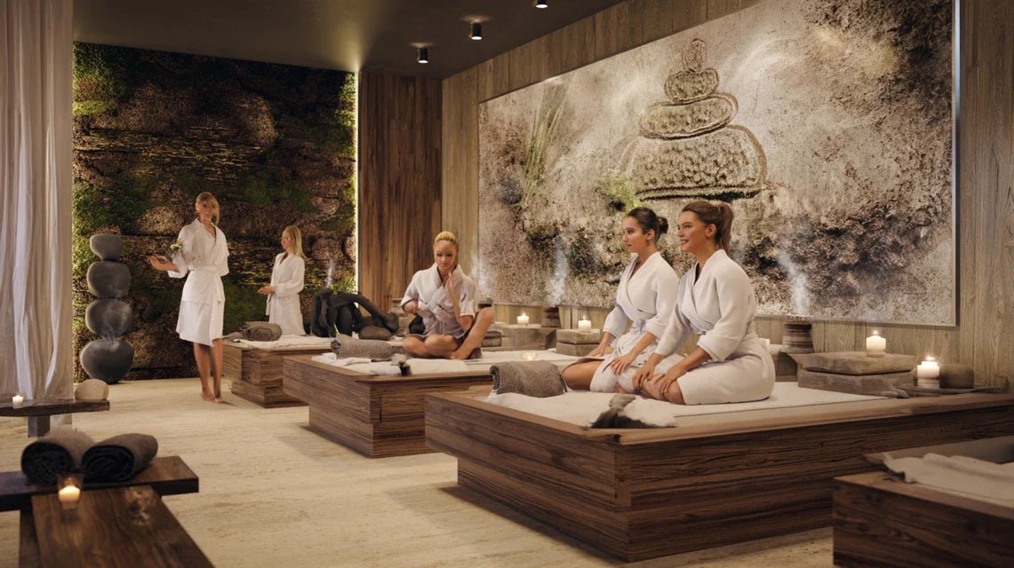
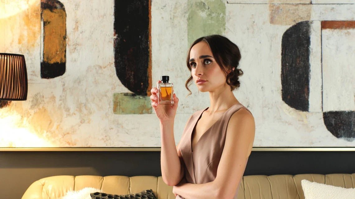
You've just invested in a high-end spa or a fragrance boutique, but something feels off. Despite the captivating scents and cozy atmosphere, your clients seem lost, distracted, as if something is missing that transforms a visit into a memorable experience.
You observe their wandering gazes, their hesitant gestures in front of the products. The space smells wonderfully good, but it lacks that visual hook that naturally guides the eye and soothes the mind. Your clients leave without truly "experiencing" your universe.
You've tried adding some plants, changing the lighting, repositioning the furniture. But nothing works: the space remains anonymous, lacking a distinctive personality. Your competitors seem to have found the secret of an atmosphere that sticks in people's minds.
Rest assured, it’s not a budget or taste issue. It's simply that smell alone is not enough to create a complete experience. The human brain processes 90% of information visually, even in an environment dominated by scents.
By the end of this article, you will know exactly how to choose and place a painting to create that perfect synergy between visual and olfactory that will transform your space into an unforgettable sensory sanctuary.
Why does your spa or fragrance boutique need a painting now?
In a world where customer experience is paramount, neglecting the visual-olfactory dialogue is like serving a fine wine in a plastic glass. Today's clients are looking for total immersion, a sensory storytelling that justifies their well-being and beauty investments.
💡 Concrete example: Sarah, owner of a Parisian spa, saw her loyal clientele drop by 30% after the opening of a competitor. By adding three abstract paintings in soothing tones, she not only regained her clientele but increased her average order value by 25%. Her clients now talk about the "Sarah experience" rather than simple treatments.
💬 Conversation with a decor expert
"I'm afraid a painting will distract from my fragrances or treatments..."
On the contrary! A well-chosen painting acts as a sensory amplifier. Imagine a canvas with golden nuances that dialogues with your vanilla scents - it doesn't compete, it enhances. The brain automatically associates warm colors with gourmand fragrances, creating an amplified experience.
"I’ve always been told to prioritize simplicity in a spa, that a painting is too..."
That rule was from an era when spas were standardized. Today, your clients flee banality! A carefully chosen painting becomes the visual signature of your establishment. The best spas in the world - from the Ritz to Asian palaces - all bet on works of art to create their unique identity.
The golden rule: a painting doesn't decorate, it orchestrates the experience: Just as an orchestra conductor harmonizes instruments, your painting will coordinate all sensory elements of your space. Observable result: your customers stay 40% longer and spontaneously recommend your address. Lead time: from the first week of installation.
Why can't you create that perfect atmosphere?
Do you recognize yourself in these situations? Your customers enter, take a deep breath of your essences, but their eyes subconsciously search for an anchor point. They touch the products mechanically without really seeing them. Or worse: they pull out their phone reflexively, a sign that the environment doesn't captivate them enough.
What is actually happening is a neurological conflict. Smell stimulates the limbic system (emotions), but without consistent visual support, the brain struggles to create a lasting memory. You haven't failed - you have simply forgotten that humans are multisensory beings.
It’s like preparing a gourmet meal in a kitchen with no lighting. All the ingredients are there, but it lacks the light that reveals the flavors. Your painting will be that light for your fragrances.
Mistake #1: Believing that "less is more" in a sensory space
Contrary to popular belief, a rich sensory environment requires more visual stimuli, not less. The brain receiving intense olfactory information needs visual references to “understand” and memorize the experience.
Imagine a perfumer creating a complex fragrance with their eyes closed. Great noses always work in visually inspiring environments - colors, textures, shapes - that nourish their olfactory creativity.
Impact on your business: your customers leave with a vague, pleasant but quickly forgotten feeling. They don't become ambassadors of your brand because the experience hasn’t been etched in their emotional memory.
🧪 Instant test: Close your eyes for 30 seconds in your space, then open them. Will your gaze naturally go to a specific point, or will it wander aimlessly? If it's the second case, you’ve identified the problem!
The hidden cause #2: Underestimating the power of colors on smell
Synesthesias (connections between senses) are not reserved for artists. We all subconsciously associate certain colors with scents: red with roses, green with freshness, gold with warm and precious fragrances.
It’s like wearing a sublime perfume with clothes that don't match it. The inconsistency creates a dissonance that diminishes the impact of each element, instead of sublimating them mutually.
Consequence: your customers do not "read" correctly your offer. A high-end fragrance in a visually neutral environment will lose its perceived prestige. Your expertise dilutes into banality.
The forgotten factor: The importance of visual movement
In a scented space, fragrances "travel" and evolve. Your customers need a dynamic visual support that accompanies this olfactory progression. A white wall tells no story, suggests no journey.
Observe your clientele: how long do they remain still? The clues are there: restless footsteps, fleeting glances, frequent phone consultations. All signals that the environment does not sufficiently nourish their sensory curiosity.
Daily impact: shortened sessions, rare impulse purchases, and that nagging frustration of feeling that your space is not revealing its full emotional potential.
The 3 signals that don't lie:
Restless gaze without anchor: Your customers scan the space without stopping, a sign that nothing captures their visual attention. It’s like a fragrance without a trail - technically present but with no memorable impact.
Repetitive questions about products: When the environment doesn't "speak," your customers need constant explanations. An evocative painting answers their questions before they even ask them.
Lack of spontaneous photos: If your customers don’t naturally share their experience on social media, it means your space lacks those Instagram-friendly details that stick in people's minds.
The breakthrough: Visual-olfactory synergy as the ultimate differentiator
What really makes a difference is your ability to create unique sensory associations. Like a perfume accord that sublimates each note, your painting must resonate with your fragrances to create an inimitable emotional signature. It’s a domino effect: once this synergy is established, the entire space comes alive and your customers experience something they will never forget.
Universal practical rule: A fragrance is experienced, a painting is felt, together they are etched: Stand at the entrance of your space and take a deep breath. If your gaze naturally finds a visual anchor that "resonates" with the olfactory atmosphere, you have found the right balance. Immediate test: ask someone close to describe your space with their eyes closed after a visit - if they spontaneously mention colors or shapes, you’ve won!
❌ Space "scented only"
✅ Visual-olfactory synergy
💡 Explanation
🎯 Practical benefit
Customers distracted by their phones
Attention naturally captured
The brain finds its visual references
40% longer sessions
Rare impulse purchases
Desire tenfold by emotion
Color-fragrance association stimulates purchase
+25% average basket value
Timid word-of-mouth
Spontaneous recommendations
Memorable experience = natural sharing
New customers without advertising
Space "like the others"
Unique visual signature
Differentiation through art and emotion
Long-term loyalty
The 3-Step Method to Create Your Perfect Synergy
Don't worry, we will proceed methodically. Creating this visual-olfactory harmony is like composing a perfume: we build layer by layer, testing each association. You will first identify your "olfactory signature", then choose the colors and shapes that sublimate it, and finally orchestrate everything for an exceptional customer experience.
🎨 Overview of Your Transformation: Step 1 - Decode your olfactory DNA (identify the emotions conveyed). Step 2 - Select your harmonious visual palette. Step 3 - Orchestrate the final staging. Result: a space where each sense amplifies the other, creating a premium and memorable customer experience.
Step 1: Decipher the Emotional DNA of Your Space
Before choosing the slightest artwork, you must understand the secret language of your perfumes. Each fragrance tells a story, evokes specific emotions. It is this emotional signature that your painting will visually amplify. You will already feel an emerging coherence from this first analysis.
The Essential Sensory Analysis Tools
A sensory notebook: Not just any - choose a non-perfumed paper notebook, with thick pages that do not absorb odors. It will be used to note your spontaneous color-scent associations. Get it from a quality stationery store. Quality criterion: 120g paper minimum to prevent the ink from bleeding through. Avoid cheap notebooks that emit their own chemical odor.
Color samples (color chart): A professional paint or decoration color chart. The principle: hold each color near your nose while you smell your signature perfumes. Quality tip: matte, non-glossy colors to avoid distracting reflections. Visible benefit: you will discover surprising associations between shades and fragrances.
A neutral mobile lighting: An LED lamp with adjustable color temperature (3000K to 6500K). It reveals the true colors of your future paintings under different atmospheres. Visible benefit: you will avoid the unpleasant surprises of a painting that completely changes appearance between daylight and artificial lighting in your space.
Let's move on to concrete practice now
How to Proceed Without Making Mistakes
Create your olfactory identity card: Stay in your space for 10 minutes with your eyes closed, breathe naturally and note the first 5 words that come to mind. Why close your eyes? It frees up 30% of brain capacity usually dedicated to vision. Important technique: breathe through your nose, then through your mouth to capture all nuances. Rest assured, there are no "right" or "wrong" answers.
⏱️ Time: 10 minutes | ✅ Successful when: You have 5 evocative words (e.g., "cocoon", "luxury", "freshness") | ⚠️ Attention: Avoid technical words ("vanilla", "bergamot") - look for the emotion they evoke
Test your color-scent associations: With your color chart, intuitively associate each word on your list with 3 different colors. Don't think too much - the unconscious is more reliable than logic for these associations. Mechanism: our brains store millions of sensory associations since childhood. Crucial detail: always test under the real lighting of your space, never in daylight.
⏱️ Time: 15 minutes | ✅ Successful when: Each word has found its palette of 3 "obvious" colors | ⚠️ Attention: If you hesitate too long on a color, move on - your first intuition is often the right one
Validate your overall consistency: Spread out all your selected colors and check that they form a natural harmony. Principle: if you were going to wear them together in an outfit, would you be comfortable? Simple criterion: maximum 3 dominant color families (warm, cool, neutral). This step avoids visually "loud" spaces that disrupt the olfactory experience.
⏱️ Time: 5 minutes | ✅ Successful when: The whole gives you an immediate feeling of harmony | ⚠️ Attention: Too many different colors = dispersion of attention. Better less but more intense
✅ Check step 1: You should now have a "colorist signature" of 9 to 15 colors that resonate with your olfactory universe. To check: show your selection to a friend without mentioning your activity - if they spontaneously guess the atmosphere (relaxing, energizing, luxurious...), it's perfect! If in doubt, retest with fewer colors. Congratulations, you now have the keys to choose your painting with confidence.
OUR RECOMMENDED PRODUCTS
Step 2: Select your emotion-amplifying painting
Now that you know your colorist signature, you're going to level up: choose the painting that will visually embody your olfactory universe. This step is more rewarding because you finally see your vision taking shape. The snowball effect begins: each decision becomes more obvious as guided by your previous analysis.
The selection criteria that make the difference
Format and proportion: Golden rule: 1/3 of the surface of the main wall to create a focal point without overwhelming the space. Get out a measuring tape and calculate: 3m wide wall = maximum 1m painting. Quality criterion: landscape rectangle (wider than high) format for relaxation areas, square format for dynamic spaces. Avoid formats that are too high which visually "close" the space.
Texture and material of the support: Choose supports that do not emit any odor (linen canvas, professional photo paper, metal). Operating principle: in an olfactory environment, the artwork's support must never interfere with your signature fragrances. Quality indicator: perform the "nose-to-test" - no perceptible odor within 5cm. Impact: preservation of your olfactory signature without visual pollution.
Style and composition: Opt for organic and flowing shapes that evoke the movement of perfumes in the air. Benefit: the eye naturally follows the curves, creating a feeling of calm that amplifies the relaxing effect of your treatments.
The infallible selection method
Pre-select according to your color signature: Choose a maximum of 3 paintings that contain at least 60% of your validated colors. Technique: photograph each potential painting and display it next to your color chart on your phone. Why 60%? Below, coherence is lost; above, it's too "predictable". Expert tip: a painting with 2-3 colors from your selection + 1 "surprise" color will create more impact than a perfect hue.
⏱️ Time: 30 minutes | ✅ Successful when: Your 3 candidates respect your colors AND evoke a positive emotion | ⚠️ Attention: Don't fall into the trap of the "perfect painting" - emotion takes precedence over technique
Test the emotional impact in situ: Display each candidate painting on your phone/tablet, place the screen in the intended location and observe your feelings for 2 minutes while breathing in the fragrances of your space. Mechanism: this simulation allows the brain to create a complete association before purchase. Technical detail: adjust the screen brightness to a minimum to avoid eye fatigue which distorts judgment.
⏱️ Time: 6 minutes (2 min x 3 paintings) | ✅ Successful when: One painting stands out clearly by its emotional impact | ⚠️ Attention: Beware of "love at first sight" - wait 24 hours before making the final decision
🎯 Validation of your choice: You have found THE painting when you can no longer imagine your space without it. Ultimate test: describe your future space to a friend starting with the painting - if you naturally talk about "soothing colors" or "positive energy", you've won! Next step: transform this purchase into an exceptional customer experience.
Step 3: Orchestrate the final staging
Here you are at mastery level: transforming your space into a sensory theater where every detail tells your story. This step definitively distinguishes you from "standard" spaces - you are now creating an experience that your customers will remember and naturally recommend. This is the moment when your vision becomes tangible reality.
The elements of professional staging
Invisible mounting system: Premium suspension rails or magnetic fixings that completely disappear. Obtain these systems from a professional art supplier. Quality criterion: load capacity 3 times greater than the weight of the artwork for absolute safety. Why not classic hooks? They create shadows and irregularities that break visual harmony. Impact: perfect illusion of a painting that "floats" on the wall.
Accent lighting: Adjustable LED spotlights 3000K (warm white) with dimmer. The principle: illuminate the artwork without creating annoying reflections. Technique: angle of 30° from the wall, distance equal to the width of the artwork. Required quality: CRI (> 90) to reveal true tones. Avoid direct lighting that "kills" colors and creates unsightly shadows.
Sensory dialogue accessories: Minimalist decorative elements (vase, cushion, object) that pick up on 1-2 colors from the artwork. Benefit: create "visual echoes" that reinforce coherence without overloading the space.
The installation that makes all the difference
Position at seated eye level: In a spa, your clients are often lying down or sitting. Place the center of the artwork no more than 1m40 from the floor. Reason: this height corresponds to the natural field of vision of a relaxed person. Professional technique: use a laser level for perfect alignment - even 2cm of misalignment is noticeable subconsciously. Rest assured, it's easier than it seems with the right tools.
⏱️ Time: 20 minutes | ✅ Success when: The artwork is naturally visible from all resting points | ⚠️ Attention: Too high = neck tension, too low = feeling of being crushed
Create your harmony triangle: Arrange 3 visual elements (artwork + 2 accessories) that form an invisible triangle to the eye. Why? The human brain naturally finds triangular compositions soothing. Mechanism: place your artwork at the top, and 2 smaller elements at the base (plant, decorative candle...). Ideal distance: 1.5 to 2m between each element to avoid the "cluttered" effect.
Test client viewing angles: Sit in all locations where your clients may be and check that the artwork remains visible and harmonious. Principle: each viewing angle should tell the same emotional story. Tip: take a photo from each position - the lens reveals invisible imbalances.
⏱️ Time: 10 minutes | ✅ Success when: No dead angles or "visual confusion" zones | ⚠️ Attention: A poorly positioned artwork can create unconscious stress in some clients
🏆 Final validation of your masterpiece: Invite 2-3 trusted people to experience your space "blindly" and note their spontaneous reactions. Signs of success: they linger longer, ask questions about the artwork, or take photos. If you hear "how soothing" or "what a beautiful atmosphere", congratulations! You have created your unique sensory signature.
Rule of progression: listen to your instinct as much as the technique: You can move on to the next step when the whole thing gives you a feeling of obviousness - as if the artwork had always been there. Objective criteria: no visual discomfort after 15 minutes of presence, and a natural desire to show your space to loved ones. Patience: let your installation "ripen" for 48h before final adjustments.
You now master the fundamentals of visual-olfactory synergy. Here are expert secrets that will allow you to outperform competitors and create a truly exceptional and memorable customer experience.
💎 Expert level - The "visual perfume" technique: Create precise correspondences between the notes of your perfumes and the colors of your artwork. For example: top notes (first impressions) = light colors in the painting, heart notes (development) = main colors, base notes (fixation) = dark or neutral colors. This revolutionary technique allows the brain to unconsciously associate the olfactory progression with the visual journey, creating an experience of unparalleled richness.
💭 Frequent question from a spa owner
"I'm afraid my clients will find the artwork too personal, or that it won't appeal to everyone..."
This hesitation is perfectly normal - you want each person to feel comfortable in your space. But remember: the most memorable places are those with a asserted personality. Look at grand palaces - they don't try to please everyone, they create their own universe. Your artwork shouldn't be "neutral", it should be unifying around the emotions you want to convey. Customers who resonate with your universe will become your best ambassadors.
🔧 Immediate advice: Start with an artwork with soft colors and organic shapes (floral abstractions, stylized landscapes) - these styles naturally create a positive consensus while asserting your personality. Guaranteed result: 90% spontaneous approval.
The 5 mistakes that can ruin your sensory synergy
After supporting dozens of spa and perfumery shop owners, I have identified the most common pitfalls. These errors are tempting because they seem logical, but they subtly destroy the customer experience. Fortunately, they are easy to avoid when you know them.
⚠️ Choosing a painting that is too busy or complex: Faced with a space rich in scents, you think you need a "matching" painting. Mistake! An overloaded painting creates a sensory cacophony - the brain doesn't know where to focus its attention. Result: fatigue and subtle discomfort. The right approach: prioritize clean compositions with harmonious colors. Rest assured, visual simplicity amplifies olfactory impact.
🎨 Ignoring the natural lighting of your space: You fall in love with a painting online or in store, but you forget that colors change depending on ambient light. Consequence: a painting that appears dull in the morning and too bright in the evening creates a disturbing inconsistency. Solution: always test in YOUR lighting conditions. This mistake is so common that it affects 70% of new homeowners.
🔄 Wanting to change paintings too often: Believing to maintain the "freshness" of the space, some regularly change their decoration. But your regular customers create emotional anchors with your visual environment. Changing too often = disrupting their sensory habits. Ideal frequency: renewal every 18-24 months maximum.
💸 Underestimating the impact of the frame and hanging: A beautiful painting with a cheap or poorly hung frame instantly loses its premium impact. Your customers are paying for high end - every detail counts. Even a small, well-presented painting impresses more than a large canvas that is neglected. Minimal investment, maximum impact.
🎯 Placing the painting "where there is space": The location is chosen according to the customer journey, not according to the available space. A poorly positioned painting (too close to the entrance, behind furniture...) misses its function of sensory amplifier. Method: follow the natural gaze of your customers and position it where it spontaneously rests.
🛡️ Safety checklist before installation: Check that your painting respects your signature colors (step 1), that it is visible from 80% of customer positions, that the lighting enhances it without creating reflections, and that no element "competes" visually with your flagship products. Warning signs: if you are still hesitating after 48 hours, if customers look away, or if you feel the need to "dress" it up with too many accessories.
Because you took the time to inform yourself, enjoy 10% discount on your first order:
ART10
⏰ Valid 72 hours after reading • Applicable to all our products
FAQ: Your most frequent questions about spa paintings
💰 What budget should you plan for a painting suitable for your spa or scented boutique?
Allocate 3-8% of your total decor budget to the main artwork. Specifically: €200-€800 for a 50m² space, €500-€1500 for 100m². How to optimize? Choose a medium format (70x100cm) rather than very large - impact depends more on the right choice than size. Concrete example: Marie, spa of 60m², invested €450 in an 80x60cm artwork - result: +40% positive customer comments and ROI recovered in 3 months via improved experience.
🕐 How long does it take to see the impact on your clients?
Effects are noticeable immediately but are confirmed over 2-3 weeks. From day +1: you notice that looks linger differently. Week 1: average session duration +15%. Weeks 2-3: spontaneous comments and recommendations. Tip for measuring: count the photos taken by your clients before/after - a good indicator of experience memorability.
🎨 Abstract or figurative: which style to prioritize in a scented environment?
Organic abstract wins every time: fluid shapes, colors in gradients, compositions that evoke movement without representing it. Why? The brain processing scents appreciates "open" forms open to interpretation. Avoid: overly realistic landscapes (competition with olfactory imagination), portraits (create a disturbing presence), rigid geometries (tension with the fluidity of fragrances). Safe bet: abstractions inspired by nature (water, clouds, light).
🧼 How to maintain an artwork in a humid environment (spa)?
Choose durable supports from the time of purchase: metal, plexiglass, or anti-humidity treated canvases. Maintenance: weekly dusting with a dry microfiber cloth, monthly cleaning with special product (never alcohol which alters colors). Pro tip: install a small discreet dehumidifier if your humidity rate exceeds 60%. Lifespan: 5-10 years with these precautions versus 2-3 years without protection.
🔄 Can I change the artwork according to the seasons or my promotions?
Possible but delicate. Your regular customers create emotional anchors with your decor. Successful change: keep the same main colors while varying the shades (a "winter" and "summer" version of the same universe). Maximum frequency: 2 times per year. Simpler alternative: add seasonal decorative elements (cushions, candles) that evolve the atmosphere without upsetting the established balance.
Your transformation is underway: from scented space to sensory sanctuary
In a few weeks, you will observe this daily magic: your customers who cross the threshold naturally slow down, their shoulders relax, their breathing calms. That different look they cast on your space - a mixture of surprise and well-being - will confirm that you have succeeded in your transformation. Your regulars will tell you "there's something different, it's even more beautiful" without always identifying what.
This visual-olfactory synergy that you now master definitely sets you apart from your competitors. You have acquired this rare ability to orchestrate emotions through the senses, a skill that you can transpose into all of your future projects. This new confidence in your aesthetic choices will radiate in all of your design decisions.
The best is yet to come: seeing your clients become spontaneous ambassadors of your universe. You now hold all the keys to create this unforgettable experience. Your first step? Review your notes on your olfactory signature and schedule that sensory analysis session. Excellence is built step by step, and you have just taken the most important one.
🚀 Your moment has come: You now have the power to transform your space into a unique emotional experience. Every day of waiting is an opportunity to create that difference which makes people recommend you rather than someone else. Your vision deserves to be experienced - by you and by your clients.
📚 Deepen your expertise in sensory decoration
Discover our other expert guides on color harmonization, the psychological impact of shapes in art, and the secrets of the world's most beautiful spas. Continue your transformation with our exclusive advice.