⏱️ Reading time : 8 minutes
You look at your white and cold walls, dreaming of that
coastal ambiance you admired in that little boutique hotel in Saint-Malo last summer. You can already imagine this
refined maritime atmosphere in your home, but every time you pass by the decor sections, it's disappointing.
Plastic shells, cheap anchors, garish blues that turn your living room into an amusement park setting... Nothing looks like that coastal elegance you dream of. This discreet sophistication that whispers of the ocean without shouting "ocean vacation."
You've tried scented "marine breeze" candles, striped cushions, even that "sunset" painting found at a big-box store. But the result? A heterogeneous mix that sorely lacks that high-end coherence you are looking for.
The problem isn't your taste or your budget. It’s that 90% of marine decorations available aim for folklore, not elegance. They reproduce clichés instead of capturing the sophisticated essence of coastal living art.
By the end of this article, you will know exactly how to create that premium coastal ambiance you crave, avoiding all the "too much" maritime pitfalls and investing in the right pieces that will truly transform your interior.
Why doesn't your current marine wall decor satisfy you?
The coastal decor is one of the most misunderstood trends in interior design. Most people accumulate explicit references (anchors, lighthouses, boats) when true coastal luxury lies in the subtlety of evocations. If you wait any longer, you risk getting tired of this trend and missing the opportunity to create a timeless style that transcends seasons.
🏠 Customer testimonial : "Sarah, an interior architect, says: 'My Parisian client wanted to recreate the ambiance of his Deauville house in his Haussmannian apartment. After three attempts with themed decorations, we opted for a single abstract painting with oceanic hues. The result? His guests consistently ask where this 'maritime serenity' comes from as soon as they enter.'
💬 Conversation with a decor expert
"I'm afraid my new painting won't match if I change my wall color..."
Relax! It’s exactly the opposite. A true artistic crush adapts and even reveals itself with new colors. It's like a diamond that shines differently depending on the lighting!
"But I was told you always had to match colors..." Who told you that? Modern decor plays on subtle contrasts. A painting with warm tones on a cool wall is like a fireplace in a blue room: magical!
Finally understand why your previous attempts have failed
Do you recognize yourself in these situations? You buy a "marine" object that you like in store, but once at home, it clashes with your interior. You multiply small blue and white accessories, but the overall effect looks more like a souvenir shop than a refined interior. You constantly hesitate between "not evocative enough" and "too cluttered".
What you are experiencing is nothing unusual. The problem comes from the fact that mainstream maritime decor confuses "theme" and "atmosphere". It reproduces the visual codes of the sea instead of capturing its emotional essence.
It's like the difference between wearing a sailor costume and dressing with the relaxed elegance of a yacht club. One shouts your belonging, the other whispers it with confidence.
The confusion between thematic decoration and coastal ambiance
Contrary to what popular magazines suggest, a high-end nautical interior does not look like a boat cabin. It evokes the horizon, not navigation. It breathes amplitude, not narrowness.
Imagine the difference between fish & chips in a fishing port and a gourmet restaurant facing the ocean. Same inspiration, radically different expression.
This confusion costs you both money (by accumulating objects that don't work together) and pleasure (by creating an interior that doesn't reflect who you are). Understanding this distinction will revolutionize your decorative approach.
🔍 Revealing test: Close your eyes in your current "marine" room. If you think "boat" before thinking "serenity", then you are in the thematic, not in the ambiance. A true premium coastal style first evokes an emotion.
The error of decorative accumulation
Popular belief dictates that you create an atmosphere by multiplying references. More blue, more anchors, more stripes. In reality, it's exactly the opposite: coastal elegance is born from selectivity and refinement.
It’s like a Michelin-starred chef who prefers five perfect ingredients to twenty random ingredients. Sophistication comes from quality, not quantity.
This accumulative approach visually exhausts you and dilutes the emotional impact you are seeking. It turns your interior into a "sea museum" instead of making it a maritime haven.
The trap of stereotyped color codes
Many think that "seaside" automatically equals blue and white. This ignores all the chromatic richness of the coastal environment: the ochres of the cliffs, the deep greens of seaweed, the pearly pinks of sunsets over water.
You can easily verify this richness by observing your last vacation photo on the seaside. Count the nuances: you will be surprised to discover that blue is only one color among many.
This fixation on the blue-white duo deprives you of all the sophistication of contemporary marine palettes and drastically limits your possibilities for harmonization with your existing interior.
5 signs that your nautical decor lacks sophistication:
- Your guests immediately identify the "theme": Like a theater costume, your decoration announces its function instead of creating an atmosphere
- You feel uncomfortable photographing your interior: The accumulation of themed objects creates a "shop window" effect that is not very photogenic
- Each new purchase poses an integration problem: Sign that you are collecting rather than composing a coherent set
The trigger factor: the quality of the artistic support
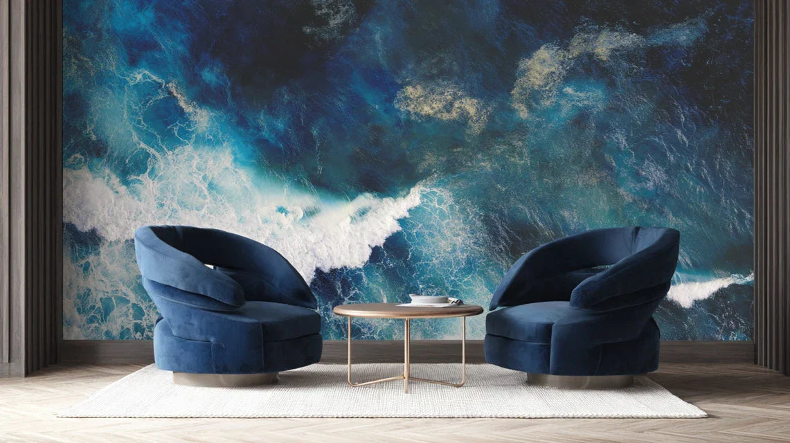
What really distinguishes a premium coastal interior from amateur decoration is the quality of the main support. Like a perfumer who chooses his essences, the secret lies in selecting an exceptional wall artwork that alone evokes all of the maritime atmosphere. This centerpiece acts as a tuning fork: it sets the tone and allows all other elements to harmonize naturally around it.
Law of decorative impact: one exceptional work transforms, ten average objects clutter: Invest in a high-end sea border painting rather than a collection of accessories. You can verify this rule by observing the most beautiful coastal interiors: they breathe because they purify.
| ❌ Cumulative approach |
✅ Premium approach |
💡 Why it changes everything |
🎯 Immediate benefit |
| Multiply explicit marine references |
A centerpiece with subtle evocations |
Elegance is born of suggestion, not exhibition |
Instant and timeless sophistication |
| Confine yourself to blue and white |
Explore the entire oceanic palette |
The real sea offers an infinity of nuances |
Easy harmonization with your existing decor |
| Seek the immediately identifiable "theme" |
Prioritize emotion over recognition |
The art of coastal living touches the soul before the eye |
Soothing atmosphere every day |
| Budget scattered across many objects |
Investment concentrated on a quality work |
A diamond is worth more than ten trinkets |
Maximum decorative profitability |
The 3-step method to succeed with your premium coastal ambiance
Rest assured: creating that elegant coastal atmosphere you desire doesn't require any renovations or a pharaonic budget. It’s a process as logical as building a house: solid foundations, harmonious structure, refined finishes. By following this progression, you will achieve in a few weeks the coastal sophistication you have been dreaming of for months.
🗺️ Your roadmap to coastal excellence: Step 1 - Choose your centerpiece (the emotional anchor), Step 2 - Harmonize the environment (visual consistency), Step 3 - Refine the details (the premium signature). Each step builds on the previous one for a result that exceeds your initial expectations.
Step 1: Selecting Your Reference Coastal Artwork
Starting with the coastal artwork is no coincidence: it will dictate the harmony of your room. Just as foundations determine the solidity of a house, your artistic choice will condition the success of the whole. Once this decision is made, you will immediately feel that sense of clarity that guides all subsequent steps.
What You Need to Choose Wisely
-
Museum-quality support: Opt for canvas print or aluminum dibond rather than standard paper. These materials give a depth and richness of color comparable to original works of art. You will recognize them by their matte appearance and resistance to the touch. Absolutely avoid glossy laminated prints that immediately betray their industrial origin.
-
Dimensions in proportion to your space: A painting too small is lost, too large it overwhelms. The rule of professionals: your artwork should cover between 50% and 75% of the width of the wall or furniture it overlooks. Measure before you buy and visualize the final impact on the balance of the room.
-
A harmonious palette with your existing decor: Analyze the dominant colors in your interior and look for a work that complements rather than copies them. A successful painting creates a colorful conversation, not redundancy.
Now, let's move on to the selection itself
How to Choose Without Making Mistakes
Define your target emotion: Before looking at visuals, close your eyes and visualize what you want to feel in this room. Serenity? Escape? Energy? This emotion will guide your selection better than any aesthetic criterion. A wall art sea abstract will convey a different emotion than a figurative landscape.
⏱️ Time: 10 minutes of reflection | ✅ Success when: You can describe the desired atmosphere in 3 words | ⚠️ Attention: Do not confuse "style I like" and "emotion sought" - it's the emotion that counts
Test color compatibility: Photograph your destination wall and use this photo to visualize different artworks. Colors appear differently depending on lighting and environment. This step avoids 90% of post-purchase disappointments.
⏱️ Time: 15 minutes per option | ✅ Successful when: The harmony seems obvious in the photo | ⚠️ Attention: Artificial lighting alters colors - test at different times
Check visual impact from a distance: A good marine wall art should be legible and impactful from the entrance of the room, not just up close. Step back and observe if the artwork "holds" the distance. This is the test of artistic presence.
⏱️ Time: Immediate test | ✅ Successful when: The artwork naturally attracts the eye | ⚠️ Attention: Fine details disappear at a distance - prioritize the strength of color masses
✅ Validation of step 1: Your chosen artwork immediately evokes the desired emotion, naturally harmonizes with your existing colors and has that "presence" that attracts the eye without force. If any of these criteria are missing, continue your search - this masterpiece determines 80% of your final success.
Step 2: Creating a setting for your artwork
Now that your chic nautical wall decor is chosen, it's time to create an environment that amplifies its impact. This step is more rewarding as you immediately see the transformations. This is where the magic happens: your room begins to breathe that coastal elegance you were looking for.
Essential accompanying elements
-
Enhancing lighting: Adjustable LED spotlight or wall sconce to create accent lighting on your artwork. Warm light (2700K) reveals nuances better than cool light. Place the source at 30° from the painting to avoid reflections. Lighting transforms a simple decoration into a true work of art.
-
Harmonious furniture: Opt for natural materials (driftwood, linen, rattan) rather than explicit marine references. These materials create a subtle complicity with your artwork without competing with it. Absolutely avoid "themed" furniture that would break the sought-after sophistication.
-
Purified textile palette: Select 2 to 3 colors maximum for your textiles, discreetly echoing the nuances of your painting. Natural linen, bouclé wools, and matte velvets bring this premium coastal texture without falling into the cliché of navy stripes.
The art of accompaniment without competition
Clear the space around your artwork: Create a "breathing room" of at least 30 cm around the painting. Remove any competing decorative elements within a radius of 2 meters. This purification allows your sea painting to deploy all its evocative power without visual interference.
⏱️ Time: 30 minutes | ✅ Success when: The eye naturally goes to the painting | ⚠️ Attention: Do not confuse purified and empty - keep a few significant elements
Adjust the general lighting: Install a dimmer switch to modulate the atmosphere according to the moments. In the evening, subdued lighting with emphasis on the painting creates that cozy atmosphere of the finest coastal hotels. Lighting accounts for 50% of the emotional impact of your decor.
⏱️ Time: 1 hour installation | ✅ Success when: You can create 3 different atmospheres | ⚠️ Attention: Cheap LEDs create an aggressive light - invest in quality
Harmonize existing materials: Identify the elements of your current furniture that "speak" with your marine artwork and highlight them. Discreet camouflage or relocation for pieces that clash. This curation reveals the hidden coherence of your interior.
⏱️ Time: 45 minutes of reorganization | ✅ Success when: Every visible element seems in its place | ⚠️ Attention: Don't change everything at once - proceed with gradual adjustments
Step 3: The finishing touches that make the difference premium
You now have a solid foundation. This third step takes you from "successful" to "exceptional". This is where your decorative personality reveals itself and your interior acquires that unique signature that impresses your guests and recharges you every day.
Signature details of the premium coastal style
-
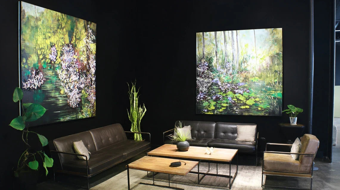
An architectural silhouette plant: Strelitzia, ficus lyrata or indoor olive tree for this elegant verticality that evokes palm trees without falling into the tropical. Choose a pot made of natural material (terracotta, wicker, wood). The plant brings the essential organic life and movement to the balance of the composition.
A subtle ambient fragrance: Reed diffuser with sophisticated marine notes (algae, salt, driftwood) rather than sweet "beach" fragrances. Olfactory completes the visual experience and anchors emotion in memory. Avoid synthetic perfumes that are too present.
A unique work of art: Sculpture, vase or lighting fixture handcrafted that dialogues with your painting without copying it. Prioritize local creations or vintage pieces over series objects. This piece signs your personal taste and distinguishes your interior from standard decoration magazines.
The signature of coastal excellence
Create a focal point: Identify the main viewing angle of your seascapes wall art and optimize this perspective. Move a chair if necessary or adjust the lighting to create that "perfect moment" where the whole reveals its magic. This is your personal paradise corner.
⏱️ Time: 20 minutes of adjustments | ✅ Success when: You feel an immediate sense of calm | ⚠️ Attention: This viewpoint should be natural, not forced
Refine the sensory experience: Add ambient fragrance, arrange a plaid made from natural material, adjust the temperature for optimal comfort. The premium coastal ambiance engages all senses, not just sight. This multisensory experience creates positive addiction to your space.
⏱️ Time: 15 minutes of staging | ✅ Success when: The space "invites" naturally to relaxation | ⚠️ Attention: Keep the subtlety - too many sensory elements are fatiguing
Test and adjust according to the seasons: Your luxury seascapes wall decor should work in summer as well as winter. Test different textiles, lighting intensities depending on natural light. This adaptability guarantees your lasting satisfaction and avoids seasonal fatigue.
⏱️ Time: 2-week test | ✅ Success when: The atmosphere remains magical in all seasons | ⚠️ Attention: Note your impressions to reproduce the optimal settings
Premium progression rule: let it mature before adding: Live with each step for 15 days before moving on to the next. The eye gets used to it and reveals the necessary adjustments. Patience distinguishes thoughtful decoration from impulsive accumulation.