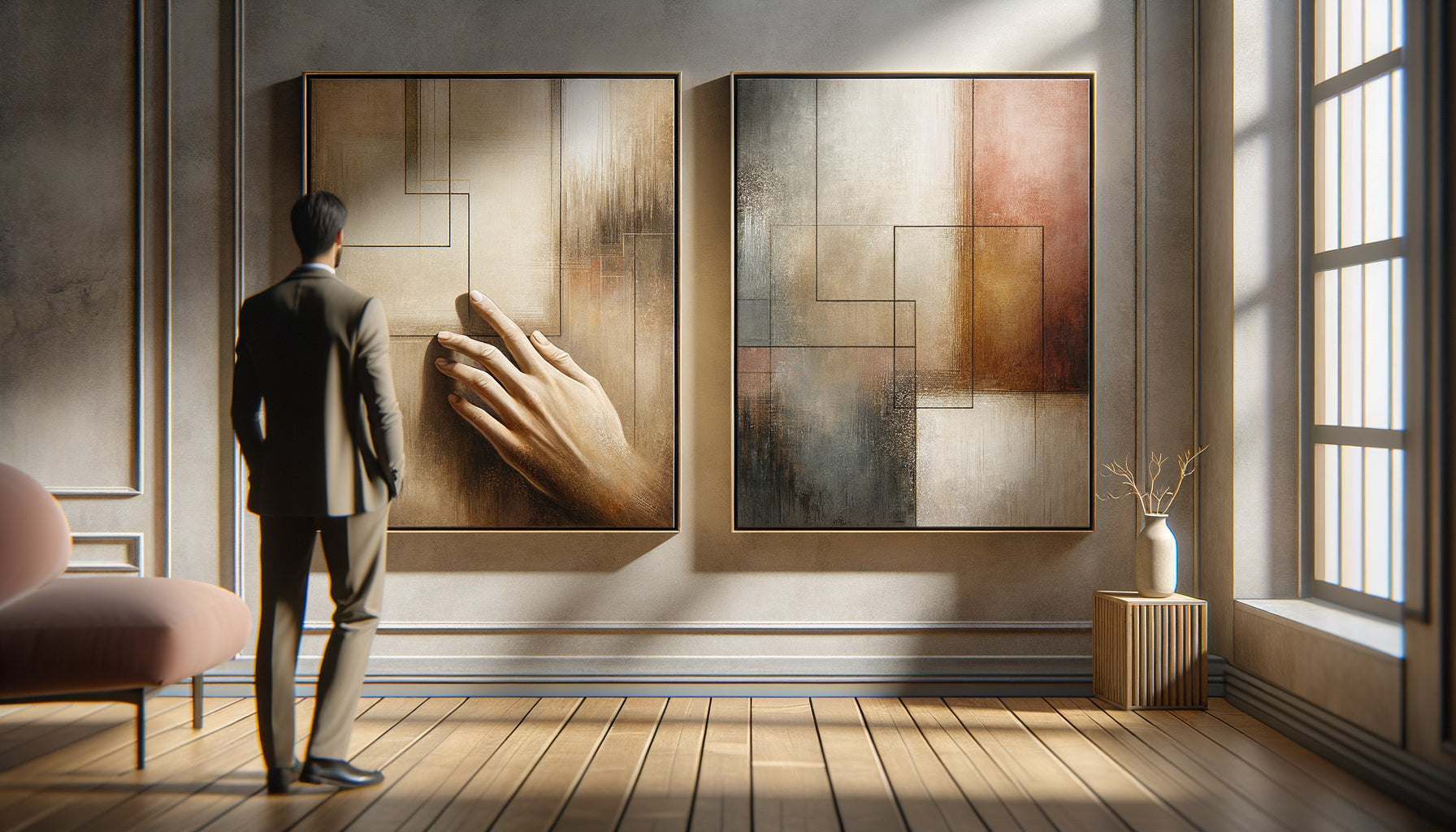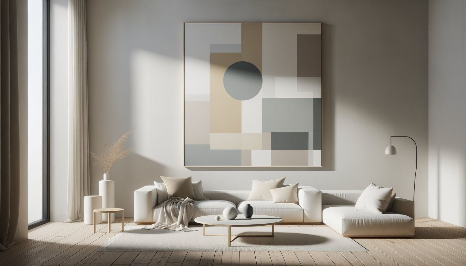
I’ve spent ten years decluttering overwhelmed interiors for clients who were literally suffocating under the accumulation. And each time a living room finally reached that long-sought breath, this question would come back as an obviousness: can you hang something on these bare walls without ruining everything? The answer is a resounding yes, provided you understand that minimalism in art does not mean absence, but essential presence. Minimalist paintings bring three major transformations to a clean living room: they create a visual anchor point without saturating the space, they warm up the atmosphere without breaking harmony, and they reveal the personality of the place without cluttering it. Many fear that any addition will break this fragile balance, that the work will shout louder than the silence of the walls. I understand this apprehension. But let me show you how minimalist paintings become the natural, almost necessary complement to a clean living room.
The subtle equation between void and presence
In a clean living room, every element counts double. It is precisely this requirement that makes minimalist paintings so relevant. Unlike works loaded with attention-grabbing elements, a minimalist painting dialogues with the void rather than filling it. I recently accompanied a couple who had spent six months decluttering their large Parisian living room. White walls, linen sofa, solid oak coffee table. Beautiful, but curiously cold. We installed a monochrome beige rose canvas of 120x80 cm above the sofa. Nothing else. The change was immediate: the space still breathed, but it finally lived.
The magic of minimalist paintings lies in their ability to structure space without dividing it. A simple horizontal line on a neutral background guides the eye, creates a visual rhythm, suggests a horizon. In a clean living room, this discretion becomes strength. The eye finds a point of rest without being distracted. The visual silence of the place is not broken, it is punctuated. It’s the difference between a bare wall that waits and a clean wall that breathes.
The color palettes that honor simplicity
The palette of a clean living room generally obeys a chromatic rigor: off-white, pearl gray, natural beige, sometimes a deep black. Minimalist paintings excel in this restrained register. I observe three approaches that work wonderfully.
Monochrome that sublimates
A minimalist painting entirely white with subtle variations in texture creates an unsuspected depth. On a light gray wall, this work captures the changing light of the day. The clean living room then becomes a camera obscura that records the hours. I have seen clients contemplate these variations as others watch the sea. This approach is particularly suitable for north-facing spaces, where diffused light reveals every nuance.
Measured Contrast
A black line on a white background, a gray anthracite geometric shape on beige. These minimalist paintings introduce a calculated visual tension. In a clean living room with light tones, this contrast becomes the accent that avoids monotony. But be careful of proportion: the contrast must remain minor, never dominant. A rule I apply: no more than 20% of the painting's surface in strong contrasting color.
The Organic Touch
A soft ochre, a pale terracotta, a sage green. These earthy colors on minimalist paintings warm up a clean living room without denaturing it. They work like natural breathing, a nod to the organic world that humanizes space. I particularly recommend them when furniture favors raw materials: linen, untreated wood, stone.

Geometry as a Silent Language
Minimalist paintings often speak through geometric shapes. Circles, rectangles, lines. This purified visual grammar finds a natural echo in the architecture of a clean living room. The right angles of the furniture, the pure lines of the luminaires, the geometry of the windows: everything dialogues.
I have noticed that circular forms on minimalist paintings bring a particular softness to very angular clean living rooms. A simple beige circle on a white background breaks the rigor without introducing disorder. Conversely, strict horizontal lines reinforce the serenity of an already soothing space. It is not about repeating the present forms, but about creating a subtle counterpoint. Art then becomes a structural element in its own right.
Size also counts. In a large clean living room, a minimalist painting that is too small will get lost. I advise covering approximately 60 to 75% of the width of the furniture below (sofa, console). For an entire wall without furniture, dare the monumental format: a minimalist painting of 150x100 cm will never overwhelm if it remains faithful to formal purity.
When the Frame Disappears (or Almost)
The question of framing often reveals misunderstandings about minimalist artworks in clean living rooms. A baroque golden frame? An obvious disaster. But even a simple frame can betray the minimalist intention.
The most coherent minimalist artworks with a clean living room use three approaches. Canvas on chassis without a frame, where the paint extends onto the edges, creates perfect continuity with the wall. The ultra-thin box frame in natural wood or brushed aluminum, almost invisible, protects without imposing itself. Finally, frameless plexiglass, mounted with invisible fixings, literally makes the artwork float. This last option is particularly suitable for minimalist artworks graphic on paper.
I've seen too many projects ruined by a poorly chosen frame. In a clean living room, the frame should never draw attention to itself. It serves the work, not the other way around. If you are unsure, always choose the most discreet solution.

Hanging as a choreography of space
Where to place a minimalist artwork in a clean living room? This technical question hides an issue of overall coherence. The ideal location respects three principles: eye level, balance of masses, circulation of light.
The classic rule positions the center of the minimalist artwork at 1.60 m from the floor, average standing eye height. But in a clean living room where low seating is often preferred, I adjust to 1.50 m. The work remains visible and pleasant from the sofa, the main viewpoint.
The balance of masses requires considering the minimalist artwork as a visual counterweight. Above an imposing sofa, it anchors the composition. On a wall facing a large bay window, it prevents the gaze from being constantly drawn outwards. In a corner, it softens the junction of two planes. Each location has its logic.
Finally, observe the light. A minimalist artwork with subtle textures reveals all its richness with a flat lateral lighting. Variations in matte and shine dialogue with the hours of the day. In my experience, clean living rooms facing west, bathed in golden light in the afternoon, enhance warm monochrome works.
The clean collection: one or more artworks?
Should one install a single minimalist artwork or compose a series in a clean living room? Both approaches work, but respond to different intentions.
The unique, monumental artwork becomes a powerful statement. It affirms: here is the visual heart of this space. In a large, uncluttered living room, this approach creates an immediate focal point. I particularly appreciate this solution for spaces with little wall space available, where multiple hangings would fragment attention.
A series of three identical or subtly varied minimalist artworks introduces rhythm. Aligned horizontally with regular spacing between them (I recommend 10 to 15 cm), they form a visual breath. In a longitudinal, uncluttered living room, this arrangement naturally accompanies the perspective. Attention: the series requires absolute consistency. Same dimensions, same framing, strictly harmonized palette.
I avoid eclectic gallery walls in an uncluttered living room. This accumulation works in bohemian interiors, but contradicts the very principle of minimalism. If you want multiple minimalist artworks, prioritize a thoughtful series over a disparate collection.
Your uncluttered living room deserves a work of art to match
Discover our exclusive collection of living room art that respects the perfect balance between artistic presence and minimalist discretion.
Art as a final breath
After years of observing transformed spaces, I note that the most successful uncluttered living rooms are never totally empty. They breathe, but they also live. Minimalist artworks bring this subtle life, this presence that prevents minimalism from tipping into austerity.
Imagine your uncluttered living room in six months, in two years. The light will change with the seasons, your gaze will evolve. A well-chosen minimalist artwork will age with you, revealing new nuances according to your mood, the time of day, the light. It is this silent depth that justifies its presence.
Start simply. Visit galleries, observe what resonates within you. In an uncluttered living room, a single sincere work is better than three compromises. And when you have found that minimalist artwork which naturally dialogues with your space, you will understand that it added nothing: it revealed what was already there, waiting to be named.
Frequently Asked Questions
Won't a minimalist artwork make my living room too cold?
This is the most common fear, and I understand it. But coldness never comes from minimalism itself; it arises from an imbalance between hard materials and a lack of organic touches. A minimalist artwork with warm tones, such as beige sand or pale terracotta, instantly warms up a clean living room without breaking the harmony. I've found that works with subtle textures, raw canvas, or matte paint also bring a visual tactile softness. If your living room already features natural wood, linen, or wool, the minimalist artwork will integrate into this family of soft materials. Think of it as a textile element on your walls: it dresses without cluttering. Finally, lighting makes all the difference. Direct cold light hardens the whole thing, while indirect warm lighting reveals the depth of the monochromes and creates an enveloping atmosphere.
What size artwork should I choose to avoid overwhelming the space?
Intuition often leads to choosing small sizes for fear of overcrowding, but it's usually a mistake in a clean living room. A minimalist artwork that is too small on a large white wall creates an imbalance: it floats, lost, and attracts attention with its inadequacy rather than its serene presence. The rule I apply: for a wall above a sofa, the artwork should cover 60 to 75% of the width of the furniture. For a 200 cm sofa, aim for 120 to 150 cm in width. On an entire wall without furniture, dare the imposing format: 150x100 cm or even larger. Paradoxically, a large minimalist artwork is less overwhelming than a small artwork full of details. Why? Because formal simplicity absorbs dimension. The eye reads the whole thing at once, without getting lost in the details. The clean living room retains its breath, simply punctuated by a calm and assumed presence.
Can minimalist artworks be mixed with other styles of decoration?
It all depends on what you mean by mixing. In a clean living room, adding a minimalist artwork is perfectly complemented by other streamlined design elements: a simple contemporary sculpture, an architectural vase, textured monochrome cushions. These objects share the same philosophy of essentials and naturally dialogue. On the other hand, combining a minimalist artwork with an accumulation of decorative objects, busy floral patterns, or baroque furniture creates dissonance. It's not impossible; some successful eclectic interiors play on these contrasts, but it’s no longer a clean living room. You switch to another register. My recommendation: if you like simplicity, embrace it fully. Choose two or three noble materials (wood, linen, ceramics), a restricted palette of natural colors, and let the minimalist artwork punctuate this coherent ensemble. The strength of simplicity lies in its joyful discipline, not in its constrained asceticism.