I remember this client, a high-end furniture designer, who had just invested in a sublime charcoal gray sofa. Her living room exuded minimalist elegance, but something was missing. The white walls created a void that literally swallowed the room. "It's beautiful, but it's cold," she confided to me. Three weeks later, a triptych of abstract art with touches of copper and Sienna earth transformed her space into a warm showcase. Gray was no longer neutral; it had become the backdrop for a true staging.
Here's what a well-chosen painting brings to your gray sofa: it magnifies its neutrality by creating a vibrant focal point, it structures the space by defining a chromatic consistency, and it reveals the personality of the place by breaking the "showroom" effect. Are you also staring at that blank wall above your sofa, wondering which artwork could finally give character to your living room? You hesitate between a thousand directions: bright colors that risk clashing, black and white that is too predictable, abstract art that intimidates you?
Rest assured: gray is your best ally, not your enemy. This neutrality is a blank page that accepts almost anything. In this article, I will reveal to you how to transform this apparent constraint into creative freedom, by guiding you towards the painting that will bring your interior to life.
Gray: this backdrop that calls for color
Contrary to popular belief, a gray sofa does not impose sobriety. On the contrary, it demands a visual counterpoint. I have observed this in dozens of interiors: the more neutral the gray, the more it absorbs the energy of the room. Without a colored accent, your living room risks turning into the atmosphere of a waiting room.
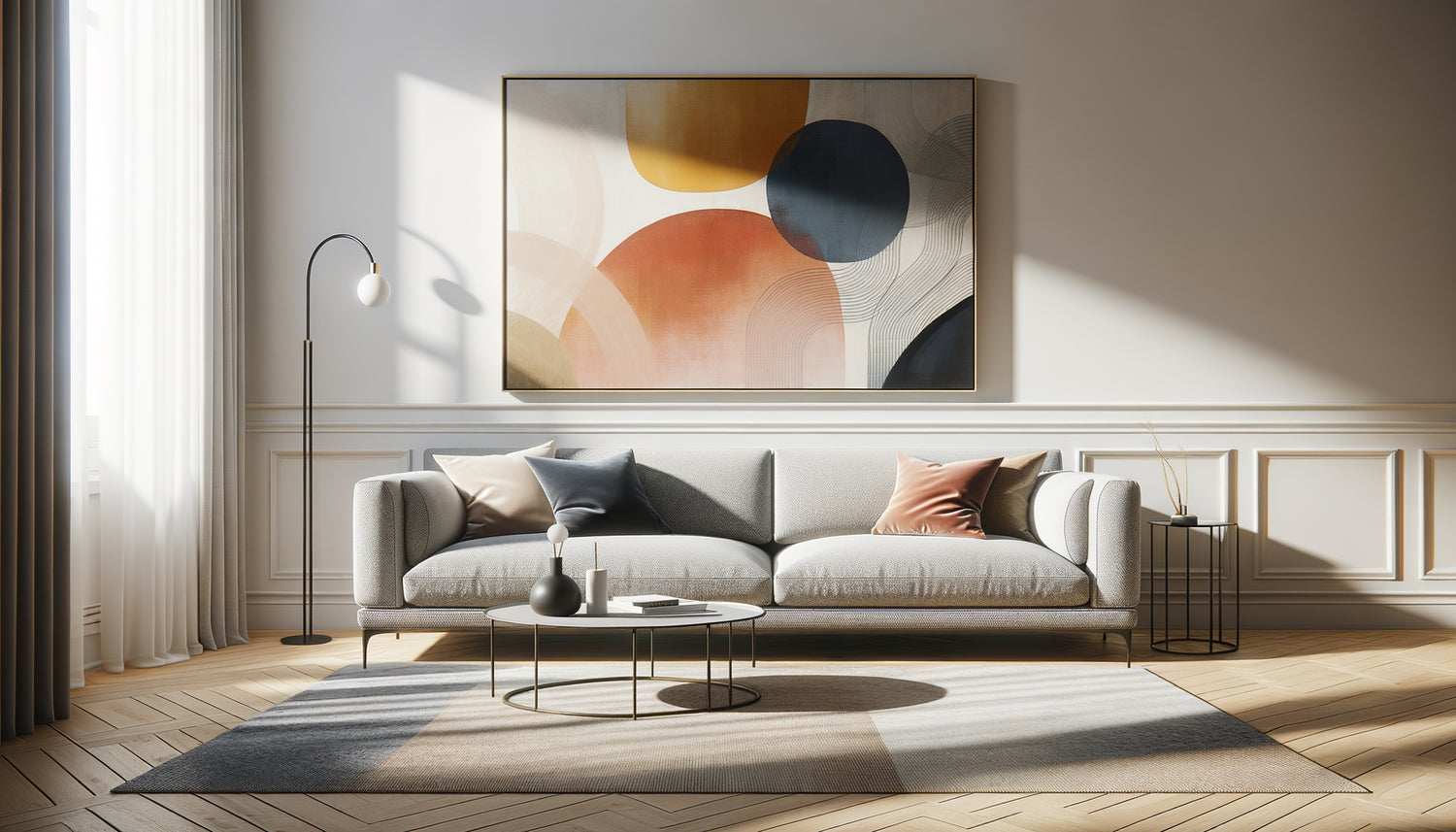
The real question is not "what color can I afford?" but rather "what color will awaken my space?". A painting with warm tones – ochre, terracotta, mustard – will instantly warm up a gray perceived as cold. Conversely, deep blues, emerald greens or touches of burgundy will bring immediate sophistication to a light gray.
I have noticed that complementary colors work wonderfully: if your gray tends towards blue, dare oranges or corals. If your sofa has warm undertones, blues or purples will create a refined balance. The secret? To pick up at least one shade present elsewhere in the room – a cushion, a rug, a vase – to create visual consistency.
Format and proportion: the mistake everyone makes
How many times have I seen a magnificent painting lost above a sofa because it was too small? The golden rule that I apply systematically: your artwork (or composition of several paintings) should occupy between 60% and 75% of the width of your sofa.
For a 200 cm sofa, aim for a painting 120 to 150 cm wide, or a wall composition that reaches those dimensions. Too small, it will look like a postage stamp. Too large, it will overwhelm your furniture. Harmony comes through proportion, and it is often this technical detail that makes all the difference between an amateur interior and a professional staging.
Formats that always work
The horizontal panoramic format naturally follows the lines of a sofa and creates a soothing visual continuity. It's my first instinct for straight, minimalist sofas. The square format, on the other hand, brings a contemporary touch and works particularly well in triptych or diptych.
For adventurous souls, an asymmetrical composition – three paintings of different sizes arranged in a constellation – gives it a gallery feel. But be careful: this approach requires a keen eye. If you're just starting out, stick to a single imposing piece or two identical paintings side by side.

Artistic style: finding your visual signature
Your gray sofa is an empty theater stage. What show are you going to put on? An abstract painting brings a contemporary energy and leaves room for interpretation. Organic shapes, generous brushstrokes, layering of materials create movement in a static space.
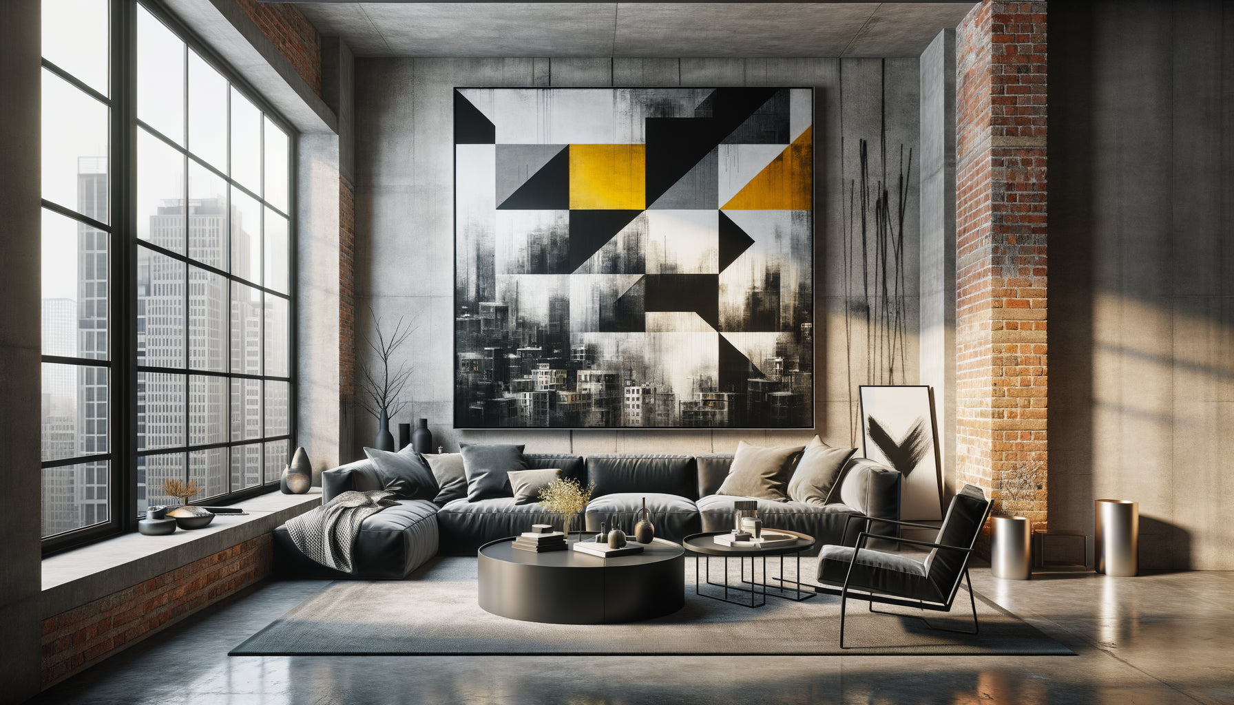
If you prefer representation, a black and white urban landscape with a few touches of color can create an immediate sophistication. I've seen architectural photographs transform a bland living room into a New York loft. Portraits, on the other hand, establish a presence, a soul – but they require confidence.
For interiors that embrace minimalism, line art – those drawings with clean lines – or large-format art photography bring elegance without clutter. A nude artwork, a botanical silhouette, geometric shapes: the gray of the sofa then serves as a setting for the purity of the line.
Texture: that dimension we too often forget
Beyond color and subject matter, the texture of the painting dialogues with that of your sofa. A corduroy velvet sofa calls for a smooth, shiny surface to create a tactile contrast – think of plexiglass photographic prints or lacquered paintings.
Conversely, a leather or technical fabric sofa is enhanced by a textured canvas: thick knife painting, collages, mixed techniques. This opposition creates a sensory richness that the eye perceives, even from afar. I've noticed that the most successful interiors always play on these contrasts of materials.
Relief textured artworks or pieces with 3D elements – deep frames, stretched canvases, assemblages – add a sculptural dimension particularly suited to low and streamlined sofas. They create shadow plays that evolve with the daylight.

Light and hanging: the details that change everything
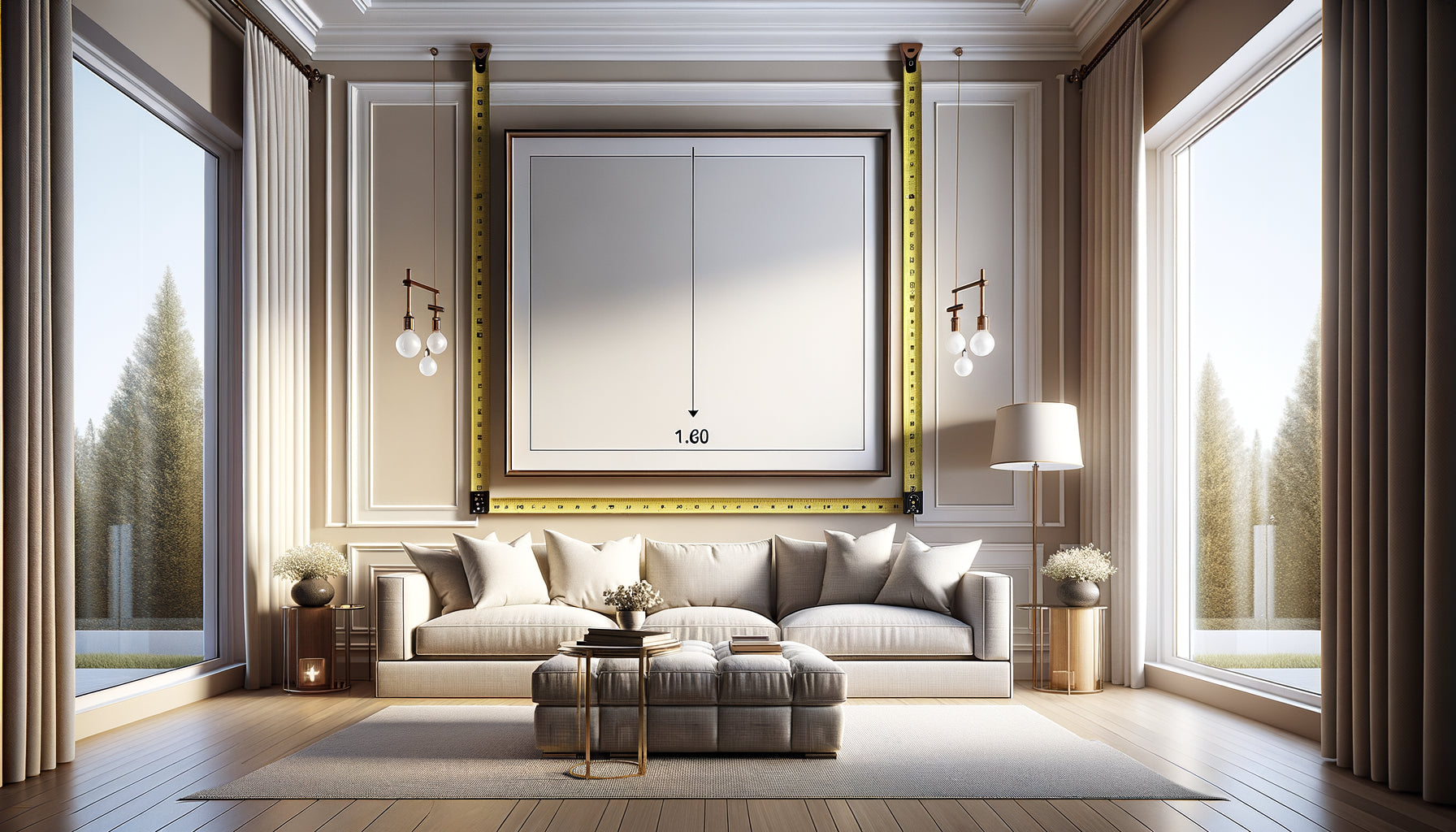
A perfect painting poorly hung loses 50% of its impact. The ideal height : the center of the work should be between 145 and 155 cm from the floor, which corresponds to the eye level of a standing person. Above a sofa, leave 20 to 30 cm between the backrest and the bottom of the frame.
Natural light can be your best friend or your worst enemy. Avoid direct reflections from the sun that create dazzling areas. If your painting faces a window, prefer anti-reflective glass or an unvarnished canvas. For important works, I systematically install dedicated lighting – an LED strip or adjustable spotlights – which enhances colors in the evening.
The distance test
Before permanently drilling, use adhesive tape to mark the location and live with it for 48 hours. Sit on your sofa, observe the whole thing from the entrance of the room, check the balance from different angles. This step avoids 90% of hanging errors.
Your living room deserves more than a blank wall
Discover our exclusive collection of wall art for Living Room that will transform your gray sofa into a true decorative anchor point.
Dare without making mistakes: my proven combinations
After years of composing visual universes, I have identified winning duos that always work. Light gray sofa + painting with terracotta and dusty rose hues: instant Scandinavian softness. Dark gray anthracite sofa + abstract black, white and gold artwork: Parisian sophistication.
For lovers of bright colors, a mid-grey sofa admirably supports electric turquoise, mustard yellow, or jungle green. The trick? Repeat these colors in small touches – cushions, throws, decorative objects – to create a consistent chromatic flow.
If you like boldness, try a total monochromatic look: different shades of grey in the artwork, playing on contrasts of value and texture. This tone-on-tone approach, far from being boring, creates a refined elegance that never goes out of style.
The fatal error to absolutely avoid
NEVER choose a painting just because it « goes with grey ». Your favorite must take precedence. I've seen too many technically perfect interiors lacking soul because the artworks were selected like accessories.
A painting you truly love, even if it deviates from your usual codes, will bring more life than a perfectly coordinated work that leaves you indifferent. Grey has this exceptional quality: it knows how to fade away to let what really matters shine. Trust it, it will know how to accompany your visual passions.
Imagine yourself in three months, returning home after a long day. Your gaze rests on that painting above your grey sofa, and a smile appears. This artwork doesn't just decorate your wall: it tells who you are, it creates an atmosphere that resembles you. Start by defining the emotion you want to feel in this space. Then, let yourself be guided by your intuition, armed with the principles I have just shared. Your living room will thank you.
Frequently Asked Questions
Can I put several small paintings instead of one large one?
Absolutely, and it's even an excellent option if you like the gallery effect. Create a grouped composition by imagining a virtual rectangle that respects the 60-75% rule of the sofa width. Arrange your paintings while maintaining 5 to 8 cm of space between each frame. The trick to success: use frames of the same color (black, white, natural wood or gold) to unify the whole, even if the works are very different. First trace your composition on the floor to visualize the balance before drilling the walls. This approach works particularly well with a grey sofa because the neutrality of the furniture absorbs the visual complexity without creating cacophony.
Is my grey sofa compatible with a very vibrant colored painting?
Not only is it compatible, but it’s often the best decision! Gray is the perfect neutralizer for saturated colors. Where a beige or blue sofa would compete with a fuchsia or electric turquoise painting, gray serves as a soothing frame that allows the artwork to shine. The key lies in repetition: incorporate at least two or three small touches of this vibrant color elsewhere in the room (cushion, vase, decorative book) to create visual continuity. If you fear being overwhelmed, start with a painting where the vibrant color is present but not dominant – for example, splashes of bright red on a white and gray background. You can then evolve towards more boldness once your eye is accustomed.
How to choose between black and white or color for my painting?
This decision depends on the atmosphere you are looking for and the other elements in your room. A black and white painting brings timeless elegance, a graphic and sophisticated side that works particularly well in minimalist or industrial interiors. It creates a frank contrast without adding chromatic complexity. Choose this option if your room already contains several colors or if you like simplicity. Conversely, a colorful painting injects life, warmth and personality – ideal if your interior lacks character or if you want to create an energizing focal point. A very successful intermediate solution: a painting mostly black and white with a few strategic touches of color (a red, a gold, a blue). This approach offers the best of both worlds: the elegance of monochrome with the vitality of color.