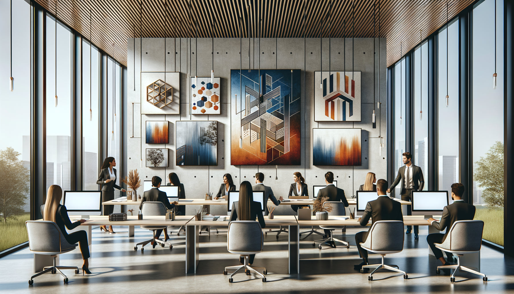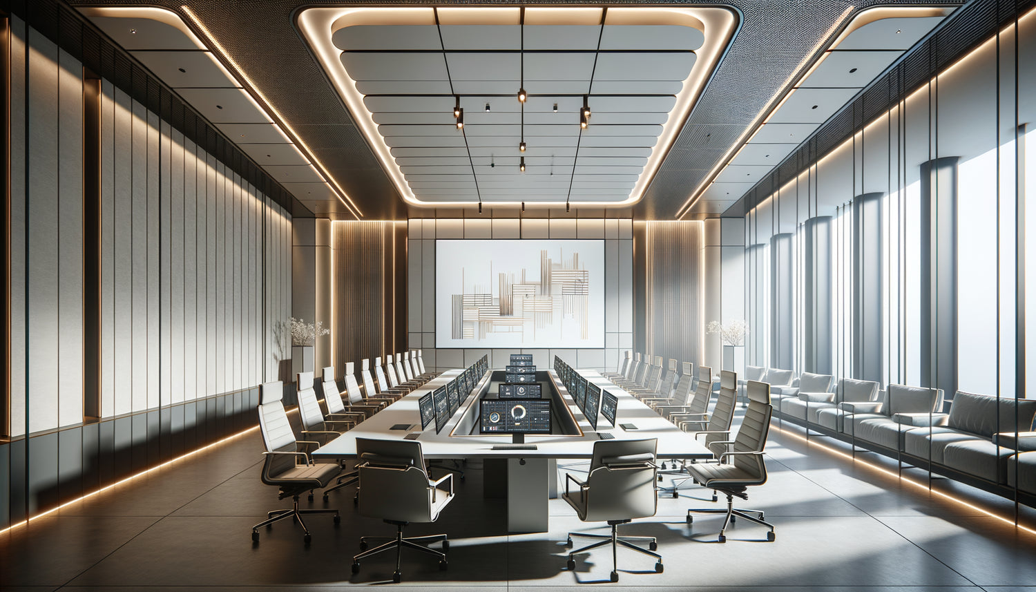
I recently assisted a Lyon-based scale-up in the design of its new headquarters. After three months of renovation, the founders moved their teams into ultra-modern spaces: giant touch screens, ergonomic furniture, invisible wiring. Yet, during the first week, several employees mentioned a feeling of diffuse discomfort. Not a technical problem, but rather a constant visual tension. We then introduced a series of minimalist paintings in the meeting rooms. The effect was immediate: sessions became more fluid, participants more focused.
Here's what minimalist paintings bring to technological meeting spaces: a visual breath that counterbalances informational density, mental clarity that favors decision-making, and a visual identity that humanizes high-tech environments. This alliance between refined art and technology is not just aesthetic.
If your meetings seem endless despite state-of-the-art equipment, if your employees struggle to maintain their attention in front of multiple screens, if your clients notice the technology before the atmosphere, you are not alone. Many companies invest heavily in digital infrastructure while neglecting the sensory balance of their spaces.
The solution does not require restructuring or a colossal budget. The thoughtful integration of minimalist works radically transforms the dynamics of these places. I will show you how these paintings become silent partners in your strategic meetings.
Visual silence in digital chaos
A modern technological meeting room generates an invisible cognitive overload. Count the sources of visual information: the main presentation screen, open laptops, smartphones placed on the table, LED notifications from video conferencing systems, sometimes even dynamic display panels. Each element flashes, refreshes, solicits attention.
In this context, a minimalist painting acts as an anchor point. Its refined composition – often simple geometric shapes, neutral color blocks, pure lines – offers the eye a place to rest. Unlike screens that constantly change, the artwork remains stable. This stability is not passive: it allows the brain to reset between periods of intensive analysis.
I observed this dynamic during a strategic meeting at a software publisher. Facing a monochrome abstract painting, participants naturally raised their eyes during moments of reflection. These micro-visual pauses, lasting only a few seconds, visibly reduced eye and mental fatigue. Artistic minimalism thus becomes a necessary counterpoint to technological intensity.
The Psychology of Clean Space
Cognitive neuroscience confirms it: our brains process a limited number of visual information simultaneously. Beyond a certain threshold, we switch to defensive attention – a form of automatic filtering that reduces our ability to analyze. Technological meeting rooms regularly cross this threshold.
A minimalist artwork doesn't add information: it psychologically subtracts it. Its simple shapes and reduced colors create a zone of visual neutrality that balances the density of the rest of the environment. This is particularly relevant in spaces where walls are often white or gray to maximize light projection. The minimalist work enriches without cluttering.
Chromatic Harmony with the Digital Ecosystem
Modern technological interfaces favor specific color palettes: cool blues for trust, pure whites for clarity, deep blacks for sophistication. LED screens produce particular lights, often blue-dominant, which subtly alter the perception of surrounding colors.
Minimalist artworks naturally integrate into this chromatic ecosystem. Their monochrome or bichrome compositions dialogue with interfaces without creating dissonance. I have seen technology companies choose works in slate gray, beige sand, or midnight blue tones that subtly echo their digital graphic charter.
This consistency is not insignificant. It generates a aesthetic continuity between the digital universe and the physical space. Participants no longer perceive the meeting room as a simple container of equipment, but as a unified environment where technology and art coexist harmoniously. This visual unity subconsciously reinforces the company's credibility and professionalism.
The Materials That Amplify the Technological Effect
Beyond composition, the choice of supports and finishes is enormously important. Minimalist artworks on canvas bring an organic texture that contrasts with the coldness of glass and metal omnipresent. Conversely, works on aluminum or plexiglass create a material continuity with high-tech equipment while retaining an artistic dimension.
I accompanied a Parisian fintech company that opted for minimalist artworks with a matte finish. This surface absorbs light slightly rather than reflecting it, avoiding parasitic reflections that disrupt video conferences. Technical detail, but major impact on the user experience. Minimalism becomes functional.

When art subtly guides group dynamics
The placement of an artwork in a technology meeting room is never neutral. Positioned facing the participants, it unconsciously structures attention. In my projects, I often prefer the wall opposite the presentation screen. When looks temporarily turn away from the slides, they meet the artwork rather than a blank wall or a distracting window.
This creates an attention triangle: the presenter, the technological screen, and the minimalist artwork. The eyes naturally circulate between these three poles, which maintains engagement without generating fatigue. I have observed that meetings in these balanced spaces last on average 15% less time while producing more consensual decisions.
Minimalist artworks also influence the tone of exchanges. Their visual sobriety unconsciously encourages clarity of speech. In an environment where every element is refined, participants naturally tend to get straight to the point. This is particularly valuable in strategic meetings where information density can quickly become paralyzing.
Visual identity beyond the projected logo
Many technology companies limit themselves to projecting their logo on the welcome screen. It's a missed opportunity. Minimalist artworks allow anchoring brand identity in a more subtle and lasting way. A series of three works in corporate colors, for example, creates an immediately recognizable visual signature.
I worked with a cybersecurity company that commissioned abstract paintings reminiscent of data flow diagrams – clean lines, connection points, geometric tracings. Without being literal, these artworks evoke their profession while remaining visually restful. Their clients now instantly recognize the atmosphere of their meeting rooms.
This approach transforms the space into a non-verbal communication tool. During important negotiations or sales presentations, the environment speaks before you even open your mouth. Well-chosen minimalist artworks communicate rigor, mastered innovation, attention to detail – exactly what decision-makers in the technology sector are looking for.
Permanence in the face of obsolescence
Technology evolves rapidly. Today's state-of-the-art screen will be obsolete in three years. This programmed obsolescence generates a form of visual instability in corporate spaces, with constant renewal cycles. Minimalist artworks, on the other hand, transcend trends.
Their timelessness offers a valuable anchor. As equipment modernizes around them, these works remain relevant. I've revisited clients five years after installation: their meeting rooms had been completely technologically renovated, but the minimalist artworks were still there, more consistent than ever with the new interfaces. This artistic continuity creates a story, a memory of the space that humanizes perpetual technological renewal.

The luxury of simplicity in the age of complexity
There is something paradoxically luxurious about simplicity. As our professional environments become more complex – interconnected systems, multiple interfaces, permanent connectivity – artistic minimalism becomes a true privilege. It signals mastery rather than accumulation.
The most advanced technology companies have understood this. They don't expose technology to impress; they integrate it discreetly and let minimalist artworks create the visual impact. This reversal is powerful: it shows such confidence in technical competence that it no longer needs ostentatious demonstration.
In my consultations, I see this as an aesthetic maturity. Startups in the early stages often multiply visual gadgets. Confirmed scale-ups prefer elegant sobriety. Minimalist artworks then become a marker of this evolution, a subtle signal sent to partners and investors: we master our universe.
Transform your meeting rooms into spaces of strategic excellence
Discover our exclusive collection of art for Meeting Room that perfectly balance technological sophistication and visual serenity.
Transformation begins with a conscious choice
Imagine your next strategic meeting. Your collaborators enter a space where every element has been designed to promote mental clarity. Technology is present but discreet, performant but non-intrusive. On the wall, a minimalist artwork structures the space and soothes the eyes. Exchanges are more direct, decisions faster, the atmosphere more serene.
This transformation doesn't require a revolution. Sometimes, a single well-chosen work is enough to rebalance an environment. The key is to understand that your meeting rooms are not just technical containers: they are spaces of influence where strategic issues are at stake. Every detail counts, including – especially – those that seem purely aesthetic.
Start by observing your own reactions during the next meeting. Where does your gaze naturally settle? Do you feel visual tension after an hour? These observations will guide you towards the minimalist artworks that will truly transform your experience and that of your interlocutors.
Frequently asked questions about minimalist artworks in technological environments
What size artwork should I choose for a meeting room equipped with a large screen?
The rule I consistently apply is that the minimalist artwork should occupy about one third of the surface area of the main screen. If it's too small, it disappears visually against the technology; if it's too big, it competes. For a 75-inch screen, I recommend an artwork of approximately 80x120 cm. This proportion creates a balance where the work complements the equipment without dominating it. Also consider the viewing distance: in a 20 m² room, prioritize medium formats rather than a single large piece. Several small minimalist artworks can also work in a coherent series, creating a visual rhythm that dialogues with the architecture of the space.
Do minimalist artworks work in rooms with lots of screens and equipment?
Paradoxically, it is precisely in these saturated environments that they are most effective. I equipped a trading room with twelve active screens simultaneously – an extreme environment if there ever was one. We installed three monochrome minimalist artworks on the back wall. Traders quickly got used to turning their chair to look at these works for a few seconds during moments of high tension. This micro-visual disconnection reduced their perceptible stress level. The denser the technological environment, the more critical the need for visual breathing space. Minimalism doesn't fight technology; it makes it bearable in the long run. The key is to position the artworks outside the direct field of vision of the main screens, creating distinct zones: technological action on one side, visual rest on the other.
How to choose the colors of a minimalist artwork for a high-tech meeting room?
I always start by analyzing the color temperature of screens and LED lighting, which often leans towards cool blues. To create warmth without aesthetic disruption, I integrate minimalist artworks in beige sand, sienna earth, or warm gray tones. These nuances bring an organic dimension without creating dissonance. If the company has a strong graphic charter, I reuse a secondary color rather than the dominant one – for example, a sophisticated gray rather than corporate blue. For very neutral spaces (white, gray, black), a minimalist artwork with a single accent color – a burnt orange, a sage green – creates a memorable focal point. The mistake to avoid: saturated or multiple colors that compete with luminous interfaces. Chromatic minimalism amplifies the impact much more than profusion.