Every morning, in the corridors of the residence where my team works, a scene repeats: Mrs. Duchamp stops in front of the large painting depicting a Provençal market, hesitates for a few seconds, then resolutely turns to the right towards the dining room. This painting has become her landmark, her Ariadne's thread in everyday life. Because a painting is not just decoration: it is a visual anchor, a silent guide that transforms a sometimes confusing space into a familiar and reassuring place.
Here's what guiding paintings bring concretely: they create memorable visual landmarks which facilitate the autonomy of residents, they structure the space into zones instantly identifiable, and they reduce anxiety related to disorientation while beautifying living spaces.
You may have noticed that some residents seem lost in spaces that are well-signposted. Classic directional signs go unnoticed, blending with neutral walls. Frustration rises: how to transform these anonymous corridors into intuitive paths? How to allow everyone to find their way without constant assistance?
Good news: the solution exists, and it is both simple and elegant. Guiding paintings work according to proven psychological principles, accessible to all. No need to be a signage expert: with the right keys, you can create an environment where each artwork naturally becomes a visual guide.
In this article, I will reveal how to select and position paintings that truly guide your residents, transforming your establishment into a space that is both beautiful and functional.
Visual memory: your little-known ally
During a recent intervention in a Lille residence, I observed a fascinating phenomenon. After installing a painting depicting a field of sunflowers facing the elevator, requests for help to find the library fell by 70%. Why? Because our brain retains an image that is strong and contrasted much better than a gray arrow on a white background.
Visual memory works through emotional associations. A painting with bright colors, recognizable shapes, or an evocative scene anchors itself in the mind like a personal memory. Residents no longer think “turn at sign number 3”, but rather “after the sunflowers, I turn left”. This linguistic transformation testifies to a profound appropriation of space.
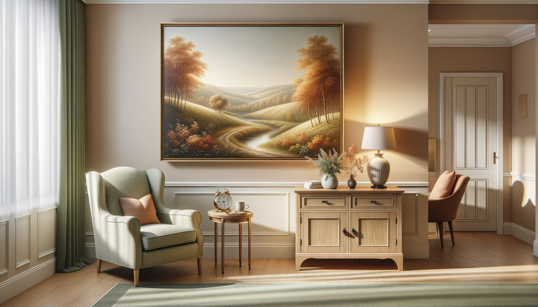
To exploit this power, choose paintings with strong visual identity: a red boat on a blue lake, a bouquet of pink peonies, a snowy mountain landscape. Avoid complex abstractions or too subtle shades that blend into the decor. The goal is not artistic daring, but immediate recognition.
The three criteria of memorability
An effective directional artwork must combine three essential qualities. First, a strong chromatic contrast: the combination of complementary colors (blue-orange, red-green) naturally attracts the eye. Next, an identifiable subject in less than three seconds: animal, flower, iconic landscape. Finally, an emotional dimension: the image should evoke something pleasant, nostalgic or comforting.
In my practice, I have found that paintings evoking nature and scenes of daily life from times gone by work particularly well. A village market, a flowering garden, a beach with colorful cabins: these images draw on the collective memory and instantly create a connection.
Mapping the space with color
Imagine your residence as a map where each zone has its own chromatic signature. This approach, which I call “emotional mapping,” radically transforms the perception of space. The East wing becomes the “blue sector” with its marine paintings, the West wing the “yellow sector” with its landscapes of wheat and sunflowers.
Chromatic consistency by zone creates an intuitive orientation system. Residents quickly learn: “My room is in the green zone,” even if they cannot state the exact number. This logic echoes that of subway lines: it's easier to remember “blue line” than “line 12.”
To implement this system, assign a dominant palette to each sector. However, pay attention to overall consistency: transitions between zones must remain harmonious. An orange painting can serve as a visual bridge between a yellow zone and a red zone, creating a narrative fluidity in circulation.
The code of destinations
Certain destinations naturally call for visual themes. To orient towards the dining room, prioritize paintings evoking conviviality: still lifes of fruit, market scenes, vineyard landscapes. These images mentally prepare for mealtime and create a positive anticipation.
Towards relaxation areas, opt for soothing scenes: seaside at sunset, peaceful undergrowth, zen garden. The atmosphere of the painting announces that of the place. For activity rooms, choose dynamic and joyful compositions: village festivals, flowering gardens, lively scenes.

Strategic Points: Where to Hang to Guide
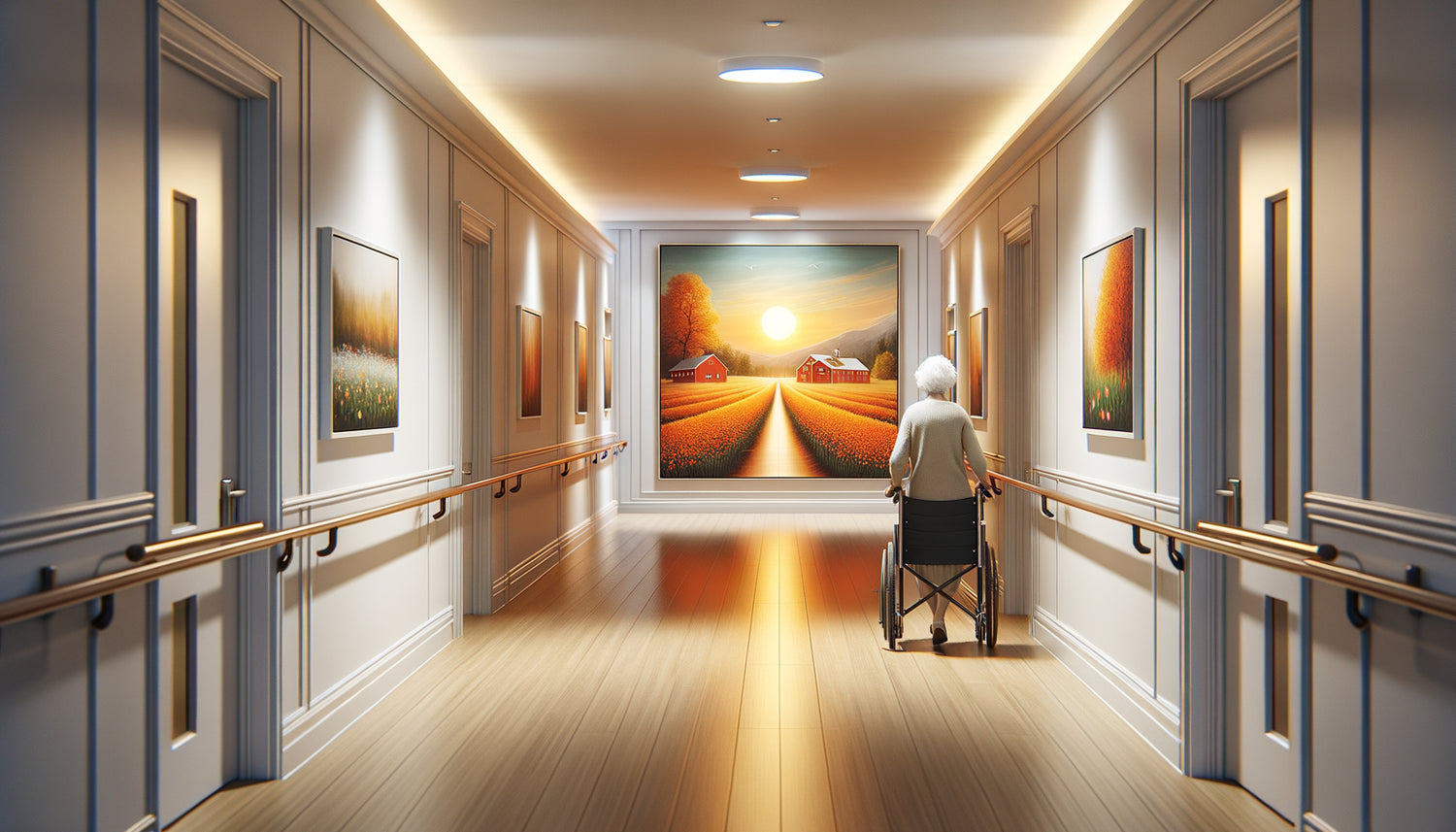
The placement of an orienting painting obeys specific rules. Contrary to popular belief, artworks should not be concentrated in the hallway, but at intersections and decision points. Every place where a resident must choose a direction deserves its visual landmark.
In my projects, I first identify the “decision nodes”: elevator exits, corridor crossings, significant turns. At each of these points, an artwork facing the gaze automatically becomes an anchor point. If placed too laterally, it loses its orientation power; if positioned frontally, it calls attention and guides.
Hanging height also plays a crucial role. For people who sometimes move in wheelchairs or with canes, the optimal visual center is between 1.40m and 1.60m from the floor. This height allows comfortable visibility from different positions, seated or standing.
The Rule of Three Looks
To verify the effectiveness of a positioning, I apply the “rule of three looks”. A resident arriving from point A to point B should cross at least three significant paintings: one at the start (confirmation that they are on the right path), one halfway (maintaining direction), and one at the destination (validation of the destination).
This visual repetition is not redundant: it reassures and confirms at each step. In long or complex spaces, these visual landmarks transform a potentially anxiety-inducing journey into a marked promenade. The resident is never in uncertainty for more than a few meters.
Personalize According to Cognitive Profiles
Not all residents decode space the same way. Some remember shapes better, others colors, and still others narrative themes. An inclusive orientation system combines several types of visual landmarks to adapt to these different profiles.
For people with a dominant chromatic memory, focus on bold and contrasting colors. For those who function through narrative associations, choose paintings telling a clear story: “the fisherman's painting” becomes a familiar character, almost a hallway neighbor.
Individuals with mild cognitive impairment particularly benefit from simple figurative paintings. A red cat on a cushion, a bicycle in front of a house, a steaming cup of coffee: these universal images transcend the barriers of immediate memory and draw upon deeper recollections.
The Multisensory Approach
Although these are visual artworks, you can enhance their orientation power by creating multisensory associations. A lavender painting near a subtle diffuser of that fragrance, a coffee scene accompanied by the discreet aroma of coffee beans: these sensory correspondences anchor spatial landmarks more deeply.
This strategy works remarkably well for people with declining vision. Orientation then becomes a holistic experience, where multiple senses collaborate to create familiarity and recognition.

Avoiding Common Visual Pitfalls
Some well-intentioned choices paradoxically create confusion. I have seen residences multiply abstract paintings “to be modern,” generating a disorienting sense of uniformity. When everything looks the same, nothing guides.
Another frequent pitfall: paintings that are too dark or have insufficient contrast. In hallways that are sometimes dimly lit, a work with muted tones becomes invisible, losing all orientation function. Always favor luminous compositions, even when dealing with twilight subjects.
Be wary of trends as well. Ultra-minimalist paintings, while aesthetically pleasing, often lack the informative richness necessary for memorization. A solid color, however elegant, offers no narrative memory grip.
Visual Overload
Conversely, too many paintings kill the painting. A hallway saturated with artworks creates a visual pollution where no landmark truly emerges. The golden rule: one striking painting every 8 to 12 meters in circulation areas, concentrated at decision points.
Between these main landmarks, let the walls breathe. This alternation between fullness and emptiness allows each painting to fully play its orientation role without visual competition.
Transform your residence into an intuitive and reassuring space
Discover our exclusive collection of wall art for senior residences that combines artistic beauty and orientation function to promote the autonomy and well-being of your residents.
When art becomes a guide
A few months ago, during a follow-up visit to a residence in Toulouse, a caregiver told me a touching story. A resident with moderate cognitive impairments, who systematically refused to leave his room for fear of getting lost, had started participating in group activities again. His secret? He had memorized "the path of the birds": three ornithological paintings marking the route to the common room.
This story illustrates the real power of orientation artworks. They do not replace traditional signage; they transcend it by speaking directly to our emotional and memory brain. They transform the obligation to orient oneself into the pleasure of recognition, spatial constraint into a familiar walk.
Your residents deserve this environment where beauty and functionality meet. Start small: identify the most frequent disorientation point in your establishment, and install a strong, memorable, bright artwork there. Observe. Listen to comments. Then gradually extend this network of visual cues that will weave an affective geography of your residence.
The regained autonomy of a single resident already justifies this approach. Now imagine the impact on your entire community. Each painting then becomes much more than decoration: it becomes a silent companion, a benevolent guide who whispers "you are in the right place, continue, I recognize you".
Frequently asked questions
How many paintings should be planned for a 50-room residence?
Rather than reasoning in absolute numbers, think in terms of strategic points. For a standard residence, count approximately 15 to 20 orientation artworks well positioned: one per elevator exit (usually 2-3), one at each major hallway intersection (4-6), one in front of each important common area (dining room, living room, library, i.e., 4-5), and a few intermediate markers in the long corridors. The essential thing is not the quantity but the positioning at decision points. A single perfectly placed painting at a critical intersection is better than three beautiful works invisible in corners.
Can abstract paintings serve as orientation aids?
Technically yes, but with important caveats. An abstract painting can function as an aid if it has a very distinctive visual signature: a unique geometric shape, a color combination that is impossible to confuse, a composition immediately recognizable. However, abstract art has a major disadvantage for orientation: it does not generate a memorable narrative. Our brains retain "the painting with the red cat" much better than "the painting with orange shapes." For people with cognitive impairments, this difficulty is exacerbated: abstraction requires an interpretive effort that can generate confusion rather than clarity. If you insist on abstracts for aesthetic reasons, reserve them for bedrooms and private spaces, and prioritize figurative art for common circulation areas where the orientation function takes precedence.
Should you change paintings regularly to renew the decor?
That's precisely what you shouldn’t do with orientation paintings! Unlike commercial or domestic spaces where decorative renewal is desirable, visual aids in senior residences become more effective with permanence. Each change resets the spatial learning process of residents. Mr. Durand took three weeks to integrate that "after the poppy painting, it's his room": removing this painting plunges him back into disorientation. Visual consistency creates a reassuring familiarity. If you absolutely want to vary the decor, do so in spaces without an orientation function: individual bedrooms, rest alcoves, closed rooms. But for corridors and decision points, consider your orientation paintings as permanent architectural elements, just like doors or windows. Their stability is their strength.