Imagine standing before an American prairie. Before you, only undulating grass and a vast sky meeting somewhere in the distance. How do you capture this immensity on canvas without it becoming... boring? This is the art of painting horizontality, a challenge that plein air painters have faced for generations.
Painting Prairie Landscapes: Challenges of Horizontality
Painting a prairie is like trying to tell a story without characters. No majestic mountains, no spectacular waterfalls. Just a horizontal line cutting your canvas in two. The trap? This simplicity can kill your composition if you don't master negative space.
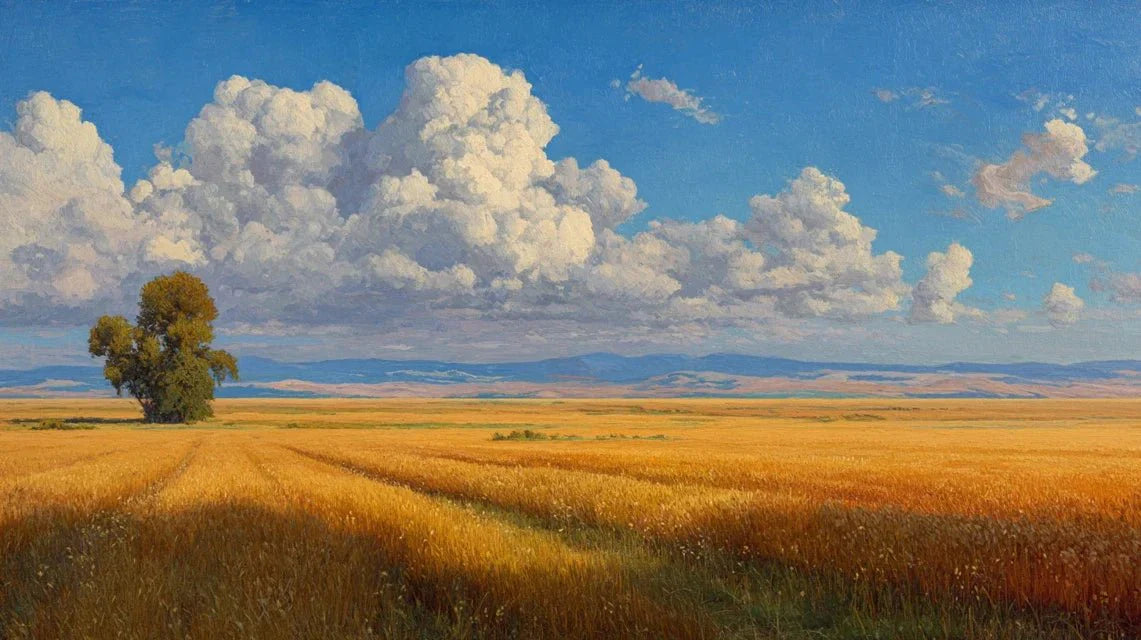
19th-century American masters understood this by exploring the Great Plains. Their solution? Introduce vertical accents where they don't naturally exist. A solitary tree becomes a hero. A fence post takes on immense importance. Even a simple bouquet of taller grasses can save your composition.
But here's the secret: the prairie isn't really flat. It lives. The grasses undulate in the wind, creating waves of light and shadow. The sky changes constantly, offering a spectacle that contemporary artists of the American Prairie Reserve have learned to exploit. In their works, the sky tells the story that the earth cannot tell.
Composition Techniques for Capturing the Horizontality of American Prairies
Forget what you've been taught about the rule of thirds. When facing a prairie, this rule becomes too wise, too predictable. True connoisseurs go further: they give 70% or even 80% of the space to the sky. Why? Because that’s where the visual drama plays out, an approach inherited from American tonalism.
Think depth. In a landscape without relief, you must create paths for the eye:
- A fence leading to the horizon
- A path winding into the distance
- Variations in vegetation creating tiers
- Shadows carving out space
Panoramic format becomes your best friend. A canvas two or three times wider than high? Perfect. It may seem extreme, but that’s exactly what it takes to do justice to these endless spaces and capture the prairie atmosphere in all its splendor.
And here's a pro tip: play with color planes. Your foreground should be rich and dark. Then, gradually, everything brightens towards the horizon. This simple rule creates depth that relief cannot give you.
The Horizon Line in Prairie Landscapes: Placement and Balance
This horizontal line that cuts your canvas? It decides everything. Placing it in the center is a sure death for your composition. Really, never do it.
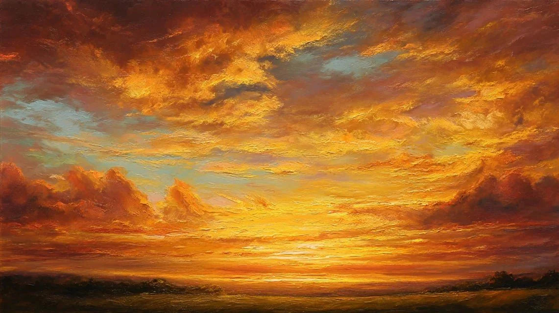
Low horizon, at 30% from the bottom of the canvas? You create a sense of infinite space. Perfect when a spectacular sky is required, with its dramatic clouds or end-of-day colors. It's the "sky dominant" composition that always works for American prairies.
High horizon, at 70% from the bottom? There, you force the viewer to look at the earth. Textures become protagonists. The games of raking light on the grasses take full importance. Ideal for capturing the richness of a prairie in spring.
The extra trick? A small vertical element in the part opposite your horizon. Low horizon? Add a bird in flight in the sky. High horizon? A small tree on the horizon line. This subtle counterweight balances everything. By the way, you can see how these principles come to life in our wall art landscapes collection, perfect for bringing that sense of space into your home.
Capturing vastness: panoramic format and American prairie landscapes
You really want to honor a prairie? Take a panoramic canvas. Yes, those ultra-wide formats that seem immense. Contemporary artists are not afraid to use canvases 2 meters wide by only 60 centimeters high.
The challenge? Fill all this space without creating boring areas. The solution is in the visual rhythm. Alternate detailed zones and simpler zones. Create points of interest distributed intelligently, like milestones on a path.
The pioneers of painting the Great Plains had a genius trick: they turned their canvases into horizontal journeys. Your gaze enters from the left in a textured foreground, crosses an intermediate zone, and escapes towards the light on the right. Exactly as if you were actually traveling through the prairie.
Values and depth in horizontal prairie landscapes
Without mountains to create depth, how do you do it? Tonal values become your absolute allies. The rule is simple: four planes of values. Dark foreground, mid-tone intermediate plane, light background, even brighter sky. This progression naturally guides the eye towards the background.
The atmospheric perspective works wonders in prairies. This natural haze caused by humidity and particles in the air gradually transforms your deep greens into pale bluish tones towards the horizon. It's magical and it’s real.
And never forget: subtle nuances make the difference. A slight change in tone where the terrain inclines slightly. A variation of color where the sun hits differently. These invisible details create the credibility of your space. In the prairie, the devil is really in the details – or rather, beauty lies in subtleties.
FAQ: Painting prairie landscapes
What canvas format is ideal for a prairie landscape?
The panoramic format (ratio 2:1 or 3:1) is the most suitable to capture the characteristic horizontality of prairies. A canvas two to three times wider than high allows you to faithfully reproduce the immensity of these spaces without artificially compressing them.
Where should the horizon line be placed in a prairie landscape?
Avoid the center absolutely. Place the horizon either low (30% from the bottom) to prioritize a spectacular sky, or high (70% from the bottom) to emphasize the details of the terrain. This asymmetry creates the essential dynamic for a successful composition.
How to create depth in a flat landscape?
Use the progression of tonal values: dark foreground, intermediate planes progressively lighter, and bright sky. Atmospheric perspective, which pales and blues distant tones, naturally reinforces this feeling of depth even on a horizontal terrain.