The first time I contemplated an ink landscape from the Muromachi period in a private collection in Kyoto, I was struck by this realization: behind the apparent simplicity of black on white lay a universe of nuances, techniques, and radically different philosophies. Each brushstroke revealed the school it came from, like an invisible signature for the uninitiated eye.
Recognizing the different schools of monochrome painting during the Muromachi period allows three essential revelations: understanding the zen influence that transformed Japanese aesthetics, distinguishing masters by their unique ink wash techniques, and appreciating how these works laid the foundations for contemporary minimalist design.
Faced with these ancient scrolls, many feel the same frustration: all these monochrome landscapes look alike. Misty mountains, bamboo groves, hermits contemplating water... How do you distinguish a Sesshū from a Shūbun? Yet, this ability to identify schools radically changes our perception. Suddenly, these works cease to be mere antique paintings and become philosophical dialogues, aesthetic manifestos, silent revolutions.
I will guide you through the visual and spiritual codes that allow each school to be identified. Together, we will decipher this fascinating pictorial language that still influences today our relationship with monochrome and space.
The sacred context: when zen meets ink
The Muromachi period (1336-1573) marks a radical turning point in Japanese art. Monochrome painting, or suibokuga, arrives from China with Zen Buddhism and finds fertile ground in Japan. Zen temples become the workshops where these stripped-down works are developed.
This aesthetic revolution is not just artistic: it embodies an entire philosophy. Monochrome becomes the vehicle of enlightenment. Each ink wash expresses the principle of ma, this empty space that is not absence but presence. Painter-monks believe that truth lies in what is not shown.
Three major schools dominate this period and shape distinct approaches to Muromachi monochrome painting. Each develops its own visual grammar, its own spiritual obsessions, creating a rich panorama that goes far beyond the idea of a uniform style.
The Shōkoku-ji school: the contemplative rigor of Josetsu and Shūbun
At Shōkoku-ji Temple in Kyoto, Josetsu lays the foundations for the first major Japanese ink painting school. His flagship work,
His disciple Shūbun refines this method with a technique instantly recognizable. His landscapes present clearly defined superimposed planes: detailed foreground, middle ground with trees or rocks, background of evanescent mountains. This three-level structure becomes the hallmark of the school.
The characteristics to identify a Shūbun: distinct outlines in the foreground, a gradual progression towards blurriness, the use of washes in subtle gradients to create depth, and this impression of peaceful order. His trees have angular branches, almost architectural. The space is never chaotic but orchestrated like a guided meditation.
Shūbun's technical palette
Observe the texture of the rock: Shūbun uses the hikibokuhō technique, these quick, dry strokes that suggest mineral matter. His clouds and mists are rendered with superimposed wet washes, creating soft transitions. This duality between dry stroke and wet wash characterizes the Shōkoku-ji school.

Sesshū Tōyō: the rebellious genius who revolutionizes monochrome
Then comes Sesshū Tōyō (1420-1506), trained at Shōkoku-ji but too wild to conform. After a trip to Ming China, he develops a style that blows up conventions. Recognizing a Sesshū is a visceral experience: his works pulsate with an almost violent energy.
His signature technique: haboku, or splashed ink. He literally projects the ink onto the paper, creating forms that emerge from chaos. His mountains are not gently softened as in Shūbun's work, but surge up in abrupt masses, built with angular and broken strokes.
In his four seasons landscapes (particularly the 16-meter long scroll), Sesshū uses what I call the dramaturgy of contrast. He opposes areas of dense, opaque ink to brutal whites, without transition. Where Shūbun seeks progressive harmony, Sesshū creates tension, a visual shock.
To identify a Sesshū: look for abrupt brushstrokes, almost violent, sharp angles, radical asymmetry. His trees are twisted, tormented. The space is no longer contemplative but dramatic. You feel the hand of the painter, his physical gesture, where the Shōkoku-ji school sought to erase the artist.
The Ami School: the aristocratic refinement of a dynasty
Parallel to this, the Ami family develops a totally different approach in service of the Ashikaga shogunate. Nōami, Geiami and Sōami – grandfather, father and son – create a school that favors courtly sophistication over zen austerity.
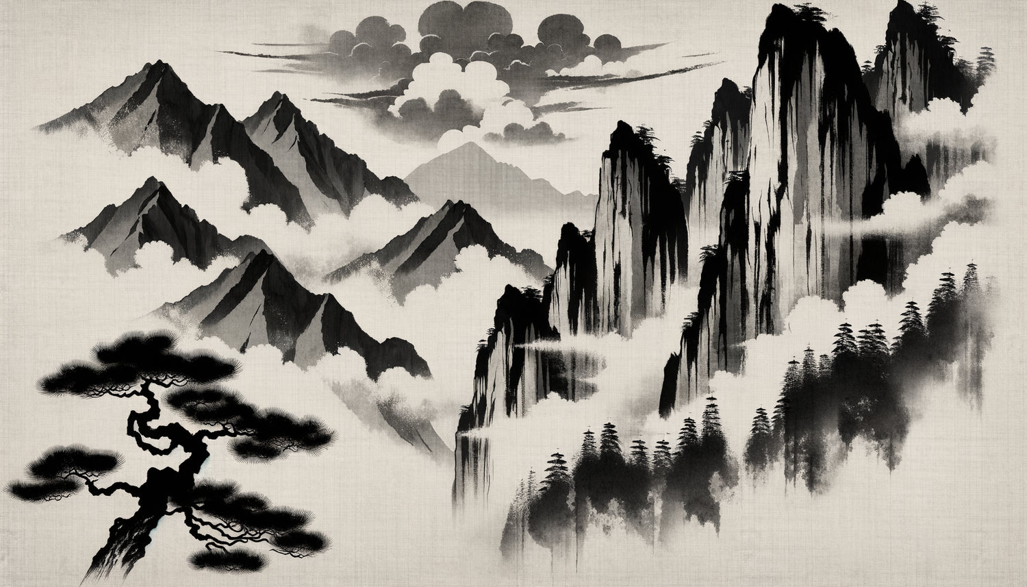
Their style is immediately identifiable by its extreme softness. The contours dissolve into vaporous washes. Shapes barely emerge from the mist, like floating memories. It's painting of ephemerality, the fleeting, the almost-nothing.
Technically, the Ami master the tarashikomi, this technique where ink is deposited on a still wet area, creating halos and unpredictable fusions. Their landscapes seem to breathe, vibrate with an inner light. Space is no longer structure or drama, but pure atmosphere.
The poetry of emptiness according to the Ami
In an Ami landscape, up to 70% of the surface can remain blank. This white is not simply unpainted paper: it's mist, light, breathing space. A solitary pine emerges from nothingness, a few lines suggest a distant mountain, and everything else is visual silence. This radical economy still influences contemporary minimalist design today.

The visual codes to identify each school at a glance
After years of observation, I have developed a simple method for quickly identifying the school of a monochrome painting from the Muromachi period. First look at the ink density: homogeneous and progressive for Shūbun, contrasted and dramatic for Sesshū, diluted and vaporous for the Ami.
Next, observe the treatment of space. The Shōkoku-ji school organizes space into clear horizontal layers. Sesshū creates dynamic diagonals and spatial breaks. The Ami dissolve space into atmosphere, rejecting any rigid structure.
The brushstroke reveals everything: controlled and methodical with Shūbun, gestural and expressive with Sesshū, almost invisible with the Ami who seek fusion rather than trace. Look at the trees: architectural, tormented, or barely suggested?
Finally, feel the spiritual intention. Shūbun invites you to ordered meditation, Sesshū confronts you with the raw energy of reality, the Ami dissolve you into dreamy contemplation. Each school offers a different path to enlightenment.
How these schools inspire monochrome design today
The influence of these Muromachi painting schools extends far beyond art history. Contemporary minimalism, Scandinavian design, the aesthetics of clean interiors: all draw on these principles established in the 15th century.
When you display a black and white composition in your interior, you subconsciously activate these legacies. A visually striking contrast evokes the energy of Sesshū, creating dramatic focal points. A vaporous image with subtle gradations recalls the Ami, bringing softness and contemplation.
Contemporary interior designers use these same principles: the structured balance of Shūbun for rational spaces, the tension of Sesshū for creative places, the dissolution of the Ami for meditative atmospheres. Recognizing these schools allows you to acquire a visual vocabulary that transforms your approach to monochrome.
Capture the Muromachi spirit in your space
Discover our exclusive collection of black and white artworks that reinterpret the aesthetic principles of Japanese masters to sublimate your contemporary interiors.
Your gaze transformed on monochrome
From now on, when you contemplate a monochrome work – whether old or contemporary – you have the keys to understanding. You perceive the structure beneath the apparent chaos, the intention behind the gesture, the philosophy behind the technique. This ability to distinguish Muromachi monochrome painting schools enriches your aesthetic sensitivity far beyond ancient art.
Each school offers you a different prism for apprehending space, emptiness, contrast. By integrating these principles into your decorative choices, you are no longer simply selecting a black and white image: you are choosing a philosophy, an energy, a way of inhabiting space. Start by observing with this reading grid, and monochrome will reveal its infinite secrets.
Frequently asked questions about Muromachi painting schools
Why was monochrome painting so important during the Muromachi period?
Monochrome painting becomes central during the Muromachi era because it perfectly embodies the Zen philosophy that then dominates Japanese culture. Zen Buddhism, imported from China, promotes simplicity, meditation and the search for the essential. Monochrome, with its economy of means – simply ink and paper – becomes the ideal vehicle for this spirituality. Monk-painters consider each brushstroke to be an act of meditation, and the emptiness on the paper expresses the Buddhist concept of mu (the creative void). This stripped-down aesthetic profoundly influences the warrior aristocracy and the Ashikaga shogunate, who make it the official style of their court. It is also a period when Japan seeks to distinguish itself from China while assimilating its influences: monochrome becomes a field of experimentation to create a purely Japanese aesthetic identity.
How can I start appreciating these paintings if I know nothing about Japanese art?
The beauty of Muromachi monochrome painting is that it speaks directly to the sensibility, without requiring prior knowledge. Start by simply observing how your eye travels through the image. Where does your gaze first settle? Which areas attract you? Do you feel serenity, tension, mystery? Then observe the contrasts: is there a lot of white or does ink dominate? Are the shapes sharp or blurred? These intuitive observations naturally lead you to an understanding of the different schools. I recommend virtually visiting collections of Japanese museums (the Tokyo National Museum or the Kyoto National Museum offer excellent online resources), comparing two or three works side by side, and noting your spontaneous impressions. Then read about the artists: you will discover that your intuitions often correspond to the intentions of the masters. Appreciation is built through repeated exposure, kind curiosity, and permission to feel before intellectually understanding.
Can these principles really influence my modern interior decoration?
Absolutely, and in a very concrete way. The principles of the Muromachi schools have directly inspired the contemporary minimalist design we know today. The concept of ma (the interval space) that Ami masters translates perfectly into our interiors by the importance given to empty spaces, clear surfaces, negative space. Sesshū's contrast technique guides you to create powerful focal points in a clean room – an intense black and white painting on an immaculate white wall, for example. Shūbun’s structured approach inspires the organization of open spaces into distinct zones. When choosing monochrome works for your interior, ask yourself what energy you are looking for: contemplative and gentle (Ami style), dynamic and assertive (Sesshū style), or balanced and harmonious (Shūbun style). This reflection transforms the decorative act into an intentional gesture, creating spaces that are not only beautiful but resonate with your state of mind and aspirations. Japanese monochrome teaches us that less can be infinitely richer.