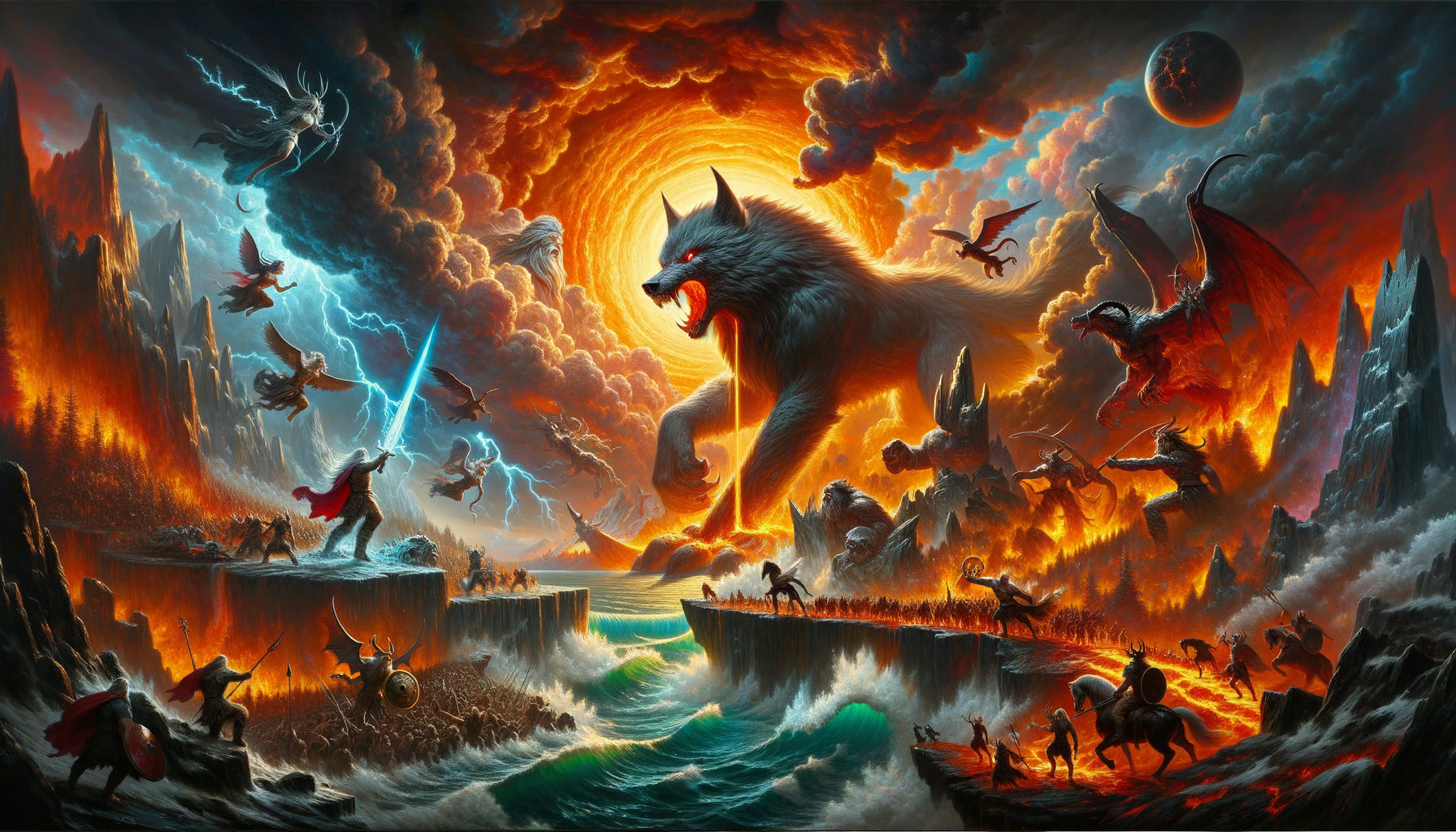
Within the cozy intimacy of a Stockholm apartment I was redecorating last winter, my client confided in me her dilemma: she loved Norse mythology, owned a magnificent Fenrir painting, but feared this legendary creature would clash with the Scandinavian purity of her interior. Six weeks later, this titanic wolf reigned above her natural linen sofa, becoming the centerpiece of a harmonious living room where modernity and cultural heritage dialogued with a disturbing evidence.
Here's what a Fenrir wall art brings to your Scandinavian decor: a narrative depth that transcends white minimalism, an authentic cultural anchor that connects the space to the Nordic soul, and a controlled visual tension that energizes without saturating. Three essential dimensions to avoid the folk museum effect while celebrating Scandinavian identity.
The challenge with Fenrir wall paintings? Many imagine that Norse mythology necessarily imposes overloaded compositions, aggressive colors or this caricatured Viking style that turns an interior into a historical reconstruction. As a result: we give up integrating these powerful symbols for fear of aesthetic imbalance. Yet, modern Scandinavian design is precisely rooted in these ancestral legends. The mistake would be to believe that you have to choose between mythological authenticity and contemporary elegance. The two nourish each other when you identify graphic styles compatible with the Nordic DNA: functionality, purity, connection to nature, natural palette.
I will reveal how to select and integrate a Fenrir painting that respects Scandinavian codes while asserting its symbolic presence.
Linear minimalism: when Fenrir becomes silhouette
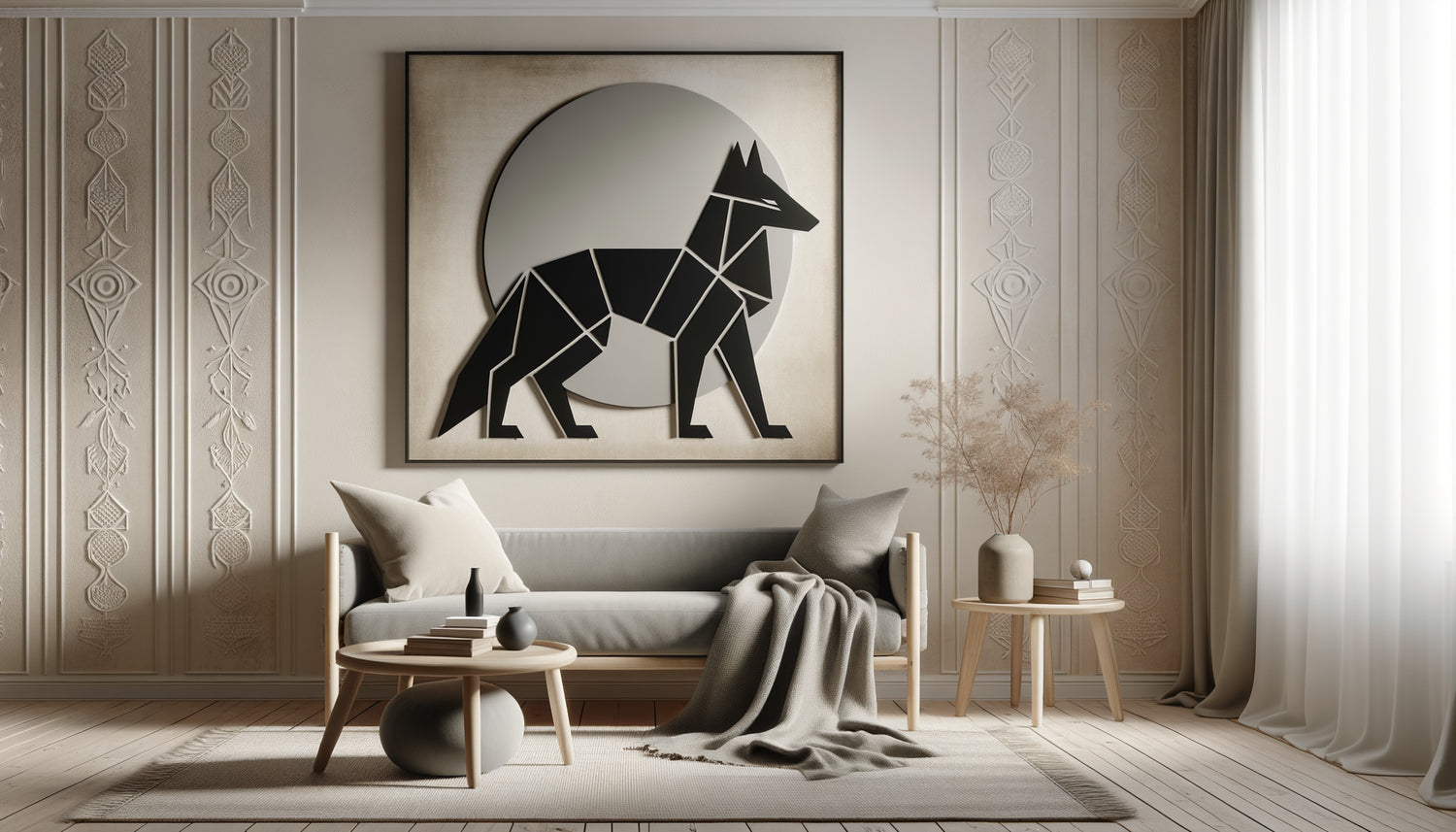
The first style that perfectly embraces the Scandinavian aesthetic transforms Fenrir into pure graphic essence. Imagine the cosmic wolf reduced to its essential lines: a continuous black line on an immaculate white background, or vice versa depending on your wall. These minimalist wall paintings exploit the power of suggestion rather than exhaustive description.
I installed this type of representation in a couple's home in Copenhagen: a stylized Fenrir in geometric, almost calligraphic lines, which dialogued beautifully with their light oak furniture and pearl gray textiles. The narrative force remained intact – one instantly recognized the menacing muzzle and posture of the legendary wolf – but the graphic execution respected Scandinavian purity.
This style works particularly well in open spaces where the wall painting becomes a focal point without visually fragmenting the space. Linear minimalism creates breathing room, a balance between mythological presence and domestic serenity. Favor vertical or square formats to accentuate the architectural effect, and position your Fenrir painting at eye level to maximize emotional impact without saturating the visual field.
The natural palette: earth, stone and Nordic mist
The second style compatible with Scandinavian decor draws on organic tones directly inspired by Nordic landscapes. Forget blood reds and medieval golds: Fenrir wall art that is most harmonious in a Scandinavian context adopts slate grays, sand beiges, deep forest greens, faded glacier blues.
This chromatic approach transforms Fenrir into an earthly creature rather than a fantastic monster. The wolf becomes an extension of the fjords, an incarnation of winter storms, a spirit of boreal forests. For a villa in Aarhus, I selected a wall art depicting Fenrir in Sienna earth and misty gray tones, with touches of off-white. The work integrated as if it had always belonged to this interior of raw wood and natural wool.
Texture counts as much as color in this register. Look for wall art with material effects: slightly grainy canvas prints, matte finishes that absorb light rather than reflect it, sometimes even mixed techniques suggesting watercolor or diluted ink. This soft materiality blends well with the natural surfaces omnipresent in Scandinavian design: crumpled linen, artisan ceramics, polished stone.
How to compose your Fenrir wall
A Fenrir wall art in natural palette works ideally above a low wooden cabinet framed by hanging plants that extend the organic anchoring. Avoid overloading it: Scandinavian philosophy favors negative space. A single artwork large enough (minimum 80x120 cm) always surpasses a hesitant accumulation of small formats.

Symbolic abstraction: deconstructing the legend
Third path particularly relevant for contemporary Scandinavian interiors: wall art that deconstructs Fenrir into abstract symbols. Rather than literally representing the chained wolf, these works evoke its power through intertwined circular forms (the chains of Gleipnir), rough textures (its mythical fur), dynamic compositions suggesting movement and contained threat.
This approach appeals to purists of Scandinavian design who seek intellectual sophistication. The wall art becomes a visual enigma: only initiates recognize Fenrir, creating subtle cultural camaraderie. I installed this type of work in an ultramodern Malmö loft: concentric gray anthracite and off-white circles on a linen background, evoking both the wolf's chains and the waves of a Nordic lake. Magnificent ambiguity.
Symbolic abstraction integrates particularly well into multifunctional spaces – living room-office, kitchen-living room – because its apparent neutrality allows it to traverse zones without creating thematic disruption. It is also suitable for personalities who appreciate mythology without wanting to display it literally, preferring discreet sophistication to ostentatious assertion.
Black and white contrast: Nordic graphic power
Fourth compatible style, that which exploits the radical black-and-white contrast so characteristic of modern Scandinavian aesthetics. These Fenrir wall artworks use flat areas, without gradients, creating compositions of immediate readability and powerful visual impact.
Think of traditional wood engravings, Nordic expressionism, this graphic tradition that favors narrative clarity and direct emotional force. A black and white contrast Fenrir wall artwork brings an architectural presence: it structures the wall as would a exposed beam or built-in bookcase.
This style works remarkably well in interiors with colorful furniture. If your sofa displays a deep blue, your cushions a mustard yellow, or your rugs multicolored geometric patterns, the black and white wall artwork becomes a stabilizing visual anchor. It calms the whole without sweetening it, brings a gravity that balances the chromatic fantasy of textiles.
The invisible framing trick
To maximize the contemporary effect of Fenrir wall artworks in black and white, opt for a frameless mounting: canvas on a thick (3-4 cm) frame with overflowing print on the edges. This technique, typically Scandinavian, eliminates the physical boundary between the artwork and the space, creating an elegant wall continuity.

The illustrative Nordic style: between folklore and modernity
Fifth option for integrating Fenrir into a Scandinavian decor: the contemporary illustrative style which reinterprets traditional iconography with a modern sensibility. These wall artworks borrow from medieval illuminations, runic motifs, Viking interlacing, but translate them into a refined graphic language.
I discovered this approach with a textile designer from Helsinki who collected these hybrid representations: Fenrir was certainly recognizable there, but stylized with slightly shifted proportions, Nordic geometric patterns integrated into its fur, a balanced composition that respected the principles of symmetry and harmony dear to Scandinavian design.
This style is particularly suitable for family spaces – living room, dining room – as it tells an accessible story without falling into childish naivety. Children see a fascinating wolf, adults appreciate the graphic sophistication and cultural reference. The wall artwork then becomes a conversation starter, a starting point for passing on Nordic legends to new generations.
For this style, favor medium formats (60x80 to 80x100 cm) that allow you to appreciate the illustrative details without overwhelming the space. Position them in passageways or gathering areas where their narrative richness will be regularly contemplated.
Ready to invite the power of Fenrir into your Scandinavian interior?
Discover our exclusive collection of Myths and Legends artworks that transform Nordic mythology into contemporary elegance.
Composing the balance: where and how to position your Fenrir artwork
Beyond the graphic style, the successful integration of a Fenrir wall artwork into a Scandinavian decor crucially depends on its spatial positioning and dialogue with the immediate environment.
The Scandinavian golden rule: a monumental wall artwork deserves a breathable wall. Absolutely avoid placing your Fenrir on a panel already cluttered with shelves, multiple lights or other artworks. Nordic design celebrates negative space as an active component of the composition. Your artwork must breathe, surrounded by at least 40 to 60 cm of emptiness on each side.
I observe a recurring mistake: positioning the artwork too high, as if trying to hide it. However, Fenrir symbolizes assumed power, primal force. Place the center of your wall artwork at approximately 145-150 cm from the floor – standard eye level – to create a direct visual confrontation, a dialogue between the mythological creature and the inhabitant.
Lighting radically transforms perception. Ideally, prioritize indirect natural light – a wall perpendicular to a window rather than facing it – which reveals nuances without creating reflections. If you need to add artificial lighting, opt for a discreet track with adjustable spotlights rather than a decorative sconce that would compete with the artwork.
Last tip for perfecting integration: create subtle visual echoes between your Fenrir artwork and other decorative elements. If the work features slate grays, repeat this shade in a throw or cushions. If geometric patterns appear, let them resonate in a rug or ceramic. This chromatic and formal coherence, a hallmark of successful Scandinavian design, transforms the wall art into an organic member of the decorative ecosystem rather than a tacked-on piece.
Imagine your living room in three months: you return after a winter day, the declining light caresses your Fenrir wall art which observes the space with its millennial presence, and you feel that rare satisfaction of inhabiting an interior that tells your story while respecting the timeless elegance of the North. This harmony between mythological heritage and Scandinavian modernity is precisely what a thoughtful stylistic choice allows.
Start by identifying which of the five styles resonates with your personal sensibility. Accurately measure your destination wall. Photograph the space to visualize proportions. And dive in: a well-chosen Fenrir artwork does not simply decorate your Scandinavian interior, it anchors it in a cultural continuity of several millennia.
Frequently asked questions about Fenrir artworks in Scandinavian decor
Could a Fenrir artwork risk making my interior too dark or aggressive?
This concern constantly arises, and I perfectly understand it. Fenrir indeed embodies destruction, chaos, apocalyptic threat in Norse mythology. But remember that Scandinavian design itself was born out of the need to counterbalance long dark winters with bright and welcoming interiors. A well-chosen Fenrir wall art – in minimalist styles, with natural palettes or graphic black and white – brings a controlled dynamic tension rather than an oppressive heaviness. It is precisely this contrast between the softness of your Scandinavian furniture and the symbolic power of the wolf that creates a fascinating balance. Think of it as a bass note in a melody: it adds depth and structure without dominating the composition. The trick? Balance your Fenrir artwork with enough light and natural elements around – blond wood, white textiles, plants – so that the mythological creature becomes a dramatic focal point rather than visual saturation.
What size Fenrir artwork should I choose for my wall without unbalancing the space?
The question of format troubles many of my clients, and the answer depends on a simple but essential calculation. For a standard Scandinavian living room wall, your Fenrir wall art should occupy approximately 50 to 70% of the width of the furniture below (sofa, sideboard, console). Too small, it will appear shy and lost; too large, it overflows visually and creates an imbalance. Specifically, for a 200 cm sofa, aim for a wall art piece 100 to 140 cm wide. If you install your Fenrir on an empty wall without furniture below, the rule changes: the artwork can then be more imposing, occupying up to 40% of the total wall surface. My practical advice? Cut out a rectangle of kraft paper with the intended dimensions and temporarily attach it to the wall with masking tape. Live with this simulation for a few days, observe it at different times, from different angles. Your eye will quickly tell you if the proportions work. Scandinavian interiors breathe through their empty spaces: never sacrifice this breathability for an oversized format.
Can a Fenrir artwork be mixed with other mythological elements or should one remain consistent?
Excellent question that touches on the delicate balance between narrative richness and visual cacophony. In an authentic Scandinavian decor, thematic consistency is extremely important. A Fenrir wall art can absolutely dialogue with other Nordic references – a stylized Yggdrasil in the entrance, discreet runes on a cushion, a minimalist representation of Thor or Odin elsewhere – provided that two cardinal rules are respected. First rule: stylistic unity. If your Fenrir adopts a minimalist linear style, the other mythological elements must share this graphic refinement. Mixing a hyperrealistic Fenrir with an abstract geometric Odin would create a visual dissonance. Second rule: clear hierarchy. Fenrir must remain the centerpiece, the main focal point. The other mythological references then function as subtle echoes, secondary notes that enrich the main melody without competing with it. In practice, limit yourself to two or three mythological elements maximum in the same open space, and space them out enough so that each can breathe. Scandinavian sophistication lies in suggestion rather than accumulation: a magnificent solitary Fenrir artwork is better than a complete Nordic pantheon that would transform your living room into a museum exhibition hall.