


Why Your Wall Art's Sharpness Matters
By the end of this article, you will understand exactly why alu Dibond and acrylic glass reveal every detail with exceptional sharpness, and how to transform your walls into true art galleries.
Why Your Artwork's Sharpness Determines the Atmosphere of Your Interior?
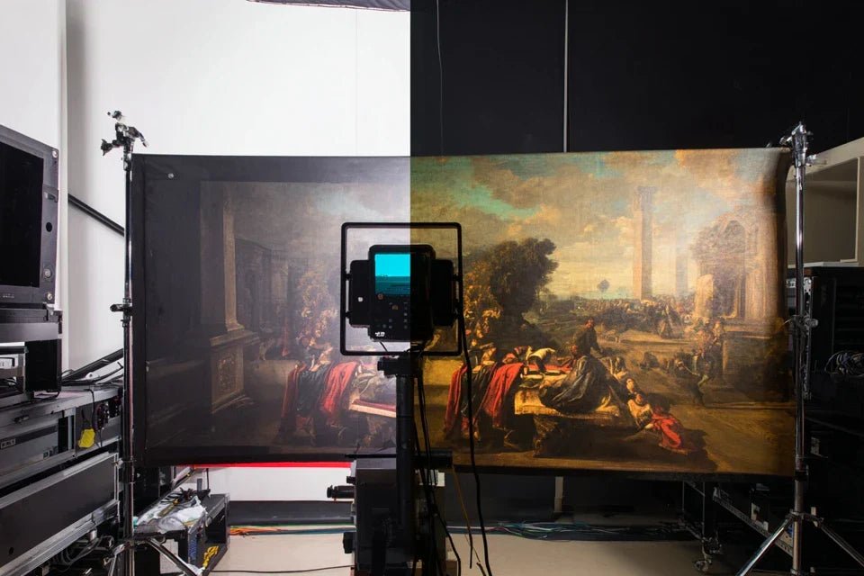
Imagine walking into a living room where every artwork tells its story with crystalline precision. Each brushstroke reveals the artist’s emotion, each nuance of color dialogues with the light. That’s the difference between owning art and living with art. Waiting is accepting that your walls remain flat surfaces rather than windows onto the imagination.
🏡 Customer testimonial: "I hung my Van Gogh reproduction on Dibond after seeing it on canvas for 2 years. It was like discovering the work for the first time! The impasto seemed sculpted, the stars of Starry Night literally shone. My guests now stop in front of it, fascinated by this incredible depth."
💬 Conversation with a Decor Expert
Sharpness transforms a simple artwork into an emotional window: just as clear water reveals the pebbles at the bottom, a reflective support unveils every artistic subtlety. Your guests will notice the difference from the first second, and you will rediscover your works every day.
What's Really Behind That "Artistic Blur" Print
You’re looking at your artwork and something feels off. The image seems "suffocated," the details are lost, and you wonder if it’s your lighting, your eyesight, or if the piece was really that beautiful online.
Rest assured: the problem isn't with your eyes or the original artwork. It's the surface of the support that "eats" the light instead of reflecting it back to you, creating this dull veil effect across the entire piece.
Imagine looking at a landscape through a dirty window versus a crystal-clear one: same landscape, two totally different experiences.
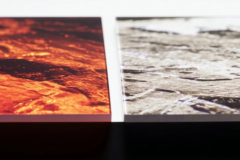
Surface Texture: The Invisible Enemy of Sharpness
Contrary to popular belief, it’s not the print quality that determines the final sharpness, but the support's ability to reflect light uniformly. Rough surfaces scatter rays of light in all directions.
It’s exactly like comparing the water of a lake stirred up by wind to that of a perfectly calm mirror pool: same sun, but only the smooth lake reflects a clear image back at you.
This discovery changes everything in your decor approach: you realize that the beauty of art depends as much on the support as it does on the artwork itself. No more suffering from dull images that no longer inspire you.
🔍 Quick test: Place your hand near your current artwork and see if you notice clear reflections of your fingers on the surface. No reflection? That’s why your details are lost!
Many think that a "matte" support protects from reflection. In reality, matte surfaces absorb up to 40% of the incident light, transforming your vibrant colors into faded versions of themselves.
It’s like wearing sunglasses all the time: everything looks duller, less intense, less lively.
Result? Your guests walk past your artworks without stopping, and you gradually lose the emotion you felt when you bought them. Art deserves better than indifference.
Support Planarity: The Key to Visual Precision
Here’s what no one tells you: invisible micro-undulations create shadows and highlights that fragment the image into thousands of imperfect mini-reflections.
You can check this by looking at your artwork from a low angle with a lamp: you will see all these irregularities that "break" the visual continuity.
That’s why even an HD print on an unsuitable support will always give a disappointing result, while an acceptable image on a perfect support will exceed your expectations.
🎯 The 3 signals of a quality support:
- Uniform mirror reflection: Your face is clearly reflected on the entire surface, like in a calm lake Saturated colors: The colors seem to "pop" out of the support rather than sinking into it
- Sharp details from every angle: The image remains precise even when moving around the artwork
The Dibond and acrylic effect: the revolution of sharpness
The secret lies in the
| ❌ Traditional support |
|---|
| Rough surface that catches the light | Mirror-like perfectly smooth surfaceThe light reflects uniformlyEach detail regains its original sharpness
| Absorption of 30-40% of brightness | Reflection of 95% of the lightNo loss of intensityBright colors and preserved contrasts
| Invisible micro-ripples | Perfect industrial flatnessNo image distortionPixel-by-pixel precision guaranteed
| Dull appearance that fatigues the eye | Subtle brilliance that attracts the gazeThe eye naturally perceives qualityMagnetic presence in your interior
How to choose and optimize your support for maximum sharpness
Now that you understand the mechanism, let's move on to practice.
Step 1: Decipher essential technical characteristics
Let's start with the foundations, because
🔍 The 3 star materials for sharpness
-
Sandwich of ultra-flat aluminum that looks like a silver rigid panel. Its secret? The perfectly flat surface that never deforms. Forget PVC which warps: Dibond remains stable for 20 years. Check the thickness (3mm minimum) to avoid vibrations that blur the image. - Acrylic Glass (Plexiglas): Ultra-resistant transparent plastic that mimics glass without the weight. The principle? The optical surface reflects 95% of incident light. Demand "cast acrylic" (not extruded) to avoid distortions. The result? Your colors seem to literally "float" in front of the wall.
- High-Density Forex PVC: An economical alternative to Dibond, but be careful about thickness! Minimum 5mm otherwise beware of waviness. Its advantage: lightness for large formats. The quality criterion: the surface must feel "glazed" to the touch.
Now let's move on to the practical selection of your ideal support
🎯 How to choose according to your project
Check the flatness of the support: Place a ruler on the surface and see if there is any gap. No space = perfect flatness. This check avoids 90% of disappointments because even 0.5mm of deformation creates blurred areas. Rest assured: all our supports are laser checked!
⏱️ Time: 30 seconds | ✅ Successful when: Ruler in perfect contact over the entire length | ⚠️ Attention: Thin supports warp with humidity - always prefer thickness
Test the light reflection: Bring your lit smartphone close to the surface: your reflection should be clear and bright. A matte surface = loss of 40% brightness. This simple rule avoids unpleasant surprises and guarantees vibrant colors.
⏱️ Time: 15 seconds | ✅ Successful when: Screen reflection perfectly visible | ⚠️ Attention: Some "anti-reflective" treatments kill sharpness - beware!
Evaluate UV resistance: Request the anti-UV certification or look for the "UV stabilized" mention. Crucial to avoid yellowing which dulls whites in 2-3 years. A good support lasts through the decades without alteration.
⏱️ Time: Immediate check | ✅ Successful when: UV certification visible | ⚠️ Attention: Low-end supports yellow quickly in the sun
✨ Final validation: Your ideal support reflects your face clearly, resists finger pressure without flexing, and bears a quality certification. If in doubt about quality, trust your first tactile impression: good materials "feel" the quality.
OUR RECOMMENDED PRODUCTS
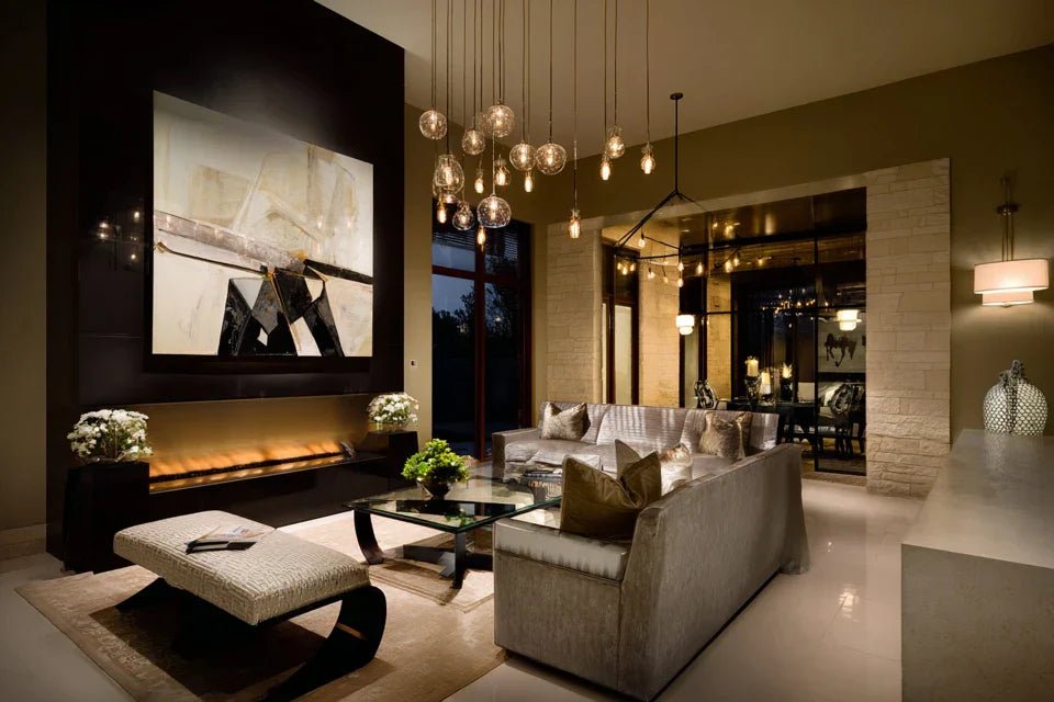
Step 2: Optimize lighting to reveal all the details
Now that you have the perfect support, lighting becomes your brush of light. This is where the magic happens: good lighting transforms a decent painting into a stunning artwork. The effect is immediate and spectacular - your guests will notice it instantly.
💡 Lighting techniques for reflective supportsPositioning the lighting at an angle: Place your light source 30-45° from the artwork to avoid direct reflection while maintaining intensity. This golden rule avoids glare while preserving contrasts. Simple but effective!
Time: 2 minutes of adjustment | ✅ Successful when: No bulb reflections visible | ⚠️ Attention: Frontal lighting = guaranteed blinding reflection
Choose the color temperature: 3000K (warm white) for works with golden tones, 4000K (neutral white) for pure colors. This shade completely changes the ambiance and reveals hidden hues. Test both to see the difference!
⏱️ Time: Instant test | ✅ Successful when: Colors appear natural | ⚠️ Attention: Cool white distorts reds and yellows
Step 3: Position for maximum impact
Final placement determines whether your artwork becomes the focal point of your room or a simple decorative element. Here, you go from amateur to informed collector. The result? An interior that tells your artistic story with elegance and sophistication.
🏠 Optimal positioning rules
Calculate the hanging height: Center of the artwork at 1.60m from the floor (average eye level). This universal height guarantees optimal visual comfort for all your guests. Measure from the center of the work, not from the bottom!
⏱️ Time: 1 minute of measurement | ✅ Successful when: Comfortable vision without tilting head up/down | ⚠️ Attention: Hanging too high = impression of distance
Rule of expertise progression: First master a single artwork perfectly lit and positioned. Once the "wow" effect is achieved, reproduce the formula on your other works. Patience and method beat haste!
You are now able to transform any space into a personal gallery. Here are some professional tips to refine your installation and impress even connoisseurs.
🎨 Gallery secret: Use indirect lighting (LEDs hidden behind a frame or discreet directional spotlight) to create a "halo" around your artwork. This technique enhances the depth effect of Dibond and acrylic supports, creating an almost magical presence in your interior.
🤔 Frequent question from our customers
"Do these supports risk being too 'clinical' or 'modern' for my classic interior?"
I completely understand this concern! Many imagine that "reflective" necessarily means "cold" or "impersonal". In reality, the clarity enhances all artistic styles, from classic to contemporary. A Monet reproduction on Dibond reveals the texture of the brushstrokes with incredible sensuality, while a romantic landscape on acrylic gains emotional depth. The shine remains subtle and warm.
💡 Risk-free test: Order a small piece (30x40cm) first on the medium that intrigues you. You will see that the quality transcends style and naturally adapts to your decor.
The 5 mistakes that sabotage the clarity of your paintings
Even with the best support, some well-intentioned reflexes can ruin all the work. These errors are so common that they seem logical - which is why I prefer to tell you about them now rather than have you discover them through disappointment.
- ⚠️ Cleaning with aggressive products: The desire to "do well" leads to the use of degreasers that microscopically scratch the surface. Result? Gradual loss of clarity. Use only a slightly damp microfiber cloth. This mistake affects 70% of owners!
- 📐 Hanging without a level: "It looks straight to the eye" - but on an ultra-clear support, even the slightest parallelism defect is obvious! Take 30 seconds to check with a spirit level. Your guests will see the difference immediately.
- 💡 Multiplying light sources: More light = better? False! Crossing multiple lights creates parasitic reflections that break the clarity. One well-positioned source is better than three approximate ones.
- 🔄 Changing your mind about the location: Reflective surfaces reveal the slightest impact of fixings. Avoid repeated repositioning which marks the wall and support. Measure, visualize, then hang definitively.
- 🌡️ Ignoring thermal variations: Placing a painting near a radiator or an exposed window dilates the support and can create micro-ripples. Choose areas with stable temperatures to preserve perfect flatness.
🛡️ Quality safety checklist: Clear reflection of your face on the entire surface, no trace after gentle cleaning, painting perfectly horizontal, lighting without parasitic reflection. Warning sign: if you have to squint to see the details, something is wrong!
🎁 Special readers offer
Because you took the time to inform yourself, enjoy 10% discount on your first order:
⏰ Valid for 72h after reading • Applicable to all our products
The difference is
Absolutely! Contrary to popular belief,
High-quality Dibond and acrylic retain their optical properties
Clarity
Standard fixings are sufficient!
In a few weeks, your friends will stop in front of your paintings asking: "Where did you find these works so clear and bright ?" You'll smile realizing that
Beyond decoration, you have acquired
The hardest part - understanding the mechanisms of clarity - is behind you. Now,
✨ Art deserves perfection: Every day spent with dull artworks is a day less lived surrounded by authentic beauty. Your artistic sensibility awaits supports worthy of it!


