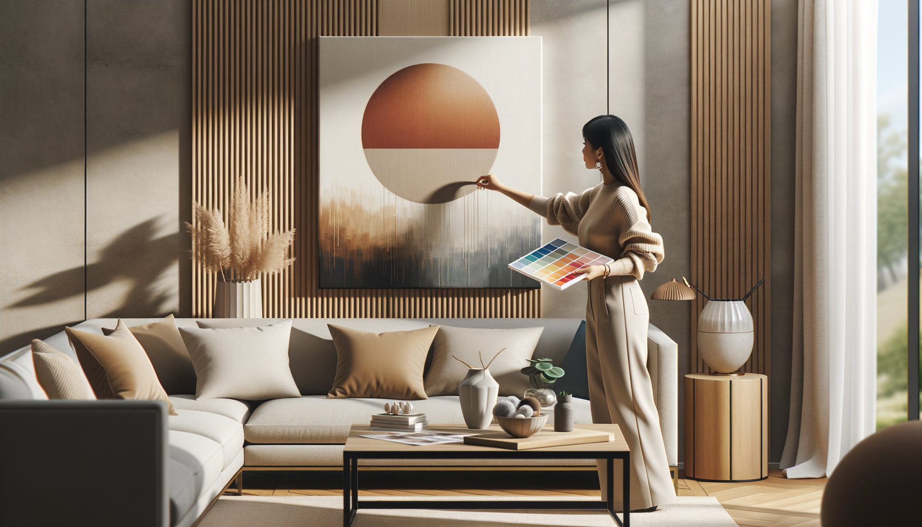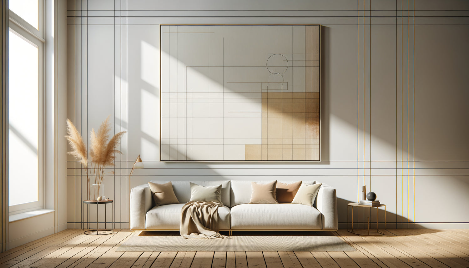
I spent fifteen years visiting contemporary art fairs, from Basel to Miami, advising collectors and institutions on how to hang their acquisitions. And do you know what the mistake I see in 80% of the interiors I visit is? A magnificent painting lost on a huge wall, or conversely, a canvas stifled in a space that is too narrow. The relationship between the size of the wall and the size of the painting is not just a matter of aesthetics: it determines whether your work breathes or suffocates.
Here's what a harmonious relationship between your wall and your painting brings: a work that naturally captures the eye without effort, a space that gains depth and character, and that rare feeling that each element is exactly where it should be. As if the work had always been destined for that specific wall.
You may have already experienced this frustration: you come home with a painting you love, you hang it enthusiastically, and something feels off. The artwork seems to float in the void or, on the contrary, invades the space. You change the height, shift it by a few centimeters, but the discomfort persists. It's not the painting that is the problem, nor your artistic taste. It’s simply that no one has ever explained the proportions that create visual harmony to you.
The good news? There are simple principles, tested on thousands of hangings, which instantly transform the perception of a room. Rules that gallerists apply instinctively and that I am going to pass on to you today, without technical jargon or complicated formulas.
The rule of thirds: the secret of professional hangers
In the world of museum hanging, we apply a golden rule rarely shared with the general public: a painting should occupy between 50% and 75% of the width of the wall it adorns, with an ideal balance point around two-thirds. This proportion is not arbitrary: it stems from decades of observation on how the human eye perceives spatial balance.
Why does this range work so well? Because it creates what I call a visual breathing space. The artwork occupies enough space to assert itself, to tell its story without being interrupted. At the same time, the wall remains present, offering a neutral frame that highlights the colors and composition of your painting. It's like a theater scene: the main actor must dominate, but he needs space around him to fully exist.
Specifically, on a 3-meter wide wall, aim for a painting between 1.50 m and 2.25 m wide. On a 2-meter panel, prioritize a work from 1 m to 1.50 m. These proportions ensure that your painting naturally becomes the focal point of the space, without forcing the gaze or appearing timid.
When wall height comes into play
Width is only half the equation. I've seen collectors choose the perfect width for their painting, then completely lose it on a 4-meter high cathedral wall. The height of the wall directly influences the minimum size of the work to maintain its visual presence.
On a standard wall that is 2.50 m to 3 m high, a painting 60 to 100 cm high works beautifully for a living room. But if your ceiling reaches 3.50 m or more, rarely go below 80 cm in height, otherwise your artwork will disappear into the vertical immensity. The eye needs some visual mass to anchor itself in a generous volume.
A piece of advice I consistently give: the painting should occupy at least one-third of the visible height of the wall between the floor and ceiling. This proportion ensures that the artwork dialogues with the architecture rather than being lost within it. In a loft with 4 meters under the ceiling, don't hesitate to opt for a canvas 120 to 150 cm high that affirms its personality.
The exception of multiple compositions
When you compose a gallery wall with several paintings, the rule changes slightly. The entire composition must respect the proportions we are talking about, not each work individually. Imagine an invisible rectangle encompassing all your frames: it is this rectangle that should occupy 50 to 75% of your wall. This approach allows you to create dynamic installations while preserving spatial balance.

The pitfalls of small spaces and how to avoid them
In a narrow hallway or above a console in an entrance, the rules are relaxed out of necessity. I learned to my detriment that a painting that is too wide in an 80 cm hallway creates a feeling of oppression, even if it theoretically respects the proportions of the wall. In confined spaces, prioritize verticality: a painting that is taller than it is wide guides the eye upwards and gives a sense of space.
For a hallway, limit the width of your painting to 60-70% of the passage width, and focus on generous height. Above a piece of furniture like a console or sideboard, the rule changes again: the painting should measure between 50% and 75% of the width of the furniture it overlooks, creating a visually coherent unity between the two elements.
This furniture rule is crucial. I have seen too many small paintings lost above wide sofas, floating without anchorage in space. If your sofa is 2.50 m wide, your painting (or your composition of paintings) should ideally measure between 1.25 m and 1.90 m wide to create a harmonious relationship between the furniture and the wall art.
The question of the style and subject of the work
Here's a nuance that few people mention: the artistic style influences the ideal proportions. An abstract minimalist painting, with large blocks of color, can afford to occupy up to 80% of the wall because it naturally dialogues with the void. Conversely, a very detailed figurative work, rich in visual information, benefits from a little more breathing room around it.
I have exhibited hyperrealistic works that required this visual distance, this white space around them so that the viewer could absorb all the details without eye fatigue. In these cases, I am happy to go down to 50-60% of the wall width, creating an almost meditative contemplation effect. The work becomes like a window open in the wall, generously framed by the surrounding space.
Tableaux with imposing, ornate frames also require a more conservative approach. The frame itself brings a significant visual mass: if you add a 15 cm wide baroque gilded frame to a canvas, you significantly increase the overall visual impact. Always count the outer dimensions of the frame in your proportion calculations.

The art of adjusting according to the function of the room
In a living room where you spend time conversing, relaxing, the painting can be generous, assert its presence. It is a living space where art contributes to the atmosphere, where it can even become the subject of conversation. Here, don't be afraid of large proportions, of those works that proudly occupy 70% of the wall and impose themselves as aesthetic manifestos.
On the other hand, in a bedroom, the balance shifts towards serenity. More modest proportions, around 50-60% of the wall, create a soothing atmosphere where the work accompanies without dominating. I have noticed that collectors who sleep poorly often move their most imposing paintings to the living room after a few weeks: the art of the bedroom should whisper, not proclaim.
In a dining room, the painting dialogues with the table. Ideally, its width should be close to that of the table or sideboard it overlooks, creating an architectural coherence that visually structures the dining area. This vertical continuity – from furniture to painting – instantly gives elegance to the room.
The particular case of the entrance
The entryway deserves special attention as it’s the first impression of your interior. Here, a slightly oversized artwork, occupying 70-75% of the wall, creates a memorable impact. It's your visual signature, the preamble to the story your interior tells. Don't hesitate to be bold in this transition space.
Find the artwork with the perfect proportions for your space
Discover our exclusive collection of artworks that will transform your walls into harmonious personal galleries.
Test before hanging: the template method
Here's a professional technique I consistently use before hanging an important artwork: the kraft paper template. Cut out a rectangle with the exact dimensions of your artwork, temporarily attach it to the wall with masking tape, and live with it for a few days.
This simulation instantly reveals whether the proportions work in your real space, with your lighting, furniture, and traffic flow. You’ll see if the artwork respects the rule of thirds, if it dialogues correctly with the window next door, if it doesn't obstruct the opening of the door. I have avoided countless costly mistakes thanks to this simple precaution.
Take photos of your room with the template in place, at different times of the day. Natural light changes the perception of proportions: an artwork that seems perfect in the morning may seem too imposing in the evening under artificial lighting. These photographic tests reveal imbalances invisible to the naked eye when you are in the space.
When breaking the rules becomes an aesthetic choice
After fifteen years of applying these proportions, I’ve learned that rules are meant to be understood before being broken. A tiny artwork on a huge white wall can create a striking dramatic effect, a visual tension that intrigues and fascinates. But this boldness only works if it is intentional, assumed, driven by a clear artistic vision.
In minimalist Japanese interiors, a small kakemono on a large expanse of wall embodies the philosophy of ma, this empty space that has as much value as matter. The wall then becomes an active element of the composition, not just a support. But be careful: this approach requires perfect mastery of visual balance and overall coherence throughout the interior.
Similarly, a monumental triptych occupying 90% of the wall in an industrial loft can create a spectacular immersive experience. The artwork almost engulfs the architecture, transforming the wall into a portal to another universe. These radical choices work when the space allows it and the artwork has the power to support this heroic scale.
Conclusion: balance in service of emotion
The right balance between your wall and your artwork isn't a rigid mathematical formula, but a living equilibrium that respects both the architecture of your space and the soul of the work. These proportions – the famous 50 to 75% of the wall width – are not constraints, but safeguards that allow you to express your artistic sensibility with confidence.
Imagine yourself in six months, receiving guests who naturally stop in front of your artwork, drawn by this visual harmony they won't know how to name but will feel deeply. This feeling that everything is exactly in its place, that the work and the wall are one. That's the magic that good proportions create.
So take out your measuring tape this weekend. Measure your walls, calculate these percentages, test with a template. And above all, trust your feelings: if a work speaks powerfully to you, the right proportions will amplify that emotion rather than contradict it.
Frequently Asked Questions
Can I hang a small artwork on a large wall?
Absolutely, but with method. A small artwork alone on a large wall will create a visual tension that may seem unbalanced. Two solutions are available to you: either you assume this minimalist choice by integrating it into a global refined aesthetic approach, or you create a composition by adding other elements around – other artworks, shelves, decorative objects. The entire composition should then respect the 50-75% rule of the wall width. Also think about directional lighting that can create a frame of light around a small artwork, increasing its visual presence without adding physical elements.
How to choose the size of an artwork above a sofa?
The sofa is your main reference point, not the wall itself. Measure the width of your sofa and aim for an artwork (or composition) that measures between 50% and 75% of this width. For a 2-meter sofa, choose a work 1 m to 1.50 m wide. In height, leave ideally 20 to 30 cm between the top of the backrest and the bottom of the frame – this visual breathing space prevents the artwork from appearing crushed on the furniture. If your sofa is very long, consider a composition of several artworks rather than one huge work, which brings rhythm and depth to your wall.
Does the color of the wall change the ideal proportions?
Excellent question! Wall color indeed influences the perception of proportions. On a very dark wall – midnight blue, anthracite gray, forest green – a painting visually occupies more space because the contrast with the frame and white mat is maximal. On these dark walls, you can therefore go down slightly in size, towards 55-65% of the wall width, while still maintaining a strong impact. Conversely, on a white or light wall, the painting blends into the space more and can afford to be a little more generous, up to 75% of the wall width. Colored walls also create a chromatic dialogue with the artwork: a painting in warm tones on a terracotta wall will need less space to assert its presence than a monochrome work on pristine white.