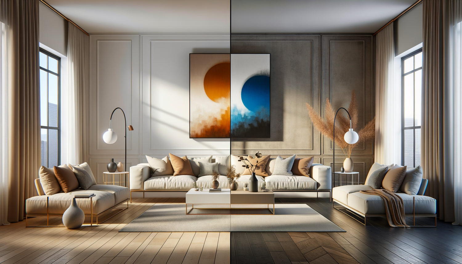
I remember this client who hesitated for three months. In her beige and wood living room, she had two reproductions: a watercolor in the same cream tones, and a flamboyant red abstract canvas. “Which one should I choose?” she asked me, with a pleading look. Her question summarizes the dilemma that 80% of art buyers face in front of their empty wall.
Here's what a well-chosen painting brings to your interior: it creates a consistent atmosphere that soothes or generates an energy that stimulates, it reveals your personality without saying a word, and it transforms an ordinary space into a memorable place. Whether you opt for harmony or contrast, it is your relationship with the space that will be transformed.
You are blocked in front of your sofa, unable to decide between a painting that blends gently or explodes on the wall. You're afraid of making a faux pas, buying a work that clashes, or worse, disappears into the decor. This paralysis is normal: choosing a painting is taking a position on the atmosphere you want to create at home.
Good news: there are no wrong answers. Only choices that correspond or not to your temperament and the use of the room. In this article, I will reveal to you when to favor harmony, when to dare contrast, and above all how to decide based on your personality and your space.
Chromatic harmony: when the painting extends the soul of the place
A painting that matches the furniture works as a natural extension of the space. It picks up the dominant tones of your decor – beiges, grays, deep blues – and amplifies them subtly. This approach creates a visual continuity that envelops the gaze instead of jolting it.
I have seen interiors transformed by this philosophy. A Scandinavian living room in pale tones enhanced by a photograph of a misty forest. A terracotta bedroom sublimated by an abstract watercolor with ocher and sand nuances. In these spaces, the painting does not seek to dominate: it converses with the cushions, dialogues with the rug, whispers to the curtains.
The main advantage? An immediate cocooning atmosphere. The matching painting creates a consistent sensory bubble, perfect for rooms dedicated to relaxation. In a bedroom, this harmony promotes rest. In a home office in neutral tones, it maintains concentration without visual distraction.
The nuances that make the difference
Attention: matching does not mean identical. A navy blue sofa doesn't necessarily call for a completely navy blue painting. Instead, look for tonal variations – a petrol blue, an indigo, a blue-gray. This subtle variation creates depth without breaking the harmony. It’s like wearing a three-piece suit in slightly different shades: elegance comes from controlled variation.
Bold contrast: when art becomes protagonist
Conversely, a contrasting painting asserts itself as the main character of the room. It stands out, challenges, disrupts visual habits. This approach transforms your wall into a magnetic focal point that immediately captures attention.
Imagine a minimalist white and gray interior punctuated by a large painting with vibrant colors – electric oranges, emerald greens, solar yellows. Or a classic dark wood living room energized by a contemporary work with striking geometric shapes. The contrast creates a creative tension that awakens the space.
This strategy works particularly well in neutral or monochrome interiors. If your walls, furniture and textiles play it safe, a contrasting painting injects the missing personality. It becomes the statement accessory, the equivalent of a red leather jacket worn over an all-black outfit.
When contrast reveals your boldness
The contrasting painting requires a certain decorative confidence. It affirms: "I'm not afraid to take a position." In a living room where you entertain, it becomes a formidable conversation starter. In an entryway, it sets the tone from the moment you step inside: here lives someone who dares.
But be careful not to confuse contrast with chaos. The contrasting painting must remain in dialogue with the space, even if it challenges it. Pick up at least one element of the work elsewhere – a color in a cushion, a shape that echoes a lamp. This connecting thread prevents the painting from appearing randomly placed.

The method of three questions to make a decision
Faced with the dilemma, I have developed a simple questionnaire that helps 90% of my clients choose. Take a moment to answer it honestly.
Question 1: What energy do you want in this room? If you are looking for peace, serenity, a refuge after a busy day, lean towards harmony. If you want to stimulate creativity, energize exchanges, provoke an emotional reaction, choose contrast.
Question 2: Is your current decor neutral or already colorful? A neutral-toned interior (white, gray, beige, black) wonderfully supports contrast – it even needs it. A decor that is already rich in patterns, textures and colors will benefit more from a matching painting that unifies without overwhelming.
Question 3 : Do you tend to change your decor regularly? A contrasting artwork can tire you more quickly or force you to adapt your decor around it. A harmonious artwork offers more flexibility: you can change your cushions, rugs or curtains without the whole losing its coherence.
The hybrid approach: the best of both worlds
Here's a secret that few decorators reveal: you don't have to choose a camp. The hybrid approach combines harmony and contrast intelligently.
Specifically? Choose an artwork whose dominant color blends with your furniture, but which incorporates contrasting touches. For example, in a blue and white living room, opt for a work predominantly blue crossed by splashes of gold or coral. This gives you the reassuring coherence of harmony and the stimulating dynamism of contrast.
This technique works particularly well with abstract artworks that blend several tones. They create visual bridges between different elements of your decor while bringing a chromatic surprise that maintains interest.
The 70-30 rule
To succeed with this approach, apply the rule of proportions: 70% of the work in the tones of your decor, 30% in a contrasting color. This distribution creates enough anchorage for the artwork to integrate naturally, while generating enough surprise for it to become memorable.

The fatal mistake that 60% of buyers make
After fifteen years observing the choices of hundreds of clients, I have identified the most common mistake: buying an artwork by default rather than by desire.
This manifests itself as follows: you choose a matching artwork not out of aesthetic conviction, but out of fear of being wrong. Or you opt for contrast not out of love of boldness, but because a magazine told you it was trendy. The result: an artwork that doesn't look like you, which doesn't generate any emotion when you look at it.
The right artwork – matching or contrasting – must provoke a visceral reaction. When you see it on the wall, you should feel something: joy, serenity, excitement, pride. If your only reaction is “At least it doesn’t clash”, keep searching.
Trust your instinct (educated)
Instinct alone can mislead you, especially in a store where lighting and context differ from your interior. But an instinct educated by relevant questions – desired energy, consistency with the decor, ability to evolve – becomes your best ally.
Before buying, visualize the artwork in your space. Take a photo of your wall, mentally project the work, imagine yourself having your coffee while looking at it every morning. This projection often reveals whether you are choosing with your heart or with fear.
Your wall deserves more than just filling
Discover our exclusive collection of wall art that transforms your space into an authentic reflection of who you are.
From theory to your wall: take action
Now that you understand the mechanisms of harmony and contrast, imagine yourself in six months. You come home after a difficult day. Your gaze rests on that painting you finally chose. How do you feel?
If you see yourself smiling, relaxing, feeling a breath of positive energy, then you have your answer. The right artwork is neither one that blindly follows a decorative rule, nor one that defies all conventions. It's the one that creates the right emotion in your daily life.
Start by identifying the three dominant colors in your room. Then ask yourself if you want to celebrate them or challenge them. Trust this intuition fueled by reflection. And remember: a painting is one of the few decorative elements that can be moved, given a second life in another room if your tastes evolve. The mistake is never definitive, but the regret of not having dared can last a long time.
FAQ
Can we mix matching and contrasting artworks in the same room?
Absolutely, it's even a sophisticated approach! The trick is to create a hierarchy: choose a dominant artwork (often contrasting) that becomes the focal point, and complement it with more discreet works (matching) that create harmony. For example, above the sofa, a large painting with bright colors, and on adjacent walls, more neutral works that soothe the whole. This composition creates rhythm without cacophony. Simply ensure you maintain a common thread – a color, a style, an atmosphere – that unifies the collection.
My interior is very colorful, how do I choose an artwork that doesn't overload it?
In a decor already rich in colors, prioritize a painting that picks up one or two existing shades and amplifies them, rather than introducing new ones. Or opt for a black and white work that creates an elegant visual pause amidst the color. Monochrome photographs, engravings, or graphic illustrations work wonderfully in these contexts. They bring structure and allow the eye to rest without sacrificing personality. Think of the painting as an orchestra conductor who harmonizes instruments rather than a new soloist who wants to dominate.
How do I know if a contrasting painting will quickly bore me?
Ask yourself this question: have you always been attracted to the contrasting color, or is it an impulsive crush? If you've always been drawn to red but your interior doesn't yet express it, a contrasting red painting will prolong an authentic passion. If it’s a sudden novelty, wait a few weeks before buying. Visit public places that use this color, observe your reaction over time. A good test: display a temporary reproduction for two weeks. If it still stimulates you after this period, the contrast suits you. If it starts to tire you, you have avoided an unsuitable purchase.