In the suites I have been decorating for twelve years for five-star hotels and private residences, I always notice the same hesitation among my clients: this king-size bed beautifully dressed, this impeccable headboard, and this wall that seems to call for something majestic. But what exactly? A painting that is too small will be lost like a timid note in a symphony. Too imposing, it will overwhelm the atmosphere and disrupt sleep. The perfect dimension transforms a bedroom into a sanctuary.
Here's what a properly proportioned painting brings to a luxury suite: an immediate presence that captures the eye, a visual balance that soothes the mind, and that final touch that differentiates a beautiful room from a true haven of peace.
You have probably already felt this frustration: you invest in exceptional bedding, Italian linen sheets, lighting studied down to the millimeter, yet something is missing. That wall above the bed remains desperately empty or welcomes a work that does not do justice to the whole. This visual dissonance spoils the harmony you are trying to create.
Rest assured, there are proven rules that I systematically apply in my projects. These principles, refined over dozens of prestigious suites, will transform your bedroom into a space worthy of a palace. Today I am going to share with you the exact dimensions, ideal proportions, and secrets that will make all the difference.
The rule of two thirds: the secret of hotel prestige decorators
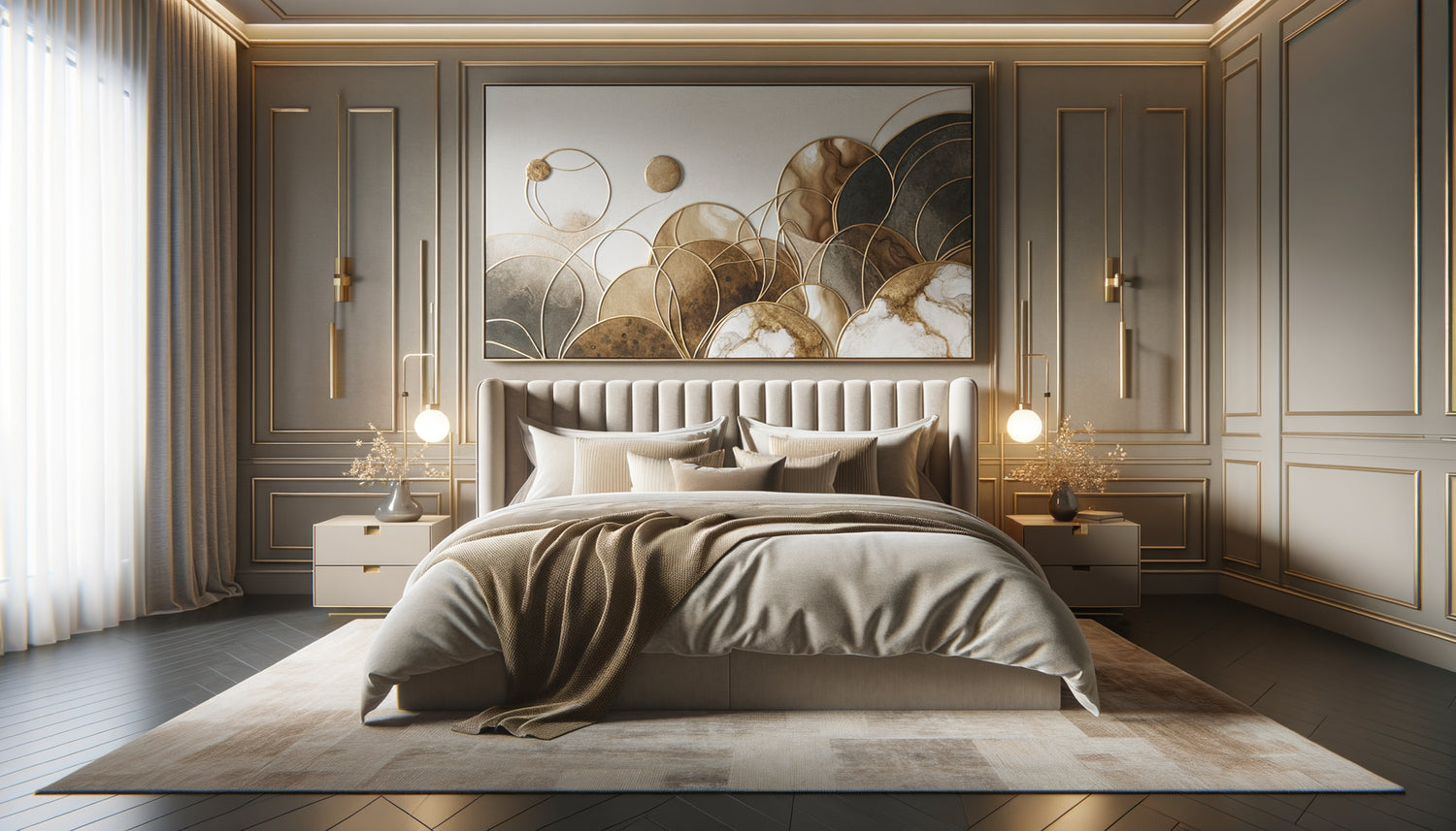
In the world of luxury suites, one rule dominates all others: your wall art should cover between two-thirds and three-quarters of the width of your king-size bed. An American king-size bed is generally 193 cm wide, while a European king-size bed reaches 180 cm. This reference defines everything else.
For a 180 cm king-size bed, prioritize a painting 120 to 140 cm wide. For a 193 cm bed, aim for 130 to 150 cm. These dimensions create what I call the 'visual anchor': the artwork dialogues with the bed without dominating or disappearing. The eye immediately finds its focal point when entering the suite.
I learned this lesson during a difficult project: a Parisian suite with a sumptuous king-size bed and a client who insisted on a large 200 cm painting. The result overflowed on each side of the headboard, creating a feeling of visual clutter. We replaced the artwork with a 135 cm format, and the space literally breathed. The room went from cluttered to majestic in an afternoon.
Height of the painting: the art of creating a sense of space
Width is not everything. The height of your wall art directly influences the perception of volume and the atmosphere of your suite. In my high-end projects, I apply this formula: 60 to 90 cm in height for a horizontal painting, the most harmonious format above a king-size bed.
A panoramic format (55 x 28 inches for example) visually stretches the space, ideal for suites with standard ceilings of 8 feet. It creates a soothing horizontal line that invites relaxation. A more square format (47 x 39 inches) is better suited to bedrooms with high ceilings of 10 feet or more, bringing a vertical presence that balances proportions.
The frequent mistake? Choosing a picture too high that reaches the ceiling. In a hotel suite I was working on in Brussels, the owner had installed a 47 x 60 inch artwork above his bed. Beautiful in a gallery, oppressive in a bedroom. The painting seemed to want to escape upwards, disrupting rest. We replaced it with a 51 x 31 inch format, and customer feedback on sleep quality improved noticeably.

The space between the bed and the artwork: this detail that changes everything
Here's a secret that few decorators share: the space between the top of your headboard and the bottom of the artwork determines the final elegance of your suite. Too much space, and the painting floats without anchorage. Too little, and the whole thing seems stifling.
The ideal distance? Between 8 and 12 inches above the headboard, or 16 to 20 inches above the mattress if you don't have a headboard. This measurement creates what I call the visual breathing zone, enough space for each element to retain its identity while forming a coherent whole.
In luxury suites without a headboard (a growing trend in contemporary hospitality), I adjust slightly: the painting descends 14-16 inches from the mattress to compensate for the absence of vertical structure. This proximity strengthens the visual connection between the bed and the artwork, creating a harmonious block that structures the entire room.
A client from Geneva absolutely wanted to center his painting based on the entire height of the wall, ignoring the headboard. The result: a beautiful work perched 32 inches above the bed, as if suspended in the void. After repositioning at 10 inches from the headboard, the suite regained its balance and intimacy.
Alternative formats: when to break conventions with elegance
The most memorable luxury suites sometimes dare to move away from the single artwork. I have developed three alternatives that work wonderfully above a king-size bed, provided the same logic of proportions is respected.
The balanced diptych
Two paintings of 60 x 80 cm each, spaced 10 to 15 cm apart, create an ensemble 130-135 cm wide. This composition brings a sophisticated visual rhythm, particularly suitable for modern suites. The central spacing avoids monotony while maintaining visual unity. I use this solution in 30% of my current projects.
The majestic triptych
Three paintings of 40 x 70 cm create an ensemble 140 cm wide with the spacing. More daring, this format is suitable for suites with eclectic or artistic decor. The eye travels from left to right, creating a movement that energizes the space without disturbing the calm necessary for a bedroom.
The asymmetrical vertical format
For exceptionally high headboards (120 cm and more), I sometimes dare a large vertical format of 100 x 140 cm. This spectacular option only works in suites with ceilings of at least 3.20 m. The painting becomes a true architectural statement, transforming the bed into a majestic throne.

Adapt the size according to your suite's architecture
Each luxury suite has its architectural personality, and your wall painting should take this into account. The dimensions I have shared with you are a solid basis, but three factors may require subtle adjustments.
Mouldings and panelling : If your bedroom features decorative mouldings or panelling framing the wall behind the bed, slightly reduce the width of the painting (10-15 cm less). The artwork should respect these existing architectural frames, creating a harmony between the old and the new. I learned this lesson in a Lyon mansion where a 140 cm painting was bumping into Louis XVI mouldings. At 120 cm, the ensemble finally breathed.
Wall lights : The presence of wall lights on each side of the bed influences the maximum width. Measure the distance between the two wall lights and ensure that your wall painting does not exceed this width by more than 10 cm on each side. The balance between functional lighting and artwork creates a harmonious overall composition.
Wall color: On a dark wall (midnight blue, forest green, anthracite gray), favor a slightly larger artwork (+ 10 cm) to compensate for the visual absorption of the dark color. On a white or light wall, strictly adhere to the two-thirds rule to avoid the artwork dominating too much.
Dimensional errors that ruin the luxury effect
After more than a decade correcting unfortunate choices, I can instantly identify the mistakes that turn a promising suite into an ordinary space. Three faults recur systematically.
The timid artwork: A 60 x 80 cm format above a king-size bed of 180 cm. This disproportion gives the impression of a hastily furnished space, without reflection. The artwork floats, lost on this large wall, unable to create the necessary visual anchor. Even an exceptional work loses its impact under these conditions.
The unsuitable portrait format: A vertical artwork (e.g., 80 x 120 cm) above a horizontal king-size bed creates a visual conflict. The eye naturally seeks horizontal lines in a bedroom, the ultimate space for relaxation. This vertical format creates a subconscious tension that undermines the feeling of relaxation.
The disordered accumulation: Five or six small artworks arranged as a wall gallery. This Instagram trend works in a living room, rarely in a luxury suite. The eye finds no rest, the wall becomes chatty, and the atmosphere of sanctuary disappears. Sophistication lies in restraint.
Transform your suite into a sanctuary of refinement
Discover our exclusive collection of artworks for luxury hotels that perfectly respect these essential proportions to enhance your relaxation space.
Visualize before investing: the professional method
Before drilling the slightest hole in your wall, I always apply this simple technique which avoids 90% of sizing errors. Take kraft paper or newspaper and cut out a rectangle to the exact dimensions of your contemplated artwork. Temporarily fix it to the wall with repositionable adhesive tape.
Live with this simulation for 48 hours. Observe it in the morning when you wake up, in the evening before going to sleep, under different lighting conditions. Your intuition will speak to you: too imposing, too discreet, perfect. This method has spared me countless returns and costly adjustments. A client from Monaco realized that his initial choice of 160 cm completely overwhelmed his bedroom, while a format of 135 cm created the balance he was looking for.
Also photograph your simulation with your smartphone from the entrance to the bedroom. The camera lens reveals disproportion that our eye naturally accommodates. This objective view will give you final confirmation before purchase.
Imagine your suite tomorrow morning: you open your eyes and immediately encounter this perfectly proportioned artwork, neither dominant nor timid, which dialogues with your king-size bed in a soothing visual harmony. Every dimension has been considered, every centimeter counts. Your bedroom is no longer simply a place to sleep, but a space that nourishes your senses and respects your need for beauty. Measure your bed today, apply the two-thirds rule, and give yourself this transformation that your daily life deserves.
Frequently Asked Questions About Dimensions of Paintings Above a King-Size Bed
Can I use several small paintings instead of one large painting above a king-size bed in a luxury suite?
Yes, absolutely, provided you respect the same overall proportion rule. The entire composition (paintings + spaces between them) should cover 120 to 140 cm in width for a standard king-size bed. I particularly recommend the diptych (two identical paintings) or triptych (three paintings) as they create a consistent visual unity. The spacing between each painting should not exceed 10 to 15 cm to maintain cohesion. However, avoid accumulating more than three paintings: beyond that, the eye loses its guiding thread and the peaceful atmosphere essential for a luxury suite disappears. Always think in terms of visual rhythm rather than collection: your wall should tell a fluid story, not exhibit a catalog. This approach works particularly well in contemporary suites where symmetry and repetition create a strong visual signature.
What is the ideal height to hang a wall painting above a king-size bed with a high headboard?
For a tall headboard (100 cm and more), consistently maintain a space of 20 to 30 cm between the top of this headboard and the bottom of your painting. This rule does not change, regardless of the height of your headboard. What adjusts is potentially the height of the painting itself: with a very tall headboard, you can afford a slightly higher painting (up to 100 cm in height) without risking an overwhelming effect, provided that your ceilings are more than 2.80 m high. I worked on a suite with a tufted headboard 120 cm high: we installed a 130 x 90 cm painting 25 cm above it, and the result created a true architectural statement. The whole formed a majestic block that structured the entire room. Always measure from the highest point of your headboard, even if it has curves or ornaments.
Can a painting that is too large really affect sleep quality in a luxury suite?
Absolutely, and it’s an aspect I take very seriously in my high-end projects. An oversized artwork creates what environmental psychologists call visual cognitive load. Your brain, even at rest, continues to process the visual stimuli of your immediate environment. An artwork that overflows the bed significantly, rises too high towards the ceiling, or whose colors are too aggressive for its dimensions, keeps your nervous system in a state of slight alert. I have documented several cases where simply replacing an overly large artwork with a correctly proportioned format has improved subjective sleep quality according to occupants. A suite is not an art gallery: it should promote letting go and relaxation. An artwork with the right proportions acts as a soothing focal point that visually closes the space without dominating it, unconsciously creating a feeling of safety and control that promotes falling asleep. That’s the difference between admiring a work and being overwhelmed by it.