

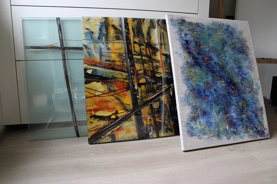
You’ve finally found the perfect artwork for your living room, the one that makes you vibrate with every glance. But here's the thing: three support options are available and it's impossible to choose. Acrylic glass, aluminum Dibond, canvas... Salespeople bombard you with technical terms without explaining what really changes in your daily life.
As a result? You hesitate for weeks, fearing to waste your investment with a bad choice. What's worse, you can already imagine your disappointment if the colors fade, if the hanging is not secure, or if the rendering does not match your expectations.
You’ve probably already tried to compare yourself, by browsing through dozens of contradictory reviews on the internet. Some swear by acrylic glass for its shine, others by canvas for its authenticity, still others by aluminum Dibond for its modernity.
It's normal to be lost: each support has its advantages, but no salesperson takes the time to analyze your personal situation. The real reason for this confusion? You are presented with technical characteristics without being explained the concrete impact on your decoration and daily satisfaction.
By the end of this article, you will know exactly which support to choose according to your room, your budget and your priorities. No more hesitation: you will order with confidence and fully enjoy your new work of art.
Why choosing the right support determines 80% of your satisfaction?
Choosing the right support now avoids regrets for years. A bad material choice can turn your artistic crush into a source of daily frustration. It's like buying the car of your dreams with bad tires: the overall experience suffers. The opportunity? Make the right choice today and transform your space into a personal gallery that inspires you every day.
🏠 Customer testimonial: Sarah ordered a magnificent landscape on canvas for her bright dining room. After 6 months, the colors began to fade near the bay window. She should have opted for anti-UV acrylic glass, which is more resistant to direct light. Today she has replaced her painting: avoidable double investment.
💬 Conversation with a decor expert
The golden rule of wall decor: The perfect support is the one that makes its presence forgotten while sublimating the artwork. Your gaze should go directly to the art, not the frame or the material. Visible result in 24h: your room instantly gains sophistication.
Let's decode what's really going on in your head
You find yourself in one of these situations? You stay frozen in front of three options wondering "what if I’m wrong?”. You browse ten different sites and leave even more confused than before. You postpone your purchase “waiting to better understand”.
What's really happening: your brain seeks security above all. It prefers to put off rather than risk disappointment. It’s not a lack of decision on your part, it’s a normal protective mechanism facing an important decor investment.
It's like choosing wine in a cellar: without knowing the characteristics of each grape variety, it is impossible to know which one will perfectly accompany your meal.
First misconception: “The more expensive, the better”
False! The most expensive support is not necessarily the most suitable for your situation. The difference between believing in price and choosing according to needs? It’s like buying a Ferrari to go to the supermarket and choosing the ideal vehicle for its use.
Concrete example: acrylic glass costs more than canvas, but in a room without direct light, canvas will be warmer and perfectly suited.
Impact on your decision: you will invest just what is necessary, without wasting money, and obtain exactly the desired effect. Your approach changes: you first think about usage, then budget.
🔍 Quick test: Look at your wall and note the lighting at different times: morning, noon, evening. If there is direct light for more than 4h per day, eliminate traditional canvas from the start. You have just refined your choice in 2 minutes!
Authenticity does not depend on the support but on the quality of the print and the final rendering. A poorly stretched or low-quality canvas distorts the artwork more than excellent acrylic glass. It's like comparing a good ebook to a paper book with pages that are peeling off.
Speaking metaphor: authenticity is when emotion passes. A high-definition acrylic glass reproduction can convey more emotion than a medium-quality canvas.
Practical consequence: you will feel more daily pleasure with a support that perfectly reveals the colors than with a “traditional” support that tarnishes them. Solution preview: choose according to the final rendering rather than according to conventions.
Third misconception: “Alu Dibond is cold and industrial”
Error! Modern Dibond allows for incredible finishes, particularly for photography and contemporary art. Concrete example: a natural landscape on matte Dibond reveals details invisible on canvas, with a striking depth.
How to spot it in your situation: if you like clean lines, minimalist interiors or large wall surfaces, Dibond might surprise you. Practical tips: white walls, designer furniture, LED lighting.
Daily impact: your decor becomes more modern without losing human warmth. The well-chosen Dibond brings a subtle sophistication that enhances your taste.
3 signals that betray the right support for you:
- Your first instinct when entering the room: Do you look at the light first? Opt for acrylic glass. Textures and materials? Canvas will delight you.
- Your way of choosing your clothes: Do you prioritize comfort? Canvas. Impeccable style? Acrylic glass. Assumed originality? Dibond.
- Your previous decor purchases: More design and contemporary? Dibond. More warm and traditional? Canvas. More luxurious and timeless? Acrylic glass.
The trigger factor: the lighting in your room
The lighting determines 70% of the relevance of your choice. It's a domino effect for wall decor: the right support, enhanced by the right lighting, completely transforms the atmosphere. Concrete clues: south-facing windows = acrylic glass, subdued lighting = canvas, LED spotlights = matte Dibond.
Law of decorative harmony: The perfect support amplifies existing lighting without being subjected to it. Immediate test: photograph your wall at midday with your smartphone. If the photo is overexposed, avoid shiny surfaces.
| ❌ What we believe | ✅ The reality | 💡 Why | 🎯 Your benefit |
|---|---|---|---|
| Acrylic glass is plastic-like | It offers crystalline transparency | Technologies have evolved over 20 years | Vibrant colors that last |
| Canvas is always warmer | It depends on the quality and pattern | A poor canvas tarnishes more than it warms | The real criterion: the emotion felt |
| Dibond is too modern | The matte finish adapts to all styles | It's the finish that creates the atmosphere | Subtle sophistication guaranteed |
| The more expensive it is, the better it is | The right choice = matching needs/usage | Each support excels in its field | Optimized investment, maximum satisfaction |
The 3-step method to choose without regret
Rest assured: choosing the right support becomes simple with the right method. No more guessing or comparing abstract technical characteristics. This logical progression leads you from analyzing your space to ordering with confidence. Like building a house: first the foundations (analyze the environment), then the walls (define your priorities), finally the finishing touches (choose the perfect support). Guaranteed result: a choice aligned with your tastes and lifestyle.
🎯 Method Overview: Step 1: Space Audit (5 min) → Step 2: Define Your Priorities (3 min) → Step 3: Select the Optimal Support (2 min). Logic: from environment to personal choice. Result at each step: more clarity, less hesitation.
Step 1: Analyze Your Space Like a Pro
Starting with space analysis guarantees a choice adapted to your daily reality. It's like planting a tree: analyzing the soil first ensures harmonious growth. Once this step is complete, you will already feel relieved: no more doubts about compatibility with your interior.
What You Need for the Audit
- Your smartphone: To photograph the wall at different times of the day. This reveals lighting variations invisible to the naked eye. Where to find it? In your pocket! Quality criterion: automatic mode is sufficient. Why not a professional camera? Your smartphone faithfully captures the reality of your daily lighting.
- A meter or ruler: To measure available space and anticipate visual impact. The principle: the ideal table/wall ratio for perfect balance. Quality tip: accuracy to the centimeter. Impact on result: avoids the "stamp" or "overwhelming" effect.
- Your recent lighting bills: To identify bulb type and color temperature. Why is this important? Each lighting reveals colors of the artwork differently. Visible benefit: perfect chromatic harmony between lighting and work.
Let's move on to practice now, it's simpler than you think.
How to Proceed Concretely
Photograph your wall at key times: Take 4 photos of the wall in question: 9am, 12pm, 4pm and 8pm (artificial lighting). Reason: reveal variations in intensity and color temperature. Technical detail: keep the same framing to objectively compare. Reassurance: even with a basic smartphone, you will get the essential information.
⏱️ Time: 5 minutes spread over a day | ✅ Successful when: You clearly see the differences in lighting between photos | ⚠️ Attention: Avoid days of strong sun or very cloudy weather which distort the usual analysis
Measure and visualize impact: Note the exact dimensions of the wall and imagine 3 different table sizes. Goal: anticipate the visual effect and balance of proportions. Tip: use newspaper to simulate the size on the wall. Confidence: this visualization avoids 90% of proportion errors.
⏱️ Time: 3 minutes | ✅ Successful when: You clearly visualize the impact of each size | ⚠️ Attention: Don't neglect the space around: you need to breathe!
Identify your lighting type: Check the room's bulbs and note their temperature (warm 2700K, neutral 4000K, cool 6500K). Objective: choose a mount that harmonizes with your lighting. Simple technical info: it’s written on the bulb or packaging. Obvious: no need to become an electrician, basic information is enough.
⏱️ Time: 2 minutes | ✅ Success when: You know the warm/cool trend of your lighting | ⚠️ Attention: Mixed lighting? Note the most used in the evening
✅ Validation of step 1: You have a clear vision of your luminous and spatial environment. Checks: telling photos, visualized proportions, identified lighting. If you doubt the interpretation: rely on your first impressions, they are often right. Encouragement: this solid foundation greatly facilitates the rest!
OUR RECOMMENDED PRODUCTS
Step 2: Define your true priorities
Now that you know your environment, clarify what really matters to you. This step makes the difference between a logical purchase and a successful emotional purchase. The snowball effect: clear priorities accelerate decision-making and reduce future regrets.
Personal reflection tools
- Your realistic budget: The amount you can invest without financial stress. What does it look like? A number that lets you sleep soundly. Usage: avoid default choices or overspending. Quality criterion: include 20% margin for discovered options. Cheaper alternative not recommended: set a budget too tight which limits possibilities. Your existing decor references: Photos of decorations that inspire you (magazines, Pinterest, at friends' homes). Operating principle: reveal your deep tastes beyond trends. Quality index: you naturally project yourself into these atmospheres. Final impact: guaranteed consistency with your decor personality. Your real lifestyle: Frequency of receptions, presence of children, animals, cleaning habits. Presentation: practical factors that influence the choice of support. Importance: avoid materials unsuitable for your daily life. Visible benefit: daily satisfaction and easy maintenance.
Personal clarification actions
Prioritize your criteria: Rank in order of importance: durability, aesthetics, budget, ease of maintenance, originality. Purpose: identify your buyer profile and avoid frustrating compromises. Simple method: imagine having to sacrifice a criterion, which one would you abandon last? Serenity: this hierarchy naturally guides you towards the right choice.
⏱️ Time: 3 minutes of honest reflection | ✅ Successful when: You have a clear and assumed top 3 | ⚠️ Attention: Avoid wanting everything as priority #1, this will paralyze your choice
Project yourself in 2 years: Imagine your artwork in your future daily life, potential moves, decor evolutions. Reason: to verify the durability of your choice and avoid impulsive purchases. Technique: visualize 3 scenarios for the evolution of your interior. Confidence: this projection avoids 80% of deferred regrets.
⏱️ Time: 2 minutes of introspection | ✅ Successful when: You see yourself satisfied in the long term | ⚠️ Attention: Do not anticipate too much: 2 years is enough as a horizon
Step 3: Choose your support with the right keys
Armed with your environmental audit and clarified priorities, the choice becomes obvious. This final step leads you from hesitation to conviction. Visible result: you order with enthusiasm, already visualizing the artwork in your interior.
Simplified decision algorithm
Apply the dominant lighting rule: Intense direct light + priority for durability = acrylic glass. Soft lighting + priority for warmth = canvas. Modern LED lighting + priority for style = Dibond. Reason: lighting reveals or betrays the chosen support. Technical principle: each material has its comfortable luminous zone. Evidence: respecting this rule guarantees an optimal rendering.
⏱️ Time: 1 minute of application | ✅ Successful when: A support stands out naturally | ⚠️ Attention: Mixed lighting? Prioritize the evening light (relaxation time)
Validate with the coherence test: Does your choice correspond to your 3 main priorities and your analyzed environment? Objective: avoid inconsistencies between analysis and decision. Verification method: if you have to justify your choice to a friend, do the arguments come naturally? Security: this consistency guarantees lasting satisfaction.
⏱️ Time: 30 seconds of verification | ✅ Successful when: Everything aligns logically | ⚠️ Attention: Inconsistency detected? Go back to step 2 without guilt
Final validation rule: The right choice makes you smile when you imagine it at home. Objective criteria: consistency with the audit + respect for priorities + personal enthusiasm. Recommended patience: take 24 hours to step back if hesitation persists. Justified ambition: aim for daily satisfaction, not theoretical perfection.
Congratulations! You now master the subtleties that even some decorators ignore. These nuances of an expert make the difference between a satisfactory purchase and a choice that delights you every day. Advantage over other buyers: you avoid marketing traps and choose with full knowledge of the facts.
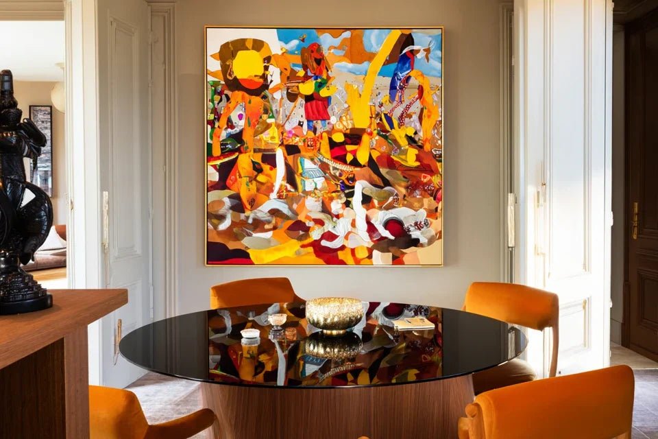
🎨 Gallery insider tip: The rule of three distances. Admire your future artwork from 3 meters (overall view), 1 meter (normal appreciation) and 30 cm (details). The perfect support beautifully reveals the work at all three distances. Why is it so effective? It simulates all your daily uses of the painting. Example application: eliminate the support that creates annoying reflections at 1 meter (conversation distance).
🤔 "What if I change my decor in a few years?"
"I love this artwork but I'm afraid it won't fit if I redo my decor..."
This concern is perfectly legitimate and reveals a thoughtful approach to your investment. Rest assured: an artwork chosen with the heart adapts to 95% of decor evolutions. It’s like a beautiful jewel that enhances all your outfits: authentic emotion transcends trends. Practical advice: prioritize timeless supports (acrylic glass, matte Dibond) which naturally harmonize with all styles. Encouragement: your artistic crush will probably be the starting point of your future decoration, not its constraint!
💡 Longevity test: Imagine your artwork in 3 different decor universes (modern, classic, bohemian). If it pleases you in at least 2 styles, go for it! Result obtained: the certainty of a durable investment that will evolve with your tastes.
The 5 mistakes that ruin even the most beautiful artwork
Attention, these mistakes are common but perfectly avoidable. I share these pitfalls to protect you from disappointments I have seen too often. Good news: knowing them already protects you!
- ⚠️ Choosing according to the lowest price: It's tempting to "get a deal" on a cheaper support. Concrete consequence: you get a dull rendering that disappoints you daily, forcing you to repurchase. Alternative: invest 30% more in the right support for 10 years of satisfaction. Reassurance: this "mistake" concerns 50% of first-time buyers.
- ⚠️ Ignoring your room's lighting: Many choose based on pure aesthetics, without considering their luminous environment. Concrete result: washed-out colors or annoying reflections that spoil the desired effect. Good practice: always mentally test the rendering under your lighting. Comfort: very common mistake of beginners, easily avoidable now.
- ⚠️ Underestimating the impact of proportions: Tempting to take "bigger for a bigger effect" without measuring the visual balance. Visible consequence: crushing or disproportionate effect that disrupts the harmony of the room. Simple solution: respect the rule of 2/3 (the artwork covers 2/3 of the available wall space). Normality: even decorators sometimes make this mistake at first. ⚠️ Neglecting future maintenance: It's a pitfall to choose solely based on "love at first sight" without considering upkeep. Practical impact: growing frustration with marks and dust that are difficult to clean. Prevention: incorporate ease of cleaning into your selection criteria. Encouragement: this anticipation makes you an informed buyer.
- ⚠️ Letting trends dictate your choices: It's tempting to follow the latest trend rather than your deep-seated tastes. Predictable result: rapid fatigue and costly desire for change. Personalized approach: choose first according to your personality, then adjust based on trends. Truth: this mistake even affects experienced decor enthusiasts.
🛡️ Anti-regret verification system: Before validating: does your choice respect your comfort budget? Does it harmonize with your lighting? Do the measured proportions match? Can you see yourself happy with it in 2 years? Warning signs: persistent hesitation, complicated justifications, significant compromises on your main priorities.
🎁 Special offer for readers
Because you took the time to inform yourself, enjoy 10% discount on your first order:
⏰ Valid for 72 hours after reading • Applicable to all our products
❓ Your most frequently asked questions about supports
Allow 40-60€ for a canvas 60x80cm, 80-120€ for an equivalent Dibond, 100-150€ for an acrylic glass. This difference reflects the quality of materials and the complexity of manufacturing. Budget optimization: start by defining the use (passageway room = canvas sufficient, main living room = invest in acrylic glass). Concrete example: for a living room painting viewed daily, the 50€ extra for acrylic glass is worth it in satisfaction over 10 years.
Quality canvas: 8-15 years depending on light exposure. Dibond: 15-25 years with excellent stability. Acrylic glass: 20-30 years, maximum resistance. Key factor: the environment (humidity, UV, temperature) influences more than the material itself. Optimization tip: a premium canvas in good conditions outperforms a low-end abused Dibond. Reassurance: all our supports are guaranteed against manufacturing defects.
Yes, considerably! A quick wipe with a slightly damp microfiber cloth is enough to restore the original shine. Comparison: canvas fears moisture and accumulates dust in the fibers, Dibond cleans well but shows fingerprints. Pro tip: clean the acrylic glass in circular motions with ammonia-free window cleaner. Realistic frequency: monthly cleaning maintains an impeccable appearance, versus weekly dusting necessary for canvas.
Each support has its own characteristics but nothing insurmountable. Canvas: lightest, standard hanging with nails or screws according to size. Dibond: discreet rail system on the back, solid wall mounting recommended for large formats. Acrylic glass: a little heavier, provide fixings suitable for the weight (molly anchors for partitions, chemical anchors for concrete). Practical advice: our paintings always include the appropriate hanging system and detailed explanatory notice.
Your new expertise will transform your decor choices
In a few weeks, when you admire your perfectly chosen painting, you will realize the value of this informed decision. Your new reality: no more paralyzing hesitation in front of a support choice, no more regret after purchase. This confidence gained radiates on your other decor decisions: you develop a sure eye and a methodical approach that impresses those around you.
Beyond the simple painting, you have just acquired an analysis method applicable to all your decor purchases: analyze the environment, clarify priorities, choose consistently. These transferable skills transform your general approach to interior design: exit impulsive purchases, place for thoughtful investments. Impact on your confidence: you fully assume your aesthetic choices and create an interior that truly resembles you.
Now that you master the technical subtleties, the most rewarding step awaits you: choosing your artistic favorite. Your first concrete action? Go back and look at that painting that caught your eye and apply your new analysis grid. Final encouragement: this expertise gives you the assurance of creating an interior that tells your story and inspires you every day!
🌟 Your transformation starts now: You move from confusion to informed choice, from hesitation to conviction. This mastery is definitively acquired: it will accompany you in all your future decoration projects. Visualize your satisfaction in 6 months: a harmonious interior that perfectly reflects your personality!


