

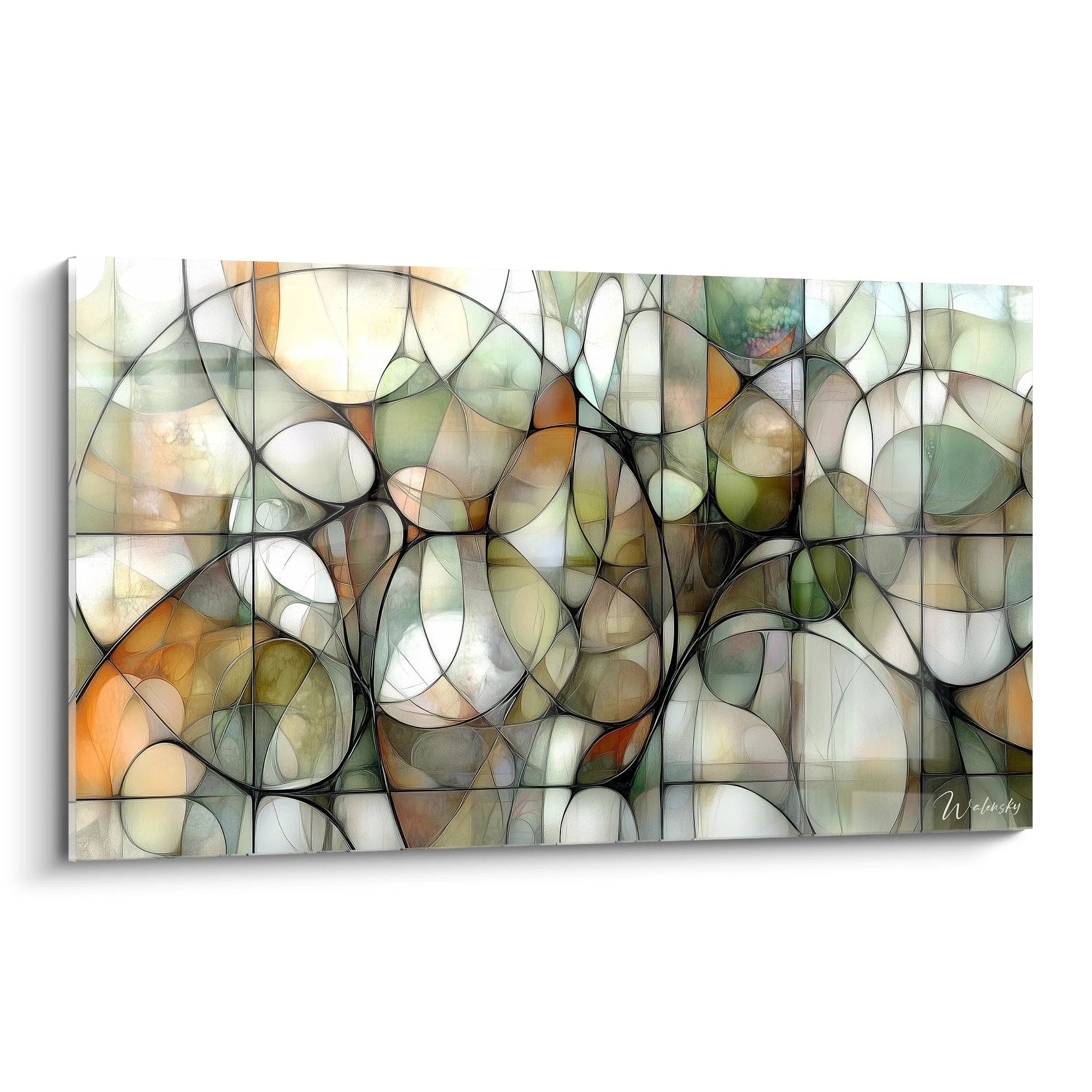






The Impact of Artificial Light on the Appearance of Your Wall Art
October 11, 2025 · 16 min read · by Walensky
The golden rule of art lighting: Your light should reveal the artist's intention, not mask it. Good lighting makes colors "sing" and gives depth to textures in 24 to 48 hours of visual adaptation.
What really happens when you improperly light your paintings
Perhaps you recognize yourself in these situations: your guests never notice your artwork, the colors seem different depending on the time of day, or you avoid turning on certain lights because they "kill" the artistic ambiance of your interior.
This isn't a problem of taste or budget. It’s that your artificial lighting is fighting against your decor instead of enhancing it. Like a musician playing in poor acoustics, your painting cannot express its beauty.
Imagine a chef preparing a refined dish in a poorly lit kitchen: even the best ingredients couldn't reveal their potential. That’s exactly what happens to your wall art.
Color temperature: the invisible enemy of your paintings
Here’s what almost no one tells you: each bulb emits light with a specific "color temperature." A cool light (6000K) will favor blues and extinguish reds, while a warm light (2700K) will enhance golden tones but dull greens.
It's like wearing colored sunglasses: you see the world, but not in its true colors. Your modern painting with cool tones under halogen lighting will lose all its modernity and visual impact.
You never fully enjoy your artistic investment, and your guests don’t understand why you chose this artwork. Your wall decor becomes bland instead of being the focal point of your room.
🔍 Quick test: Illuminate your painting with your phone's flashlight, then with a bedside lamp. You’ll instantly see how color temperature transforms the appearance of your artwork.
The angle of lighting: why your details disappear
Most people place their lighting directly in front of the painting, creating glaring reflections on the surface. It’s like looking at a phone screen in full sunlight: impossible to distinguish the details.
Think of a professional photographer: they never place their flash directly facing the subject, but slightly off-center to create relief and avoid reflections. Your painting deserves the same attention.
You lose all the richness of textures and impasto that bring the artwork to life. Your painting becomes flat, without depth, like a simple reproduction.
The quality of light: the factor no one sees
Here’s the secret known by gallerists: not all "white" lights are created equal. Some cheap bulbs emit only a few colors of the spectrum, creating "gaps" in the color rendering.
You can notice it by observing your clothes under different lighting conditions: some reveal all the nuances, while others make them appear dull or faded. Your painting undergoes exactly the same treatment.
Result: your artwork loses its color richness and emotional impact. You only see a "depleted" version of what the artist created.
🎯 The 3 signs of bad artistic lighting:
- Your colors seem "flat" in the evening: Your artificial lighting has an insufficient color rendering index (CRI), like watching fireworks through a gray filter
- You see your reflection in the painting: The lighting angle is too direct, creating a "mirror" effect that masks the artwork like a windshield in sunlight
- Details disappear depending on the time: Your lighting lacks directionality, creating a "flat" light that doesn't sculpt reliefs like a landscape under a cloudy sky
Light intensity: the art of perfect dosage
The decisive factor is not to have more light, but to have the right intensity in the right place. Too little, and your painting drowns in shadow. Too much, and you create a "headlight" effect that destroys the harmony of the room.
The rule of three: Your painting should receive 3 times more light than the surrounding wall to create a natural and pleasing highlighting effect.
| ❌ Inadequate lighting | ✅ Optimized lighting | 💡 Mechanism | 🎯 Visual result |
|---|---|---|---|
| Cold white neon direct | 3000K warm white LED + diffuser | Complete spectrum without an aggressive blue peak | Natural and warm colors |
| Spot facing the painting | Oblique lighting at 30-45° | Avoids reflections and reveals textures | Striking depth and relief |
| Same intensity everywhere | Focused gradation | Contrast that guides the eye | Painting that "pops" naturally |
| General lighting only | Dedicated lighting + ambiance | Light specific to art | Professional highlighting |
The progressive method to reveal the beauty of your paintings
Now that you understand the mechanisms, here's how to transform your lighting step by step. Like a photographer adjusting their camera, you will adjust each parameter to reveal the potential of your wall art. In three logical steps, you will get a result worthy of an art gallery.
🎯 Overview of the transformation: We'll proceed like a professional lighting technician: first analyze your painting and its environment, then choose the appropriate technology, and finally optimize the positioning. At each step, you will see an immediate improvement in the visual impact.
Step 1: Analyze your painting to choose the right lighting
Each artwork has its own specific characteristics: a delicate watercolor reveals itself differently than an oil painting with pronounced impasto. This initial analysis prevents you from making costly mistakes and allows you to precisely target your needs. You will feel immediate satisfaction in finally understanding why your painting was not expressing its potential.
What to observe in your artwork
- Artistic technique: Identify whether it is an oil painting, a watercolor, a pastel or a print. Each technique reacts differently to light - oils reveal their depth under directional lighting, while watercolors prefer diffused light. Look closely at the surface to distinguish impasto from smooth areas. Dominant color palette: Note whether your painting favors warm tones (reds, yellows, oranges) or cool tones (blues, greens, violets). This observation determines the ideal color temperature of your lighting - a mismatch here can completely distort the artistic intention. Frame style and finish: A glossy gold frame will create more reflections than a modern matte frame. This information directly influences the optimal light angle and intensity needed to avoid distracting glare.
Analysis of your current installation
Photograph your painting under different lighting conditions: Take a photo with your phone under daylight, then under your current lights. The difference will immediately reveal the flaws in your current system. This visual comparison gives you an objective reference for what follows.
⏱️ Time: 5 minutes | ✅ Successful when: You clearly see color and contrast differences | ⚠️ Attention: Avoid using the camera flash, which distorts colors
Measure the wall-lighting distance: Note the distance between your painting and the nearest light source. This measurement determines the necessary intensity and optimal angle. Lighting that is too close will create harsh shadows, while lighting that is too far away will lose effectiveness.
⏱️ Time: 2 minutes | ✅ Successful when: You have the exact dimensions | ⚠️ Attention: Consider obstacles (furniture, other paintings) that may create shadows
Test usage hours: Observe at what times you actually look at your painting. Morning with natural light, afternoon under mixed lighting, or artificial evening only? This information guides your lighting priorities.
⏱️ Time: 3 days of observation | ✅ Successful when: You know your viewing habits | ⚠️ Attention: Don't rely on first impressions, observe several cycles
✅ Step 1 Validation: You should now know the style of your artwork, its dominant colors, and any flaws in your current lighting. If anything is unclear, restart the observation - it's the foundation of the entire process. Congratulations, you now have an expert’s view of your situation!

Our favourite
Billiard Ball 8 in Motion Painting - Aquatic Impact - Billiards Edition
233,90€
Discover this artworkOUR RECOMMENDED PRODUCTS
Step 2: Choosing the Right Lighting Technology
Now that you know your artwork, it's time to select the technology that will do it justice. No more random purchases in hardware stores! You’ll choose with knowledge, like a professional. This step already significantly transforms the appearance of your work.
Guide to Artistic Lighting Technologies
- Warm White LED 3000K CRI >90: The perfect versatility for 80% of artworks. Look for the "high CRI" or "high IRC" mention on the packaging - it's your guarantee of faithful color reproduction. Avoid low-cost LEDs that create a recognizable “artificial” light. Invest in quality, your artwork will thank you.
- Low Voltage Halogen Spots: Excellence for artworks with warm tones and classic oil paintings. Their continuous spectrum beautifully reveals golds and impastos. Be careful of the heat generated - maintain a minimum of 50cm from the artwork. More expensive in electricity but exceptional rendering.
- Specialized Art LED Lighting (Ra 95+): The must-have for demanding collectors. These systems faithfully reproduce natural light and adapt to each style of work. Significant investment but optimal protection and enhancement of your valuable pieces.
Selection According to Your Specific Case
Modern Artwork with Cool Tones: Opt for neutral white LED (4000K) with a minimum IRC of 90. This temperature perfectly reveals blues, purples and greens without distorting them. Choose an adjustable spot to adjust the angle according to your needs.
⏱️ Time: 1 hour of research | ✅ Success when: You have checked the IRC on the packaging | ⚠️ Attention: Beware of "cold white" LEDs that lean towards blue
Classic Painting or Warm Tones: Prioritize low voltage halogen or very high quality 3000K LED. These light sources reveal the richness of golds, reds and earthy tones. Check the color temperature - it must be stable over time.
⏱️ Time: 1 hour of comparison | ✅ Success when: The light appears “natural” and warm | ⚠️ Attention: Avoid halogens that are too powerful and generate heat
🔍 Validation test: Your new lighting should make the colors of your artwork "sing" without creating distracting reflections. Details should be crisp and colors faithful to what you see in natural light. If this is not the case, adjust the color temperature.
Step 3: Optimize positioning and intensity
You now have the right technology, it remains to position it like an expert. This final step makes the difference between "correct" lighting and lighting that transforms your interior into an art gallery. Your painting will finally reveal all its beauty and impress your guests.
Optimal lighting placement
30-45° angle rule: Place your light source at 30-45° to the perpendicular of the painting. This angle avoids direct reflections while creating a slight relief that reveals textures. Use a protractor or smartphone app for accuracy.
⏱️ Time: 15 minutes of adjustment | ✅ Success when: You don't see your reflection in the painting | ⚠️ Attention: An angle that is too pronounced creates disturbing shadows
Optimal distance 1.5 to 2 times the width of the painting: Move your spotlight away from 1.5 to 2 times the width of your artwork. This distance guarantees even lighting without shadow areas. Mark the optimal position on the floor with a discreet adhesive.
⏱️ Time: 10 minutes of measurement | ✅ Success when: Lighting evenly covers the entire surface | ⚠️ Attention: Check that no furniture obstructs
Intensity adjustment by zones: Your painting should receive 3 times more light than the surrounding wall. Use a dimmer to finely adjust the intensity according to the desired atmosphere. Start with maximum intensity then decrease until the desired effect is achieved.
⏱️ Time: 20 minutes of adjustment | ✅ Success when: The painting naturally stands out from the wall | ⚠️ Attention: Avoid the overly marked "theater spotlight" effect
🎨 Final validation: Your painting should now have a magnetic presence in the room. The colors are faithful, the details crisp, and the whole creates a refined atmosphere. Photograph the final result to measure progress!
Rule of personalized progression: Adjust step by step without changing everything at once. Start with lighting, then angle, finally intensity. Your eye gradually gets used and guides you towards the perfect setting.
You now master the basics of artistic lighting. Here are some subtleties that will make you a true connoisseur and give your interior that professional touch that your guests will immediately notice.
🌟 Gallery tip: Use the "rim lighting" technique - add very subtle lighting behind the artwork to create a slight halo. This professional trick gives a striking depth and makes the work "float" in front of the wall. Particularly effective with modern abstract works.
"What if my artwork has a very reflective frame?"
"I have a beautiful painting with a shiny gold frame, but as soon as I light the work, the frame becomes dazzling. What should I do?"
This is a classic challenge that many art lovers face! The golden frame is part of the artwork's aesthetics, but it shouldn't steal the show. The solution is to use more diffused and slightly off-center lighting. Place your light source so that it mainly illuminates the work, leaving the frame in softer light. You can also add a diffuser filter in front of your spotlight to soften the overall lighting.
💡 Quick test: Place a piece of tracing paper in front of your existing spot and observe the difference. The reflections from the frame decrease considerably while preserving the beauty of the work.
Mistakes that ruin the effect of your finest artworks
Even with the best intentions, some mistakes can negate all your efforts. Here are the most common pitfalls I see in art lovers - knowing them will save you disappointments and save you time and money.
- ⚠️ Lighting too close to the artwork: Many think that a spot very close will give more impact. Result: you create harsh shadows and excessive heat which can damage the work. Always respect the minimum distance of 50cm and prioritize quality over proximity. 🔄 Changing all lighting at once: The desire to redo everything immediately is understandable, but you will lose your bearings. Change one source at a time, observe the effect for a few days, then adjust. Your eye adapts gradually to change. 💰 Saving on lighting quality: Cheap lighting with poor color rendering ruins the investment that represents your artwork. It is better to have a single quality spot than a multitude of mediocre sources. Consider lighting as an integral part of your work. 🎯 Uniform lighting throughout the room: If everything is lit the same way, nothing stands out. Your painting needs specific lighting to exist visually. Create a lighting hierarchy that naturally guides the eye towards your works. 🕐 Not testing at different times: Lighting that's perfect at 2pm can be disappointing at 8pm when you have guests. Test your installation at different times of the day and adjust if necessary. Your satisfaction must be constant.
Special offer for readers
Because you took the time to inform yourself, enjoy
Frequently asked questions about lighting wall art
For quality lighting, expect to spend between €50 and €150 depending on the technology chosen. Installation usually takes 1 to 2 hours if you already have an electrical outlet nearby. To optimize your budget, start with your main artwork - the effect will be immediate and you can gradually extend it to your other works.
Absolutely not! Each artwork has its own personality and specific needs. Instead, create a
Quality LED lighting poses no risk to your works. Simply avoid excessively hot sources (powerful halogens) close by and UV rays (old neon lights). The rule: if you feel heat with your hand, it's too close. Good lighting even
No, use dimmers or timers to adapt the lighting to your needs. The ideal is to have dedicated lighting that you turn on during your relaxation moments or when you receive guests. This preserves the lifespan of your bulbs and creates a true
Absolutely! A beautiful reproduction or quality poster deserves the same care as an original work. Lighting completely transforms the visual impact, even of a simple print. It's also an excellent way to
Your interior transformed into a personal art gallery
In a few weeks, when you return home and turn on your new lighting, you'll rediscover your artworks as if seeing them for the first time. The colors will have a newfound depth, the details will reveal their richness, and this refined atmosphere will naturally impress your guests.
More than just lighting, you’ve acquired a skill that will transform your relationship with art. You'll instantly be able to assess the quality of lighting in a gallery, you'll choose your future artworks anticipating how they'll look at home, and you'll create that unique atmosphere that makes the difference between an ordinary decoration and an exceptional interior.
The hardest part was understanding the mechanisms - now you master them! Start today by observing your main artwork under different lighting conditions, and take the necessary measurements. Your work of art is waiting for the light that will do it justice.
🎯 Your next step: Choose your favorite artwork and apply the method this weekend. In 48 hours, you'll have transformed your space and become aware of the extraordinary potential of your art collection!
Also read: 💡 Read more articles about wall art
</div— Our selection


