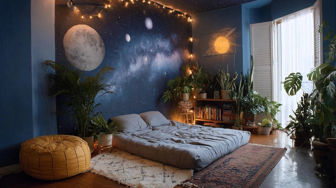
When James Gunn envisioned the visual universe of Guardians of the Galaxy, he disrupted superhero movie conventions. Forget dull metallic tones: make way for an explosion of cosmic colors that transform space into a pop playground. From the deep purple of nebulae to the electric pink of costumes, each scene becomes a retro-futuristic work of art. This chromatic boldness is no longer limited to screens: it now inspires our interiors, creating atmospheres where cosmic energy meets contemporary design.
Here's what the Guardians of the Galaxy aesthetic brings to your decor: a bold color palette that energizes space, a pop nostalgia that sparks conversations, and a cosmic dimension that visually expands rooms.
You love this universe but fear it might be too extravagant for your living room? Are you worried these saturated colors clash with your current furniture? It's a legitimate concern. However, the visual approach of Guardians of the Galaxy is based on a fundamental principle: the balance between color intensity and sophistication. Cosmic hues, when integrated thoughtfully, create interiors that breathe energy without falling into excess. Let me show you how to capture this cosmic pop magic to transform your space into a personal galaxy.
The chromatic DNA of a revolutionary space saga
The palette of Guardians of the Galaxy draws from a unique retro-futuristic aesthetic. Deep purples recall the covers of 1970s science fiction novels, while neon pink evokes the neon signs of Californian drive-ins. This combination creates a fascinating visual tension: cosmic immensity meets terrestrial pop culture.
What makes these colors so captivating is their assumed saturation. Unlike the muted tones of Scandinavian minimalism, the universe of Guardians celebrates intensity. The vibrant turquoise of Yondu, the deep red of Gamora’s ship, Rocket’s flamboyant orange: each character becomes a walking chromatic manifesto. This maximalist approach finds a particular echo in our contemporary interiors, where we are increasingly looking for spaces that express a strong personality.
The nostalgia of the 80s reinvented
The iconic soundtrack of Guardians is not the only retro element: the art direction borrows heavily from the Memphis aesthetic of the 1980s. These bold geometric shapes, these frank contrasts between primary and secondary colors... everything evokes the postmodern design of that decade. In an interior, this influence translates into graphic compositions that structure space while injecting a dose of fantasy.
The use of cosmic gradients is also a strong visual signature. These subtle transitions from violet to blue, from pink to orange, create an atmospheric depth that evokes the nebulae photographed by Hubble. In decoration, these shades generate a sense of infinity particularly valuable in small spaces: the eye glides over the tones without encountering a clear visual barrier.
Translating galactic energy into your living room
Integrating the colors of Guardians of the Galaxy doesn't mean turning your apartment into a spaceship. The most sophisticated approach is to create chromatic focal points against a neutral background. Imagine a broken white wall with an artwork in intense cosmic hues: the effect is immediate without being overwhelming.
The technique of chromatic layering proves particularly effective. Start with a subdued base (pearl gray, warm white, beige sand), then gradually overlay the colored touches: a deep purple cushion, an electric pink vase, a turquoise-based lamp. This stratification allows you to dose the intensity according to your desires, by adding or removing elements over the seasons.
Strategic visual impact zones
Some spaces naturally accept a chromatic saturation higher. The entrance, for example, benefits from an explosion of cosmic colors that creates an immediate wow effect. It is a transition space where boldness is allowed, because you never stay there long. A painting depicting a nebula in purple and gold tones becomes a stylistic statement.
The office corner is also an ideal ground for Guardians aesthetics. These stimulating colors promote creativity and energy, two essential qualities in a workspace. A cosmic triptych with pop hues creates an inspiring backdrop that fights the monotony of long hours in front of the screen. The combination of violet (which stimulates imagination) and turquoise (which promotes concentration) generates an optimal cognitive environment.

Discover this inspiring work
Color combinations that work
The Guardians of the Galaxy palette relies on counter-intuitive complements. Purple and orange, traditionally considered difficult to match, create a vibrant visual tension here. This dissonant harmony works thanks to a simple principle: varying intensities. A deep purple almost black pairs perfectly with a copper orange, while a pale lavender enhances a bright coral.
Neon pink, an iconic visual signature, becomes more sophisticated when paired with metallic tones. Brushed silver or aged brass temper its intensity while preserving its energy. This combination evokes the aesthetics of the Guardians' spaceships: shimmering technology wrapped in bold colors. In a living room, this alliance translates to copper luminaires combined with pink textiles, creating an atmosphere that is both futuristic and warm.
The structuring role of deep cosmic tones
The violets and night blues of deep space play an architectural role in this palette. They anchor the compositions, offering a base on which brighter shades can dance. An accent wall in cosmos blue creates a depth similar to that of a night sky, instantly transforming the volumetric perception of a room.
These dark hues also possess a paradoxical calming quality. Contrary to what one might think, a spatial violet in large surface areas does not visually reduce space: it absorbs it, creating a sensation of infinity comparable to that we experience when contemplating the starry sky. This chromatic depth transforms a bedroom into a cosmic cocoon conducive to relaxation.
Compose your personal galaxy in progressive touches
The common mistake is to want to integrate everything simultaneously. A layer-by-layer approach proves much more effective. Start by identifying your dominant cosmic color: are you drawn to mysterious purples, energetic pinks or electric turquoises? This shade will become your chromatic guiding thread.
Next, introduce this color through movable elements: cushions, throws, decorative objects. This flexibility allows experimentation without permanent commitment. If the intensity seems excessive, you can easily reduce the dose. Conversely, if the effect enchants you, you can progress towards more structuring choices such as a wall textile or a piece of furniture in these bold shades.
Wall art as an ambiance amplifier
A cosmic artwork is the most direct way to import the Guardians' aesthetic into your interior. Unlike a mural, which engages permanently, a work offers the desired chromatic intensity while remaining modular. Opt for generous formats that create a true window onto space: the eye plunges into colorful nebulae, creating a valuable visual escape in urban environments.
The internal composition of the artwork plays a crucial role. Centered compositions generate concentrated energy, ideal above a sofa or bed. Horizontal compositions with lateral movement, on the other hand, energize a hallway or narrow space. The orientation of color masses subtly influences spatial perception and the room's energy flow.
Ready to embark on your own cosmic odyssey?
Discover our exclusive collection of space artworks that capture the pop energy and cosmic immensity of Guardians of the Galaxy to transform your interior into a personal galaxy.

Discover this inspiring artwork
The cosmic colors of Guardians take on a spectacular dimension depending on the light temperature that bathes them. Warm white lighting (2700-3000K) enriches purples and pinks, giving them a velvety depth. Conversely, neutral light (4000K) brings out turquoise and electric shades, creating a more energetic and futuristic atmosphere.
The use of multiple light sources with variable intensity allows to modulate the ambiance according to the moments. During the day, natural light dialogues with cosmic hues, creating changing reflections. In the evening, indirect lighting (hidden LEDs, accent lamps) transforms the space into a colorful intimate cocoon. This temporal variation avoids visual saturation: your cosmic decor remains stimulating without becoming overwhelming.
Colored LEDs: with moderation
The temptation of RGB LEDs is great when discussing the Guardians aesthetic. However, sophistication lies in restraint. An LED strip behind a piece of furniture or artwork can create a subtle luminous halo that reinforces the cosmic dimension. But entire rooms bathed in artificial colored light quickly tire the eye and trivialize the effect.
Instead, opt for luminaires with colored lampshades that diffuse soft tinted light. A floor lamp with a dusty rose or violet lampshade creates a refined cosmic atmosphere, much more durable than an aggressive light show. The goal is to suggest the galactic universe, not to reproduce it literally.
Living daily with cosmic intensity
A legitimate question arises: do these intense colors risk becoming tiresome? Experience shows that cosmic hues well integrated have remarkable longevity. Unlike ephemeral trends, they draw on deep visual archetypes: our ancestral fascination with the night sky, our attraction to saturated colors that contrast with the gray urban everyday.
The key to durability lies in visual rest areas. A room entirely saturated with color does exhaust the gaze. But intense cosmic touches against a neutral background create a stimulating visual rhythm without being tiring. This is the principle of musical composition: alternation between intensity and rest generates a rich and lasting experience.
Over the seasons, you will notice that these colors evolve with natural light. Purples warm up in summer, roses shade in winter. This chromatic variability maintains visual interest and creates a subtle connection between your interior and the natural cycle. Your personal galaxy becomes a living environment, never frozen.
Conclusion: your chromatic odyssey begins now
The aesthetics of Guardians of the Galaxy teach us a valuable lesson: chromatic boldness is not the enemy of sophistication. These pop cosmic colors transform our interiors into vibrant spaces that reflect our personality without compromise. The deep purple of a nebula, the electric pink of a spacesuit, the luminous turquoise of an alien crystal: each shade becomes an invitation to travel, a window onto infinity.
Start modestly if apprehension persists. A cushion, a poster, a decorative object. Let these colors dialogue with your existing space. Observe how they change the energy of the room, how your gaze lingers differently. Then, gradually, compose your own galaxy. Because ultimately, that's exactly what we are looking for in our interiors: a personal universe where we feel fully ourselves, far from dull conventions. Your cosmic adventure awaits you.
FAQ: Your questions about pop cosmic decor
Won't the bright colors of Guardians of the Galaxy quickly go out of style?
This concern is natural, but cosmic hues escape the ephemeral cycles of decorative trends. Why? Because they draw on multiple and timeless cultural references: 1970s-80s science fiction, pop art, real NASA space imagery. It's not a fleeting trend but a hybrid aesthetic that blends nostalgia and futurism. Moreover, unlike trendy colors like millennial pink or Pantone greenery, cosmic hues are not marketed as THE color of the year: they constitute a coherent palette that evolves with you. The trick is to integrate gradually rather than radically transform: in this way, you can adjust the intensity according to your future desires without starting over.
How to integrate these intense colors if my interior is currently very neutral?
Excellent news: a neutral interior constitutes the ideal canvas for welcoming cosmic colors! Start by identifying the areas you frequent least during your daily movements: the wall behind the sofa where you are sitting, the space above the head of the bed. These locations accept intense color touches without creating visual saturation, as you do not have them constantly in your direct field of vision. First introduce a single focal element: a medium-sized cosmic painting. Live with it for a few weeks, observe how it transforms the atmosphere. Then gradually add subtle chromatic echoes: a cushion echoing a shade, a vase in a complementary hue. This concentric circle approach allows you to dose the intensity according to your personal level of comfort.
Do these colors suit all decoration styles or only modern interiors?
The beauty of cosmic colors lies in their surprising adaptability. A Scandinavian interior benefits from an injection of energy via purple or turquoise touches that contrast with the pristine white. An industrial style gains sophistication with neon pinks that soften metal and raw concrete. Even a classic interior can welcome these hues: a deep purple recalls royal velvets, while a cosmos blue evokes the starry nights of romantic paintings. The key lies in the intensity and surface: in a traditional decor, favor slightly desaturated shades and accent touches rather than massive blocks. In a contemporary loft, you can afford maximum saturations. The Guardians style does not impose a fixed decor: it offers a chromatic palette that you interpret according to your existing universe.